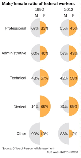
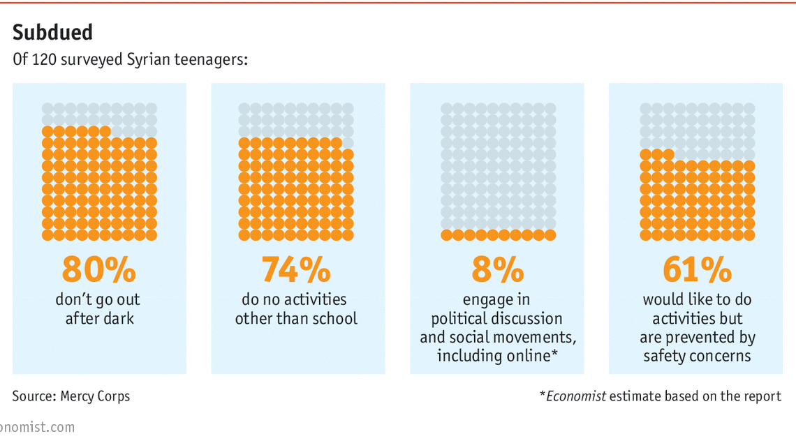
HelpMeViz

Waffle Charts

These waffle charts from The Economist sparked some interesting discussion on Twitter in response to Cole Nussbaumer Knaflic. A Google spreadsheet with the (super simple) data can be found here. The workbook is public, so anyone with the link can…

Continue reading

Avocado Pit Charts

Hi everyone, This is Jon (owner of this site). I found this set of graphics at the Washington Post this week and posted them to Twitter to simply ask what you would call them. Little did I know how much…

Continue reading

Cancer Survival Rates

I’m working on a way to display trends in cancer survival over time broken out by stage and race. The purpose is to compare trends in survival between races so that if, for instance, whites have seen a large improvement…

Continue reading

Distribution Network

I would be grateful for any help the HelpMeViz community may be willing to provide in breaking my visualization block! I always find inspiration from the responses here. We have a quarterly operations summary for a group of DCs (distribution…

Continue reading

The 2015 HelpMeViz Vizathon

Welcome to the 2nd Annual HelpMeViz Vizathon event! I am again happy to be working with the Bread for the World Institute on issues related to hunger in the developing world. This year, we’re also teaming up with the International…

Continue reading

Dashboard Help!

Hi, I’m currently working on a dashboard and I’m sure there is a way to improve it but can’t really get ideas flowing, I’m hoping the community could shed some light through your site! Dashboard parameters This dashboard serves as…

Continue reading

Mosaic Plot of the Titanic?

I’m having problems with this Titanic data set. The problem is mainly how to tell a compelling story ? I know my variables of interest well, those include Pclass, Age, Survived, Sex. I’ve spent quite some time exploring the data set…

Continue reading

Combination Chart

This figure has been published in a book chapter on the epidemiology of autism spectrum disorders (ASD), in which we discuss methodological factors impacting the estimation of prevalence and the interpretation of changes in prevalence estimates over time. All co-authors…

Continue reading
Is pollution decreasing in the Baltic Sea?

Pollution Infographic

Hello, I am working for an intergovernmental organization for the protection of the Baltic Sea called Helsinki Commission, also known as HELCOM. I made this infographic explaining how much is the pollution being reduced in the Baltic Sea and how…

Continue reading
Close