
Hi everyone,
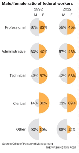
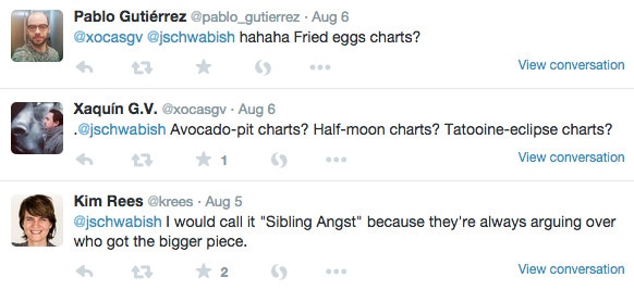
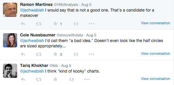
This is Jon (owner of this site). I found this set of graphics at the Washington Post this week and posted them to Twitter to simply ask what you would call them. Little did I know how much people would hate them! Now, I’ve seen this graphic type before, I think in ESPN the Magazine, and they also popped up on BBC today, so they’re around.

Anyways, here’s the data in an Excel file. Have at it and let’s see what folks come up with.
Thanks,
Jon







Simple bar chart before and after.For each profession-pair, the top bar is 1992, the lower bar is 2012. Just a quick sketch made up in Excel. The labels could stand to be improved, but you get the idea.
Here’s my favorite of some quick ideas, it’s an area chart made small enough to look more like bar chart. It communicates both proportion as well as a sense of direction. The workbook (with reshaped data) is on Tableau Public: https://public.tableau.com/views/AvocadoPitRemix/area?:embed=y&:display_count=yes&:showTabs=y
Here’s a slope graph. What’s not to love? The slopes highlight the change over time and the overlaying helps see the overall trend toward 50-50.