in On...
On…my bars don’t start at zero
July 1, 2021
Leave a comment
2661
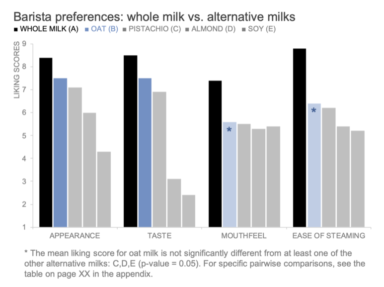
Some thoughts on starting bar charts at zero based on a post from Storytelling with Data.
Continue reading
Some thoughts on starting bar charts at zero based on a post from Storytelling with Data.
Continue reading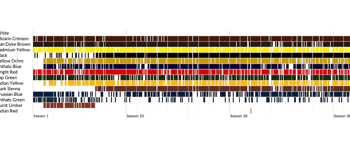
I’m a big fan of Stripe Charts–lines or dots that show individual elements in your data, often used to show the distribution. I recently came across this very cool scrollytelling piece from Connor Rothschild on the use of paint colors…
Continue reading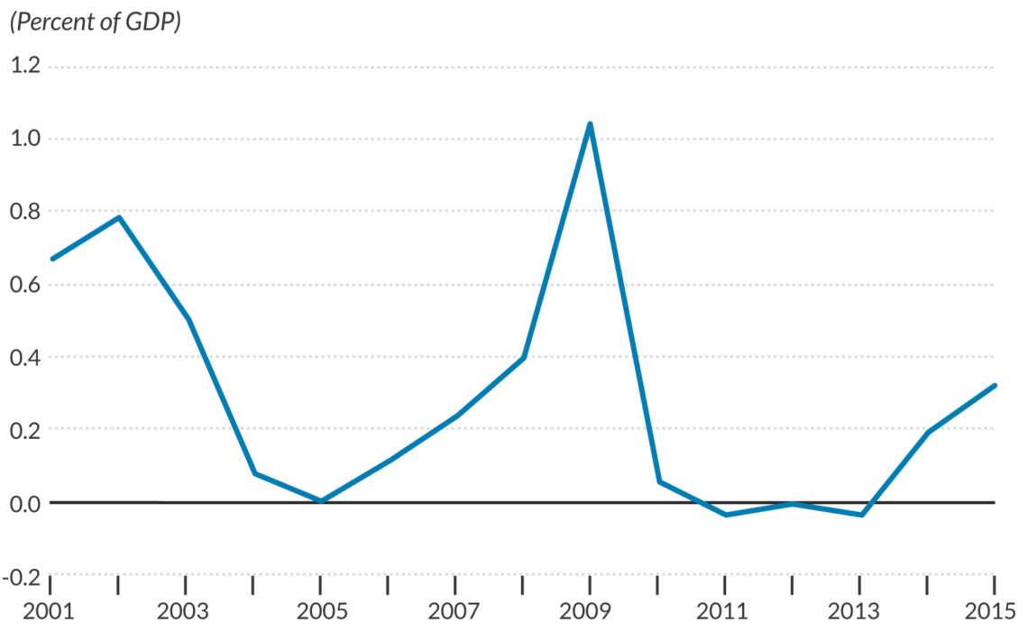
There isn’t necessarily a “correct” way to style your axis lines or gridlines in our data visualizations. It is worth noting, however, that how we draw our axes can impact how our readers perceive specific values. In the case of…
Continue reading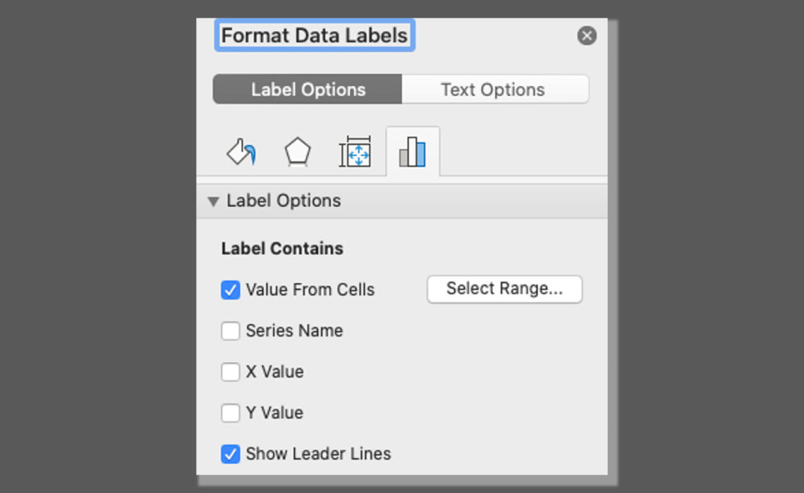
Learn how to use the “Value From Cells” option in Microsoft Excel.
Continue reading
The “On…” series is a collection of short blog posts relating to data visualization, economics, presentation skills, or data communication. In each, I discuss an issue, concept, or idea that I have not fully developed, a work in progress, or…
Continue reading
The “On…” series is a collection of short blog posts relating to data visualization, economics, presentation skills, or data communication. In each, I discuss an issue, concept, or idea that I have not fully developed, a work in progress, or…
Continue reading
The “On…” series is a collection of short blog posts relating to data visualization, economics, presentation skills, or data communication. In each, I discuss an issue, concept, or idea that I have not fully developed, a work in progress, or…
Continue reading
The “On…” series is a collection of short blog posts relating to data visualization, economics, presentation skills, or data communication. In each, I discuss an issue, concept, or idea that I have not fully developed, a work in progress, or…
Continue reading
The “On…” series is a collection of short blog posts relating to data visualization, economics, presentation skills, or data communication. In each, I discuss an issue, concept, or idea that I have not fully developed, a work in progress, or…
Continue reading
The “On…” series is a collection of short blog posts relating to data visualization, economics, presentation skills, or data communication. In each, I discuss an issue, concept, or idea that I have not fully developed, a work in progress, or…
Continue reading
Newsletter with sneak peeks, special deals, and more!


 Excel T-shirt
$13.00 – $15.00
Excel T-shirt
$13.00 – $15.00
 data. graph. repeat T-shirt
$15.00 – $24.00
data. graph. repeat T-shirt
$15.00 – $24.00
 If Not Now Venn - T-shirt
$15.00 – $16.50
If Not Now Venn - T-shirt
$15.00 – $16.50