
By popular demand, the workshops I regularly deliver for companies and private organizations are being made available to the general public. I will also list talks, seminars, or conferences I will be attending and speaking–you may need to buy a separate ticket or registration for those events, so check the appropriate website. At the moment, most of my public workshops are being held in DC, but if you would like to have me visit your city, please contact me.
Upcoming Workshops and Events
None currently scheduled
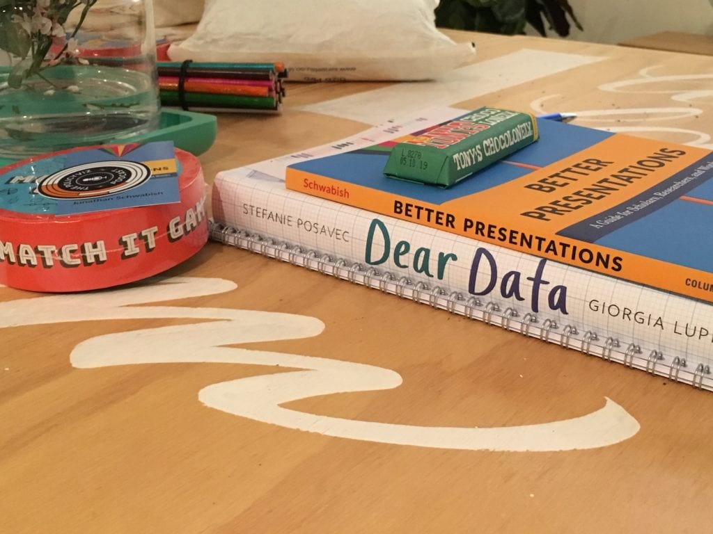
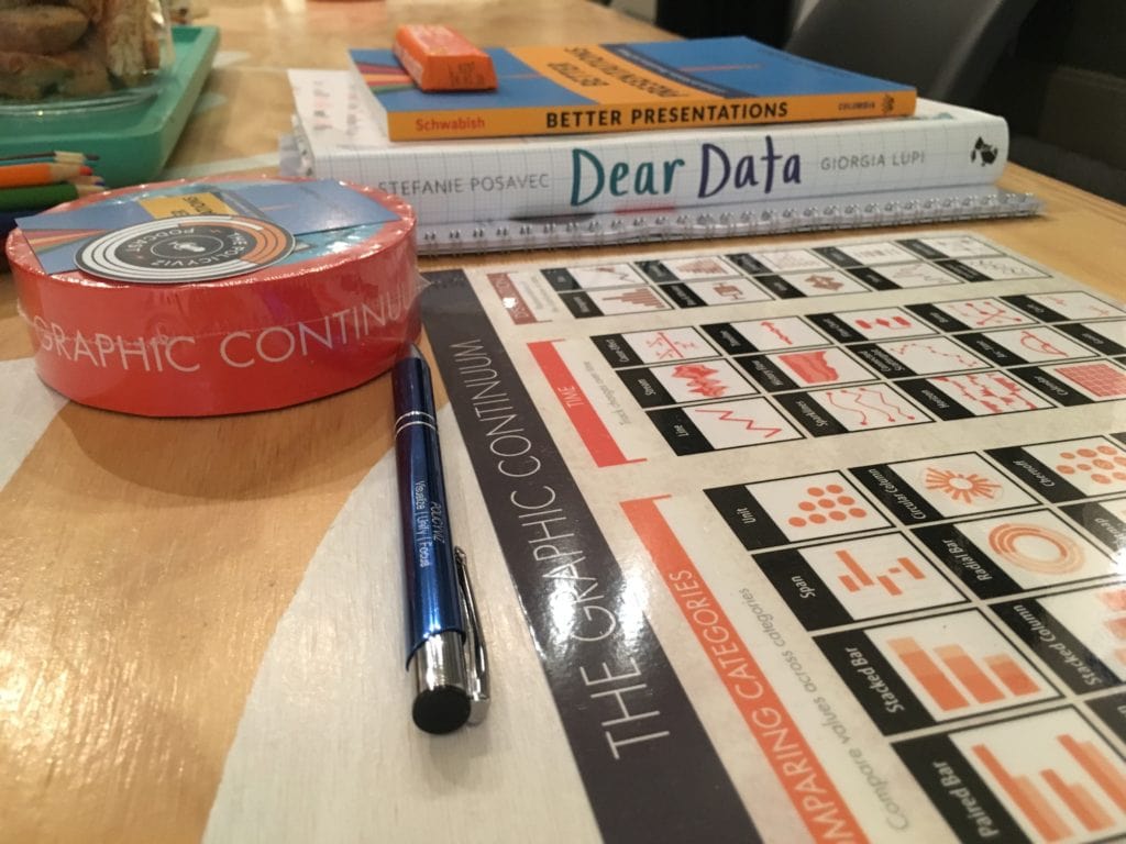


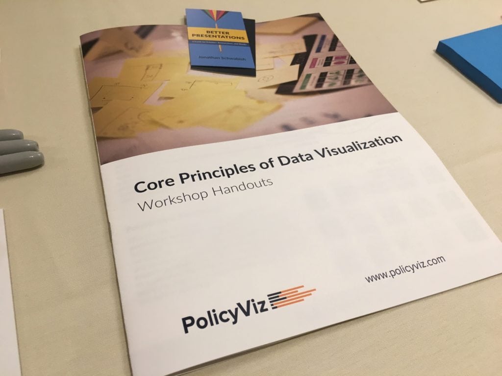

Core Principles of Data Visualization
In the 3.5-hour Core Principles session, we’ll talk about the science of perception, different visualization types to help expand graphic literacy, and best practices to creating and communicating data. Workshop participants receive a copy of my book, Better Presentations: A Guide for Scholars, Researchers, and Wonks, a copy of the desktop version of the Graphic Continuum, and a number of other handouts and resources. The workshop is a combination of hands-on exercises and lecture.
Core Principles of Data Visualization in Excel
In the Data Visualization in Excel workshop, attendees will learn how to extend the data visualization capabilities of Excel. We start with basic productivity-enhancing skills in Excel and the move to more advanced data visualization techniques. This class cover basic formulas such as INDEX, MATCH, and VLOOKUP; data importing features; in-cell charting and conditional formatting; and advanced data visualization techniques. Attendees will receive copies of my Step-by-Step Guide to Advanced Data Visualization in Excel ebooks.
Most people who work with data approach the task of presenting analysis by converting a written document into slides. Unfortunately, the result is often a text-heavy presentation saddled with bullet points, stock images, and graphs too complex for an audience to decipher―much less understand.
In this full-day workshop, attendees are shown better ways to create, design, and deliver their presentations. Specific resources, tools, and approaches are defined and discussed to demonstrate better ways to deliver memorable content. Workshop attendees work in small groups to discuss presentations, and evaluate their own and other presentation slides. A portion of the afternoon is reserved as an open time for attendees to work on their own presentations and solicit feedback and advice from the wider group. Attendees receive a copy of my book, Better Presentations: A Guide for Scholars, Researchers, and Wonks.
Data, Designed
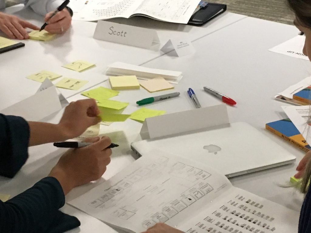
This is a special workshop in which I team up with Stefanie Posavec, a London-based designer with projects ranging from data visualization and information design to commissions data art. This workshop provides attendees with the core skills needed to conceptualize, plan, and develop data visualization products. This entire workshop is off-screen—I teach core principles in the morning and Stefanie teaching hands-on design and conceptualization in the afternoon. Attendees are given a simple data set they explore, sketch, and ultimately use to create a visualization using pen and paper.
Introduction to Tableau
The Tableau training workshop includes sample data, exercise documentation (with answers), and final workbook. The format of the workshops includes, “follow along”, “do it yourself”, and group exercises. This workshop is led by Brittany Fong, a leading voice in the data visualization community and a Tableau power user since 2012. She is organizer of the DC Tableau User Group, a co-organizer of the DC Data + Women group, and a Tableau User Group Ambassador.
Introduction to R
This is a special workshop in which I team up with Aaron Williams, a data scientist at the Urban Institute, where he works on retirement policy, tax policy, microsimulation models, data imputation methods, and data visualization. Aaron leads the Urban Institute’s R Users Group and assists researchers across Urban with projects that use R for statistical analysis, data visualization, mapping, and automation.
In these workshops, attendees learn the practical R skills that will improve the quality of their work and discover approaches to programming away the mundane. Workshops begin with a clear motivation, followed by an explanation of the approach and code, and end with hands-on examples. There are three separate workshops: Introduction to R; Data Visualization in R; and Creating R Tools for Organizations.
What We’ll Cover
The goal of each workshop is to help you improve the way you communicate your ideas, your research, and your data. We discuss the various data visualization and presentation techniques you can use to help deliver your content to your desired audience.
I have two main goals in the Core Principles of Data Visualization workshop. First, to expand your graphic literacy. Not because different graphs are inherently better, but because sometimes we see new patterns or make new discoveries when we visualize our data in different ways. Second, to expose you to best practices and strategies when it comes to creating your graphics.
In the Excel class, my goal is to make you more efficient and productive in Excel by showing you some key formulas. I will also show you how to create non-default graph types and to demonstrate the philosophy you can use to continue to grow your Excel visualization library.
In the Presentations class, we will go through the entire presentation-creation process, from conception to design to delivery. We will talk about how to set up and conceptualize your talk with worksheets and writing; how to create better, clearer, more effective slides; and things you should keep in mind when you are in front of an audience.
Who Should Attend
If you work with data, analyze data, and communicate data, then these workshops are for you. Regardless of whether you are a researcher, scholar, data scientist, or company executive, knowing how to create more effective graphs and how to effectively communicate them, can help you transmit your work to more people to help affect change.
For the half-day data visualization session, you won’t need your computer, only your imagination and willingness to work with your neighbors. For the full-day data visualization session, you will need your computer as we will work with some data. For the Excel session (either half- or full-day), you will need a computer with Excel already installed. We will work directly in Excel for the entire session. For the presentation session (either half- or full-day), you will need your computer to learn some of the PowerPoint tips and tricks, and to use the worksheets and start to create your own slides.
These workshops will give you the tools and strategies to help you create and deliver your content in the best ways possible.

Testimonials
“Thank you! For an area that I’ve never worked in/thought about before, I found it incredibly interesting and informative.”
“This was a fantastic training; highly recommend it!”
“Not only was the content extremely practical, but the class was intentionally designed with small projects that helped guide learning along the way.”
Jonathan’s workshop was a perfect combination of unique knowledge, great visualization examples, and some humor to keep things fun. We had a variety of expertise and experience levels in the room and everyone came away from the workshop with something to improve upon and all left the workshop eager to get started on new projects. Highly recommend!
Christy Friedman
Program Manager, Vanderbilt University School of Medicine, Department of Health Policy
I consistently find myself asking “What would Jon Schwabish do?” when I have data that I want to present in a compelling, nuanced way. I recommend his writings as a resource to all my students. We booked a day long training with Jon, and it turned out to be a terrific investment. I highly recommend his workshop!
Melissa S. Kearney
Professor of Economics at the University of Maryland, former Director of the Hamilton Project at Brookings
Mike Kainrath
ComEd