HelpMeViz

Help finding the right tool

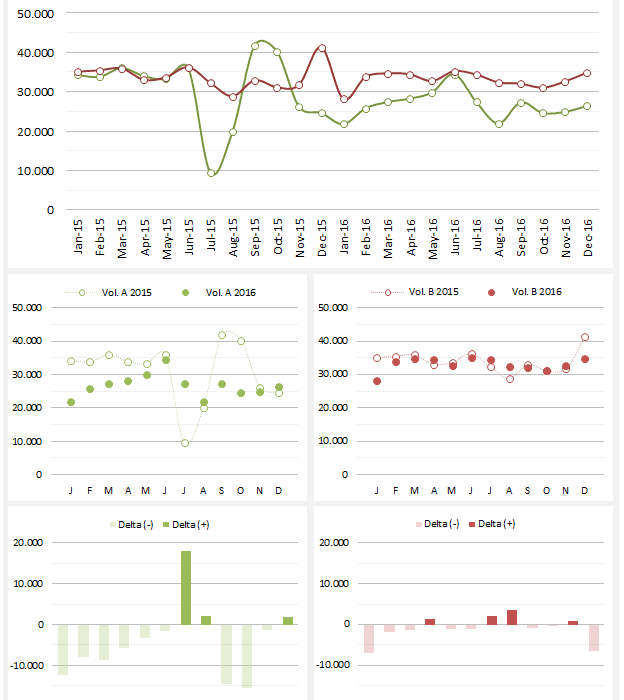
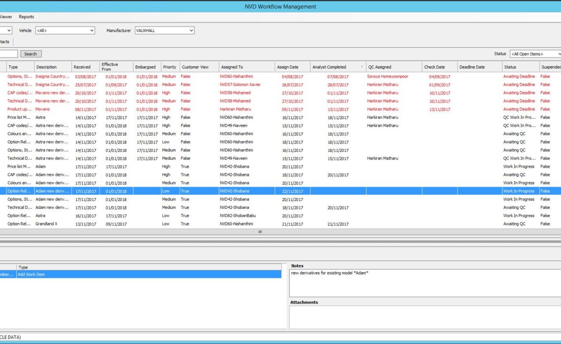
We work on automobiles data. Analysts check manufacturers and models data, and update everything in our in-house tool. We receive information about 100 jobs from different manufacturers, and they send in their updates regarding car models, bikes, lights, heavies, etc….

Continue reading

Stacked Column Chart

Hi, I have been trying to get a good visualization of the cumulative causes of changes to a pension fund’s unfunded liability by cause: -I have tried a waterfall graph – but it is very difficult to “read”. -I tried…

Continue reading

Plotting Change

Hello everyone, I am trying to show change in a pre-post data set. My visualization is two side-by-side scatter plots with hexagonal binning, one for the pre values and one for the post values. I would like to show change…

Continue reading

Visualizing Health Care

The new Republican health care program proposal–the American Health Care Act–was released yesterday (March 6) and with it came the expected comparisons with the effects under The Affordable Care Act. At the Kaiser Family Foundation, Cynthia Cox estimated the changes of…

Continue reading

Discussing Time Series Data

Hi, I would just like to trigger an exchange of views/ideas/suggestions on the plotting of time-series data (data are here). I believe the displayed charts are self-explanatory. I don’t ask for a “business” solution here, rather than personal views on…

Continue reading

A Messy Connected Scatterplot

Last year, I wrote a blog post about how U.S. presidents have limited influence over the economy. As part of that post, I showed the relationship between the unemployment rate and participation in the Supplemental Nutrition Assistance Program (SNAP; formerly…

Continue reading
Close