HelpMeViz

Help Comparing Groups

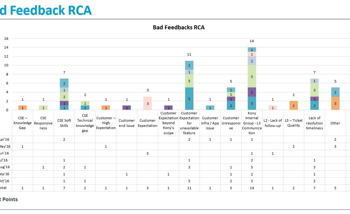
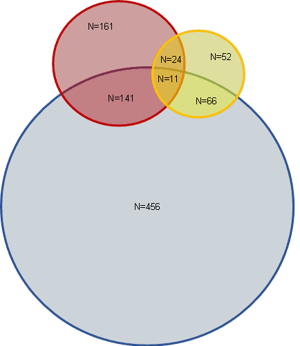
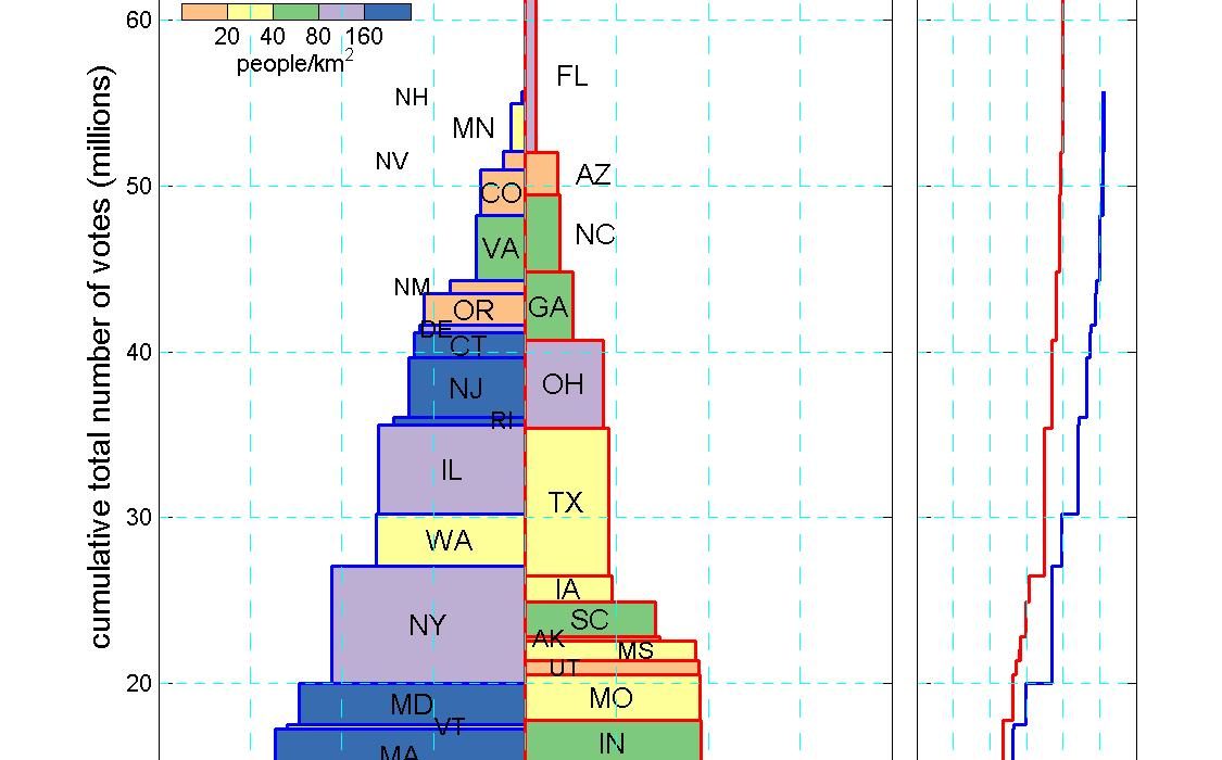
Hi, I am looking for feedback on a graphical method I’ve devised for comparing groups.  I think it can be used for many different kinds of quantities, some of which I show on my website http://mason.gmu.edu/~bklinger/nationshome.html. The plot shown below…

Continue reading

Visualizing Bad Feedback

Hi, I am trying to show trend analysis of bad feedbacks received from our customers. I have tried line, bar, etc.. graphs and found this was the best way. But I am looking forward for any suggestions on representing this in…

Continue reading

Mapping Lemurs

I’m currently helping develop a non profit foundation that aims to save lemurs. We had a call with a potential partner this week and I was describing the challenges we face in Madagascar. I want to create a visual concept, because nowadays…

Continue reading

Run Time Column Chart

The numbers in this table are run times for different graph processing libraries using five different algorithms on six different datasets. We are comparing the performance of our library, Gunrock (in term of run time) with several other libraries for various…

Continue reading

To Venn or Not to Venn?

Imagine a group of adults (~1300 total) with heart attacks who go to an ER. Using cocaine is bad for your heart, so ideally all patients with heart attacks should be asked about cocaine use. But only about half are asked (blue…

Continue reading

Design Help

I have been working on this for a long time, but I haven’t worried about how the work will actually look, but now I have to show my results in public. Any and all advise on design, fonts, charts, etc. are…

Continue reading

Bubble Map

I am writing to request review on one of my first d3 visualizations. This project is a part of the capstone projects under the Udacity Data Analyst Program. One of the project requirements is to gather feedback from online community. The…

Continue reading

Helping a Heatmap

I would like help visualising these data. What I have tried to show is by segments those that over or under index against the average (total). I think the challenge is finding a way to visualise data with many series…

Continue reading
Close