HelpMeViz

Budget Pie Chart Triplet

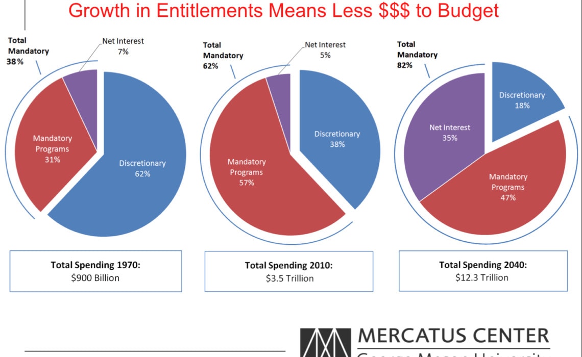
Jason Fichtner from the Mercatus Center at George Mason University sent in this set of pie charts. “The basic story is that mandatory spending has been growing as an overall share of government spending. The dollar figures are in 2009…

Continue reading

Unemployment Rate Area Chart

Jason Fichtner from the Mercatus Center at George Mason University sent in this stacked area chart (Excel file here). “This chart provides a comparison of the different measurements of the unemployment rate from the Bureau of Labor Statistics (BLS). It includes…

Continue reading

Causes of Death and Disability

Mike Freeman, from the Institute for Health Metrics and Evaluation at the University of Washington, submitted this interactive visualization for feedback and advice. He is requesting comments on three specific areas (but, sorry, the data are not available): 1. Scales:…

Continue reading

A Word from the Moderator

Happy New Year! As we enter the New Year, HelpMeViz is providing a platform for people working with all types of data and all types of visualizations to receive feedback and advice. There are now 6 visualizations under active discussion…

Continue reading

State Migration Flows

In late November, Chris Ingraham posted his interactive remake of a radial network diagram of state-level U.S. migration data. He’s asking the community for alternative approaches. Below is a sample of the text from the alternative on his bl.ocks page, but…

Continue reading

Inequality Bar Chart

This bar chart from Tim Smeeding, Director of the Institute for Research on Poverty at the University of Wisconsin, compares income distributions in 31 countries for various years using data from the Luxembourg Income Study. The figure shows the relative…

Continue reading
Close