Urban, Population, Agriculture, and Land
June 2, 2014
5 Comments
2872
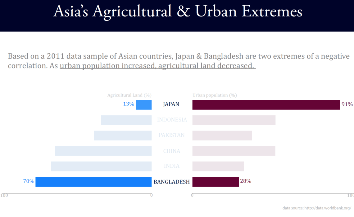
I’m interested in the relationship between a country’s urban population (as percent of total) and the share of the country’s land in agriculture. In this World Bank data, I wanted to focus on some of the interesting outliers I discovered….
Continue reading