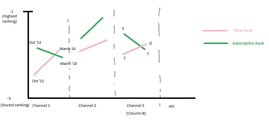
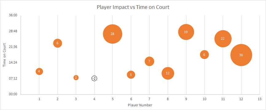
Search Results

excel

in Teaching

Next PolicyViz Workshop Announced

I’m happy to announce that the next PolicyViz data visualization and presentation techniques workshop will be held on Tuesday, April 22nd in Alexandria, VA. The workshop includes instruction and discussion about best practices for data visualization and presentation techniques. There…

Continue reading

Visualizing YouTube Analytics

Hi! My name is Julie, and I need help visualizing some YouTube channel analytics data over time. Attached is the spreadsheet I’m working on as well as quick mock-up in Paint of what I’d like the graph to look like. On…

Continue reading

Happy Pi Day!

In case you’re not aware, today is March 14, 2014—3/14/14—better known as Pi Day.  For some, this is probably an excuse to eat a lot of pie and for others it’s probably an excuse to memorize some number of digits…

Continue reading
in Tutorials

JEP Data Files

My article about data visualization was published in the Winter 2014 edition of the Journal of Economic Perspectives last week. I’m supplying Excel files for the redesigned figures shown in the article as well as a zip file of PDFs of all…

Continue reading

Maps – At a Loss

Michael Taylor from ColdWater Economics writes in the following: Dear HelpMeViz, I wonder if you could give me some pointers. I am an economist, and my particular speciality is tracking global data. For this exercise, I am following approximately 400…

Continue reading

Unemployment Rate Area Chart

Jason Fichtner from the Mercatus Center at George Mason University sent in this stacked area chart (Excel file here). “This chart provides a comparison of the different measurements of the unemployment rate from the Bureau of Labor Statistics (BLS). It includes…

Continue reading
Close