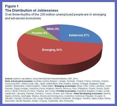
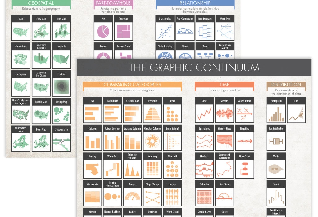
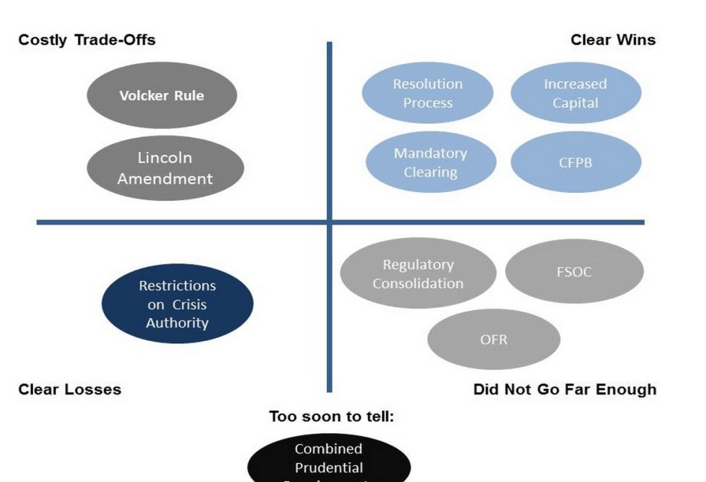
in Redesigns

Announcing the Remakes Page

New year, new ideas. This year, I’m launching a “Remakes” [Update May 2021: These are now called “Redesigns“] page to PolicyViz, which will serve as an ongoing repository for data visualizations that I think are in need a makeover. I’ll regularly…

Continue reading
in DataViz Community

Visualized 2014 Roundup

Videos from the 2014 Visualized conference in New York City were posted late last week. Shortly after the conference last January, I wrote 8 separate posts summarizing my observations about data, storytelling, aesthetics, and other aspects of data visualization and…

Continue reading
in Tutorials

Directly Labeling Excel Charts

My friend Stephanie Evergreen–who co-hosts the awesome Rad Presenters Podcast with me–published a post last week about labeling charts in Excel. In it, she offered some guidance about how to get rid of your default legends and directly label your charts…

Continue reading
in Tutorials

Table > Graphics

Sometimes a table is preferred to a graphic. A recent blog post from the Brookings Institution included a reprint of this graphic from Martin Neil Baily (Brookings) and Aaron David Klein (Bipartisan Policy Center). The graph is taken from a…

Continue reading
Close