One Chart at a Time Video Series
January 11, 2021
2 Comments
7040
Check out the new One Chart at a Time video series!
Continue readingSearch Results
Check out the new One Chart at a Time video series!
Continue reading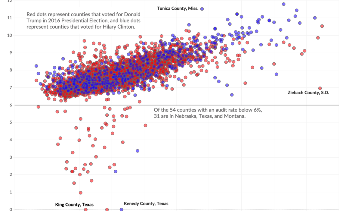
Paul Kiel and Hannah Fresques at ProPublica wrote this really interesting article a few weeks ago about the geographic distribution of Internal Revenue Service (IRS) audit rates. They found that states with the lowest audit rates “tend to be home…
Continue reading
Lazaro Gamio is a deputy managing editor at Axios, where he oversees a group of visual journalists that make charts, maps, interactive graphics and editorial illustrations. He previously worked at the Washington Post as an assignment editor on the graphics…
Continue reading
Think of all the things you learned in elementary school: How to read. How to write. How to count. How to do add, subtract, multiply, and divide. These are all learned skills, things that we are not innately born knowing…
Continue reading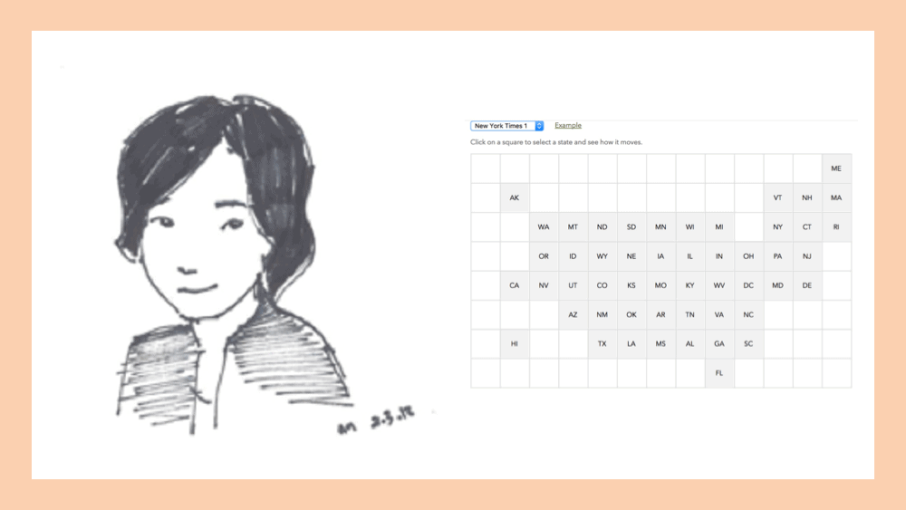
Jane Pong is a Data Visualization Journalist at the Financial Times. Previously, she produced information graphics at Thomson Reuters in Singapore and South China Morning Post in Hong Kong. She is a graduate of the University of Sydney with a combined Arts/Science…
Continue reading
In May, I published an ebook A Guide to Advanced Data Visualization in Excel 2010 that walks you through how to create more than 15 advanced chart types in Excel step by step. Today, I’m happy to release the Excel…
Continue reading
As a reader of this blog, you probably know I use Microsoft Excel for a lot of my data visualization needs. Excel is easy to use, everyone has it, and it works well with most other programs. One of the…
Continue reading
I usually hate these kind of “Year in Review” wrap-up posts, but I figured I have enough good and bad stuff saved that it was worth sharing. No rankings here, just a stream-of-consciousness kind of thing. But let me be…
Continue reading
Newsletter with sneak peeks, special deals, and more!


 Excel T-shirt
$13.00 – $15.00
Excel T-shirt
$13.00 – $15.00
 data. graph. repeat T-shirt
$15.00 – $24.00
data. graph. repeat T-shirt
$15.00 – $24.00
 If Not Now Venn - T-shirt
$15.00 – $16.50
If Not Now Venn - T-shirt
$15.00 – $16.50