in Redesigns
Remake: Time Series Column Chart
June 7, 2018
3 Comments
8302
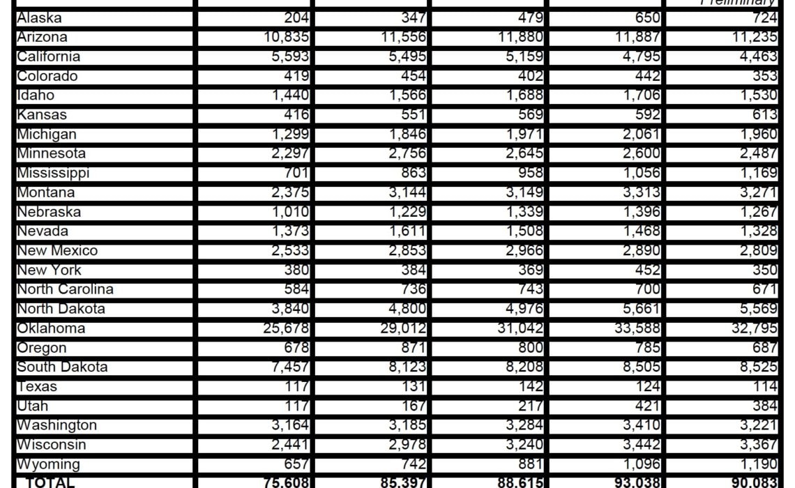
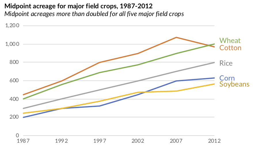
When you look at this column chart from the USDA, what is the first thing you see? Go ahead, take a second… My guess is—admittedly, based on a sample size of three people I’ve already asked—that your first observation is…
Continue reading