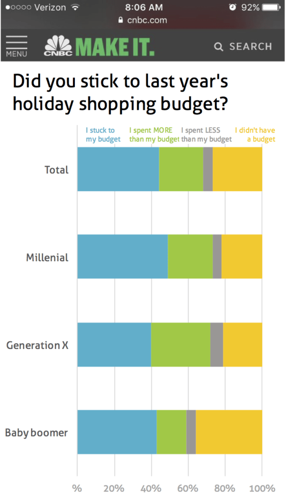
My friend Ann Emery posted this tweet over the weekend:
Coffee convo with the non-datanerd hubby: Can you remake this? This is hard to read, right? 4 groups, I can’t tell what’s supposed to add to 100%, & they ran out of space & had to twist the letters. (He has no idea that clustered columns are my least fav graph of all time. ❤️) pic.twitter.com/SUbDrZ5Zkd
— Ann K. Emery (@AnnKEmery) November 18, 2017
It doesn’t look like Ann wanted to remake this graph, so I took a shot.
What I did:
-Okay, this graph is clearly hard to read. Not only do the x-axis labels not even fit, but it’s really hard to compare across the four categories. As Ann notes, it’s hard to quickly tell that the numbers sum to 100%.
-As I started to think about my remake, I restricted myself to using the exact same dimensions as the original.
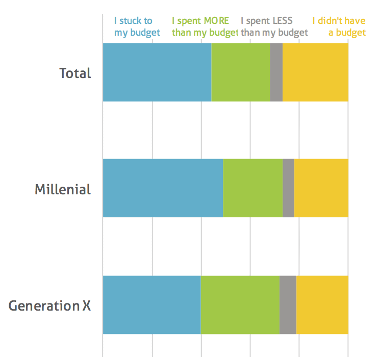
-I thought a four-pack of stacked bar charts would be a better approach. Because the data sum to 100%, the stacked bar charts all fit nicely in this single, vertical layout. I guestimated the data values and organized them by generation, not by answer.
-I considered breaking the bars up and giving each their own vertical baseline so that it would be easier to compare each answer across the four groups, but it doesn’t quite fit as nicely in this particular layout.
-I labeled the series at the top of the chart and colored them to match the data values. This way, all the really important information–title and legend–are at the top of the image.
This was a quick remake. What do you think? Give it a shot; here’s my data file.


I’ve tried my hand at a redesign too. Thank you so much for sharing the data file. Here’s an extract from my blog post. The full link is under my name, above.
“Ann’s pet peeve is clustered columns and mine is stacked bar charts. On Jon’s remake, I can’t quite see what’s going on with everyone’s Holiday shopping, except perhaps that Millenials stuck to their budget more than other generations.
Upon closer look, it seems that the point of the data is to compare how fiscally responsible each generation is in regards to its Holiday budget. Hence, it should be easy, looking at the graph, to see which generation overspends, which sticks to its budget, and which doesn’t even have a budget.
The organization of the data is close to the original: I grouped the generations under their spending habits. This way we can immediately see which generation spends more (Generation X), which sticks to its budget (Millenial), which spends less (X again) and who doesn’t have a budget (Baby boomer). Unlike Ann’s husband, I don’t find it difficult (or necessary) to see which data adds to 100%. It seems more interesting to answer the questions “Which generation over/underspends?” Given that the generations follow the same general trend, grouping by generation would yield graphs difficult to differentiate.
My general approach to data visualization is that content matters. It should influence the choice of graph, the order of the data, the colors, the analytical angle. Here are a few explanations for my design choices:
1. Obviously, I replaced the columns with horizontal bars, giving space to the titles and labels. In my training, I often joke that people would solve 50% of their data visualization issues with horizontal bar charts, but perhaps it’s not a joke.
2. I stuck to the original size because that was the rule of the game and a useful constraint. I saved some space because with the integration of text and data, I no longer needed a separate legend like the original chart did.
3. I relabeled the “Total” row. When it comes to people, it seems more intuitive and appropriate to talk about “Everyone”. I also differentiated it visually. This is another of my pet peeves: calculated data that is shown the same way as the source data.
4. I stuck to the client colors (except for a lighter grey) but I tried to apply them in a slightly more intuitive sense: yellow for overspending, green for sticking to budget and grey for no budget (neutral in this context of comparing to budget). Blue seemed neutral and indeed I’m not sure if it’s that good to spend less than budgeted on gifts.
5. I changed the order of the charts so that the one on top is about overspending, then the one about sticking to budget, then underspending and finally, no budget. It seems a more intuitive sequence (more-stuck-less-none) than the original (stuck-more-less-none) with the “on-budget” chart in between the more and less ones. The order of the generations also follows that of a population pyramid with the older people on top.
I don’t quite hope to get Ann’s husband approval given that it keeps the same groupings, but perhaps with better design, the messages will become clearer and he’ll understand the data better.”
Attached image:
I tried different approaches. I think Jon’s first remake is quite fine; i would simply remove the X-axis labels and gridlines and add labels to the data. Based on that thinking i made the first chart; adding some dummy gaps to provide for symmetry on the columns. The second is a bubble chart. It would seem better if the data had a larger variance. Third chart is an idea that I ‘ve been working for a while now. In this case however, it’s not easy to read across categories. It would suit better in plotting data from 2 by 2 matrix questionnaires (e.g. Q1: Y/N * Q2: Y/N). Data are plotted as square areas on the XY axis. Anyway, just sharing some thinking.
P.S. I forgot to add the % symbol. That would helpimplying that the data add up to 100%.
Attached image: