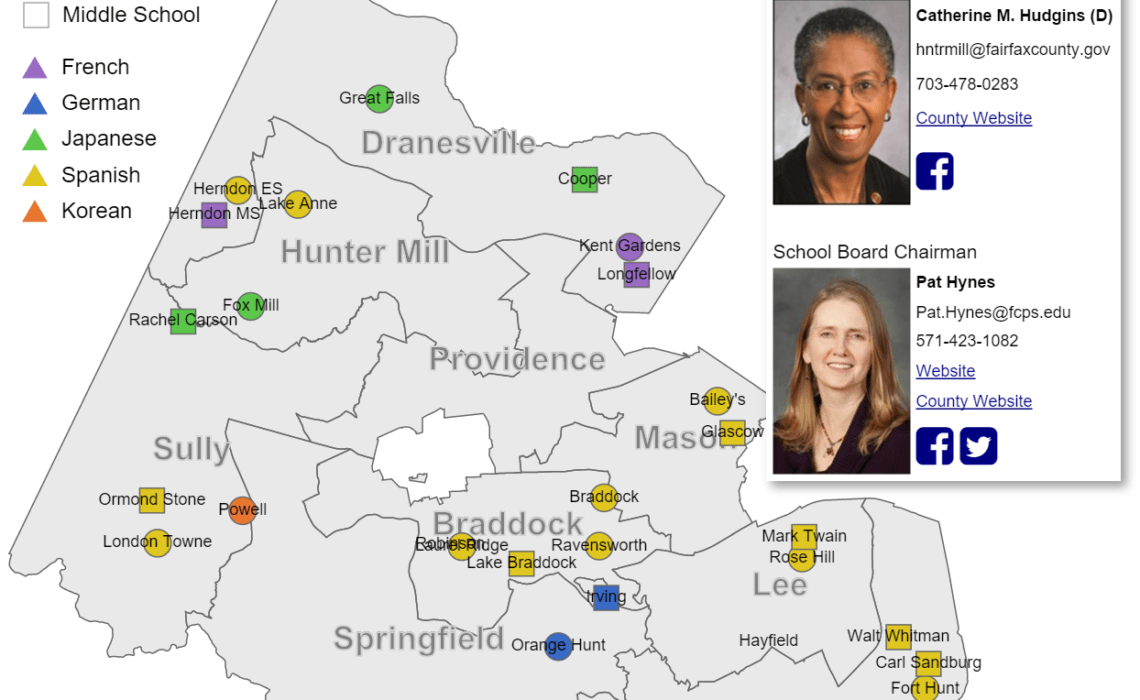
I’m working on a map for a group advocating for language immersion programs in Fairfax County, VA. The idea is that we direct parents and others to the map, they find their district, and they contact their district supervisor and school board member. Right now the map has the basic contact information, but it is a little bare bones – “cold” as someone put it. So I’d like to make it more inviting by using color and other means.
Beyond that, I’d like the map to somehow communicate what’s at stake, by representing the students who will be affected. I have some data that breaks out enrollment by school, language, grade and year, but I haven’t worked it into the graphic yet. Maybe just a simple table would be good enough, possibly showing the enrollment in the schools in the selected district on the bottom right. I’m pretty good with d3 though, so I can do pretty much anything.
This is a fairly urgent request because the decision to cut immersion programs (or not) will come in the next 8 weeks.
Thanks!


I’ve been wondering how parents learn about the language immersion programs! Thanks for working on this.