

Late last year, I presented my work on the Urban Institute’s Do No Harm project to analysts at a state department of health. (I’ve changed specific numbers in this post and am not naming the state or hospitals to keep the information confidential.) Following my presentation, one of the analysts who works on stroke care across the state told me about some of the data that had caused a bit of a stir in their data community.
At an early 2023 meeting, the department’s data team presented information about a worrying trend in stroke care at a specific rural hospital in the state. Hospitalization prevalence had increased from 8 percent of inpatient discharges in January 2021 to 10 percent in December 2021. The data showed that this hospital had more than 700 additional stroke patients discharged in 2021. But this analyst wasn’t worried because she recognized the increase as an example of survivorship bias—a logical error that can lead to false conclusions by concentrating on people (or things or communities) that pass a particular selection process.
Because this analyst deals with facilities specializing in stroke, she knew some key information about hospitals providing stroke care across the state. First, this hospital had added interventionists to do more thrombectomies between 2021 and 2023. Second, the hospital was planning to pursue a higher level of certification as a thrombectomy-capable center, which is a designation given to hospitals specializing in stroke care. The application for that designation was submitted in late 2022 and because it usually takes two to five years to pursue the designation, the hospital was clearly ramping up care in the years before.
There is also a geographic issue at play here. The analyst told me that if people in this community were experiencing more strokes, the hospital would not necessarily see an increase in the number of stroke discharges as there were only a handful of hospitals offering higher levels of stroke care in the state. Stroke patients, therefore, travel throughout the state (or to other states) to go to a thrombectomy-performing stroke center.
Thus, it wasn’t the case that the number of strokes in this community were increasing, but that the local hospital had increased its ability to provide more and better care for people with strokes. Patients would no longer have to travel to hospitals in other parts of the state or in other states as their local hospital was now able to provide a higher level of care. Instead of the increasing numbers representing a worrying trend, they actually demonstrated a community that had better access to health care.
More generally, the analyst told me that if she saw a hospital significantly increasing the number of patient discharges, she would bet it would be due to increased services, not a sudden change in the community.
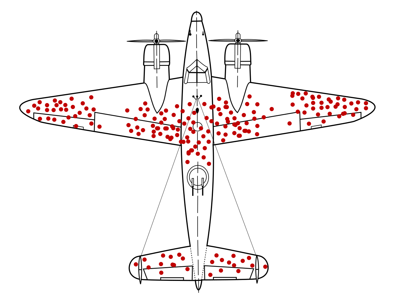
One of the most famous examples of survivorship bias comes from the study of damage to WWII bombers by researchers at the Center of Naval Analyses. The original study concluded that additional protective armor should be placed where the returning planes had bullet holes. But that missed the point. Those bullet holes were found on the planes that returned from their runs—it was areas where there were no bullet holes that were downing other planes.
This example of hospital stroke care is similar: the data don’t represent an actual increase in the number of people needing stroke care; they represent better access to stroke care. As the analyst told me, “Data alone are just that—alone. Data need context.” It’s a good lesson for all of us to keep in mind.


