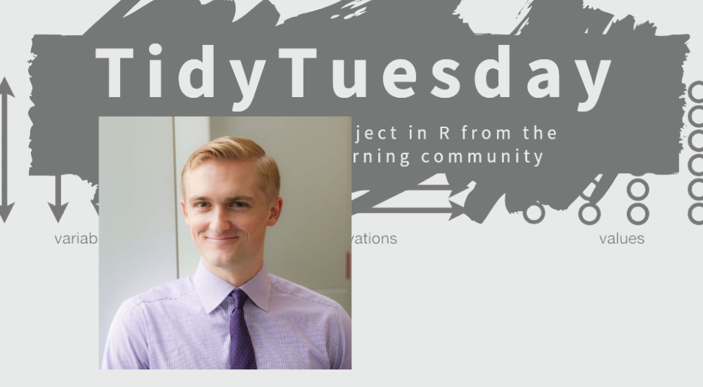
Tom Mock is the Customer Enablement Lead at RStudio, helping RStudio’s customers successfully leverage open source data science tooling and RStudio’s Professional products. He is the founder of #TidyTuesday, a weekly data science and data visualization learning community project. He maintains themockup.blog, a technical blog highlighting use cases and how-tos with R and the tidyverse. You can find him engaging with the community on Twitter at @thomas_mock. When he’s not at his computer, he’s seeking out the best churros or playing with his Boston Terrier, Howard.
Episode Notes
Tom: Twitter | Personal blog
Presentation by Mine Çetinkaya-Rundel (educator at RStudio and Duke)
gt maintainers and authors
Books
Related Episodes
Episode #201: Leland Wilkinson
Support the Show
This show is completely listener-supported. There are no ads on the show notes page or in the audio. If you would like to financially support the show, please check out my Patreon page, where just for a few bucks a month, you can get a sneak peek at guests, grab stickers, or even a podcast mug. Patrons also have the opportunity to ask questions to guests, so not only will you get a sneak peek at guests but also have the opportunity to submit your own questions. You can also send a one-time donation through PayPal. Your support helps me cover audio editing services, transcription services, and more. You can also support the show by sharing it with others and reviewing it on iTunes or your favorite podcast provider.
Welcome back to the PolicyViz podcast. I am your host, Jon Schwabish. I hope you’re having a nice holiday season, you’re staying healthy and staying safe. On this week’s episode of the podcast, I am very happy to have Tom Mock join me. Tom works at RStudio, and is obviously very active in the R community. He runs the TidyTuesday experiment or program or initiative, whatever you’d like to call it, and you should check that out, we’re going to talk about it in this week’s episode of the show. Tom has also developed the GT package in R, the grammar of tables, which if you know anything about my work, and hear about my writing, you know, I’m more and more interested in how we design really good tables. And having a package, a library in R that enables us to do so in better and easier ways, is, I think, a huge step, a huge advantage for those of us who are working with data and trying to communicate data. So we talk about all those sorts of different things that Tom does at RStudio, we talk all about these different programs and initiatives. And, of course, we talk in depth about grammar of tables. So I hope you’ll enjoy this conversation with Tom Mock, and here is that discussion.
Jon Schwabish: Hey Tom, good morning. Welcome to the show. How are things?
Tom Mock: Good morning. It’s good to be here, things are great. Just got back from a little break at RStudio, we had the weekend off and a couple extra days for Labor Day.
JS: Nice. And doing anything super exciting, super fun – I know you’re not like going into indoor stadiums and rock concerts and whatever, but…?
TM: Yeah, a few days off was nice. We moved recently, so getting settled into our new home and enjoying the outdoors has been a big chunk of our time.
JS: Lovely. Well, thanks for coming on. I’m really excited to have you on the show. I think we did a conversation a little over a year ago. I think it’s sort of the beginning of the pandemic where we talked about a lot of the work that you’re doing at RStudio. You did a talk for some folks over at Urban about the tables work that you’ve been doing so. So it’s been great, and I’m excited to share all the work that you’ve been doing with folks who are listening. So I want to start talking about your work at RStudio. I know you recently got a big promotion, you’re a big guy now. And then, I want to talk about, I guess, three main things. So you work at RStudio. You’re tight managing, organizing, facilitating TidyTuesday, and then also the grammar of tables stuff, which, as far as I know, is the only place someone’s actually thinking about doing tables better, which is kind of amazing if you think about it. So that sort of sets everybody up. Why don’t we start about RStudio, so how long you’ve been there, what’s your trajectory been like, what have you been working on?
TM: Yeah, absolutely. So I joined RStudio at the middle of 2018, straight out of a PhD school, started on their customer success team, which was mainly like working with existing clients and helping them use our software and open source data science tooling. As you kind of mentioned and alluded to, I just got a promotion to be customer enablement lead, so still kind of working the same space, but just thinking at a bigger scale, rather than working with individual customers, the entire customer base. So think about documentation, some of the training we do, some of the educational initiatives, just overall, like, what is the user experience, and kind of how are they learning how to use our software and external software as well.
JS: Right. And just for folks who don’t know, how big is RStudio, like, how many people you have there?
TM: Yeah, I think we’re at like 180 people now. So some people call it a startup, some people call it a tenured company, been around for a little over 10 years at this point. So been around for quite a while, so a good company that I’ve enjoyed working with for three years, yeah.
JS: That’s great. That’s awesome. So let’s start with TidyTuesday. These community projects are really valuable, I think, to lots of different people for lots of different reasons. So maybe we could start by having you talk a little bit about the background of it, and then maybe you’re like, I was going to say day to day, but it’s really like week to week, like, how do you manage it, how do you think about organizing the whole thing.
TM: Totally, yeah. So TidyTuesday was kind of born out of something I was doing, something I was working with in grad school. So I joined what was called the R for Data Science online learning community midway through I think 2017. I was trying to learn R, I was trying to bump up my skills in R as a statistical programming language and as a data science skill set. So learning with the community, and part of that was we wanted to connect mentors with learners, how do you do that in a scaled fashion, otherwise you have a hundred learners with one mentor and it doesn’t work. So the idea was like, okay, well, we can do like a weekly project. There’s other things doing that, there’s things like Makeover Monday, that’s great; there’s Workout Wednesday; there’s other kind of storytelling with data community. People were already doing a similar idea, but a lot of those were kind of emphasized around specific software suites. So there wasn’t really one that was like, oh, here’s how to learn with R or learn with open source data science. So we were like, okay, we can do a similar thing, new data, make sure that there’s an article associated with it, so you get the context, and they are able to learn us the everyone’s code. So launched it in April of 2018, and kind of gangbusters since then, it’s been, I don’t really know how many thousands of people, but around 120 or so people contribute every week, and multiply that out by three and a half years, and that’s what you’re going to get out to.
JS: Yeah.
TM: So yeah, that was kind of the big game. As far as like organizing it and growing, a lot of it was kind of natural in terms of my role has really been aggregating the data, cleaning it up, providing the script to bring it in, and then just saying, have at it, it’s pretty open ended intentionally. And what the community has done is built on top of it, to extend it further, like aggravating the visualizations people have created, aggregating the code, doing their own screencast, doing live video and podcasts, there’s all sorts of things that are built out of it that aren’t my work, just the community building on top of it.
JS: Right. So when you think about this idea of teaching people R at scale, do you think this is the way to do it, is it community? I mean, I will say, and I’ve written about this in the past, like, I have an Urban colleague who’s really great at R, and I said, Aaron, can you sit down with me for two days and just teach – because I had tried some of those massive online courses like Andrew Tran with the Post had done one, it was great; but like three days in, I’m like, I don’t have time for this. So what’s your take on that?
TM: No, I mean, my persona that I’m teaching to primarily is a business professional, someone working, someone not in an academic setting. So that’s a different persona than, say, a college student, a high school student or even a grad student. You don’t have the time to dedicate, oh yeah, from nine to five, I’m learning, or, from nine to noon, I’m learning, and 12 to five, I’m doing my lab work. It’s just a different persona. So for me, I think that focusing on just in time learning, better documentation, project based learning is really effective for that user population, because it’s solving the problem they want to solve, but not necessarily, like, you think of like this random adult trying to learn a project, they’re not saying like, okay, I’m ready to learn all of data science using R; they’re like, I have an Excel file that’s too big to open with Excel, and I need to graph it or something like that. Or, I got a statistical suite I need to run, and I don’t know how to run it with SPSS or SYSTAT or whatever. So I need to use R that has everything built in. So aiming at that, it’s like having something like TidyTuesday, where specifically for graphing or exploratory data analysis, here is a moment in time with a dataset that might be interesting to you, and there’s a hundred examples of how people attack the problem. That’s the core idea. It’s a project. It’s scoped. And it has hopefully useful data. And over time, there’s different datasets that people might contribute to, so some people have biology, some people have sports, some people have political data. Everyone’s not going to be interested every week, but over time, you have this giant mass of data with different scripts and then analyzing it. So I think that it’s been really effective for people to kind of jump in and jump out when they need to.
JS: Yeah. So, I mean, when you think about providing these datasets, are you thinking about, yeah, how can I pick as broad a spectrum from week to week that I can so that, yeah, if I’m not interested in sports, and so – sort of a weird question, I guess – so do you think people, when they’re trying to learn this are like, I’m not interested in sports, so if it’s TidyTuesday week one in September, and it’s on sports, I’m just not going to do it, even though it’s really not the point, the content is kind of not the point. So how do you think about mixing, matching, all of that?
TM: Yeah, I think for me, honestly, there’s a lot of people, and what I ask the community to do a lot is submit issues on the TidyTuesday repo for here’s a dataset I want to see. So a lot of the time while I’m doing the legwork of cleaning it up, aggregating it, and throwing it into the repository, someone else has really chosen the data. So I do kind of pull in like, here’s something someone else’s suggested. As far as what you’re saying though, like, yeah, there’s plenty of times where I see people come in, like, I know nothing about – we’ll use sports for example – I know nothing about the NFL, but explore the data, found this cool thing, and here’s the technique I learned. Like you said, the data is really secondary to it. For some people though, they need that motivation to even engage. They’re like, I’m not learning R for R, I’m not learning open source data science for open source data science, I’m interested in this, and I want to learn more about how to do that.
JS: Right. So now it is interesting that you’re approaching it, I mean, makes sense, you’re approaching it from like the DataViz perspective. So Hadley Wickham’s book, which is like, I’m looking at it, it sits on my desk – Hadley and Garrett’s book starts, like, chapter one is on DataViz. It doesn’t start with data cleaning, doesn’t start with regression analysis. So what’s your take on why that’s – I don’t want to say a better approach, but, well, I guess, maybe I’ll ask, like, do you think that’s a better approach, and if so, why do you think starting with the graphing is a better approach?
TM: Yeah, totally. I am 100% going to steal a concept that I 100% agree with from Mine Çetinkaya-Rundel, who’s an education person here at RStudio. She has an entire course setup, basically called have your cake and eat it too, it’s one of those lines, which is start with DataViz. And the reason why is that if you’re teaching someone how to do something with R, you can talk to them about lists and vectors and objects and memory computation, and someone’s falling asleep. Or you can start with, here’s you in four lines of code, creating a beautiful data visualization. That’s the hook. Hook them in, and then once they’re very excited about that, and they realize, I can be very powerful very quickly, build up the knowledge around that. They still probably need to know about list and object types and vectors and characters. But starting from that, from day one, you’re going to lose a whole cohort of people if you’re doing something, especially at like scale.
JS: Yeah. So we know that, like the value or the popularity of DataViz has grown over the last few years, so do you think – I remember learning in my younger days, learning SaaS and Stata in Fortran, which you can’t graph. But like learning SaaS and Stata, and you didn’t start with the graphs. Do you feel like the change in the tools, starting with DataViz is part of the growing popularity of DataViz, or has this sort of perception, like, let’s start, just what you said it, let’s start with something where I can get something visible right away has changed the way people view DataViz, and that like, where’s the direction running, or, is it just like a huge network mess that we don’t know?
TM: I’m going to punt and say it’s a huge network mess, but I’ll still give an answer, in terms of what I think everything interacts. But if you think about it, a lot of the older books from like the kind of bibles of DataViz, about here’s how to not do things the way that the defaults tell you to do it. Because they’re telling you to do 3D scatter plots, or 3D bar charts, and the defaults are terrible. Nowadays, if you think of ggplot or even Excel and other things, the defaults are actually pretty good in terms of like, they start from a baseline of like, the defaults are okay, you’re not breaking massive rules just by not editing it further. And other tooling is created that have just been more user friendly, in terms of you didn’t have to learn 99% of how to do DataViz before you could make a good thing. You can even from day one, get started and make something beautiful, make something interesting. So in my opinion, maybe not necessarily that people are teaching DataViz first, but it has become more approachable with better tooling, better defaults, and just more people thinking about it from kind of a top-down approach.
JS: Yeah. I want to ask one more question on this learning before we go to tables. So what would your advice be to someone who wants to learn R, but they see your work, and they see lots of other people doing great work, and I can’t think of a few off the top of my head, but they’re seeing all this great stuff built in R, whatever tool that they want to learn, and they’re a little overwhelmed by saying, well, I’m never going to be able to make that thing. So what do you say to those people who might feel a little overwhelmed before going into learning a tool?
TM: Yeah. So part of all of DataViz and why I think maybe this is even to the previous question, why it has been so successful is the community building around it. Regardless of what tool you’re using, there is a community that’s very excited about helping people get into it. Obviously, the R community is one I’m most deeply embedded in, I love it. But every tool has an ecosystem around it. In terms of people that get intimidated seeing good work, I hear you, in terms of like, I was there a few years back, I was like, man, I can’t make this, I feel like I’m just spinning my wheels. Part of what I’ve actually talked to actual people doing TidyTuesday about is they’re actually just doing it locally, they’re not even submitting their graphs on Twitter. So they’re still able to borrow from the community, they’re still able to like, oh, maybe if I can join and talk to this person, I can learn something. But they don’t have to take that next step of someone else can see my work. That’s often stressful for people. I think there’s huge value in sharing your work, because then you can get useful feedback; but it takes time for you to build up confidence to get there, and that’s okay. So I guess, my suggestion to new learners is, if you want to engage with something, try and find a community. For R there’s like the R for DS, an online learning community. There’s things like the rstats hashtag on Twitter. And even within your local community, whether it’s a job or a university setting or something like that, I guarantee you, there’s someone using R or another tool that you’re trying to learn.
JS: Yeah, I think that’s a great piece of advice, I mean, find those people that are right next door to you. Well, not anymore, but virtually, right next door to you. Okay, so I want to turn our attention to tables, because I’m so excited about the GT package. It’s like, I mean, just the concept of… Okay, this is what I wanted to ask. So I want you to describe GT for folks, and then, if you could, tell me about the philosophy behind it, because people have asked me to do something similar in Excel, like, oh, come up with templates. And my answer has always been, it’s just impossible, because there’s merged cells in different places, and tables can have infinite sort of dimensions and directions. And so, I’m fascinated by how you approach that from a sort of template and code base.
TM: Totally. Yeah, so GT is an R package standing for the grammar of tables. The grammar idea is borrowing from the idea of a grammar of graphics, or ggplot being an implementation of a grammar of graphics. So GT is an implementation and a defining of a grammar of tables. So what that means is that you can still build the exact same tables you’re used to, but you now have specific functions and specific language to apply changes to all the different areas of the table. This is not necessarily a new concept. I’ve seen older versions of defining the parts of a table. I know you’ve even done work about like, here’s the parts of a table. Stephen Few, back in the, I can’t remember his book, Show Me the Numbers has a definition of the parts of a GT table – or not GT, part of a table. But I think what this is, is actually an implementation of using those nouns and verbs to actually create the table, as opposed to just describing it. That was pretty long winded, but what this does is gives you an interface or a human interface to be able to create said table programmatically, so you can define all the different components, you can use data to change all those different things based on the actual values, which is very, very powerful.
JS: Yeah. And does it work, I mean, I’ll ask the – I mean, I’ve tinkered with it, so I’ll ask the questions I’m sure other people are thinking about right now listening this, so like, okay. So does it work, similarly to ggplot in terms of esthetics, and in terms of all the pieces that you sort of – so one of the reasons I like R is sort of I feel like it’s plug and play, you sort of have the fill command, the color command, like, is it worth the philosophy in the same way?
TM: Yeah. So I will say that at a very detailed level, we’ll go way back then come forward. ggplot basically creates a massive list of different things that are being changed. And so, you might think of, like you’re saying esthetics, like the x axis is equal to this, and it’s these values. GT works in a very similar way, where it says, the cell bodies or the table body, the actual values, here are their different labels in a list, here are the actual values in a list, here is the formatting in a list applied to those values. So if you look at it, it’s literally just lists on lists on lists. That’s really hard to write though. So what it provides is, like you were saying, instead of esthetics, you have things like cells body, which would be like rather than mapping the esthetic of axis X equals some variable, map the table body to these cells. So it’s going to build the table up, but then you can actually apply your esthetics or whatever, according to the different components. So cell body, column spanners, column labels, the title, subtitle, the stubhead, you can define all those different parts either programmatically or manually.
JS: I see. So if you have, let’s just say, you’re going to have data by state, let’s just say – let’s say, a percent of the population of men, percent of the population of women in each of those states you’ve got, and then if you wanted to have a spanner across that said gender or something like that, you would define that through the spanner column component.
TM: Exactly. You would say, basically, the function would be something along the lines of spanner column label, and you would say, I want to apply it on column of gender and/or male and female in this case, or however you want to put it or non-binary. And then that would create the column label as a spanner or column spanner across those two labels.
JS: Right. So now, when you think about people using GT in their work, how are you thinking about them bringing in the data into R – are you thinking about, like, oh I have this table in Excel, and it’s sort of all formatted, but I want to bring it into R, because that’s my preferred toolkit, or it’s easier to update, or now that once I have it in R, then I can build all these other graphs out of it, and so, in that case, when you have the spanner columns, or you have these grouped rows or whatever, how do you think about working from one input into GT?
TM: Yeah, so GT accepts basically a data frame, which in R is essentially a tabular data format. So GT doesn’t care how that data gets in, it could be pulled from a web API, it could be scraped from HTML, it could be brought in from Excel, it could be brought in from SQL on the database. All it has to be is in a tabular format in terms of in a data frame or a table in R. Then it can just be passed into GT, and it knows what to do with it. Once the tabular format is inside GT, then you’ve created a GT object, so you can make edits to it. And when it prints, it actually prints the table, it doesn’t print the data, it prints the formatted table every time.
JS: Right. Okay, so where do you see GT going, so like as with ggplot, there’s always, I mean, all packages, there’s always these updates, so where do you see GT going over the next, whatever year, two, 10, 12?
TM: Totally. I think the two good things here are right now we have essentially a pure grammar of tables implementation, and when I say we, I am not a developer of GT, so I’m going to give credit to Rich Iannone, Joe Cheng, Barret Schloerke who are the actual developers creating it. I post issues and things to the repository, but credit to them for maintaining and authoring the package. So what they’re doing is creating this rich API, and people can build on top of that. So if you think of something like the GT summary package, that takes a statistical model or counts and things, using the GTA interface, but creates a different table. So it’s a wrapper on top of it. And that’s what ggplot does is ggplot provides you a rich interface, you can build beautiful things with just ggplot, but there’s dozens of packages built on top of ggplot to do more, because there is an API you can use to do that.
JS: Right.
TM: The one thing that I am an author of is I just built out the GT extras package over this long weekend. What that is, is essentially removing some of the boilerplate and summarizing down some of those functions. So you think of like, I want to add a bar plot to all of these cells that is relative to the cell values. I can do that with nine lines of code in GT, which is appropriate. You’re saying, I want to apply it to this column for all these cells, and here’s the actual function to create the bar plot. Or, in a higher level package like GT extras, you can say, apply bar plot, and it just does all that boilerplate for you. You just say like, here’s the column I want to apply it to, and it passes a palette, it passes all the code to build the table, it passes all the code to build out the bar plot as well.
JS: Got you. So just so we’re all on the same page, on your long weekend where RStudio gave you extra time off, you built the GT extra. So I think that’s dedication to a craft that I can very much appreciate.
TM: I don’t know where I got, like the pandemic for me, my self-care, for some reason has been, let’s dive as deep as possible into the grammar of tables. So for literally, since about April of 2020 to now, I’ve just been slamming mental energy into the tables because can’t go to restaurants, can’t go bars, can’t go to sports games. So I do a lot of that on random days, and it’s been working. I’m happy doing it, so it is a good form of self-care.
JS: Yeah, that’s great. I want to ask you two more questions about GT. So is it possible now, or do you foresee it becoming possible to add visualizations into the tables, and specifically, I’m thinking about sparklines which I know you can do in ggplot, do you see that as part of GT, and also Excel has little data bars that you can build right into tables. So do you see that as part of it?
TM: Oh man, this is like the softball right over home plate for me. So GT extras has four plotting functions. It has a plotting function for horizontal bar plots. It has a plotting function for a percent of total. So like three, like, zero to 100, and there’s like three bars within there making up the portions. It has sparklines. And for your little stacked points, there’s a win/loss plot, which is styled after the Guardian; they do like a vertical pillar that’s green for a win in a sports game, and a vertical pillar that’s red and slightly subset as a loss, and a tie would be a gray dot in the middle. So all of those are built into GT extras. Now, that being said, you can still do all that with GT, because that’s what I’m doing is just writing code on top of GT. So GT for any row can accept a ggplot or any image. So if you can create an image, you can post it in line. And so, that could be SVG or PNG, whatever you want to create, but GT alone, oh absolutely, it can build anything into there.
JS: That’s awesome. And just so people know, we didn’t set that up beforehand. That’s softball was not predestined. I want us one last question for you. So like tables seem to get – not seem, they do get less attention in the DataViz field. And you mentioned, Stephen Few’s book has a really long chapter on tables. I have a chapter on tables in my book.
TM: A great chapter.
JS: Oh thanks. So is it just because tables aren’t as sexy as like a dot plot, or, we use so many tables all the time, like, we use tables before we even get to the graphs a lot of the time.
TM: Absolutely. I think that my hot take is that people are actually creating tables with a lot of the DataViz they use. If you think of like a horizontal bar plot, that is just a table that happens to have a horizontal plot inside of it. And you can do similar things where a table can have six values and plots a seventh. And that’s very, very valuable for here is the data visualization showing the trend or the overall shape of the data, but here are the raw values showing lookup values that you can also associate. It’s really, really hard with an actual graphic to encode five or six different things. You start doing color, shape, opacity, how dark the color is, how light the color is, you can get in these spots where it’s really hard to interpret. That’s really easy for a table to do. You just put the numbers in there. But I know we’re at time here, but the idea is that with a table, people haven’t spent as much mental energy into making good ones. So all people see, you’re like, oh god, I don’t want to show that, that’s a terrible table. If you apply some more techniques like a better data-ink ratio, if you use things like your book in terms of 10 table rules or rules from Stephen Few’s book, you can actually make beautiful tables and get tables that people want to see.
JS: Yeah, I think that’s great. I mean, I’m really excited about it to see how people use it, and I’m excited for – I don’t think I’ve seen it yet, but I’m excited for the first TidyTuesday, that’s like, this is going to be – we’re going to do a table one for TidyTuesday this week, and just see how many people get mad that they have to make a table instead of a fun graph or something.
TM: So we’ve done a – we haven’t done a core table one, but there’s been a lot of beautiful tables through TidyTuesday, so I always appreciate seeing them pop up.
JS: That’s great. Well, Tom, thanks so much for coming on the show. Congrats on the promotion and congrats on the GT package, it’s really great, I’m excited about it. So thanks a lot. I appreciate it.
TM: Thanks for having me, Jon. Have a great week.
And thanks for everyone for tuning into this week’s episode of the show. I hope you learned a lot about RStudio and about Tom’s work, and I hope you’ll go check out the GT package in R, it’s a great addition to your R toolkit to make better and more effective tables. So enjoy your holiday season, another episode or two coming up before the end of the calendar year. So until next time, this has been the PolicyViz podcast. Thanks so much for listening.
A number of people help bring you the PolicyViz podcast. Music is provided by the NRIs. Audio editing is provided by Ken Skaggs. Design and promotion are created with assistance from Sharon Sotsky Remirez. And each episode is transcribed by Jenny Transcription Services. If you’d to help support the podcast, please share it and review it on iTunes, Stitcher, Spotify, YouTube, or wherever you get your podcasts. The PolicyViz podcast is ad-free and supported by listeners. If you’d like to help support the show financially, please visit our PayPal page or our Patreon page at patreon.com/policyviz.


