

In-person conferences are definitely back. I attended the Government & Public Sector R Conference at Georgetown last week and was in Indianapolis for a total of 20 hours last Friday-Saturday for the American Evaluation Association (AEA) annual meetings. It’s what I saw at the AEA meetings that reminded (and inspired) me to write this post: Why, conference organizers, do you insist of having slide templates?
In case conference presentations are not your cup of tea, here is the basic way it works. You submit a paper proposal—you might submit on your own or as part of a larger panel, say, with 3 or 4 other papers. If you get accepted, you will have, usually, something like 5-15 minutes to present your work to the audience. As part of the presentation process, some conferences will provide speaker tips or guidelines, and some will provide a PowerPoint or Google Slides template.
But most of the slide templates I’ve seen are not especially useful. Why do they need a banner at the top or a logo at the bottom? Why is any branding necessary in the first place? We all know we’re at the conference and the conference isn’t an entity that owns the content, so it’s not like they are publishing the slides under their own banner.
Furthermore, most conferences are not so strict about using the templates that everyone uses them. Of the six presentation decks I saw at AEA, only two of them used the provided template. If the conference isn’t being strict about it and they serve little purpose other than forcing presenters to follow some arbitrary layout that doesn’t go beyond what one could easily do directly in PowerPoint/Google, what’s the point?
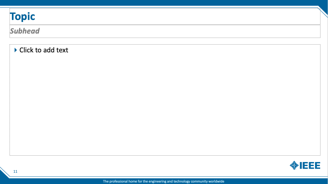
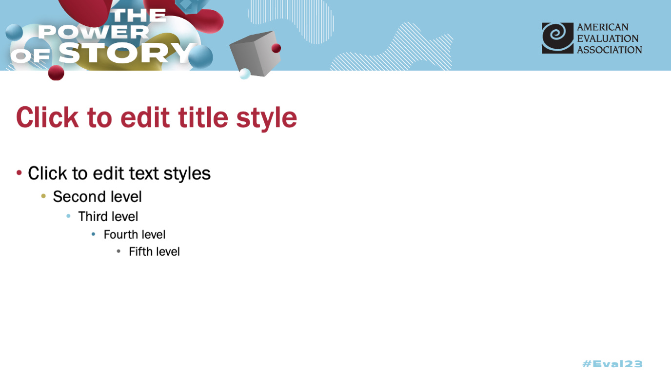
Take a look at these two PowerPoint templates, one from the IEEE conference and another from this year’s AEA conference. The banners at the top and bottom of the IEEE template and the top banner in the AEA template both take up about 18% of the total area of the slide. That’s a lot of space for unnecessary shapes that don’t help convey the content!
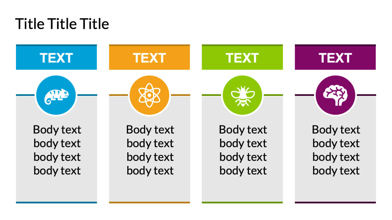
Instead, I would encourage conference organizers to provide useful templates. What might that be? First, a useful, engaging title slide–maybe with placeholders for image(s)–and a prompt to not end your presentation with a “Thank You!” or “Any Questions?” slide. Second, some alternative layouts to the standard vertical bullet point list. I like the basic set up shown in the slide below—it basically encourages the speaker to shorten the amount of text and to orient the list horizontally rather than vertically. Nolan Haims has a really good set of cards and templates for some of his alternative strategies to a list of bullet points. Third, there might also be some good lessons using some of the new PowerPoint tools like Morph and Designer. There are lots of other specific slide layouts and options I would share with presenters, but this is at least a start.
I’d love to see more examples of bad—or good—slide templates you’ve been asked to use in your presentations. Were the event organizers strict about making everyone use them? Did they provide other tips or tricks for a successful presentation? What has your experience been with presentation slides and templates?
If you have them (or even links), please drop them in the comments below.


What is the typical duration for a presentation at a conference after the submission of a paper proposal, and are there any common formats or templates provided to speakers during the presentation process? regard Telkom University
In my experience, the typical duration is around 10-15 minutes in a standard social science conference with concurrent sessions.