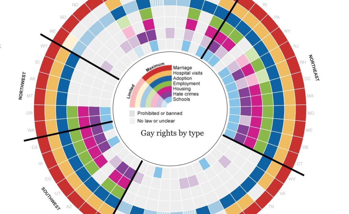
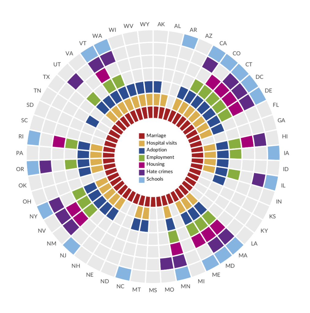
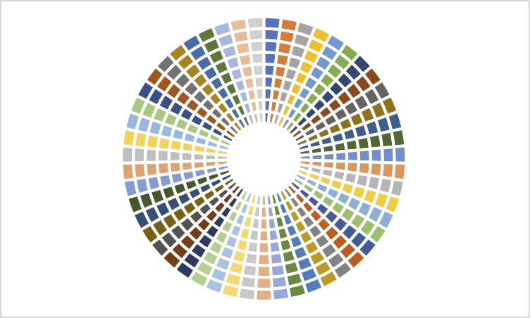
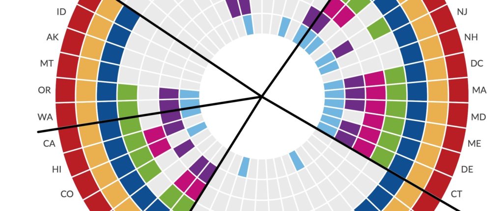
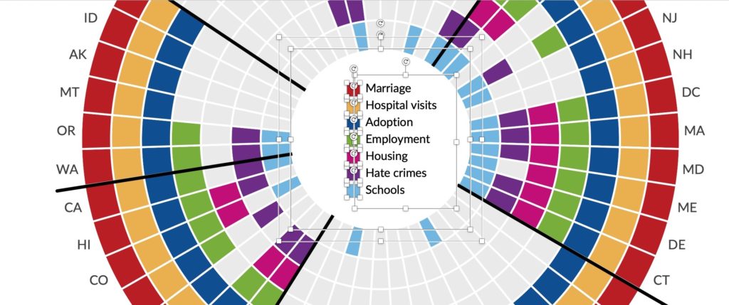
I really, really like this “radial map” (my name) the Guardian published in 2012 and then updated in 2015. The visualization shows seven different types of gay rights in all 50 US states plus Washington, DC. Each ring represents a different right—Marriage in red along the outer ring, Hospital visits in the yellow ring, and so on. Each radii shows a different state and they are grouped together by region of the country (though it’s not totally clear to me how the states are sorted within each region). In essence, it’s a circular heatmap with a specific application to geographic data.
I think it’s just a lovely, compact representation of seven different data series that enables the reader to quickly and clearly see the categorical and part-to-whole data within and between states.
There are two interesting questions about this visualization type: First, to consider how the layout affects our perception of the data, and second, how to create it in Excel.
Layout Considerations
When looking at the original graphic, you might observe all the dark, filled-in cells and say that many states are providing gay rights across many categories. (Gay marriage is granted nationwide under a 2015 Supreme Court ruling). The top-right (Northeast) and bottom-left (Southwest) states do indeed offer gay rights across many areas (a total of 121 cells are fully or partially filled in), though that is not the case in the Southeast part of the country.
What we should recognize about this radial approach, however, is that because of the way circles work, the outer rings have a larger visual weight than the inner rings; in other words, the cells along the outer ring are larger than cells along the inner ring. Take Iowa, for example, justo the right of the noon position—all seven cells are filled and you can see how the cell sizes increase as you move from the inner ring to the outer ring.
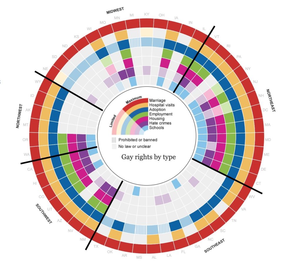
So, let’s see what happens when we flip the order of the rings.
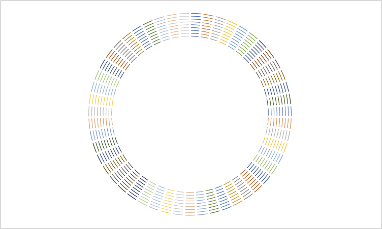
On the left is my remake of the original Guardian graph (to make this exercise a little easier, that I leave out the states with ‘limited’ rights and just focus on the ‘maximum’ rights states). On the right, I have flipped the order of the rings with Marriage now on the inside and Schools on the outside.
Does your perception of the overall change? There is now more gray in the graph because those cells are now larger. In this view, you might think the opposite of the first graph, that few states offer these rights. Again, because of how the cell size changes, there is now less colored “ink” on the page than in the original.
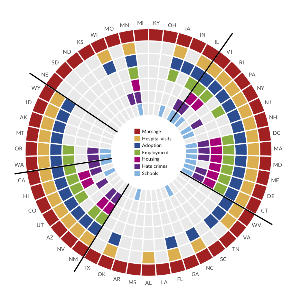
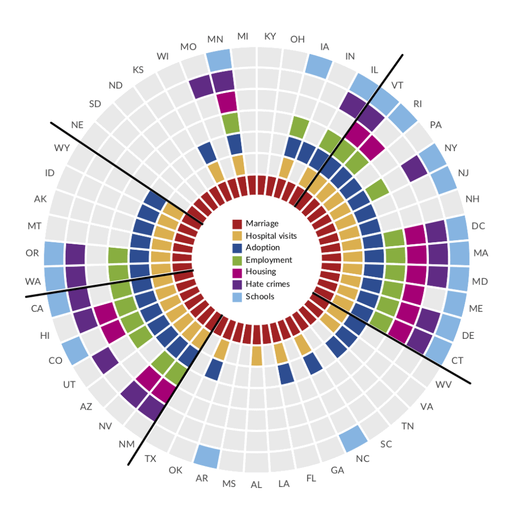
We can extend this even a bit further and organize the states not by region, but alphabetically. We still come away with a similar part-to-whole view of the data, but in this view, the clumps of states don’t necessarily have a meaningful relationship and thus we are less able to draw conclusions about societal/political patterns in different areas of the country.
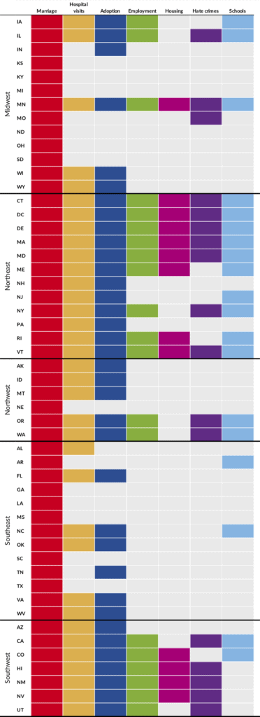
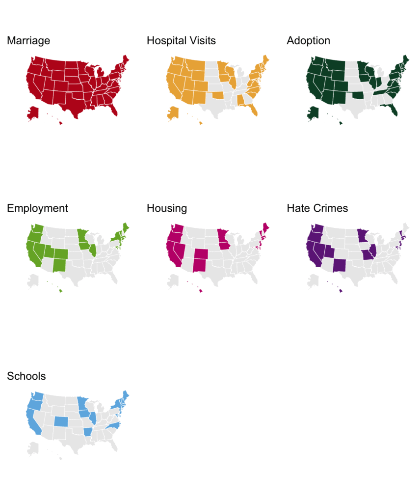
We could also show the same data as a standard heatmap or a set of small multiple maps. While the standard heatmap has the advantage that all the cells are the same size, it does become quite long. I also like the map visualization but it’s not as compact and not as easy to compare the patterns within each state (I built the maps in R and you can download the code, data, and final image in this .zip file).
While I still love the original Guardian graph, it is one of those cases where the decision about how to order and organize the data has a really big impact on our perception of the data. As creators of data visualizations, we need to be cognizant of these decisions and how they can help support our arguments or, on the flip side, mislead our readers to incorrect conclusions.
Build the Radial Map in Excel
While Microsoft Excel can be used to make lots of different graph types that are not in its default charting engine, the polar coordinate plane (i.e., circles) is not one of its stronger areas. But it turns out that creating the radial map in Excel is really not that difficult. And with a little VBA code, the tedious task of coloring all the cells can be made much easier.
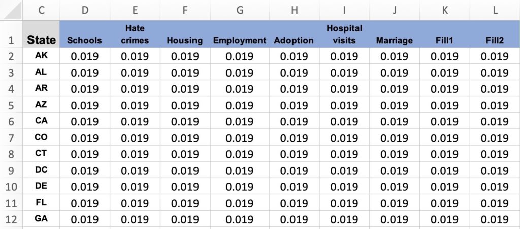
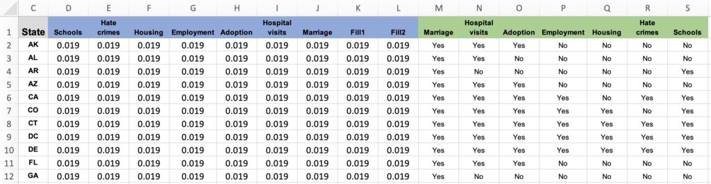
Step 1. Set up the data. I need to separate the actual data from the task of making the actual chart. In this case, I have all 50 state plus DC listed in the first column and then separate columns for each of the seven data series. Each cell value is equal to the share of each observation of the total—in this case, 0.019 or 1/51. I add two more columns (Fill1 and Fill2) with the same data values, that I will use to add the labels around the outside of the graph. The states should be arranged in the order we want them to appear in the chart (here, alphabetically), starting at the noon position.
Step 2. Insert a donut chart. Select the data, including the state abbreviations, and insert a donut chart. Again, we need first make the chart, so we are using these values and not the actual data. With the chart title and legend, you can barely see the data. If we delete those two, we can now see the data but the rings are too small. We can select one of the rings, right-click and select Format Data and reduce the size of the hole to something like 25%.
Step 3. Color the cells. We now need to change the color of the cells to match the actual (binary) data. With 51 states and 7 variables, that’s 357 cells we would need to change manually, but a little VBA code can simplify and automate the process. (If you’re not familiar with VBA code and want to learn more, I recommend the resources at PeltierTech, Excel Jet, and Excel Campus.)
I’ve placed the actual data in the next set of columns in my worksheet. As you can see, I’ve inserted a “Yes” or a “No” in each cell, but the process will work with any binary indicator (e.g., 1/0, Good/Bad, etc.). The thing to note here—which you’ll see in the commented code below—is that we need to count the column number where the data begin, in this case, column M = column #13.
To use this code, open press the Macros button in the Developer tab (you may need to make the tab visible in the Excel Options window) and simply copy and paste.
Sub RadialMap()

'Variable declarations
Dim clr As Long
Dim clr2 As Long
Dim x As Long
Dim y As Long
Dim z As Long
Dim zz As Long
Dim seriesnum As Long
Dim pointer As Long

'Resize chart to make it square
With ActiveChart.Parent
         .Height = 500 ' resize
         .Width = 500  ' resize
End With

'Set background colors
clryes = RGB(148, 200, 80)
clrno = RGB(234, 234, 234)
clrunknown = RGB(255, 255, 255)
clroutside = RGB(255, 255, 255)
pointer = 12

'Count number of series to use for the Fill series below
seriesnum = 7

'Counters:
''z column number of First Yes/No variable
''x rows
''y is rows of data, to ignore row header

'First loop is to color the data rings
For z = 13 To 19
    For x = 1 To 51
        y = x + 1
        '+1 refers to starting row of the data, ie, if row headers are in row 1 only

        'First, add color to the “Yes” cells
        'Look in each Yes/No cell (y,z) and fill in the appropriate color
        If ActiveSheet.Cells(y, z).Value = "Yes" Then
            'pointer variable points to the column that are used to plot the data in the chart (i.e., =0.019)
            With ActiveChart.SeriesCollection(z - pointer).Points(x)
                .Format.Fill.ForeColor.RGB = clryes
                If z = 13 Then
                    'this is inner ring
                     .Format.Fill.ForeColor.RGB = RGB(188, 27, 30)
                ElseIf z = 14 Then
                    .Format.Fill.ForeColor.RGB = RGB(235, 176, 69)
                ElseIf z = 15 Then
                    .Format.Fill.ForeColor.RGB = RGB(9, 76, 148)
                ElseIf z = 16 Then
                    .Format.Fill.ForeColor.RGB = RGB(118, 175, 49)
                ElseIf z = 17 Then
                    .Format.Fill.ForeColor.RGB = RGB(194, 0, 120)
                ElseIf z = 18 Then
                    .Format.Fill.ForeColor.RGB = RGB(110, 39, 135)
                ElseIf z = 19 Then
                    .Format.Fill.ForeColor.RGB = RGB(110, 181, 227)
                ElseIf z = 20 Then
                    .Format.Fill.ForeColor.RGB = RGB(234, 234, 234)
                ElseIf z = 21 Then
                    .Format.Fill.ForeColor.RGB = RGB(234, 234, 234)
                End If
            End With

        'Second, add color to the “No” cells
        ElseIf ActiveSheet.Cells(y, z).Value = "No" Then
            With ActiveChart.SeriesCollection(z - pointer).Points(x)
                .Format.Fill.ForeColor.RGB = clrno
            End With

        'Third, add color to the “Unknown” cells
         ElseIf ActiveSheet.Cells(y, z).Value = "Unknown" Then
            With ActiveChart.SeriesCollection(z - pointer).Points(x)
                .Format.Fill.ForeColor.RGB = clrunknown
            End With

        End If
    Next x
Next z

'Second loop is to color the outer rings for the labels
For x = 1 To 51
    With ActiveChart.SeriesCollection(seriesnum + 1).Points(x)
            .Format.Fill.ForeColor.RGB = clroutside
    End With
    With ActiveChart.SeriesCollection(seriesnum + 2).Points(x)
            .Format.Fill.ForeColor.RGB = clroutside
    End With
Next x

End Sub
Step 4. Label the rings. We can add the state abbreviations to the outer Fill rings by simply selecting one and adding standard data labels. I add the labels to the inner of the two fill rings and leave the other white, which helps add a bit of space from the outer edge of the chart area. Of course, this step—and Step #2 of deleting the legend and title, and changing the donut size—could also be added to the VBA code. Something like the following:
'Remove legend and title and change donut hole size
ActiveChart.Legend.Select
Selection.Delete
ActiveChart.ChartTitle.Select
Selection.Delete
ActiveChart.FullSeriesCollection(1).Select
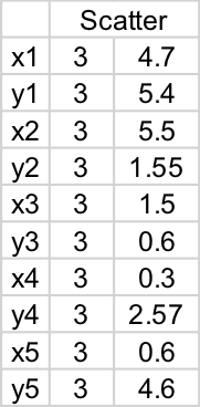
ActiveChart.ChartGroups(1).DoughnutHoleSize = 25Step 5. Add region lines. If you want to separate the space into regions as in the original Guardian graphic, you can do so using separate scatterplot graphs. I add each of these five series separately—essentially adjusting the values manually (though you could do this mathematically as well)—and connect the points with black lines. You can see how the first pair (x1,y1) is the same (3,3) for all five series at the middle of the graph, and the connection point along the outside of the circle (e.g., 4.7, 5.4) depends on where you want to draw the line.
Step 6. Add the legend. I don’t have a particularly clever way to do this other than drawing colored boxes and a text box. I also draw a white circle to place over the scatterplot lines and then group everything together. I can then grab all of these elements and save out as an image.
Wrapping Up
There you have it: A ‘radial map’ chart that can be built in Excel and made slightly easier with a bit of VBA code. I like the compactness of the view and how you can easily see the part-to-whole relationship. There are obvious issues with using the radial layout, but perhaps the engaging form makes up for those issues.


flipping the order of the rings and seeing the perceived difference is interesting! thanks so much for sharing instructions on how to create a radial map – i’ve never figured out how to do it in Excel. i’m wondering if the colors on your small multiple maps are inverted for all variables except marriage? for example, the maps show that SD and ND have gay rights laws for everything, but the Guardian map and heat map doesn’t show that to be true. thanks again!
Hi Angie,
Good catch and thanks for writing. I have (hopefully) corrected the maps now!
Thanks again,
Jon