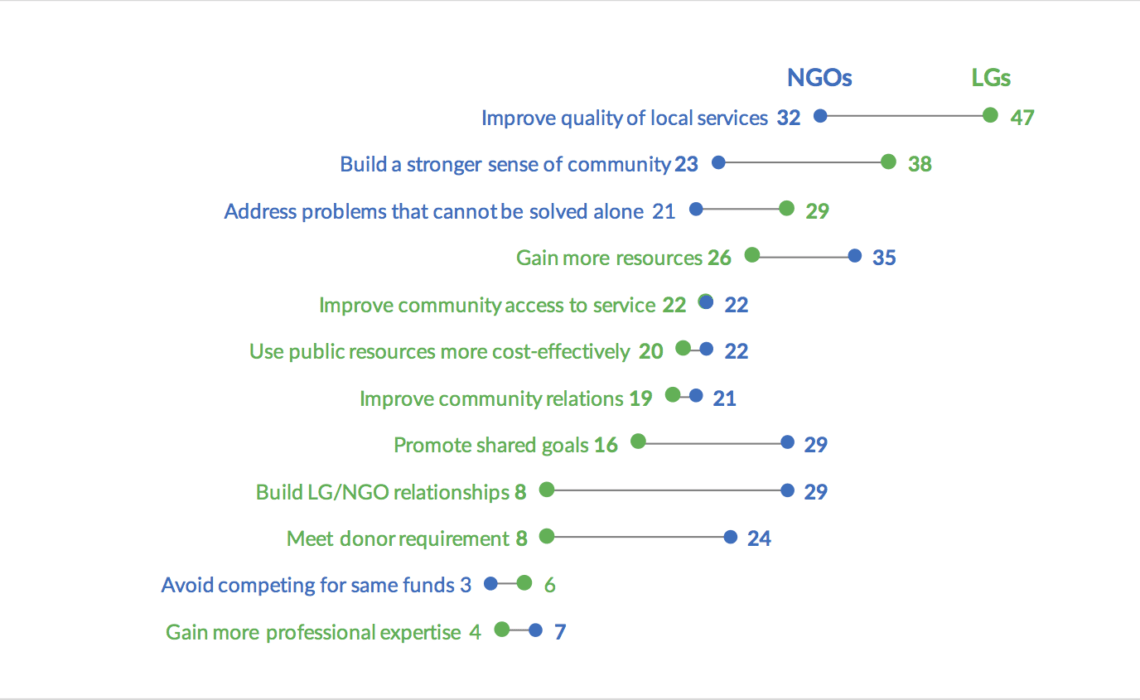
I saw this tweet from American University’s School of Public Affairs in early October:
Survey Results: NGOs and local gov’ts working together in developing countries are likely to do so for the following reasons. @JocelynMJohn pic.twitter.com/NWWNq3VmPE
— SchoolPublicAffairs (@AU_SPA) October 5, 2017
I don’t exactly know the context of this graph, but I do think there’s a better way to present these data than in a bunch of bars next to each other. (Because I don’t know the entire context, it’s not totally fair for me to try to remake it, but they did tweet it out, so my thinking here is, ‘is there a better graph I could use in this tweet’?)
I took a shot at remaking this with two different dot plots.
This first approach is the usual dot plot you’ll regularly see, with dots for each series and a label next to it. I put the labels right next to the dots, though I could have left-aligned them as follows, but I think this approach makes it a little harder to connect the labels to the dots.
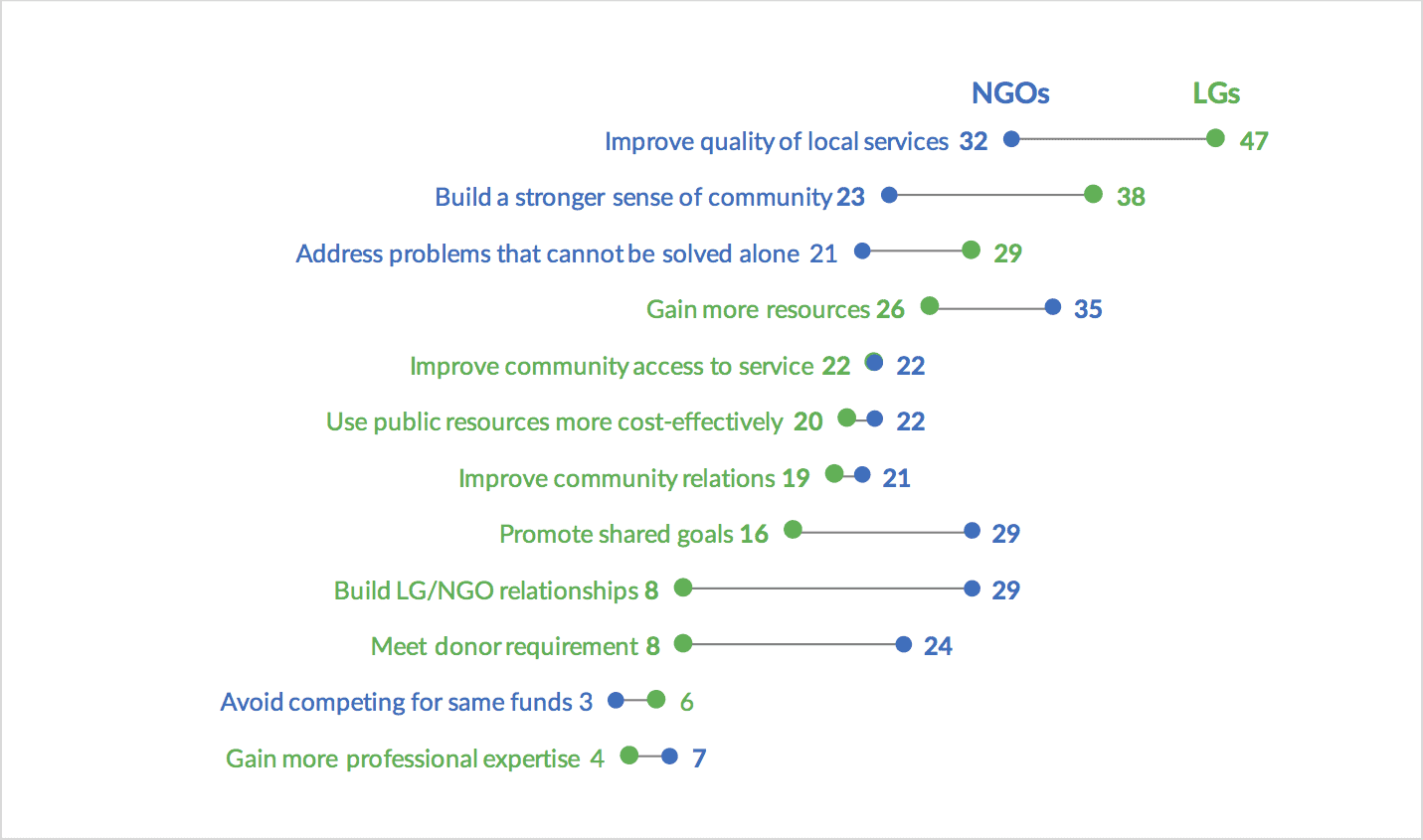
Another approach is to use arrows to connect the dots. The arrows help show the direction of the change/comparison from the NGO to the LG groups. I deleted the circles here to get rid of some the additional elements, which I found a bit distracting, but I can easily see a case for putting them back in.
In either case, the dimensions of the chart don’t really change–and might actually be wider than the original–so this can still fit nicely in a Tweet.

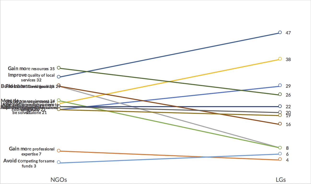
I also tried a slope chart, but the long labels make it a bit messy. You’d also have to make a choice about how to color this–the blue (NGO)-green (LG) split wouldn’t work here; instead, you could do something like blue lines for downward slope and green lines for upward sloping. Even if this were to work, however, I worry that this slope chart would need to be much taller than wider and thus it might not be a great fit in a Tweet (where images should be wider than taller).
If you have ideas for alternative approaches, please let me know. Here’s an Excel file with the data.


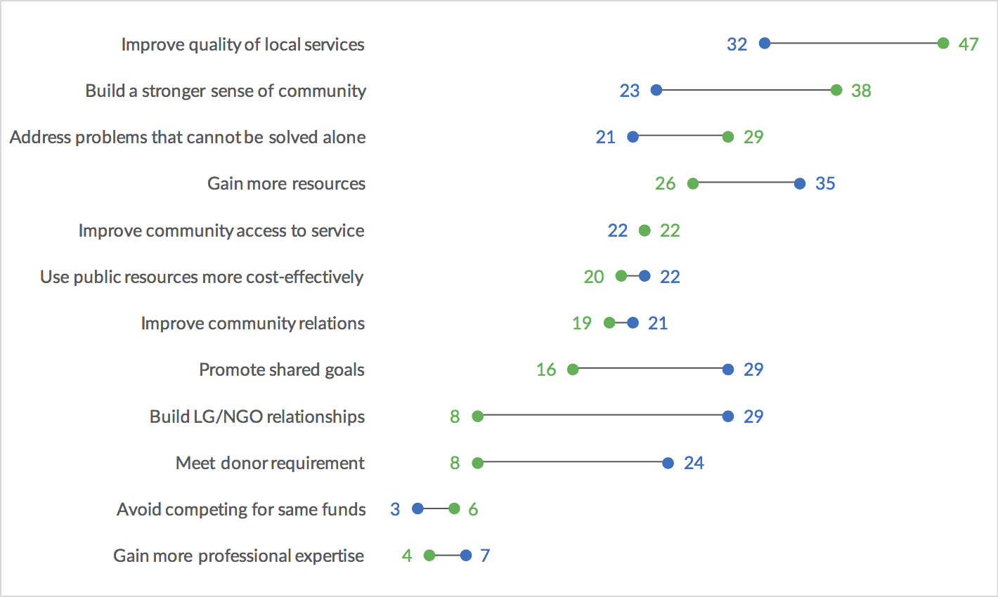
I wanted to show an ordered comparison of the data and used a dummy bullet to highlight which group performs better.
Attached image:
Hey, thanks for posting this!
I thought about this problem for a bit and it occurred to me that the most important part of the story isn’t the comparison between the two percentages. Rather, the question I wanted to answer by looking at this visual is “What do GO’s and LGO’s care about when they collaborate?”
To that end I started by making two lists, each ordered by how often it was listed as a reason for collaboration. Following that, I made a parallel coordinate plot of the reasons rankings. The only downside to this was that it removed the data point of the percentage itself. After a few more iterations, I settled on using small multiples of pie charts to display the percentage. Take a look at the result here!
Attached image: