I hope you’ve enjoyed the last few episodes of the podcast. Continuing a theme that has been present in the last few episodes, on this week’s show I welcome Javier Zarracina from Vox and Anna Flagg from the Marshall Project to talk about suspect data and data visualizations.
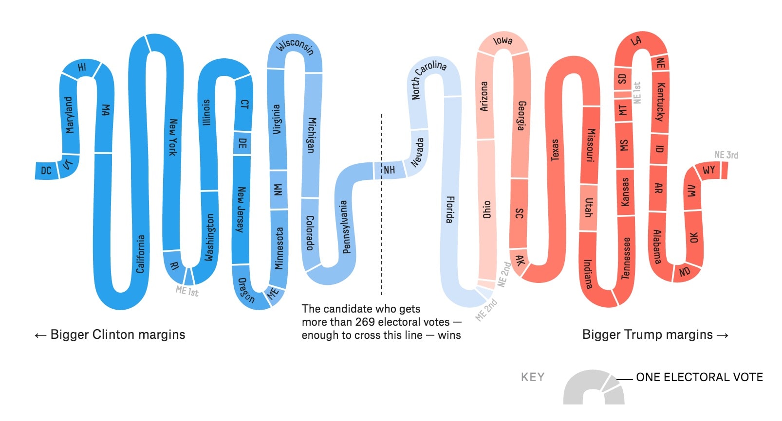
At the Malofie25 Infographic World Summit, Javier, Anna, Michael Brenner from Beyond Words Studio, Ramón Salaverría from the University of Navarra, and I reviewed 899 different online data visualization projects. One of our biggest debates was about the various US presidential election dashboards.
On the one hand, we now know that the data used in those dashboards were fundamentally flawed, and if the data are flawed, does the design of the visualization matter? On the other hand, we only know those data were flawed after the election (and the importance of it). But we don’t necessarily review other visualizations in the same way. So, how should we then view these data visualizations? Are they inherently incorrect? Where does fault, if any, lie? In this episode of the podcast, the three of us discuss these issues a bit more.
Episode Notes
Anna Flagg at Marshall Project
Election Dashboards | FiveThirtyEight | New York Times | LA Times
PolicyViz Podcasts on similar issues | Anna Flagg | Mona Chalabi | Elijah Meeks
Washington Post | These recent elections show that polling isn’t, and never was, broken | Were the polls way off in 2016? A new report offers a mixed answer
FiveThirtyEight | How The FiveThirtyEight Senate Forecast Model Works