Kassia St Clair is a writer based in London. She studied women’s dress and eighteenth-century masquerade at the University of Bristol and Oxford.She has since written about design and culture for publications including the Economist, the Telegraph, TLS and Architectural Digest. Her colour column has been running in Elle Decoration since 2013, and she is a former assistant books & arts editor for The Economist.
The Secret Lives of Colour was Radio 4’s Book of the Week, a Sunday Times top-ten bestseller and has been translated into twelve languages. The Golden Thread, her second book, is out in the UK and will be published in America by Liveright in the fall of 2019.
In this week’s episode of the show, Kassia and I talk about her book and the history and origins of color. We also talk about choosing colors for data visualization and the interesting flip in the pink-blue color gender norms.
Episode Notes
Kassia St. Clair | Twitter | Instagram | Website
Kassia on 99% Invisible Podcast
Transcript
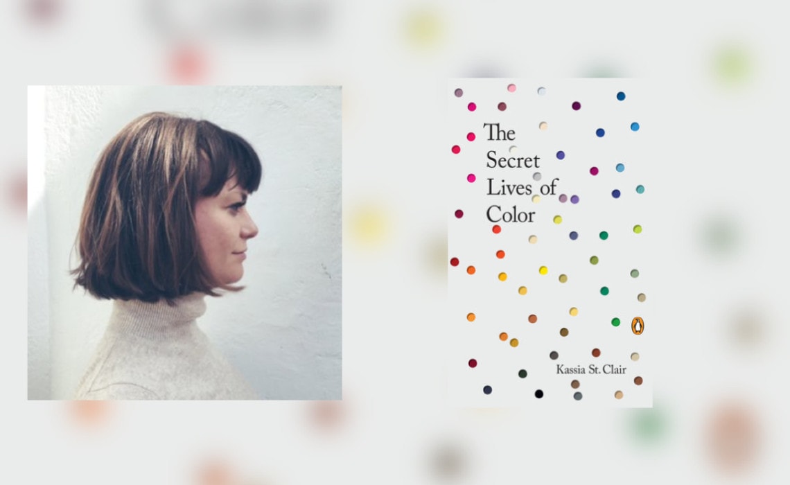
Hi everyone. Welcome back to the PolicyViz Podcast, I’m your host John Schwabish. Now, have you ever been reading a book and it has nothing to do with the work you do with data or with graphs or anything you’re working on, and yet in the back of your head you’re thinking to yourself, this book completely applies to the work that I’m doing? And that is how I felt when I read The Secret Lives of Color by Kassia St. Clair. So I heard about this book when Kassia did an interview on the 99% Invisible podcast. As I’m listening to the episode, I’m thinking to myself, I have to buy this book. So I bought it literally while I’m listening to the episode, just devoured the book, it was so great, and then invited her to come on the show because I wanted to learn more about the work that she’s doing. The book itself goes through a whole bunch of different colors, the origins of the colors, where they came from in terms of how the dyes were made, what type of people or classes of people were using those colors and where those colors were being used in different parts of the world. It’s just a fascinating tour through color history. As I’m reading, of course, I’m thinking about the colors that I use in my data visualization work and my slides, and of course I’m thinking about how we take some color palettes and we sort of apply them and we see them and we think that they’re just, you know, that’s the norm. For example, pink for women, blue for men. Did you know that that’s a fairly recent phenomenon? That’s not always the way colors were ascribed to men and women. We talk about that in this episode. We talk about how she looks at color throughout the day. We also talked about her new book, The Golden Thread, which is already out in the UK, but it’s not here in the States, so I’m just biding my time and waiting for that book. So it’s a really fun conversation we got to have, this is one of those times where I really enjoy being a podcaster because I can reach out to someone who’s written a book that’s really not in data visualization and see if they want to come on the show and chat. Fortunately, she was really willing to do so, and it’s just a really fun great conversation. I hope you’ll enjoy this week’s episode of the PolicyViz Podcast with Kassia St. Clair, the author of the book The Secret Lives of Color, and the new book, The Golden Thread.
Jon Schwabish: Kassia welcome to the show. I’m super excited to have you on. I’m in love with this book by the way. I heard the interview with you on 99% Invisible and listening to it, like five minutes in, I’m opening up my Amazon app to buy the book. I’m very excited to talk to you. Thanks so much for coming on the show.
Kassia St. Clair: Thank you for having me, and thank you for your kind words about the book. It’s really funny to me because I’ve been interested in color for a very long time. I studied history at university and specifically 18th century women’s history, and even more specifically, what women wore to masquerade balls in London during the 18th century. That’s kind of how I fell in love with color academically, because I was reading about all these interesting shades that women were mentioning in their letters and diaries, and I realized that the language around color had completely changed in the intervening centuries, and this was just fascinating to me. So I went away and kind of went down all these weird little rabbit holes of research to look at how these colors had changed and what they were called now and how they’d been made at the time and where we get them now. I really was kind of unsure as to whether anyone else was going to find this interesting. It’s kind of a very niche little interest, obsession of mine. I pitched it as a column to several magazines here in the UK and eventually got picked up by a magazine called Elle Decoration. And then after a couple of years, it looked like the column was going to be axed and I was just outraged kind of on behalf of the idea. I wasn’t ready to say goodbye to it, and I thought there were so many other great shades that I wanted to research and to tell their stories. So I pitched the idea as a book and found a publisher who was kind of willing to go down this rabbit hole with me. But it’s funny now, because I think in the last few years, there’s been a real recognition of the fact that color is actually very mainstream. But when I first started writing about it, there was this idea that it was very a very niche topic and no one would really be interested at all.
JS: Right. Can you give me a sense of when you’re doing your research, were you reading these letters and also seeing pictures or drawings that people were wearing or was it literally the language where the words didn’t resemble what you would sort of think of when someone talked about the color dress that they were wearing?
KS: Sure. So it kind of started with letters, diaries, and written accounts, and people would be discussing outfits that they had worn or that they were planning to wear or outfits that friends or rivals had worn to masquerade balls. And quite often the colors that they were describing, first of all, were very unfamiliar, they’re not the colors that we would think of now as being particularly fashionable, and sometimes they were so unfamiliar that I wouldn’t have any idea what they look like at all, and that would mean that I would have to go away and try and find a visual reference. Now, sometimes you get lucky and you can find an account of a woman or a man who’s sitting down for a portrait, you know, sitting down to have that portrait painted and they say, “Well, I was sitting down with Mr. Reynolds, and he was painting my portrait, and I was wearing my best hair brown pleats,” and then if you’re really lucky, the portrait still exists, and you can go and have kind of a visual reference. But very often that doesn’t exist, you don’t know exactly what these colors might have looked like. And even if you do have a visual reference, has that kind of changed in the intervening centuries. A lot of paint pigments do alter over time, and so you just don’t really get that sense of exactly what a color might have looked like. And because we’re not embedded in that culture of fashionable color, there’s a lot of what we perceive as color is kind of culturally imbued. We think of colors as being fashionable or unfashionable. And once a certain amount of time has elapsed, it’s very hard to see precisely what contemporaries were seeing.
JS: I want to ask you about the physical construction of the book. Well, maybe I’ll let you describe the construction of the book, how you thought about designing it because it has a unique design to it.
KS: Yeah. So when I was pitching the book to, first of all, my agent, and then to publishers, I had quite a clear idea in my head of what I wanted the book to look like. I imagined that it would have color, the relevant color that I was talking about on a specific page running down the outside. I sort of imagined it would be a bit like an address book where you have cut-away sections for A, B, C, D, and you’d see the colors kind of running down the edge of the page. That precise construction ended up just being ludicrously expensive, and no publisher was willing to take it on. But you still have these columns of color that were included in the final design. But what was quite funny about this in some ways is that a lot of what I say in the book is that colors are cultural creations and it’s very hard to pin down one precise shade that is universally agreed upon as the ultramarine or the puce. And yet, for the design of the book, I had to settle on one ultramarine or one puce, because that was the design of the book, it had to have these sections of color running down the outside. So I found myself undermining my own argument in the design, which was pretty silly. But it also took ages and real arguments and discussions about whether this was the perfect magenta or whether that was, it got quite heated.
JS: I bet, like the anxiety level you must have felt at the end [inaudible 00:08:52] these final touches must have been.
KS: Yeah I literally had sleepless nights about some of the colors. I thought, oh my goodness, I’m going to get letters from designers just getting so angry with me, because I’ve chosen this particular shade.
JS: Right, for a particular shade, right. But for each of the colors that you go through, most, if not – well, many, I’d say, if not all of them, have like a little story attached to them. There’s an individual who did this or did that. Can you talk a little bit about how you came across these stories and how that sort of helped pull the entire project together?
KS: Sure. So I kind of thought about each color a little bit like a person, and I thought of the stories that would be attached to them as little bit like character sketches. Some of them have got very long involved histories that you can trace back to antiquity or even further back, and then some of them have been fashionable for maybe only a few years and then have completely disappeared. But I sort of wanted, in a way, to give them equal hearing, and to tell their story as kind of the perfect introduction I guess. And so that is for me about writing a really compelling account that can draw the reader in, whether or not they like the color. And actually it’s quite funny, some of my favorite stories in the book are not attached to colors that I personally love the look of. But nevertheless, the story kind of stands alone. And so doing this, I would quite often fasten on a particular moment or a particular image or an object and kind of try and really vividly describe that so that the reader is right there and has really got kind of a context. And so it’s as much about the story and the moment as sort of a way into the color, if that makes sense.
JS: Yeah. Can you tell me one of your favorite stories of a color that’s not one of your favorite colors?
KS: Yeah. So as you can imagine, the colors that I – the book is broken down into chapters like red or yellow or orange or green. And within each chapter, each section, it’s further broken down into various shades like gamboge or puce or ultramarine. It was important to me to have roughly the same number of hues or pigments in each color chapter. This was really tricky because sometimes there were just loads of great stories. There were loads of great stories in blue for example and loads of brilliant red stories, and others were a lot trickier. So it was quite tricky to make sure the brown chapter had lots of compelling stories in it. And quite often shades or pigments that I had earmarked for orange or for brown would end up disappearing and actually turning out to maybe work better in red or yellow or black or whatever it was. So it was really tricky to get that balance right, and that proved an interesting challenge for the writing.
JS: Yeah, absolutely. The chapter that for me maybe, I wouldn’t say, the most interesting, but was certainly maybe the most eye-opening, was the chapter on pink, because there’s a couple of things that are interesting about pink. One is, as you’ve mentioned I think in other places and in the book, is that pink is this shade of red that has its own name that like shade of green doesn’t really have. But also, I love this part about this distinction between pink, now that we sort of see pink for girls and blue for boys, and in the data visualization field this is like a constant discussion about that’s such a terrible condescending way to present these two colors. But you have this great story about that relationship and about pink in general. So I wanted to give you a chance to tell us that story and also talk about the history of pink a little bit.
KS: Yeah, so pink to me was just completely eye-opening and fascinating as a chapter. Because, yes, as you just pointed out, we don’t have separate categories for pale yellow or pale blue in the English language, but we do have this special category for pale red, we call it pink. And that’s a fairly recent phenomenon in terms of kind of the history of the English language, but it does give it this special status, pink has a special status in the English language. But the word pink was originally not used for pale red, it was actually initially a kind of dye, and so you could have brown pinks or green pinks, and more often than, not yellow pinks. And then finally, the word and the color found each other probably about 300 years ago. And from then on, pink was more often than not associated with boys, if it was associated with a particular gender at all. So you get kind of news reports in the very early 20th century talking about blue being for little girls and pink being for little boys. In some ways, we think about it, it does make sense, because in the Western tradition, blue was the color that was most associated with the Virgin Mary. And so because she was seen as the archetypal woman, it makes sense that pale blue would be kind of the girly, dainty, pretty color; while red, which was very associated with military uniforms, was associated with men; and because pink was just pale red, that made sense. And then suddenly, during the course of the 20th century, this switches around, and how this happens and why this happens and when this happens is kind of tricky to unpick. My father is in his 90s now, he was born in 1925 and pink is his favorite color. He doesn’t see anything wrong with that. He doesn’t really think about it as being gendered in the way that I think about it. I was born in the 80s at the height of girly pink and blue for boys, and so that’s always quite interesting to me. It must have been, the associations must have been loosening and changing over around about the time my dad was in his childhood. And like I said, he has no embarrassment about pink being his favorite color.
JS: It’s amazing really like, we’re talking the mid 20th century when we had this switch of what we now sort of just take for granted with these sort of baby pink, baby blue colors, but it’s only been ascribed to those genders for the last 50 or 60 years which is astounding to me.
KS: It is, it’s really astonishing. I think it’s a testament in some ways to how commercially important – I’m trying to think of precisely the right way to say it, but we got so many products that are now on offer and they’re targeted specifically to relatively small groups of people. So rather than just marketing or selling clothes for children, we’re now marketed specific clothes and toys for boys and specific clothes and toys for girls, and that’s really a relatively recent phenomenon. If you go back 150 years, children were really just seen us as little adults and were given – there wasn’t this kind of fetishization of childhood and boyhood and girlhood in the same way that there is today. So you can kind of see how they wouldn’t have necessarily specific colors that were really closely associated with them in the same way that we do today when we spend a lot more money buying objects for our children.
JS: You’ve mentioned culture a few times, and obviously the boy-girl split is part of that. But can you talk a little about how colors differ by culture? I know there’s a part in here about, I think part of the Russian language only has certain names for certain colors, that doesn’t exist in the English language. But there’s also the difference in perception of red in English cultures tends to mean bad or negative or stop, whereas in Asian cultures it’s a good thing. So can you talk a little about these various cultures around color?
KS: If you think of all possible color, if you can kind of imagine it as a spectrum, it’s not that surprising that different languages would kind of divvy up the spectrum slightly differently. After all, if you’re looking at the spectrum instead of fine detail, the precise moment where green becomes blue or yellow becomes green could be judged differently by an individual. And so, in a way, it’s not really that surprising that different languages and different cultures have divvied up the spectrum in different ways. So there are some languages that have more words for colors, and there are some languages that have far fewer. It isn’t to say they can’t see the same colors or that colors are less important if they have fewer names for them. It just means that they express colors in a different way. As you say, in Russian, there are two different words for blue, there’s kind of a word for dark blue and there’s a word for pale blue. Similarly, in Korean, pale sort of greenish yellow is its own distinct category, in the same way that pink is in the English language. So yeah, it’s quite interesting that different languages divide the spectrum in different ways. And then building on from that, different languages and cultures have different associations. So while in the English language and in Western culture, purple is really very often associated with royalty because there was a very famous purple dye that was incredibly expensive and it was made out of a type of mollusk that was found in the Mediterranean, it’s native to the Mediterranean; if you look at China, if you were to ask someone from China even today but particularly in the past, going back a few hundred years, what color was associated with royalty and power, they would probably say yellow, because there was a particular yellow dye that was the preserve of the imperial family in China. So you kind of get these little streams of color association and color thought that are really distinct and are very firmly held, but also can change over time in the same way that blue and pink have kind of switched over in the West. Colors are kind of moving targets in a way, their associations can shift quite dramatically over time and in different cultures for different reasons. So things like traffic lights, they are fairly recent phenomenon, it’s kind of quite arbitrary in some way that red and amber and green mean what they mean in the West, and it’s kind of only really because of trains and then cars that we’ve got these very firm associations, and yet now, they’re so firmly embedded that red is stop and green is go that we can’t quite imagine how it could ever be anything else, but this is quite arbitrary in a way.
JS: Yeah, it’s amazing. You mentioned the creation of the purple dye which was the other thing I wanted to ask you about, which is, a lot of the book focuses on the making of these colors. And I never really thought about that, especially in like a digital age, we just type in an RGB code and the color is there. And some of these stories are pretty amazing, of these snails, of these mollusks who are being dredged up by the, I don’t know, sounds like millions of pounds to create some of these colors.
KS: Oh yeah. We’re so lucky, in a way today. We can go into any clothes shop or any art material store and we’ve just got such ready access to really stable bright pigments. And like you say, we can conjure them up on a screen without any effort at all. But going back really not that long ago, the effort that people had to go through in order to access bright staple colors was really just incredible, and also a great testament to the importance that humans have always placed on color. I think one of the best examples of this is this kind of imperial purple that was made using the liquid that is naturally secreted from one particular gland in two different types of sea snail that is native to the Mediterranean. And these snails would have to be caught and then they would have to be kind of crushed down in order to make this purple color stick to cloth. The crushed mollusks would have to be soaked in with the cloth in stale urine for the ammonia content for up to 10 days. This was horrifically stinky, you’ve got the rotting shellfish, you’ve got the stale urine. You can find the remains of these dye works. Archaeologists have found kind of huge dye works on the Mediterranean coast, and they’re very often sort of situated downwind from where [inaudible 00:23:30] places where people live for very good reason. But this was the source of the world’s most famous and most beloved dye to think that it had such revolting origins, and yet the final finished product was just redolent of power. It’s quite incredible.
JS: Yeah, like someone had to do that the first time, there had to be someone who said, “Oh, if we do this, put A and B together, we get this purple dye.”
KS: I mean, it beggars belief as to how that first happened, but somehow it did.
JS: The last thing I wanted to ask you about was now that you had written this column for a while and now you have this book – and I want to talk about your new book as well – but I would guess that you go through life focusing on different colors. I just finished this Netflix show, The Last Kingdom, which is based in 9th century England. After reading the book and watching the last few episodes, I’m looking at the colors that the designers of the show have chosen. I’m thinking, are these colors right? When you watch shows, when you go around the world, are you thinking, well, that’s not the color that would have actually been at that time?
KS: So I’m definitely really conscious of colors and color stories. Actually, one of the most magical things about writing a book is that people get in touch from all over the world to say, “Oh I love color too, and did you know this color story,” or “My grandmother told me this about a particular dye that used to be made.” I love getting that kind of information, because it is very often very specific to a particular culture, and that was just fascinating to me. Obviously, I’m born and bred in London, and this is where I grew up, and I’m very kind of situated in there in a Western context, and so that’s what I have most ready access to. So when people tell me color facts from other places, I love it, I’m a complete geek in that way. But I would say that I’m probably not very fussy about looking at period dramas. I studied historical fashion at university. If I went around expecting everything to be accurate, I would have driven myself mad long ago. I think because I see so much of color as being cultural and shifting, I’m well aware of the fact that our idea of what it means to look Victorian or our idea of what anything should be is very often very different from the reality. If you look now at 1930s films that were meant to represent ancient Egypt, for example, you know instantly that they are 1930s films. In the same way, today, when we produce depictions of early Britain or whatever it is, they are still recognizably of our time; even if we tried to be as authentic as possible, we’d still make mistakes because our eyes are tuned in to our own contexts. So everything from the makeup to the clothes, we’d add our own contemporary spin, and that’s just the way it is, we have to accept that, we have to accept a certain level. We also have to accept that the ideas of the audience figure into that, they don’t want to be distracted by things being a 100% accurate even if that meant that all the women had hairy legs or hairy underarms or whatever else it was. People just want to dive into the story and be convinced by it, and not be having 100 other things going on in their mind thinking about things being entirely accurate.
JS:. So you have a new book that’s out in the UK, but it’s not in the States yet, comes out I think in the fall this year, The Golden Thread. I’m totally disappointed, I can’t get The Golden Thread. I have to [inaudible 00:27:30]
KS: Yeah, you have to relocate to London to see [inaudible 00:27:33]. But yeah, it is coming out in America in the autumn, in the fall, and it sort of does something similar to The Secret Lives of Color but with fabric. And rather than telling 75 different stories, as is the case with The Secret Lives of Color, The Golden Thread tells 13 different stories about fabric right back to the very earliest fibers that we know human beings ever touched, going right up through Viking woolen sails and lace makers of the 17th century, and looking at the Apollo 11 space suits and explorers of the Golden Age; and also the makings of spider silk garments, both using spiders themselves, and also the attempts that are being made at the moment to make spider silk synthetically using genetically modified yeasts and bacteria.
JS: Okay, good because I don’t like spiders, so I couldn’t wear actual spider…
KS: Yeah. For the research, I had to go to London Zoo and the zookeepers insisted on making me stand for a photograph with this huge spider, and I’m quite frightened of spiders, and there’s this horrible photograph on my iPhone of me with about 20 chins and you can’t even see the spider.
JS: Yeah, that’s one of those states where it’s not a joy to write a book [inaudible 00:29:06] something like that. This is great. Thanks so much for coming on the show. This is great, the book is great, and I look forward to being able to get your new book when it makes its way over here.
KS: Thank you so much.
Thanks everyone for tuning in to this week’s episode of the podcast. I hope you enjoyed that interview. It was really fun to chat with Kassia and learn all about color. I do recommend you pick up the book, it was just a really fun read, and I hope that came through in the interview. As I’ve mentioned before, if you’d like to support the show, please consider reviewing the show on iTunes or your favorite podcast provider. If you want to do a little bit more, consider becoming a Patreon supporter of the show. For as little as 3 bucks a month, you can help me cover costs of transcription and audio editing and all the stuff that needs to happen to put the show on. If you don’t want to do those, that’s fine, just keep tuning in every week and listen to the show and support the show in that way. So again, I hope you enjoyed this week’s episode. So until next time, this has been the PolicyViz Podcast. Thanks so much for listening.
Support the Show
Become a Patreon supporter or review the show on iTunes or your favorite podcast provider.


