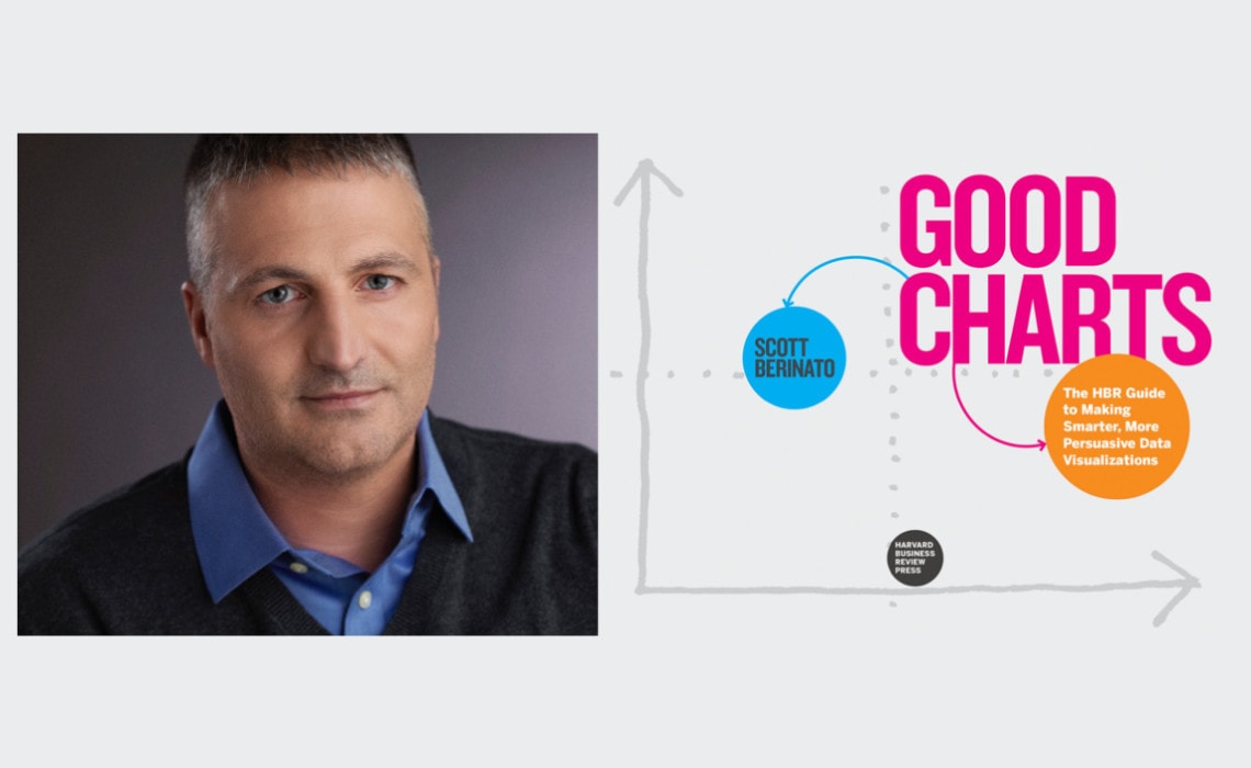
Scott Berinato is is the author of Good Charts: The HBR Guide to Making Smarter, More Persuasive Data Visualizations. Even though he’s a writer, he’s also a self-described “dataviz geek” who loves the challenge of finding visual solutions to communications and data challenges. He speaks frequently on the topic of data visualization and leads workshops to help others improve their chart skills.
Scott is a Senior Editor at Harvard Business Review, where he created successful visual storytelling formats. He writes and edits regularly for HBR and HBR.org, focused mostly on stories about data, science, and technology. When HBR redesigned in 2010, Scott created the front section of the magazine, Idea Watch, launching successful features such as “Defend Your Research.”
Prior to joining HBR, Scott was executive editor at IDG where he wrote and edited for CIO magazine and helped create and launch CSO magazine. In addition to writing and editing feature articles, he was a columnist writing about security in a post-9/11 world. He is a six-time winner of the Jesse H. Neal award (the “Pulitzers of the business press”) for best feature article of the year and two-time winner of the Grand Neal Award for the year’s best overall contribution to the business press. Scott was awarded the McAllister Fellowship for his contributions to the business press and, through it, was able to return to his alma mater, Medill, to teach writing.
Scott and I talk about his approach to data visualization and his forthcoming book, Good Charts Workbook: Tips, Tools, and Exercises for Making Better Data Visualizations. Please consider becoming a supporter of the PolicyViz Podcast by heading over to Patreon–your financial support is used for audio equipment, sound editing, transcription services, and more.
Episode Notes
Scott Berinato | at HBR | Website | Twitter | Good Charts: The HBR Guide to Making Smarter, More Persuasive Data Visualizations | Good Charts Workbook: Tips, Tools, and Exercises for Making Better Data Visualizations
William Cope Brinton, Data Presentation (free)
Steve Haroz on the PolicyViz Podcast
Iraq’s Bloody Toll, South China Morning Post
Transcript
Welcome back to the PolicyViz podcast. I am your host, Jon Schwabish. On this week’s episode I am excited to have Scott Berinato join me. Scott is the Senior Editor at the Harvard Business Review. He is also author of the book Good Charts: The HBR Guide to Making Smarter, More Persuasive Data Visualizations and he also has a new book coming out that’s sort of the workbook version of the Good Charts. So, it’s very interesting conversation talking about all things data visualization related and the process by which he thinks that we should create good visualizations.
Also, before we get into the show I just like to ask you to consider becoming a supporter of the show. I have a Patreon page set up. The money through Patreon goes to help buy better audio equipment, better sound editing services, and transcription services. If you’ve been watching the show or listening to the show for the last couple of months you’ll notice I’ve been adding transcriptions of each of the episodes for folks who may need them or want them for their own work.
Jon Schwabish: Scott. How are you? Welcome to the show.
Scott Berinato: Thanks a lot Jon. Happy to be here, this is exciting for me.
JS: Oh, great. Well, I’m glad we’re able to finally get this chat together. I’m excited to talk about the book and all your recommendations and I want to hear about this new project you have that’s coming out I think shortly. But let’s start by having you maybe talk a little bit you yourself, your background and how you ended up as an editor over HBR?
SB: Sure. Yeah, thanks. So, yeah I am a senior editor over here which means I do a little bit of everything and I am bit of a free agent. A lot of people specialize on the web or the magazine, but I do a little bit for every platform. Editors at HBR are a little different than other places in that we do a lot of author management. We have academic authors who have great ideas but maybe not aren’t the best writers or can’t really put their thoughts together in a way for lay audience, and so we really help them do that. And I do that for a lot of topics not just for visualization and data science but also I like to specialize in neuroscience and some other sort of what I would call more visceral topics than strategy, and the software leadership, the software things, I like the real sort of hardcore scientific ones. I do a lot on office space, how do you coordinate office space. I think it’s all part of my sort of visual approach to thinking that the topics I am attracted to have a real spatial and visual sort of aspect to them. So, a lot of time editing, writing, thinking about new ways to express stories to the audience which in media all we ever think about now and it’s a lot of fun. And I get to do a lot of chart making as part of this because I am an editor who is known here for making the designer less miserable by always trying to add a visual element or add some kind of visual storytelling to my articles which sort of breaks their templates and things but I think it’s really important.
JS: Are you an editor by training, by background?
SB: Yeah. So, I started out as a journalist. Middle School Journalism in Northwestern, after undergraduate Wisconsin, dove right into the tech journalism scene at a magazine, newspaper called PC Week at the time, right at the front of the dot com boom which was fun and I got to cover a lot of the craziness at that time. I got to cover the Microsoft trial so on and so forth, and then I sort of got into feature writing. Really started writing more features about the people in technology, security, cyber security and things like that and at some point I decided I wanted to see how HBR which maybe is sort of the oldest of all media brands, right? Some of the 100 years old, how they were thinking about the future of media and I just thought it was a great opportunity to be part of a transformation of a brand like that and I joined here about 10 years ago and been working on that ever since.
JS: Nice. Now you said a couple of things I want to make sure I catch before I move on. So, first up are you a Badger is that what you said?
SB: I am Go Badger and you?
JS: Yeah. I am, I am we’re both Badgers.
SB: Really?
JS: No. It’s like the best episode ever.
SB: I was just back there. I was back for the opening game this year.
JS: Oh, good.
SB: Taking my daughter to visit the campus and I was hoping she’d love it but I don’t think she is going to go there at last.
JS: Oh, that’s too bad. My kids are several years away from that but I keep gently just planting the seed of Wisconsin is the place to go.
SB: Yeah, we had a lot of fun.
JS: The other thing you mentioned was on the chart making and I’m curious what the process is like for you and for HBRs there, do you have a certain suite of tools that are used for the actual publication both online and print or is it whatever works for you personally you just make something that works for the publication?
SB: Yeah. For a while it was really the Wild West. It was whatever I could get my hand on and when I could do it and I present them with something reasonable, and then the design team would pull it into Illustrator and make it beautiful and that was our workflow for a long time, not very efficient. Effective in sort of the hacking it kind of mentality, but we knew we had to get better. We now have a full-time information designer who works with us who is great and we use a combination of tools really depending on the types of visualizations we need to do but we also have some very strong templates in Illustrator especially for print where we are pulling data in from tools like Ploty, Tableau, others just exporting SVGs and then designing those up into those templates into our style in Illustrator which seems old school but it’s actually still the best way. It’s interesting I’m sure you’ve come across this but the tools question is always the question I get first, right, when I am speaking and what tools do you use and the truth is there is no one tool that does everything well and the tools that do more things well require more training and I wish I could just say I use X tool and that will solve all your problems but it’s not. So, we do a little bit of everything. We do some Highcharts. I like to dabble in D3. I’m not a programmer by any means but I do love using D3, I love the concept and how powerful it is. I use Plotly online a lot, so I use a lot of different tools so long as I can export SVG and then we sort of design up in Illustrator.
JS: Right. Now, what about the authors are they – I mean HBR has a suite of authors, so are they creating things or are they pretty much saying here is the data, here is the screenshot from my journal article that looks terrible you go make something that looks good?
SB: Generally it’s the latter, I mean, they usually have good ideas but really – and none of them I think would be surprised that they’re sort of academic execution what I call. I don’t like to just do sort of like good or bad. I am always about like people are trying but you know some things just don’t reach general audience the way they could. So some of the academic charts are really challenging but they always have good data, so we always have good starting point that way. And a lot of it is us taking their data, and then having a conversation with them about what it is they really trying to show. Taking it away, doing something to it, showing to them, and then refining with them, there is a lot of that. Now, I will say on the conceptual visualizations which are pretty common on HBR too you know your virtuous cycles, your 2×2 matrices those kinds of things. They tend to fall in love with their conceptual diagrams even if they’re not particularly effective and that’s always a harder conversation to have and I am sure you have come across this. Some of the conceptual diagrams out there are strange and bizarre.
JS: Yes, the funnel diagrams and the 3D funnels, yeah.
SB: Yeah the funnel. The pyramids that are actual 3D pyramids with camels walking in front of them and things like that.
JS: Right. Yeah.
SB: We just saw one that was a 3D pyramid with a city skyline behind it. We couldn’t figure out what the city skyline represented. It turns out it’s just a decoration.
JS: Of course.
SB: We get a lot of that.
JS: But you have authors who are at least I would guess they are sort of a selected group, right? Like they are writing for HBR to reach a wider audience, so I would guess that their mindset is let’s make this as appealing to a broader audience as possible, is that right?
SB: Usually, yeah. I think usually. Sometimes some authors are so enamored of their data and so enamored of showing all of the data that they collect that they have hard time sort of editing, you know, they just want to show everything all at once and they think I have to show everything, and then – we’ve come across this a few times where authors just insist and we have to have these sort of really hard conversations with them about what they are trying to show is actually not coming through. People are just seeing this sort of massive bars or lines and it’s actually not effective in the way they think it’s effective. They understand it because they collected the data, they thought about the data, they know the data but the audience is never going to understand that. So, every once in a while we have those hard conversations but for the most part I think the authors really welcome the opportunity to have this sort of transformation happen. I just had this experience with an author from Northwestern who was doing some really interesting stuff with network communications and network diagrams sort of Force Directed Graphs and he really welcomed my input and we really worked back and forth, and we turned something that came out of his statistical package that looked reasonably difficult to parse into something really simple and clear and understandable, and he was just thrilled with the end result. So, that’s usually the way it happens.
JS: Right. So, that process leads of course to your book that came out I think a couple of years ago Good Charts. So, I would guess that the lessons you talk about in the book are the ones that you are sort of applying to the authors that you are working with on a day-to-day basis?
SB: Absolutely. I use the process, I actually layout the framework in the book for a way to get better at doing charts in a couple of hours. The whole point of the book, the whole idea behind the book at the time was that we needed a guide for people who were intimidated, who felt sort of put off by what I would call the actual judginess of the charting community who felt sort of the oppressiveness of rules and understanding when you can never do this or always do that or colors to use and were so stressed about the grammar of charts that they weren’t getting anywhere. They just decide you know what I’m just going to click the button in Excel and paste it in my presentation that’s good enough because this one is hard. So, we were trying to put our armor on the reader and we have a framework in there that says if you just do these steps in a couple of hours you’ll have something better than where you started and I still use that process and I am still surprised that how well it works. But the whole point of the book is not so much to say always do this, never do this, these are the rules it’s to say the right chart always depends on the context and so we take a design thinking approach. First you have to ask yourself what am I trying to say, who am I going to say to, and where am I going to say it. If you don’t do that before you make your chart you’re sort of dead in the water to begin with, and once you understand that and feel that and understand why that matters I think people start to get better output pretty quickly.
JS: Yeah. So, what do you think is the biggest challenge for the sort of folks that you work with who have a lot of data, I mean, it sounds like they’re working with data they’re able to make charts, what’s the challenge, what’s the roadblock that keeps them from taking the chart that they make in *** [inaudible 0:11:55] or SAS or whatever it is and making it something that you would be happy with publishing on the HBR platform?
SB: I would say two things. The first is time, it’s always time, right. They need more time to do this and this take a little bit of time. Yeah, I can’t lie and say oh you can make it happen just as fast as you are doing it now and have better output that’s not the case. But I think also – and I’m writing a feature for HBR about this right now which will come out in January, I think something has happened where the notion that the people wrangling the data and parsing the data and analyzing the data are the same people who should be visualizing the data and I always advocate I call the unicorn problem is these companies invested billions in getting data science operations set up, and they have invested very little in what I call the last mile which is the communication part of it, right? They find all these insights and they can’t tell the bosses what they’re finding because they can’t communicate well. And so, I always say a team approach is much better and that you have to sort of amass different talents for different tasks and put those together on teams and it’s not to throw the stuff over the wall and let the designer fix it kind of thing. It’s literally sitting together and working as a team, and that this team-based approach was lost, I would say, in the early ‘80s and in fact I have some old books I don’t know if you’re familiar with them, there’s one from 1912 by Willard Brinton called Graphic Methods for Presenting Facts, you know that book by any chance?
JS: Yeah.
SB: It’s fantastic, right?
JS: Yeah.
SB: In that book it’s just sort of well here is your team and you know you have your draftsman and you have your data entry people and all of this, and then even in the ‘50s and ‘60s this woman who worked in the U.S. Government Mary Eleanor Spear, she was a great chart maker and a great advocate for visualization. She in her books said well here is your team, these are the three people on it and the idea was it was just assumed this was a team effort, right? But then Excel happened and Chart Wizard happened, right? And you get Chart Wizard and it’s like hey I can just click on a button and I get a chart, and I can make it 3D and put a glass box around it and this is incredible. And that kind of convenience trumped the notion that we can have better output if we think a little bit about what we’re trying to show and get a few people together and put that out there. And I think we’re getting to the point now where it’s so important to communicate visually again that that’s no longer good enough and that we have to start putting these teams back together.
JS: Yeah. When you mentioned the tools earlier and there is no tool that does everything I actually don’t want there to be that tool that does everything, because I want there to be these specialization of skills where you’ve got the graphic designer does what the graphic designer does really well, and the data person does what the data person does really well and these groups sort of overlap at least in their appreciation of what these other groups could do but one like the Lord of the Rings tool rule them all is sort of makes me a little bit nervous?
SB: Yeah. I think that’s right. I think I agree with you and I wish it was a little more organized world. It’s hard to when you have no experience with it to get the experience to know which tools to go to when for sure, but also I think it’s a lot of time I’ve mentioned this team approach and like you were saying there is the graphic design tools and the statistical tools it’s lot of throwing things over the wall, right? The data science team will come up with something and they’ll output in ggplot R Python whatever and they’ll throw it over the walls to say designers you know make this pretty which is not the right approach at all. And I really also advocate for designers taking some stats classes and some stats folks taking couple of design classes, and I am not saying become an expert in these fields but at least develop a fundamental appreciation for what they’re doing, and how they’re doing, why they’re doing it. I’ve seen that when designers take stat classes especially they come to understand some of the challenges that they have to tackle like uncertainty and other concepts that we’re dealing with here, and then when the statistical folks take a design class then they sort of let-go of their fear that simple is bad or simple is hiding things or simple is manipulative which I think is often times their fear that something that’s pretty and beautiful and clear and simple is not holistic or objective you know.
JS: Right. I mean I love also for data and stats people to understand that design is not making things pretty, right? It’s more than that. It’s moving the content forward and it’s functional.
SB: Absolutely, and especially when you get to the sort of the storytelling aspect of it and the presentation aspect. Design is actually fixing your audience where you want it fixed. It’s actually moving their attention at your will and it’s a really impressive thing if it’s done well. It has very little to do with – I have a design friend who is just absolutely brilliant. She calls the industry designing and styling. Styling is making it pretty and giving it the right colors and all that, but designing is actually sort of fixing the experience.
JS: Right. You mentioned the rules earlier and I wanted to ask are there any data visualization rules that you think are absolutes in the practice?
SB: It’s funny. Yes, because somebody just asked me this the other day and I was trying to think of one and the only one I can think that really can’t break ever, ever, ever is to make categorical data continuous where you have a line chart connecting things that should be bars or something I mean that’s just wrong, right? It doesn’t make any sense. It’s illogical. I don’t have a lot of rules where I’d say never ever do that I am not a pie-chart vigilance. I’ve had arguments with people. I have a friend of mine who published a chart with a truncated Y-axis and somebody tweeted to him he thought it was a thought crime what he had done. I thought that’s a bit extreme. I don’t think that’s true. The rules I like people to think about are the ones where they’re sort of based in visual perception and neuroscience, right? So, there are things that you do to the brain when you showed a visual that if you upset the conventions and the heuristics in our brain you actually make it harder to understand, right? A simple example would be if time goes from right to left on your chart, right? It just doesn’t make sense to our brains and we have to stop and think, and any time we are sort flaunting conventions that way we are making it harder for people to see the information or the idea clearly. There are times when you know somebody is going to spend time with something that it’s okay, but in general if time is going right to left that’s really hard for us or some other conventions like that sort of heuristic conventions that happen in our brain. If you did a world map and you’re putting finger quotes upside-down, so the South Pole was at the top there’s absolutely nothing wrong with that like in space north is not up.
JS: Right.
SB: Our brains are so used to seeing that that you just make it really hard for people to process the information that there is rule. So, those are the kinds of rules I think about but I would never say never do a pie-chart, I would never say never use blue for women or pink for men or anything like that. I always say if you draw me a sketch and it says exactly what it needs to I’d rather have that than the most professionally designed chart that has the wrong information in it.
JS: Yeah. So, when either you’re writing yourself or you are working with authors there or others what’s the thing that gets you sort of most excited about communicating data or data visualization either one?
SB: Two things. I think I always look for what some folks call the ‘Bliss Point’, I’m always seeking the bliss point and I’ll define that for you because it’s not a term that’s sort of real. But a guy I know Kirk Goldsberry, do you know Kirk Goldsberry?
JS: No.
SB: He was at the Kennedy School. He’s done basketball viz for long time. He now works for San Antonio Spurs. He is a data scientist, great guy, smart guy but he calls it bliss points. When you create a visualization that is so clear and so directly applicable to the audience that they see it and there’s almost sometimes an audible gasp you know there is this moment of understanding, and then what settles in after that moment of understanding is it almost feels like it was always true and I always knew it. And when you create charts that have that instantaneous effects but then can be used for sort of deeper diving, I’m always excited by the chance to create a chart that people just get and understand and affects their thinking right away that kind of thing. I think that’s one thing. The other is, especially we’re working with academics who have very heady ideas, very complex ideas, helping people clarify their thinking visually even if it’s not something that’s published, but if we can just sit down and actually sort of maybe draw a map of their ideas or something I really love to actually work through challenges visually. I love the idea that even if it’s just something that’s just going to sit in my sketch pile it’s actually something that helped me get to the solution I needed and I do this with my stories all the time when I am writing I’ll map them out, I’ll sketch them, I’ll draw shapes that represent where I am going with the story, and sometimes they serve as great guides and the world will never see them but they helped me get to a point. I’m a real advocate for sketching all of the time and trying to just come up with visual solutions to prompts or even using visuals to solve problems. So, those are the two things that sort of excite me the most, and then any time – you know Twitter is a weird, and terrible, and awful, and wonderful place but any time public conversations and debates can happen with visuals I think if it’s being done responsibly and thoughtfully I think it’s a really powerful way to have good public discourse. I think it’s not only necessary but almost important.
JS: Yeah.
SB: It’s really important. These problems we’re trying to solve in the world today are so complex and many of them are so difficult to really understand with a critical eye that the only way to do it is through visuals and I always look forward to really smart kind of debates based on visuals.
JS: Right. So, I just want to reflect back then on the complexity versus the simplicity, a graph that says oh, I get that right away. The example of time going right to left sort of throws us off a little bit maybe, but then there is this balance between sometimes we want to have a graph where people say oh, I get that right away you know that line is going up over time and other times people just sort of get into the visualization and explore it a little bit maybe take some more time. So, how do you think about that balance? I always come back to there is a sort of famous graphic Iraq’s Bloody Toll that people sort of show which is the deaths in Iraq and the vertical axis is positive deaths but it’s going down sort of the right to your point about the time. So, that one sort of people get in and they explore it, so I wonder how you think about those two I guess competing thoughts when it comes to creating a visual for people.
SB: Yeah, and this goes back to the idea of context I talk about in the book all the time over and over again, right? So, let’s start a presentation you have like 400 milliseconds or something to get somebody’s attention and the biggest mistake I see in presentations is they will present the Iraq’s Bloody Toll chart and they’ll spend most of their presentation explaining how the chart works rather than the ideas in it. So, that’s a case where simplicity rules above all for me, right? But then Iraq’s Bloody Toll in the newspaper where I am sitting down and it’s eyes on paper or even eyes on a screen and I am having this sort of intimate experience. Yes, I want more detail, more depth, more things to explore, more surprises as I look through it or even play with it and change the variables I think any time I know my audience is expert I want to provide them more depth, more detail. If I am putting a chart on Twitter to the world that’s sort of your lowest common denominator and the more complex the less it’s actually going to be sort of process except by people who really want to engage with it which may be fine. But I sort of have these rules of thumb about what is the expertise of the audience, what is the experience as if 50 people looking at a screen and me, is it one or two sets of eyes on a piece of paper or on a screen and I sort of use my intuition about how much detail I can provide them, and even then I really love it if a chart can both give that initial impression and then allow you to explore it further. I think those are the sort of most successful charts where you look at it and you get it but then you want to spend time with it.
JS: Yeah, definitely. I want to give you chance to talk about your new project it’s like a follow up workbook to Good Charts that’s coming out any day now?
SB: January.
JS: Oh, January. Okay, so we have some time to prepare ourselves.
SB: You can pre-order now. You can pre-order that’s fine by me.
JS: Okay.
SB: So, Good Charts Workbook is the follow up and it really comes out of doing lectures and doing workshops with folks, and often times they’d be very inspired and they say okay how do I do this when you’re gone, how do I start? And that question sort of prompted the entire workbook, how do I start, and so this is a chance for you to really build your skills by yourself and what we do is we set it up sort of like a crossword puzzle book where we give you a challenge, we’ll show you a chart that may be in good shape and maybe in bad shape, we may just show you a dataset and we’ll give you three or four things to do with it, and then a little bit of blank space you know you’re going to need extra paper if you scribble like me and sketch like me, I’m just all over the map but a little bit of sketch space, and then we have a discussion. It’s not really an answer key because I find the idea that I could give you the right answer you know obviously I’m not right because I’m all about context and I don’t know your context. I am giving you some context, I am giving you how I solved the problem but I encourage people to disagree with me and say I don’t like how you solved it and we’ll actually give you an email address where you can send me your solutions to the challenges. And the challenges in the book are really – you know there are sort of two levels of them. The first are just to build those basic skills sort of like a workout, right? So, there is a chapter on color and there is a chapter on clarity and there is a chapter on choosing chart types, and these are like your lifting weights and all of that. And then, in the back of the book we give you the massive challenge where you put all that together and build a presentation based on some data we give you. I am really hoping people love it. I had a lot of fun writing it actually and I know the people who are working on putting it together and they’ve had a lot of fun doing the challenges as they are trying to put the book together too. So, we’re pretty excited about.
JS: That’s great. Well, I’ll link to it. I saw it on Amazon when we were talking ealier, so it’s out there folks and pre-order it, and of course I’ll put links to all of the things we talked about including your existing book that people I think should definitely pick out. Scott thanks so much for coming on the show. This has been a really great conversation, really interesting stuff. Thanks a lot.
SB: Loved it Jon. Thanks so much and I love your site.
JS: Thanks a lot. Well, thanks to everyone for tuning into this week’s episode. I hope you’re enjoying the every other week format this year. It’s given me a little bit of a breather which is nice. If you have comments or questions or thoughts for Scott please get in touch with comments on the site or on Twitter and I’ll put links to everything that we’ve talked about in the show notes that you can check out Briton’s book and the Iraq’s Bloody Toll, and of course Scott’s work over HBR. So, thanks for tuning in. so, until next time this has been the PolicyViz podcast. Thanks so much for listening.


