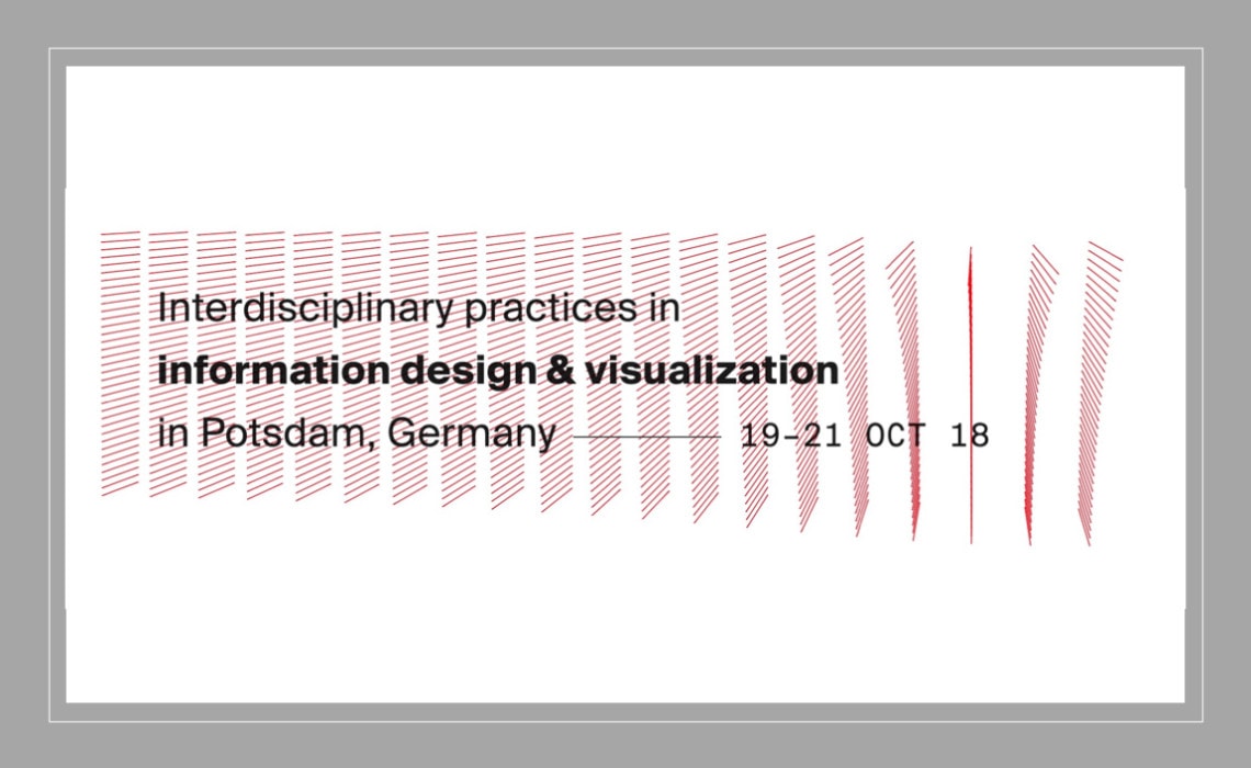
I spent the weekend-before-last in Potsdam, Germany attending the Information Plus Conference. In its second iteration (the first was in Vancouver in 2016), Info+ brings together designers, academics, and practitioners to discuss the current state of data visualization work and projects. In two days of presentations, combining longer 15-20-minute talks with 5-minute lightning talks, Info+ strives to be the rare combination of various parts of the discipline.
In lovely fall weather in an outdoor courtyard prior to the final session, I sat down with John Burn-Murdoch from the Financial Times, Andy Kirk from VisualisingData.com, and Anna Wiederkehr from Neu Zürcher Zeitung (NZZ) to discuss what we learned and our favorite parts of the conference.
It’s worth noting that our discussion took place before the final session that included three excellent talks by Catherine D’Ignazio, Greg McInerny, and Ron Morrison. Those talks dealt with some of the data ethics issues we talk about in the podcast. Videos of each talk should be posted on the conference website, so be sure to follow the conference on Twitter if you want to watch them.
Three final notes:
- First, I will now be publishing transcriptions of each podcast episode. The transcriptions will show up a few days after the episode posts, so if you’re interested in having the full text, please come back to the site later this week.
- Second, I have pulled together lists of my favorite data visualization books, presentation books, presentation tools, biographies and more on my new Amazon affiliates page. So if you’re interested in picking up some goodies, I have pulled together some lists of my favorites.
- Finally, I have launched a Patreon page to help support the show. Your support will help me cover audio editing and transcription services, audio equipment, server space, and more. You can visit my Patreon page here.
Guest Bios
John Burn-Murdoch is part of the FT’s interactive news team, working as a journalist alongside developers and designers to produce a mix of long term data-driven projects and same day interactive news stories. Other activities include presenting to domestic and overseas conferences on data journalism, data protection and big data.
Andy Kirk is a UK-based freelance data visualisation specialist: A design consultant, training provider, author, lecturer, speaker, and editor of visualisingdata.com. After graduating from Lancaster University in 1999 with a B.Sc (hons) in Operational Research, he held a number of business analysis and information management positions at CIS Insurance, West Yorkshire Police and the University of Leeds. Andy joined the highly-respected Maryland Institute College of Art (MICA) as a visiting lecturer in 2013 and taught a module on the Information Visualisation Masters programme through to 2017. He is also a visiting lecturer teaching a data visualisation module as part of the MSc Business Analytics degree at Imperial College in London, launched in 2015.
Episode Notes
Financial Times Graphics Desk on the PolicyViz Podcast
Transcript
PolicyViz Episode No, 137: Information + Conference
Welcome back to the PolicyViz podcast.I am your host, Jon Schwabish. On this week’s episode I am going to sit down chat with a couple of people about the Information Plus Conference that was held recently in Potsdam, Germany. I spent a couple of days at the conference plus a day just before the pre-conference workshop with a couple of folks from The Pudding who do some great work with data, and stories and interactive visualizations.
A few notes before we get into this week’s episode. First, I’m now going to be publishing transcriptions of each episode. The transcriptions will show up probably a few days after the episode initially posts, so if you’re interested in having the full text, if you’re interested being able to quote it or cite it please make sure you come back to the site later each week. I’ll have the transcription up at the bottom of the show notes for each episode.
Second thing is that I’ve put together a list of my favorite data visualization books, presentation books, presentation tools, biographies, brain books a lot of my favorite stuff on my new Amazon affiliates page. There’s a link on the show notes, so if you’re interested in checking out what some of my favorite books are and things that I use to give presentations you can go over to Amazon and check those out.
Finally, I have launched Patreon page to help support the show. As you know the show does not have ads I don’t go out and try to seek funding from corporate sponsors. So there are no ads on the show, but if you are interested in helping support the show that would be great. Just a few bucks here there would help me out to help me pay for the audio editing, pay for the transcription services, pay for the good audio, materials and products that I need to make show great I would really appreciate it. There is link to Patreon page on the show notes, so you can go over there drop a couple of bucks would really help support the show, lots of different levels that you can donate to, sp please do check out the Patreon page.
So on this week’s show I sat down with John Burn-Murdoch from the Financial Times, Andy Kirk from Visualizing Data, and Anna Wiederker from NZZ in the Netherlands to talk about the Information Plus Conference.
Just one note before you get to the show. The four of us sat down outside the conference during the last break before the final three talks, and the final three talks were really tremendous talks, great topics to try to I think bring a lot of the topics together that were discussed over the course of the two days and those speakers spent a little bit of time talking about data ethics, talking about diversity in the field, talking about some sort of bigger think type topics. So the conversation you’re about to hear took place before those last three sessions, but I would really recommend that you take a look at the videos for those three sessions when they become available on the conference website as well as a lot of the other talks that the four of us talk about in the episode you are about to listen to. So, without further ado here is this week’s PolicyViz podcast episode with myself, John Burn-Murdoch, Andy Kirk, and Anna Wiederker sitting outside at the Information Plus Conference.
Jon Schwabish: All right, all thanks for sitting outside on a lovely fall German day. Beautiful, right? How about this why don’t we quick, quick introductions so everybody knows who they’re listening to, and then we can talk about Information Plus. Okay, all right hit it.
Andy Kirk: Andy Kirk, Visualizing Data.
Anna Wiederker: Anna Wiederker from Neu Zurcher Zeitung.
John Burn-Murdoch: Hi, John Burn-Murdoch, Financial Times.
JS: Nice. All right, so we got a spot for you. I don’t know, and me Jon Schwabish with the podcast I am putting in quotes – that’s been more nicely put in quotes this week. All right, so two days Information Plus. How many talks have we seen? Like 26-27 something.
AK: Don’t give me numbers. Yeah, it’s been at least about 25 maybe.
JS: Okay. Well, let’s set the stage I guess a little bit. So we’re here in Potsdam, Germany. We are at University of which name I cannot pronounce. Anna you want to pronounce it for us.
AW: It’s Fachhochschule Potsdam, yeah.
JS: There you go that’s the one.
AK: And this is the second Info Plus.
JS: This is second Info Plus.
AK: So I went to the Vancouver one. We all met in Vancouver two years ago. I really enjoyed actually. Anyway it was nice to get to – I think for me what interests me in being here is about the mixture of people and backgrounds. It’s not an academic conference, it’s not a creative coders conference, it’s not a batch yard conference. It’s nice mixture just trying to bring all those different skills both in terms of the talkers and participants.
JS: Do we want to talk about favorite talks?
AK: Sure.
JS: Your favorite talk?
AW: Before even done yet.
JS: We’re not even done yet, but *** [inaudible 0:05:32] there are three talks left, you’re right. So, we’re at Sunday afternoon, but there are three talks left. So, we’re going to – the sample is selected but favorite talks so far. And let me set the stage a little bit, so the talks were a mix of 20-25-minute keynotes, some 15-minute talks, and a bunch of 5-minute lightning talks. I will say for the organizers they were really good at keeping people on time. There was no…
AK: Sure you want to say about the Germans. Yeah it’s run smoother. I like that format, because even in 20 minutes longer talks even if you’re not onboard it’s over quite quickly
JS: That’s right.
AK: And it’s hard to even to reduce the talk to 20 minutes let alone 5 minutes which is remarkable when you lightning talks how quickly that goes. One other thing I liked most was the lighting talk format. I think lightning talks light have quirky things, little things almost made towards an end of a discussion, but I really liked the piece by Ms. Adina who was a student at Camby [0:06:42] Institute in Finland – is it Aalto? I think it was, and that was a talk about this idea that – well the premise was that Finnish people are not wonderful such sort of occasions, at bus stops they don’t have interactions and as a British person that’s very much you know they’re in line with that. But the idea was that totally I guess the icebreaking element of the conference including Visualizing Knowledge back in May this year. They developed these little radar devices that people self rated against eight dimensions of personality or interest, and then on your lanyard the graph of your *** [inaudible 0:07:26] and it was an icebreaker. So, if you walk up to them not just seeing them then, but you’re getting a quick sense of are they totally into the same things as you are, are they different in which case let’s have a chat about what I don’t know and you don’t know about me and I thought it was a very nice idea. Then obviously from a design point of view it doubles up as a piece of branding to *** [inaudible 0:07:45] and some nice little animated things that sit in the background.
JBM: The other nice touch about that talk was she put the images for all the conference attendees and highlighted the ones where people didn’t answer questions, right, where basically there was no *** [inaudible 0:07:59]
JS: That’s right. And then, the few that were the maximum of each of those A-categories and she didn’t know whether people – they actually think that they were there their own strengths are all these things or they just said yeah it’s a *** [inaudible 0:08:11]
AK: So I think yeah I really liked that one.
JS: Anna you have a favorite?
AW: Yeah. I think it was Jessica Bellamy’s to be honest. I think she is the one from Kentucky who does more info-graphic work, but focus on the very low economic colored group where she grew up and where her family has roots in, and I think this is a use of data visualization info-graphic design in its most valuable way. She also gave a fire talk and I jumped…
JS: She really did, right?
AW: …in 5 minutes she explained – I mean I am American, so maybe I have a little bit of a bias because I think Americans can give emphatic presentations and I think she did a wonderful job of that, and I also think like whereas some of the other talks were like I am researching in this eco-chamber of me and my other researcher friends where we ask research questions to each other or the people who are amazing high Twitter follower, visualization superstars are only talking to each other. She was like look here’s where I am coming from, this is what I am doing, and this is the impact it’s having in a real social context that’s the stuff that I think that we should be doing, and yeah she showed up, fire talked, and walked off stage and I was like that’s it I want to…
JS: She also had this whole part of like she wasn’t just making info-graphics about socially conscious issues like she was doing things in the community, and then taking information from the community and then visualizing that. So, it wasn’t like oh I am designer interested in these topics. She is like actually volunteering and doing some *** [inaudible 0:09:46].
AW: Right, and she wasn’t like ah here is the design thinking approach walking us through this like. This is what we talk to our users, and we go observe them and that like when you go to these conferences…
JS: Yeah, *** [inaudible 0:09:56].
AW: Yeah, and she was like no I sat down at a place that’s a restaurant that sells whiskey buy the drink, and we are like disgust with these people who are like hurting and feeling stuff. Yeah, she didn’t need to observe anybody like a researcher she was like now this is it. I just felt that was a yeah…
JBM: And just like a really great way of holding power to account as well. I feel like in industry sometimes we wonder why we’re – not why we’re doing this but how we’re assessing the value of what we’re doing. Yeah, she is talking about you’re able to go out and come face-to-face with local politicians and say hey we’ve actually got the facts here about how you failed on this policy or something. It’s just a really great tool at that level like really immediate.
JS: Yeah.
AW: I hear like a phrase of like I actually gave them weapons. I mean we talk about data visualization as a tool to convince people or to make money or to convince our clients and that kind of stuff, but she was like no I gave them a weapon.
AK: Next level of *** [inaudible 0:10:56] was it?
JS: No, it’s for the 18.
AW: Yeah, but not afraid to say it and I think that’s like super viable because we all maybe think like ah we got tools but really we need weapon sometimes.
JS: John what about you?
JBM: I thought Martin Wattenberg, Fernanda Viegas this morning was awesome. So that was looking at the use of data visualization in machine learning and AI to identify patterns and to help in this difficult process of explaining how some of these models actually work. There were couple of things I really liked about one is just that AI is having increasingly big impacts on people’s lives and lot of people don’t really know much about it as they just view it as sci-fi, and I think that more that people can actually appreciate what’s going on here, including how the dumb mistakes that some of these things make and we saw examples where a frog could be labeled as a cat or even an owl was labeled as a dog or something. And I think it’s demonstrating what’s going on behind the scenes and how in some cases it’s quite simple is just really valuable and it’s clear that data analysts can do that. Then separately they used this example of a live data visualization explorable piece which demonstrates how biases can be reproduced by supposedly through objective meritocratic models, and again I think it’s really, really important thing to demonstrate and to talk about as someone raising a question that it’s not necessarily that AI is making things biased but when you’ve got a highly unequaled world and it’s that unequal world that’s been set down in data then if you then rely on that data to do…
JS: But still the inflow happens.
JBM: Yeah. So I thought really awesome stuff, and then yeah I think they’re really inspirational people who’ve done awesome work in this field for years now, so it’s great to get a chance to see them in *** [inaudible 12:53]
JS: Hold on one second wait for them to go on. All right, anymore highlights?
JBM: I think the one that I like the most maybe was Valentinia D’ Efillippo’s talk on map. She had this really cool – I don’t know would you call a project, it was a thing that she does where she had people draw – but we did it at dinner last night where she had people draw map of the world, and what was interesting is she had done it in different places and where you put the center of the world is where you are, where you’re from.
AK: Yeah, or in the case of UK correct, and also the detail of your knowledge of your local ships is pristine, but when you get far-flung places being in ***[inaudible 0:13:46] like a blob.
JS: Right. Yeah, it’s like a blub. I mean let’s start by doing in her workshops which I think was a great exercise I am definitely trying.
AK: And what she talked about is that the other people can add attributes to that. Things like where have you been, where you want to go, where do you have nice memories of things like that and it took a dumb distant illustrations to something that you are not…
JBM: And your personal experience that you can then talk to people about oh I went to France for this thing, oh you went to France.
AK: Yeah. I mean be canonical to say out of those kind of you have led them our way is commonality wrap in there.
JS: Yeah, put them altogether.
JBM: I thought Nadieh’s talk just before that as well was great. So she was showing behind the scenes of the project that she and Shirley worked on for the bussing of homeless people across the US, but the thing I really liked about it is – yeah these two projects already won a lots of awards, but was seeing the messy stuff behind it like the fuzzy matching shoes doing on text because of different spellings of places and the rough ggplot charts dozens of works she mocked up, and I think quite often in this community we just see the end product and it can either polish people’s poster syndrome you think I am never making anything that is that good. But when you realize that everyone is making crap stuff along the way to find the gems that you then either making a D3 and whatever. Yeah, I just thought it’s really nice, because Nadieh’s work is awe stunning. It was great to be honest. I know I’ve made charts that are like that as well. Yeah, you just keep looking at that.
AK: I loved Pedro’s – Pedro Cruz, was it this morning or was that…?
AW: Dendros.
AK: That’s right. A dendrogram of the immigration to US and I love that project in every conceivable way. Everything about it just ticks the box for me, it’s meaning and it’s astute choice.
JS: Someone talk about that, so for people – most people who went to the show have seen it, but…
AK: Yeah and this is the work really loved it.
JS: Oh dear.
[Crosstalk]
AK: It’s tree rings dendrochronology, so the idea was that it’s a concept of looking at I think of 150 year-ish immigration to the US and he plotted this into these rings, these contour rings of decades, and then he used color and little mark indicators to I think 100 immigrants as a unit, then of course indicate the origin whether it’s in Europe or South America, from Far East you know seven different origins, and then this animation builds up, but then you see the collective ring, you see bulges of where it’s been dominant immigrations from, you see the context of Americans who have home born but can’t remember the phrase he actually used but it’ll just give you some context. And then he split it around to 50 states for each…
JS: Put on a map.
AK: And so, again you see the sizes of population, but it was so clever way state side it kind of comes from the neighboring continent effectively.
JBM: What was also neat about it was he set up the talk of – he was very clearly conscious of the visual imagery he was going for, and then at the end he has this little video where the thing is animating and there are sounds of trees wrestling in backgrounds.
AK: I think above that the general theme that I’ve most enjoyed about this that consists of just lots and lots of different people who have not heard speak the fire talk actually they have not come across or met before just having the chance to learn about new people, new project and give them a chance to have a voice because it’s the format with the rapid nature of the talks, not just the lightning talks but the *** [inaudible 0:17:33] you can fit in more speakers. And somebody was on the panel for judging the proposals I know hundreds of other people that were fantastic at any conference but didn’t make it. So the people who have made it have obviously got some really interesting thing to say,. Naturally not everything strikes a chord with everyone. Some things are – I am interested in learning about, but it’s not just my – machine learning is not sometime I may get involved in but I am glad to be given a chance to learn from *** [inaudible 0:18:05] whether that’s manufacturing something of interest.
JBM: I mean I think to that point what I liked about the set up of the conference is that it started with these two or three talks about the history of information visualization, and then it felt kind of like it moved forward in time as well because we started with the history of information visualization and today we started with machine learning which is like the next where we are going, and then in-between are all these various projects that are – some are static, some are using qualitative data, some are doing interactive stuff, something to worry about mobile. I liked that having a whole – I assume it was a conscious decision but like having this theme, this arc throughout the entire couple of days.
AW: I thought that was a little bit different than other conferences that I have been to is this is like I really thought that audience was much more critical and not just…
JS: Yeah, the questions.
AW: And not just critical to each other like oh my God did you hear that oh terrible. No, it was like they are like I actually know something about this as well, and there is always like the one person who asks the question but then like professor with their whole life’s work that’s a different person. It’s the person who is like actual – and not even just having a thought about this but more like very poignant question that makes the speaker – I mean the goal is not to throw them off guard, but also to like hey have you thought about things about this or have you really thought about due fact of history in terms of this question that you were asking and presenting. I thought that was cool. Usually people are like just good talk and he is like here is the softball, but this one I was like sometimes.
JS: Data ethics question came up a lot.
AK: I think it was after the machine learning this morning there was a question which was – it was a good 5-minute question, but it wasn’t one way that was 5 minutes for explaining who that person was. It was just a absolute sort of complex just a real razor sharp critique sort of itself drawing on work maybe of whoever asked it or what *** [inaudible 0:30:07] you could see from Marin and Fernanda sort of gritting they were like this is an amazing question and almost like yeah that is classic. So every speaker had a very articulate response, I mean they had things to navigate through a good question actually answers the questions being raised. I think everyone has dealt with those very well. Maybe it’s part of that having lot of academics among the attendees where critique is a crucial part of work.
JS: We don’t need to go on for too much longer, but were there any topics you would have liked to have seen discuss, I mean there is a lot here in terms of content so I am not saying there’s anything missing but is there something of your personal interest that you would like to see someone get up there and talk about?
AK: I guess I have just a personal bugbear at the moment about how there’s so much attention on perception precision reading of charts and my feeling is that most people outside of this practitioner of data and academic community don’t read charts in that way. They are not really looking at them pixel-by-pixel. They’re reading them as a unit that makes an argument, and obviously that’s an equally black and white binary view. I don’t think it’s either all, but I’d be really interested to see some more debate about – we show that this is how people are actually evaluating our charts and *** [inaudible 0:21:35] and making a memorable point overall rather than people reading into these *** [inaudible 0:21:42]. I think Sarah Campbell spoke yesterday about feeling numbers just touching on hat idea of 20 minute spectrometry just sense of quantitative numbers but then also feel towards qualitative values. You cannot really put into it about chart. So yeah to *** [inaudible 0:22:06] full spectrum of tropics and I am struggling to think of a thing that feels missing other than just selfish myopic view of hearing about freelancers and how they do their jobs, but that’s not for *** [inaudible 0:22:20]
JS: I feel like the data ethics thing because there are so many questions that’s one that’s I would like to hear.
AK: Yeah, it’s not to be spoken about. It’s a topic that’s been asked about.
JS: Yeah, exactly. I think the answers of those questions have been really good, but it’s clearly a topic that we’re actually considering.
AK: Yeah, I mean if you think about a lot of the courage costs your selection regarding trust, trust in data, trust in forecast and stuff like that, and I guess that was elements of Martin and Fernanda’s talk about to make this invisible thing that’s happening behind the scenes to get more visible, but equally to keep it more explicit about the description about trust.
JS: Yeah, trust in institutions. Anna do you have anything?
AW: Yeah. I think something – I used to be a frequent UXUI conference goer, Interactions Design conference goer which is a different world, and a Visualization conference goer and I think something that gets covered there is a lot about testing, and this is like maybe a subsequent subject of your point which is like if you designed the precuts a lot of the thing that you have to spend the most time on is testing and getting to know your users. And I think that’s something that sometimes visualization misses, because they just make something beautiful like tree rings or I don’t know anything from National Geographic or Washington Post there were people that blatantly said, “Don’t really know my audience. I don’t really know my,” and you’re like you run a paper what the hell or you’re like the buildings I mean this is why the conversation from Deutsche Bahn and Christine Lay say like peak spotting and they know who their users are. They sat with their users and I was like what a – I got UX talk, right, this is about UX and visualization together and everybody else is kind of like yeah well we kind of just looked at it together.
JBM: Even if you look at clicks. The person is like oh we looked at clicks.
AW: Yeah, it’s the easiest answer, right?
JBM: But it’s not.
AW: Or I looked at it within my team. My team of experts who are not using testing actually, and so I am like where is this and visualization – how do we know if people can read this and we know this…
AK: When is it kind of a – okay now unnecessary things if you come and join a major newspaper, newsroom like that maybe you’re just going to inherit the style guide that’s so evolved over time that you just assume that this has been shaped around what is relevant and interesting news for people but you run it.
AW: It’s a bad assumption to make.
JS: Yeah, it’s something that’s quite opposite.
AW: Yeah, as I was working at these papers we know like – and as soon as you ask it you find out like this they’re like ah not really sure and as medium stain it’s also much more relevant question to ask because if you work at a traditional media organization it’s like yeah maybe we know our print audience, we know our digital audience, right? There is so much saloon from these spaces together but I think up until this point I haven’t heard a lot about user testing in visualization arena, good to hear about.
AK: One other thing that you just reminded me of in that Deutsche Bahn talk one thing I really liked is sharing this amazing, intricate, and powerful, and useful visualization, and then they shared the animation of the trains people in Germany and that was the point where the whole audience went oh.
AW: Right, *** [inaudible 0:25:28] in visualization.
AK: They were really honest and said we made this as well, but we don’t use it at all. There’s no use. We don’t need it. I just like that because number one it’s just being honest and saying – but they described how it’s an important thing to make because it got people to realize they really had something cool here. It was the thing to make the team more passionate, and to convince them the data was what they thought it was but I think it’s worth thinking about – again when we make visualization it’s not always about is this going to change the world. So, just get down on this stuff is all about how this is going to change things. Sometimes it’s how it’s going to inspire people. Maybe it’s just a part of a – as a *** [inaudible 0:26:05] from a project. This thing is cool. Yeah it’s good stuff.
JS: That’s great. Andy, Anna, John that’s it. Go and have fun.
JBM: Thank you.
AW: Thank you.
And thanks everybody for turning into this week’s episode. I hope you’ve enjoyed it. Please be sure to come back in a couple of days I’ll have the transcription ready for you at the bottom of the show notes. Please also check out my Amazon affiliates page and if you are able please head over to Patreon page and help support the show. So until next week this has been a PolicyViz podcast. Thanks so much for listening.


