The Chart Styles Excel Add-In
April 9, 2019
12 Comments
67399
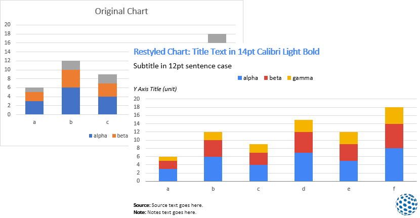
The primary workflow of many organizations goes through the Microsoft Office system. They use PowerPoint for presentations, Word for documents and reports, and Excel for data analysis and visualization. For some of these organizations, applying their branding styles and guidelines…
Continue reading