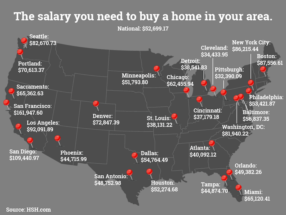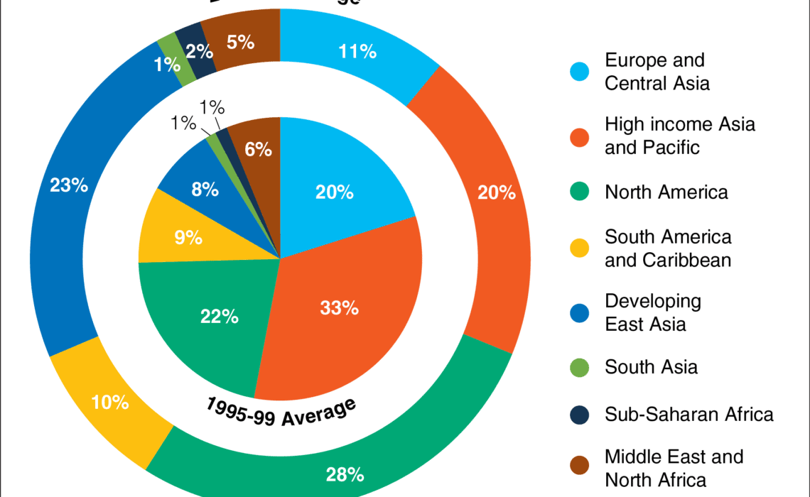
in Redesigns
Remake: Pie-in-a-Donut Chart
February 15, 2018
Leave a comment
14346
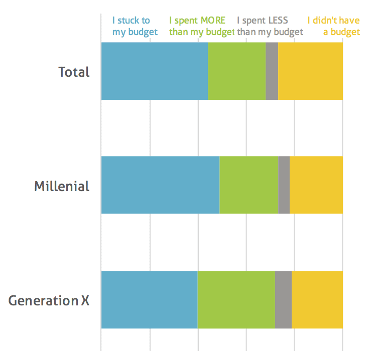
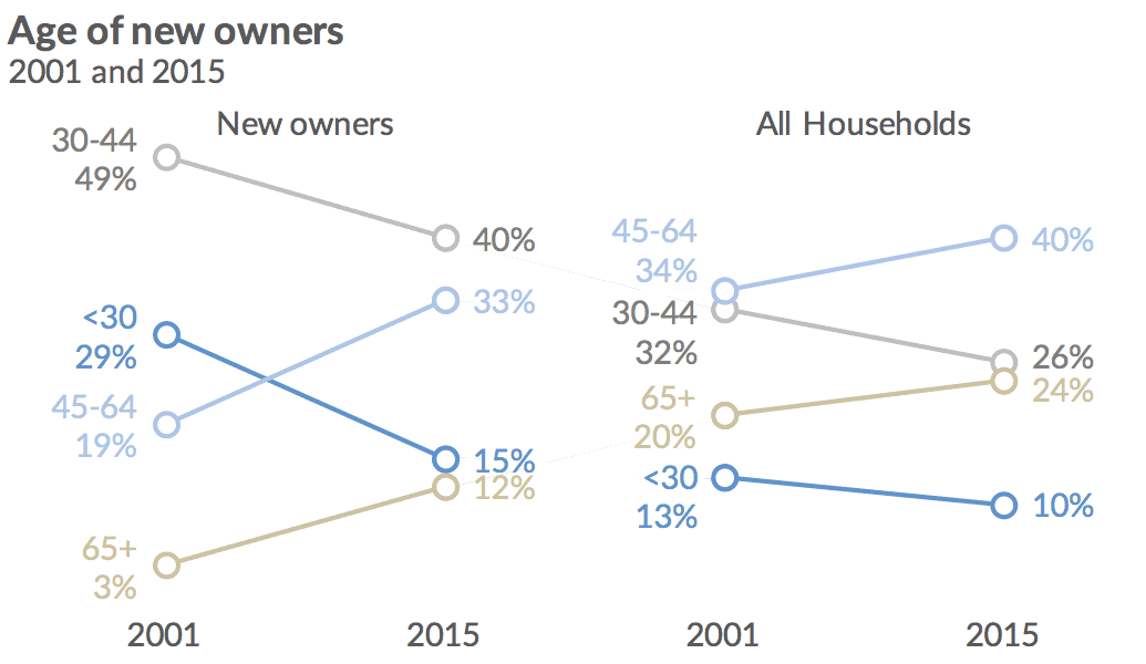
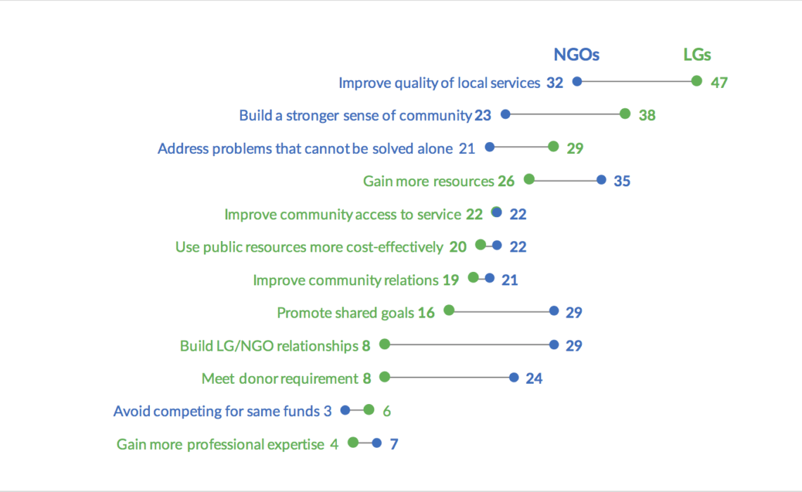
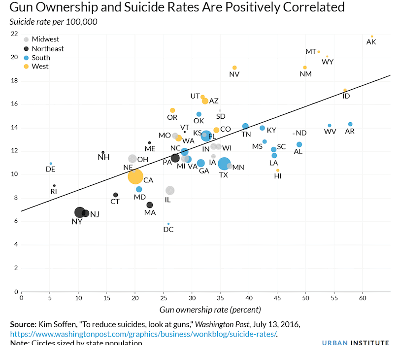
You might now know that I’m not a huge hater of pie charts. They do have their place and they can have value. But, just like a bad column chart or a bad map, there are also bad pie charts….
Continue reading