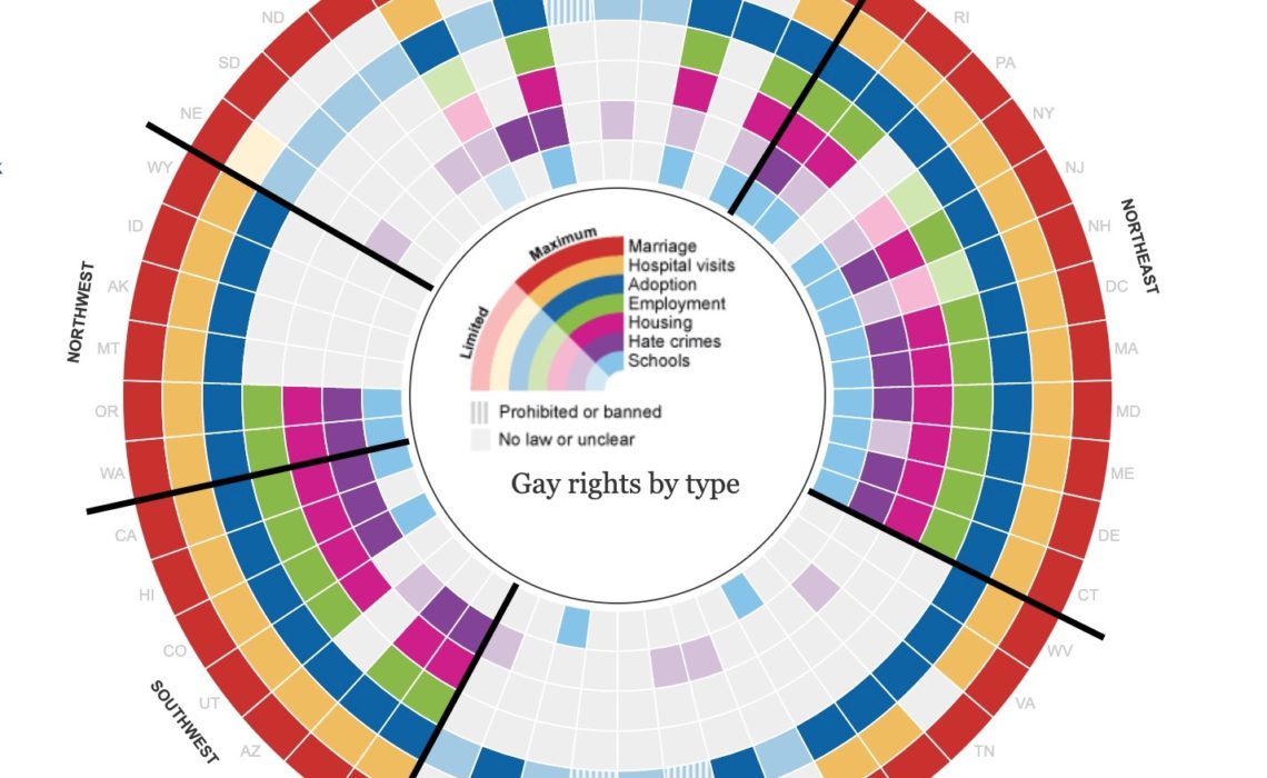
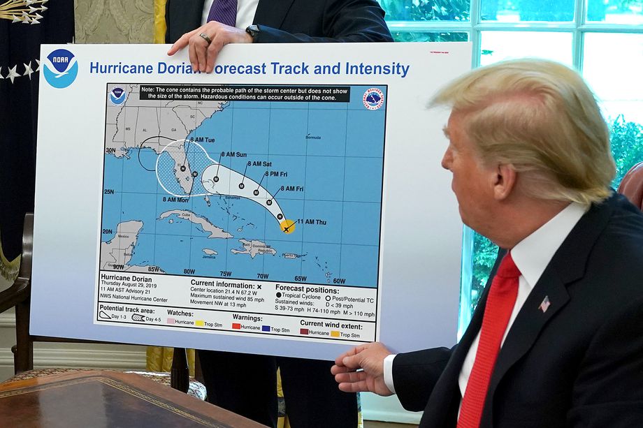
The Ten Most Misleading Charts During Donald Trump’s Presidency
Here are the top ten most misleading charts, graphs, maps, and tables from the Trump Administration over the past four years.
Continue readingHere are the top ten most misleading charts, graphs, maps, and tables from the Trump Administration over the past four years.
Continue readingOn this week’s show, I talk with Aaron Williams about his work as a data journalist, scientist and visualization expert tackling inequity in data and design at scale.
Continue readingChristine Zhang just joined the Financial Times as a data journalist on the US elections team for 2020. Previously, she was a data journalist at The Baltimore Sun, where she used numbers, statistics and graphics to tell local news stories…
Continue readingI really, really like this “radial map” (my name) the Guardian published in 2012 and then updated in 2015. The visualization shows seven different types of gay rights in all 50 US states plus Washington, DC. Each ring represents a…
Continue readingPart of the FT’s interactive news team, John-Burn Murdoch works as a journalist alongside developers and designers to produce a mix of long term data-driven projects and same day interactive news stories. Other activities include presenting to domestic and overseas…
Continue readingLazaro Gamio is a deputy managing editor at Axios, where he oversees a group of visual journalists that make charts, maps, interactive graphics and editorial illustrations. He previously worked at the Washington Post as an assignment editor on the graphics…
Continue readingAlex Selby-Boothroyd joined The Economist as an interactive visual data journalist in 2015 and now runs the data journalism department. His team writes data-driven articles and creates all of the static and interactive charts and maps for the website, apps and weekly…
Continue readingAlberto Cairo is the Knight Chair in Visual Journalism at the University of Miami. He teaches data visualization and infographics in our Journalism and Interactive Media Masters programs, and he is also the director of the Visualization Program at UM’s Center…
Continue readingMichael Gonchar and Sharon Hessney lead a new project at the New York Times called “What’s Going On in This Graph?” (WGOITG). Every second Tuesday of every month, the NYT publishes a graphic on a topic suitable for subjects across…
Continue readingBen Welsh is the editor of the Data Desk at the LA Times (@LATdatadesk), a team of reporters and computer programmers in the newsroom that works to collect, organize, analyze and present large amounts of information. Projects that he has contributed…
Continue reading