I’ve recently been exploring data about average school starting times using data from the National Center for Education Statistics (NCES), the primary federal agency that collects and analyzes data related to education in the U.S. and other nations. As part of my exploration, I worked with a relatively simple dataset: the average starting time in public schools across the United States. For each state, the data includes the overall average start time and the distribution of schools within 29-minute bands (i.e., 7:30 a.m.–7:59 a.m.; 8:00 a.m.–8:29 a.m.; and so forth). In this post, I’ll show four different ways to visualize this average starting time. You can learn how to create these on your own by checking out these step-by-step videos on my YouTube page or purchasing the templates directly in the shop.
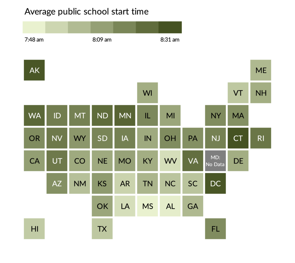
Choropleth and Tile Grid Maps
As is probably the case with many people who visualize geographic data, the first instinct is likely to create a choropleth map. It’s a fairly basic approach and can be combined with other chart types such as a bar chart.
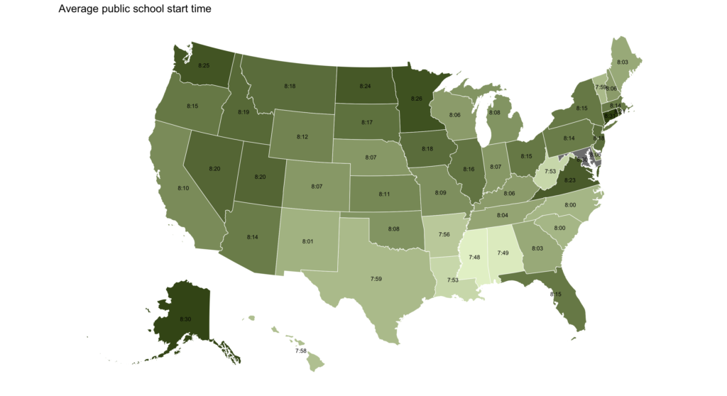
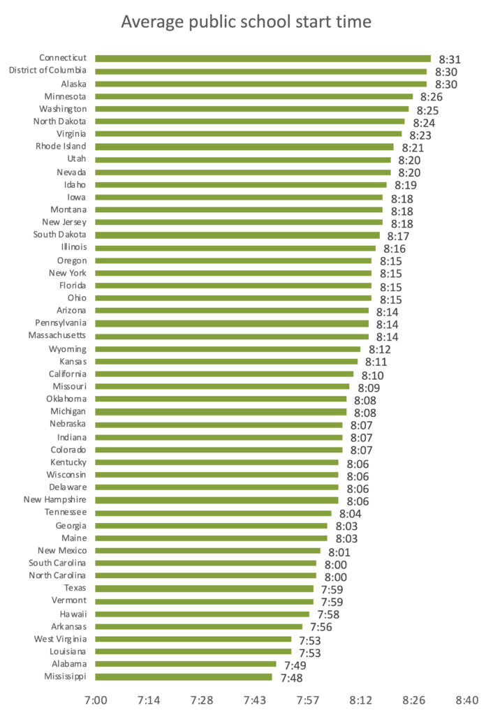
Of course, the challenge with the choropleth map is that it can be difficult to pick out exact differences between the values or even to quickly see the highest values (here, they are Connecticut that starts at 8:31 a.m., and Washington, DC and Alaska which both start at 8:30 a.m.) and lowest values (Mississippi at 7:48 a.m.), but the familiarity of the map can offset those concerns. (Big thanks to Aaron Williams for helping me solve the time formatting issue of the labels in the R programming language.)
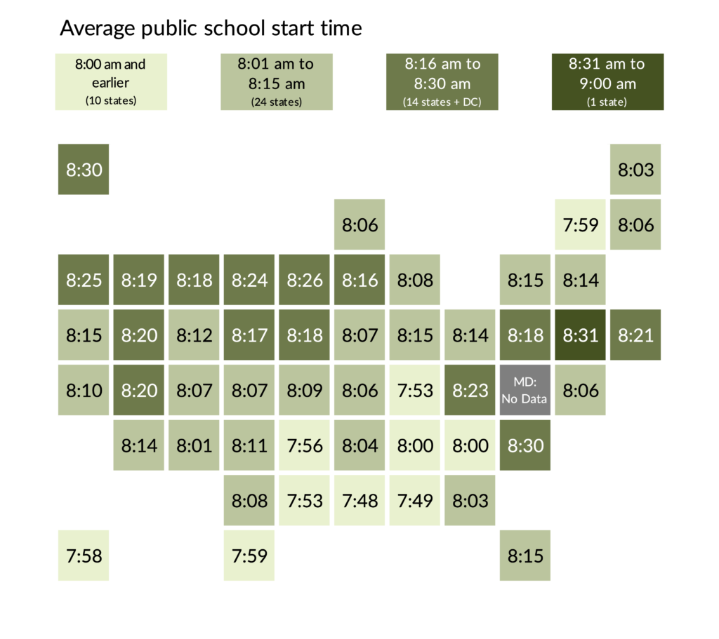
Another option is to create a tile grid map (here, in Excel). The tile grid map uses a single square for each geographic unit. Plotting each state as the same size and shape saves us from the geographic distortions that can occur in the typical choropleth map, but the states are now in arbitrary positions. I’ve tried two approaches here—one where each starting time range has its own category (and the states are labeled with the values) and a more continuous version (where the labels are the state abbreviations).
The Dot Plot
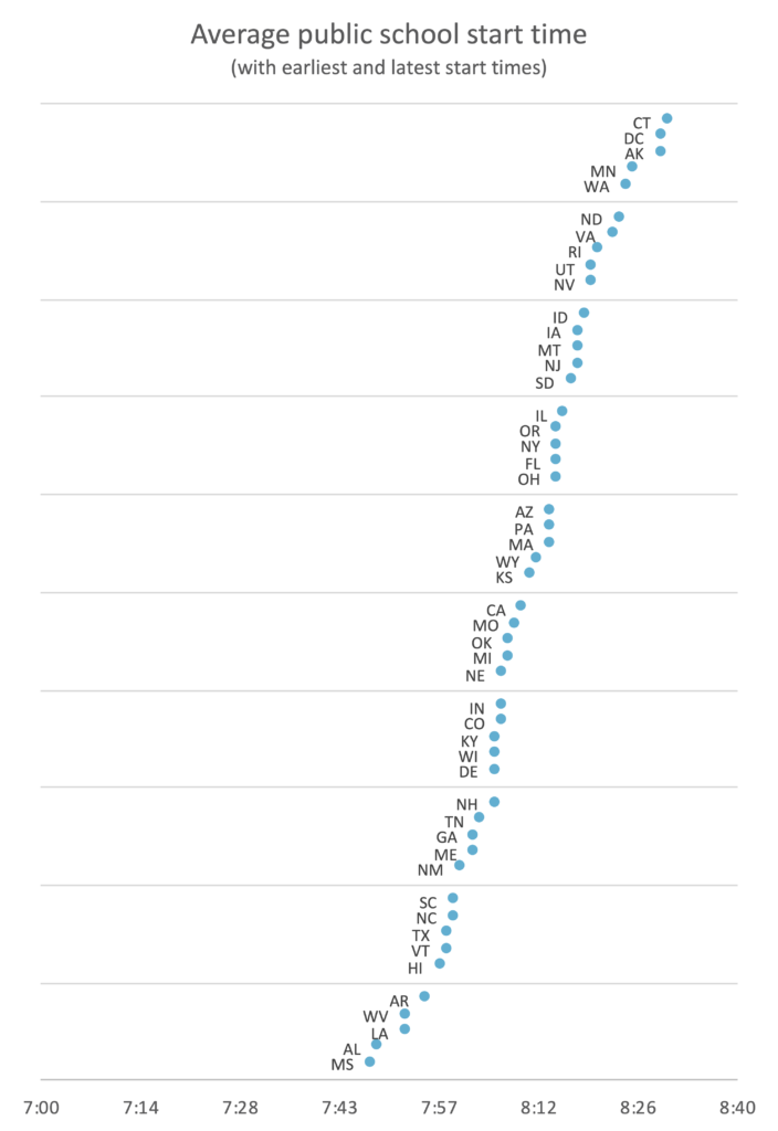
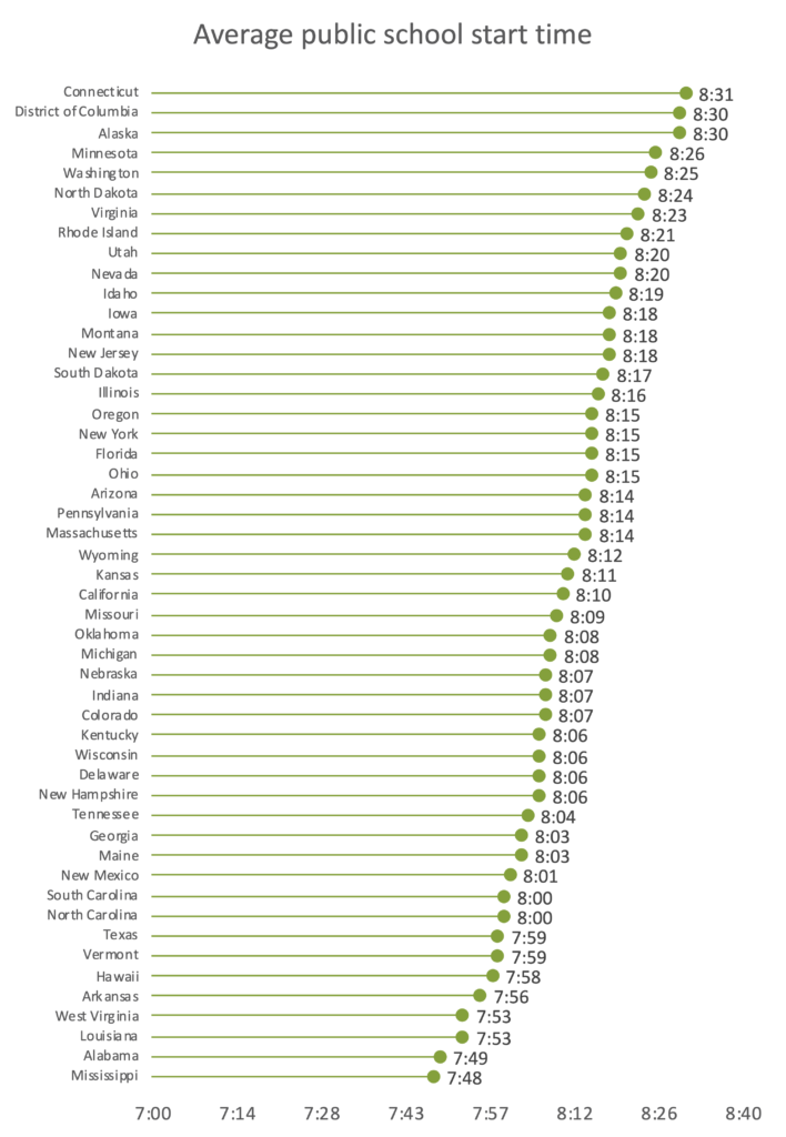
We could create a standard bar chart (first chart below) with these data, but instead let’s try a dot plot (sometimes called a dumbbell chart, barbell chart, or gap chart; second chart below), one of my favorite alternatives to the paired or stacked bar chart. The lollipop chart (third chart) has the same basic setup, but a line connects the point to the axis.
When bar charts include too many bars, the graph can look cluttered. By contrast, the dot plot shows the same data with a dot at each data value connected by a line to show the range or difference. The circles use less ink than the bars, which lightens the visual by adding more empty space. Here, I’ve tried different labeling strategies with each chart.
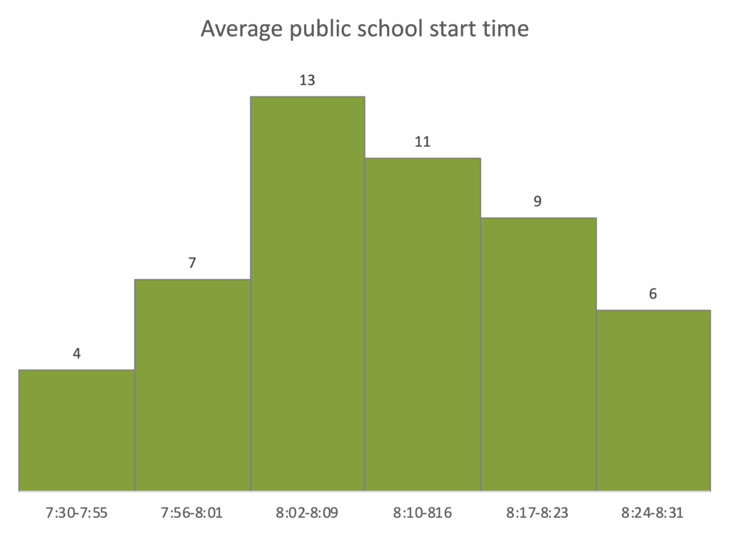
The Histogram
Or we could use a histogram. The histogram is the most basic graph type for visualizing a distribution. It is a kind of bar chart that presents the tabulated frequency of data over distinct intervals, called bins, that sum to the total distribution. The entire sample is divided into these bins and the height of each bar shows the number of observations within each interval. Histograms can show where values are concentrated within a distribution, where extreme values are, and whether there are any gaps or unusual values.
In this case, a basic histogram might look like this.
We can modify this graph in a couple ways. Instead of just using bars—which aggregate the data into an abstract shape—what about using the actual state names in each segment? The next graph employs this approach and adds color to each state name based on its region of the country. The second version uses a similar approach but instead of names I’ve converted them to state icons (using ProPublica’s StateFace font).
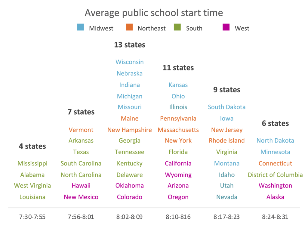
I love this strategy! I first saw it in Matt Daniels’s piece in The Pudding a couple of years ago and always consider it as an option when I make a histogram (that histogram is featured in my new book, Better Data Visualizations). The icon version is fun, but I think it’s probably too hard for readers to quickly identify their states. If the regional patterns were even clearer—as they are in Daniels’ piece—then it might be a useful alternative. (Both of these histograms were made in Excel and you can see how to do so in this video.)
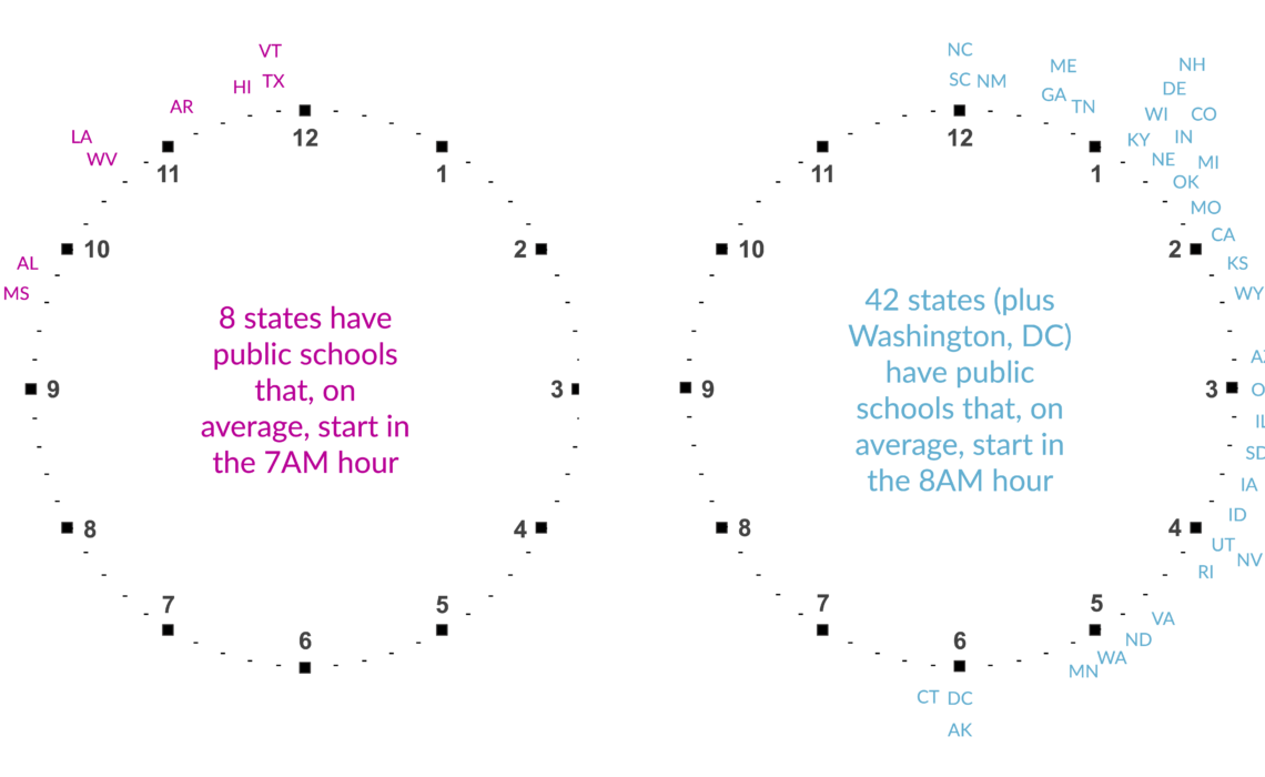
The Clock
The last visualization I tried was to really embrace the idea of time in the data. Instead of a map or bar chart or something else, I placed the state abbreviations around two clock faces. I know it sounds weird, but take a look at the final version.
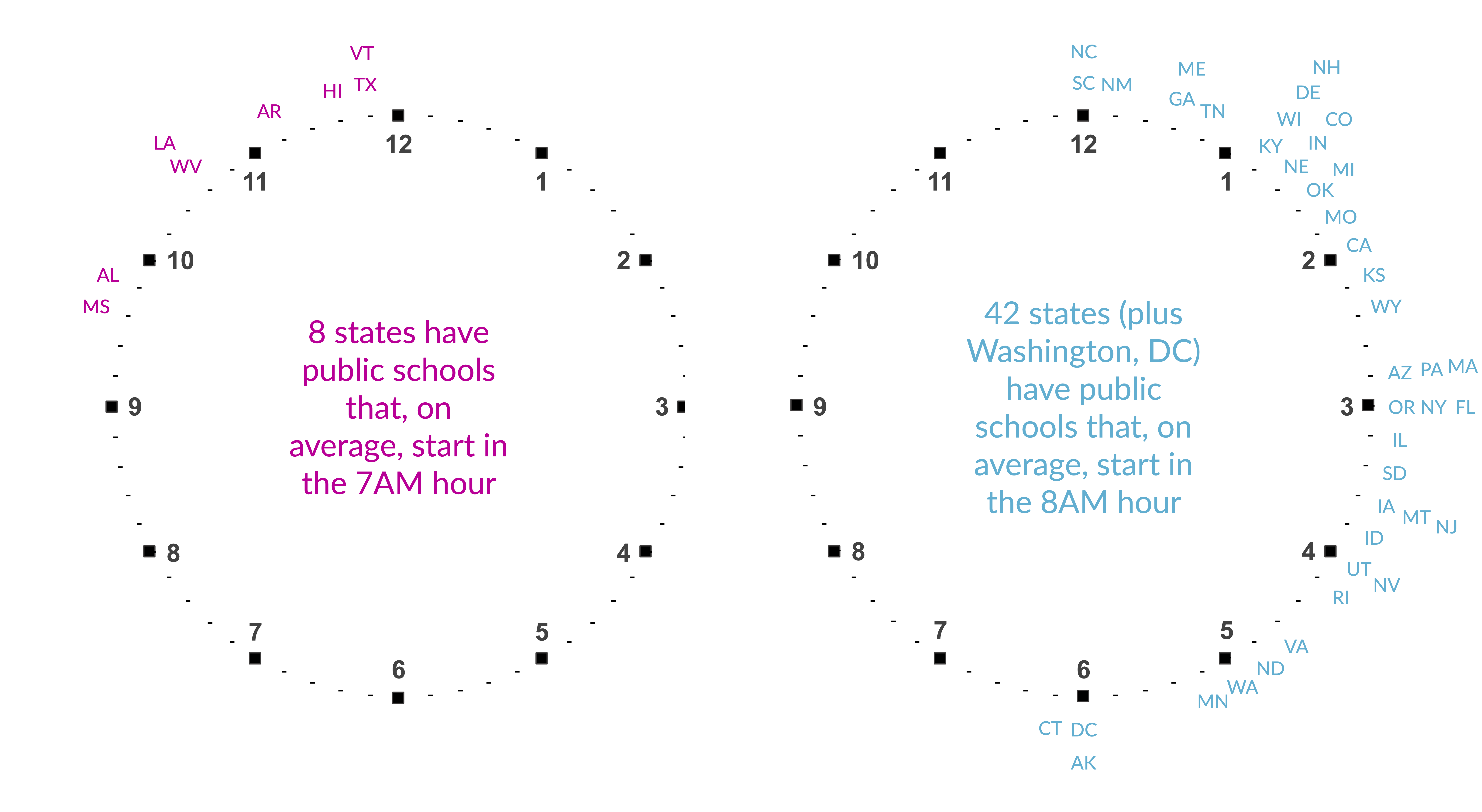
I think this is a fun visualization, and it communicates more precisely the exact average starting times than the previous graphs. The two clocks could be combined to one, but I worry it’s not quite as clear, so I tried using the different colors to differentiate the two hours.
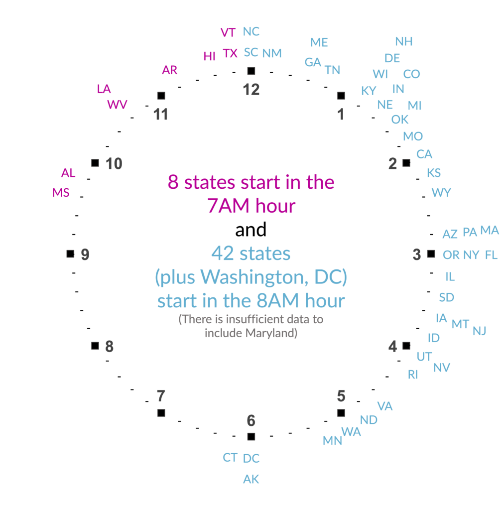
The Excel file does not include instructions on how to build these clocks, so if you’re interested in seeing how I built them, please check out this video.
Wrapping Up
Even with a relatively simple data set like the average starting time of public schools around the country, there are lots of visualization options. None of these are necessarily right or wrong, but each may be more appropriate for a certain audience or for communicating a certain level of detail from the basic story to the precise data. It’s one of the joys (and sometimes curses) of data visualization that the set of graphs available to us is infinite. The bar chart did not exist before someone invented it. Maybe it’s you who will invent the next great graph type.
Additional Resources
🛒 Purchase the Excel files (Clocks, Histogram)
📺 See the step-by-steps on YouTube | Histogram tutorial | Clocks tutorial |
📊 Learn more about different charts and graphs in the One Chart at a Time video series
📚 Expand your data visualization skills in Excel with my step-by-step ebook


