The COVID-19 pandemic has presented extreme challenges to families and children facing elevated levels of food insecurity. Understanding nutritional need levels is important for local and federal policymakers to determine where, when, and how to provide support to families. But getting a handle on these needs has been made difficult because of a lack of data to compare to the prepandemic period and to examine changes during the pandemic. Creating accurate data visualizations is also important because, for some, it will be the only way they interact with the topic, and for others, it will help them decide whether to read the full research.
Estimating rates of food insecurity during the COVID-19 pandemic
Some researchers (PDF) have proposed stitching together different datasets to better understand changes in rates of food insufficiency and food insecurity. The differences between the two measures can be important for our understanding of how people and families obtain nutrition. Food insufficiencymeasures whether a “household generally has enough to eat.” Food insecurity is a broader concept that measures whether a household, at times, is unable to acquire adequate food because of insufficient money or other resources. Researchers at the Brookings Institution and the Institute for Policy Research at Northwestern University (PDF) have developed a method of comparing estimates of food insufficiencyfrom two different datasets, one from before the pandemic and one during the pandemic. To do so, they look at the relationship between food insecurity and food insufficiency in the US Census Bureau’s Current Population Survey Food Security Supplement (FSS); the COVID Impact Survey, conducted by NORC at the University of Chicago for the Data Foundation; and the National Health Interview Study to quantify the association between the two measures. This allows them to map those results to measures of food insecurity that are collected in the Census Bureau’s Household Pulse Survey (HPS). The HPS was conducted on a weekly basis from April 2020 through July 2020 (phase 1) and then on a biweekly basis from mid-August 2020 through March 2021 (phases 2 and 3).
How well food insecurity or food insufficiency can be measured in these different surveys — even whether the three phases of the HPS are comparable — is still a matter of some debate. Different organizations and researchers have come to different conclusions. Over the past year Institute, several research teams at the Urban Institute have been using the HPS data to help highlight issues around racial and ethnic disparities in food insufficiency, job growth among communities of color, and housing disparities. Urban’s tech and data team, communications team, Statistical Methods Group, and the Racial Equity Analytics Lab regularly work together to better understand the underlying data and to provide the data through our feature dashboard and data catalog. Along with Census Bureau researchers and analysts, these teams have concluded that researchers should not compare rates of food insufficiency in the HPS data to other prepandemic datasets, owing to differences in survey structure, sample weights, and other related issues. They have also concluded that phases 1 and 2 of the HPS are not comparable because of “several key differences in the survey design” (PDF) — for example, that the questionnaires are inherently different, the survey periods differ, and there are different nonresponse rates between them (Urban’s teams have concluded that phases 2 and 3 in the HPS are comparable because they have identical questionnaires).
But others, including researchers at Brookings and Northwestern University, have also been in communication with the Census Bureau and the US Department of Agriculture and have reached a different conclusion. From their perspective, the surveys are not structurally different enough to warrant not making these comparisons. Further, they have used the sample weights to reweight the data in an effort to make the series more consistent.
Methodological issues aside, the issues of data comparability and missing data are compounded when trying to visualize trends in food insecurity or food insufficiency. What is the best way to compare one dataset to another, especially when various researchers disagree? How should we visualize annual data next to weekly data?
The default line chart approach
In November 2020 blog post, Brookings researchers presented the graph below to argue that severe food insecurity increased sharply at the beginning of the pandemic and then declined over the summer. In this graph, we can see a decline in food insecurity between 2008 and 2018 when measured in the FSS. Then, using phase 1 of the HPS data, we can see a sharp upward spike at the beginning of the pandemic, which, for all households (the dark green line), varies between about 20 percent and 25 percent. At the end of summer, new phase 2 HPS data (now measured every two weeks instead of each week) show slightly lower rates of food insecurity.
There are three main ways this graph could more effectively visualize the issues around missing data and data comparability.
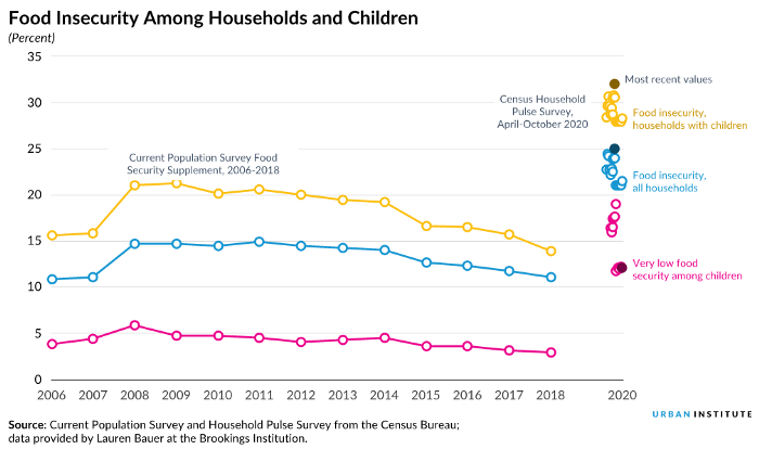
· First, by using the same increments between each label along the horizontal axis, the plot suggests the data are reported at the same frequency. But the data are reported annually in the first part of the graph and weekly/biweekly in the second part. Visualizing the data this way gives an immediate impression that higher levels of food insecurity have persisted for at least the previous 13 years.
· Second, the dashed lines suggest a straight, linear connection between datasets, which might also imply a linear increase in food insecurity rates during those periods.
· Finally, details about changes in the datasets in the note at the bottom of the chart could be made clearer.
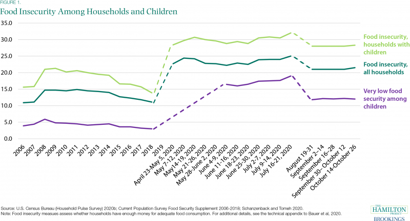
We can address the first issue by using the correct increments along the horizontal axis and address the other two issues by adding clear labels. The graph below includes the exact same data as that above but spaced correctly, with annual data spanning the bulk of the graph and the 2020 weekly data grouped together in the far-right side of the graph. Even if the two datasets are not strictly comparable, using the correct increments provides a better presentation of the data frequency, so we see a slow decline in food insecurity in the prepandemic period. Also, unlike in the original, I omitted the 2019 label and tick mark because there are no data for that year. In this version, the white space between the FSS and HPS datasets — rather than straight, dashed lines — helps show the reader there is a break between the two series, and the two labels clearly state the two different datasets used in the analysis.

Of course, the problem with this graph is that it doesn’t make the most recent HPS data visible — they pretty much just look like clusters of circles. One solution is to use another graph, focusing in on the most recent period. In this next graph, I show estimates of food insecurity in just the two phases of the HPS during 2020. Again, white space (and text) helps make clear the two phases of the survey may not be strictly comparable. I’ve also included thin, dashed lines to show the 2018 value from the FSS data. (The 2006–18 average could also be used, but food insecurity tracks the overall economy (PDF), so the most recent point may be a better choice here.)
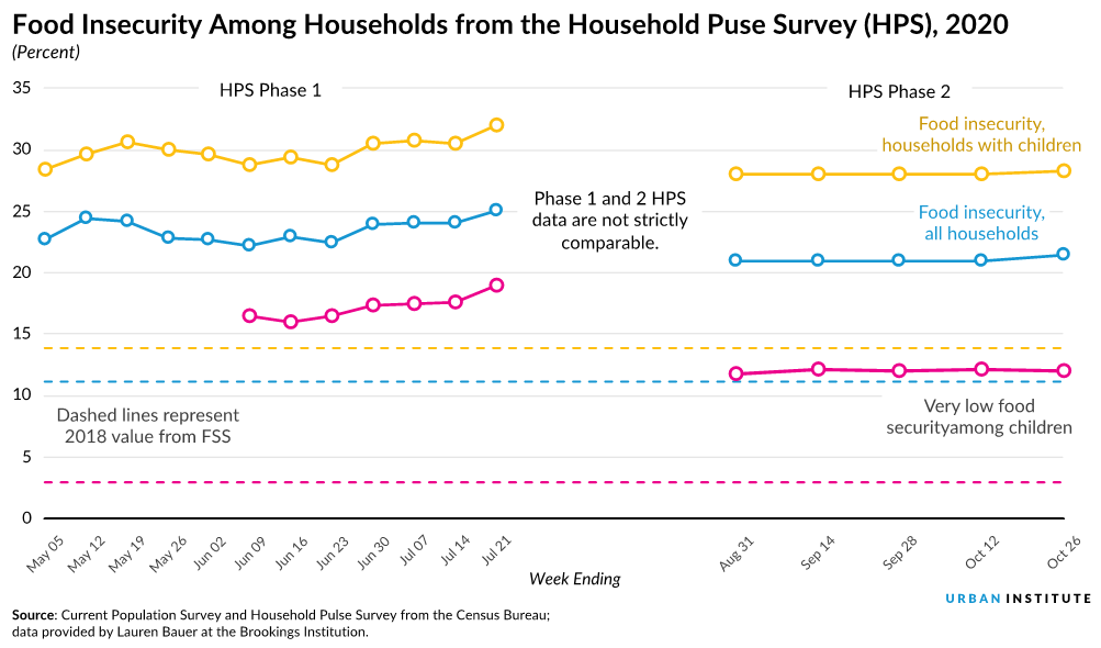
I didn’t add a dashed line to connect the two phases in the HPS. As noted, my Urban colleagues have documented (PDF) why these two HPS phases should not be stitched together, and for purposes of this visual exercise, I follow their recommendation (Urban’s collection of HPS-related projects, Tracking COVID-19’s Effects by Race and Ethnicity, explicitly separates the two surveys).As in the first redesigned graph, I use white space and labels to make and explain the break in the series.
By plotting the time series data in the correct positions and more carefully using labels and annotation, we can create a plot that, at least visually, addresses some of the methodological concerns raised by different researchers. The task of comparing data before and during the pandemic is no easy task, but making it clear where missing data may be and where data series may not be comparable can help readers better understand the caveats and the content.
This post was originally published on the Data at Urban blog on March 24, 2021.


