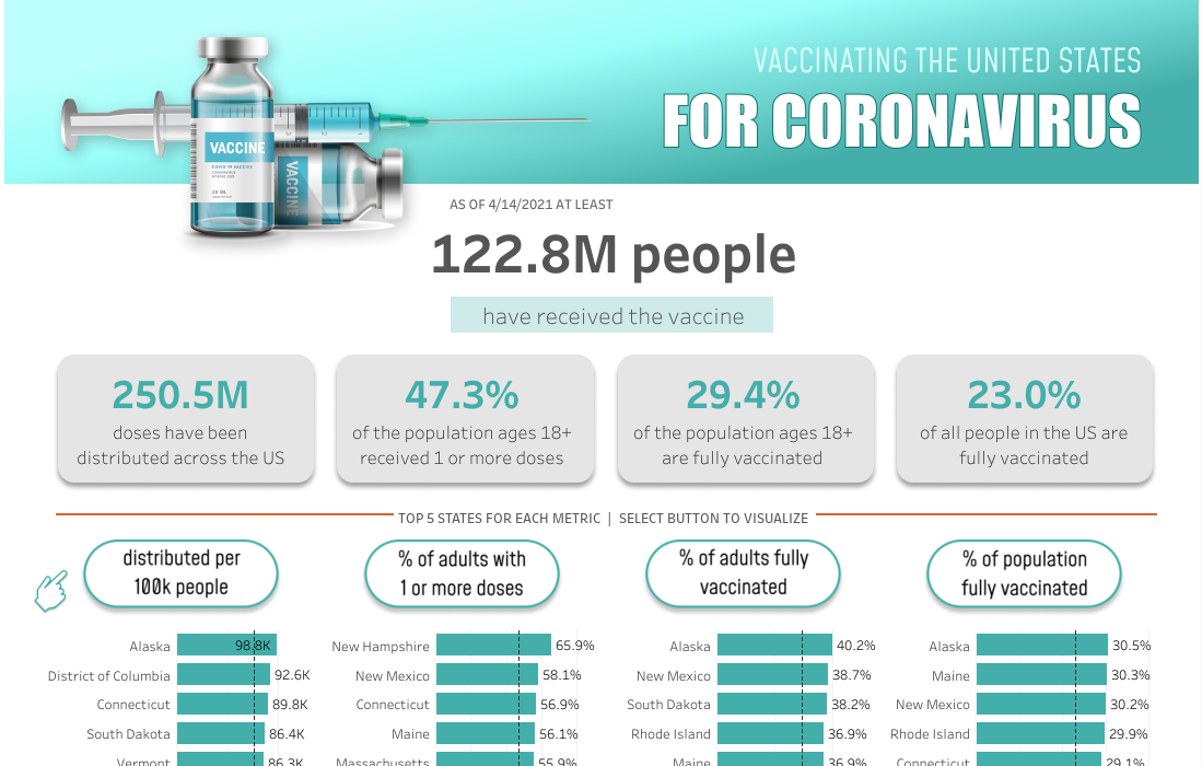
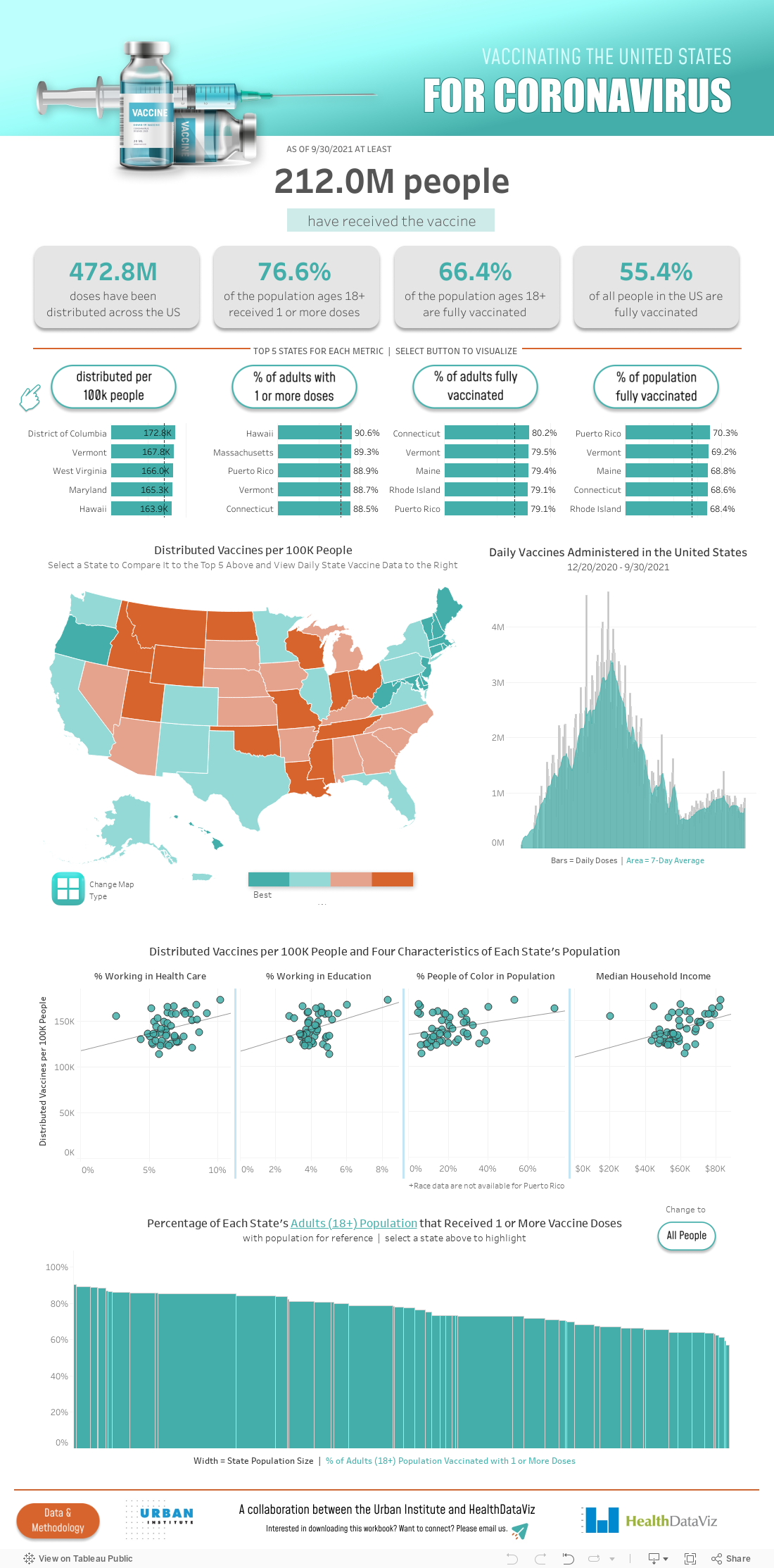
With various COVID vaccines now becoming available around the world, many organizations and individuals have created data trackers, visualizations, and dashboards. The Tableau dashboard below looks at not just trends in vaccination rates, but also where those vaccines are available and how that distribution intersects with sociodemographic information such as percent of people of color and percent of people working in different sectors.
To build this dashboard, I’ve been working closely with Lindsay Betzendahl from HealthDataViz and my Urban Institute colleagues, Ajjit Narayanan and Claire Boyd over the last few weeks. We pull daily vaccination data from the Centers for Disease Control (CDC) website and Our World in Data, (because OWID has done the relatively hard work of cleaning and maintaining a historical record of the CDC data). We combine those data with annual sociodemographic data pulled from the Bureau of Labor Statistics and the US Census Bureau using the tidycensus package in the R programming language. The data are all piped into a Google sheet, which is then read and automatically updated in the Tableau dashboard that Lindsay built.
You can view the dashboard below or the full screen version on Tableau Public. Please circulate it to friends, colleagues, and other stakeholders who may be able to use these data and/or these specific layouts.


Good visualization. But shouldn’t the map legend be shown with orange to teal (worst to best) from left to right?
I get a lot of “sort” errors when I download the packaged workbook, and the visualizations don’t work. I’m using the latest version of Tableau.
Hi David,
We mistakenly left the download option on–you won’t be able to get this dashboard to work on your own machine because the data are scraped to a Google sheet that is not publicly accessible.
Thanks for giving it a shot, though!
-Jon
Thanks, Jon. That’s a shame b/c I use downloaded vizzes to teach grad students and my public health peers, and this one would be a good one to emulate. But I understand. I’ll just point folks to the Tableau Public version and let them explore in awe. 🙂 Thanks for all your good work.