Over the past several years, I’ve worked with dozens of organizations to help them do a better job communicating their data, analysis, and research. A common problem that occurs early in my conversations is helping people better understand their audience. Too many groups want a big, shiny interactive website or multi-layered dashboard when a simple bar chart will do. The 2020 presidential election gives us plenty of examples of data visualizations that match the communication method with the needs of the audience.
One of the most important things you can do to communicate your data more effectively is to consider the needs of your user (or reader or audience member) and how you expect them to use your work. Some audiences want long, in-depth reports. Others want short briefs or blog posts. And some just want to get their hands on the data to do their own work.
To help identify the needs of my audience, I find it useful to think of four broad kinds of data visualizations. I find this broad schematic helpful when thinking through what kind of visualizations is best for your audience. For each category, I discuss a data visualization from the New York Times that was used to visualize the 2020 presidential election.
Defining a Data Visualization Schematic
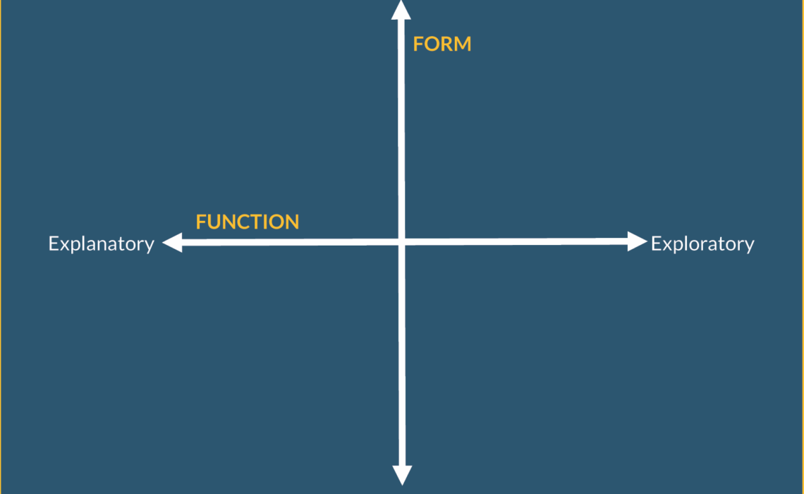
We can define four broad kinds of visualizations by designing a space with two perpendicular lines. The first is a vertical line that defines the general FORM of the visualization. This line runs from static to interactive.
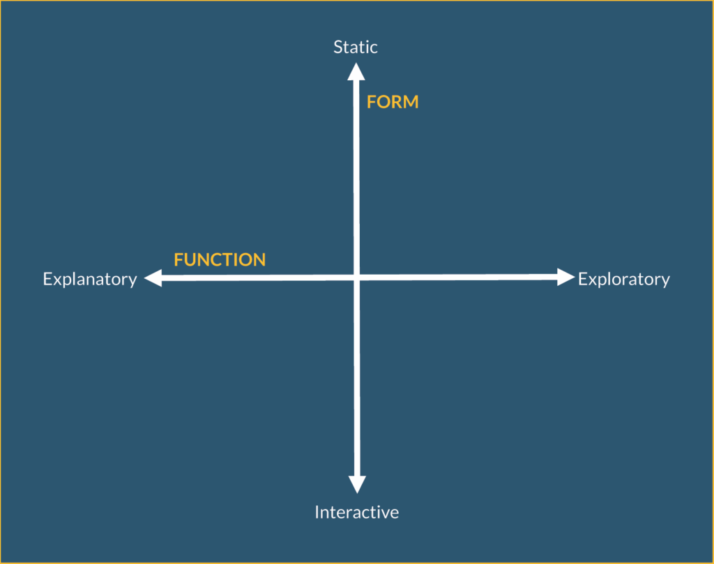
- Static visualizations provide all the information at once and do not move. These are, for example, your basic line, bar, and pie charts.
- Interactive visualizations allow a transfer of information between the user and the interface. The user clicks, swipes, or hovers, and something happens or additional information is made visible.
On the horizontal spectrum is the FUNCTION of the visualization. Here, visuals run from explanatory to exploratory visualizations.
- Explanatory visualizations bring the results to the forefront; they convey the author’s hypothesis or argument to the reader.
- Exploratory visualizations encourage the user to explore the data or subject matter to uncover findings for themselves.
The intersection results in four quadrants, and following the 2020 presidential election the New York Times produced data visualizations that fall within each.
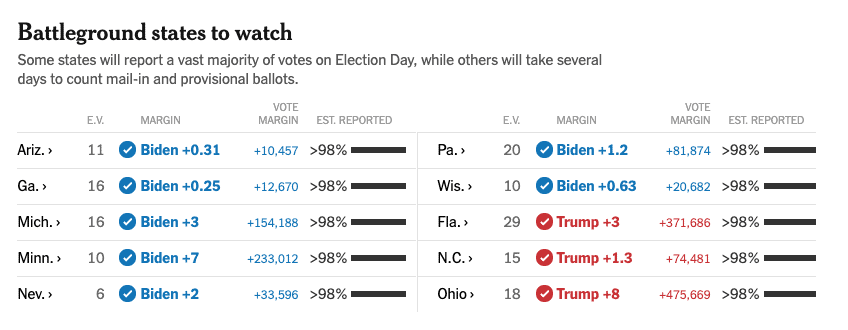
Static and Explanatory
Graphs that are not interactive or do not move are typically used to illustrate a point or reinforce an argument made in the text or presentation, like a line or bar chart. These are also the visualizations we might make on our own or within our organization as we explore our data and develop our findings.
There were many such examples of static, explanatory graphs and charts that were used to explain the election results, but maybe the simplest are the tables they produced to show detailed numbers. (Yes, tables are a form of data visualization. If you want to show the exact amount of every value in your data, a table might be your best solution.) Notice also how this table includes more visual elements like color, check marks, and small bar charts to help engage the reader and highlight specific results.
Static and Exploratory
These visualizations let readers interpret the data and find their own results in a static display of information. In the print version of the November 6th edition of the paper, this full-page bubble map shows the margin of victory in each county across the country. The detailed map encourages us to explore the data on our own. The paper doesn’t make a specific argument about the election, but instead it lets you explore the data to draw your own conclusions. Some small annotations outside the map help explain some key counties and results, but overall, the reader is left to explore the country on their own.

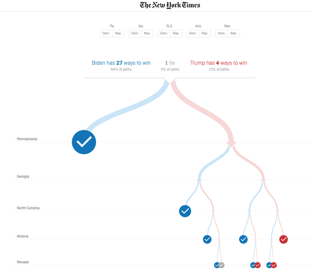
Interactive and Explanatory
Perhaps the easiest explanatory-interactive graph to consider is a static graph that has an interactive hover or rollover layered on top of it. While supremely popular just a few years ago, this approach seems to be falling out of favor as readers move toward smartphones and the need to click and hover is less important. Interactivity can engage a reader to experience a story or explain a process. To take just one example, consider the “Paths to the White House” graphic, which lets the user pick the paths by which either presidential candidate could win the election.
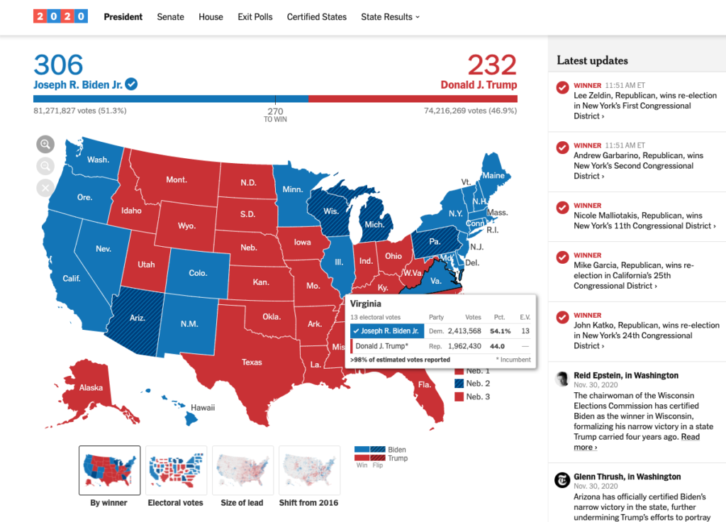
Interactive and Exploratory
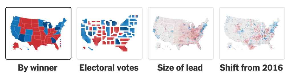
These visualizations graphically present a complete data set and ask users to find interesting patterns or stories. The main online election maps primarily serve this purpose. Users can highlight over states or counties to see the vote split or change from the previous elections. In this case, users can also select three other map options to explore the data in different ways. While in this case the goal is to let users explore the data, other times, the purpose of these graphics is to simply give people the data to explore or create visualizations on their own.
There is no right or wrong
Remember these axes are spectrums, so a visualization can land somewhere in the middle of this space, or bring different aspects of these quadrants together. You’ve certainly seen examples of this from the New York Times, but also in the Guardian, Washington Post, Wall Street Journal, and elsewhere—a combination of interactive and static visualizations paired with text, perhaps audio clips from interviews and pictures, all sewn together to creative a visual experience that gives you a deeper level of experience and understanding than the text alone might do.
There is no “right” or “wrong” quadrant here. What you choose depends on what reaction you want from your audience, where you publish your content, and what tools your audience needs to understand the data. As you and your organization go forward with your own data communication efforts, be sure to first ask yourself who makes up your audience and what do they need that will help them make discoveries, find insights, and improve their work.
This blog post is adapted from my new book, Better Data Visualizations: A Guide for Scholars, Researchers, and Wonks, on sale now wherever you get your books. I’ve also written about this idea back in 2014 on this blog and in the Journal of Economic Perspectives.


