One of the great things about the new One Chart at a Time video series that I didn’t foresee, was all the great conversations I’m having about different chart types!
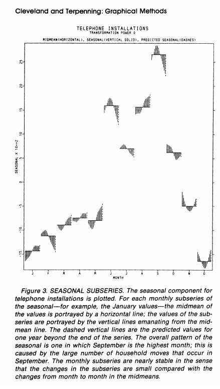
Two primary things came out of last week’s video from Kennedy Elliott about the cycle plot. First, Naomi Robbins shared the original paper where the cycle plot was introduced, which I hadn’t seen before. In William S. Cleveland & Irma J. Terpenning’s Graphical Methods for Seasonal Adjustment (1982) paper, they focus on the importance of seasonal adjustments in various data series and how graphs and charts should be a routine part of the process of seasonally adjusting data.
Second, Michael Brown commented that he needs to figure out how to create the cycle plot in Excel.
I definitely need to figure out how to create this cycle graph in Excel.
— Michael Brown (@Michael54289459) February 5, 2021
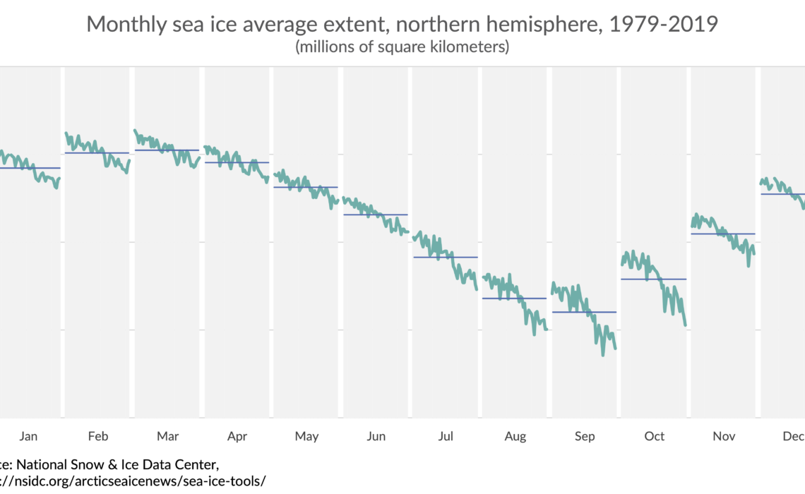
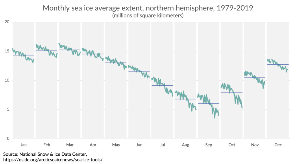
I’m pretty sure I have made cycle plots in Excel in the past, but couldn’t find my earlier files, so I created one based on a cycle plot Kennedy created when she was at the Washington Post in 2015 (and that she discusses in her video). I grabbed monthly sea ice extent data from the National Snow and Ice Data Center and created this version with just three data series.
Now, instead of creating a long, step-by-step blog post with screenshots and descriptions, I thought I’d try my hand at doing a video walk-through, which you can watch below or over at my YouTube channel.
You can also download my Excel file where I’ve inserted comments into the header cells so you can see how each series is plotted. It’s a fairly simple graph to create, so I hope this approach will be sufficient.
I haven’t created a lot of step-by-step video tutorials, but if you find it useful, please let me know in the comment section below. If you’d like to learn more advanced data visualization in Excel, check out my ebook.


Hi Jon,
First of all: thank you for the great Youtube series “One chart at a time”. Really inspiring.
Then the cycle plot: I am a huge fan of this chart type. Unfortunately it is unknown to a lot of people, so great to see your article and Excel template on this.
We have started last year to develop visuals for Power BI. We focus on developing the visuals we miss, and the Cycle Plot is obviously one I was missing. This is why I could not resist using your data to create this chart in Power BI.
Attached image:
Cleveland published several papers on this. One earlier than the paper you cite is
Cleveland, W. S., Dunn, D. M., and Terpenning, I. J. 1978. SABL: A resistant seasonal adjustment procedure with graphical methods for interpretation and diagnosis. In Zellner, A. (ed.} Seasonal Analysis of Economic Time Series: Proceedings of the Conference on Seasonal Analysis of Economic Time Series 1976. U.S. Department of Commerce, Bureau of Census, 201-231. https://www.census.gov/ts/papers/Conference1978/ClevelandDunnTerpenning1978.pdf
Less trivially, the same idea from 1852 [!] can be seen on p.170 of Neurath, O. 2010. From Hieroglyphics to Isotype: A Visual Autobiography. London: Hyphen Press.