The “On…” series is a collection of short blog posts relating to data visualization, economics, presentation skills, or data communication. In each, I discuss an issue, concept, or idea that I have not fully developed, a work in progress, or just some thoughts about a topic or issue I’d like to share.
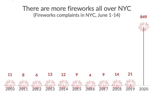
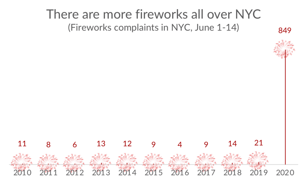
I saved this late June tweet from Chris Ingraham for two reasons: First, it’s a nice example of how a bar chart can do a nice job showing an outlier (i.e., don’t break the bar!). Second, could I use Excel to add some fireworks to a graph about fireworks?
Skyrocketing complaints over fireworks in NYC, Baltimore and other cities this summer. There’s some media coverage but nothing offering a compelling explanation yet. Any theories? pic.twitter.com/GxKuUQargf
— Christopher Ingraham (@_cingraham) June 17, 2020
Turns out, yes, we can create this chart in Excel. Here’s a quick tutorial.
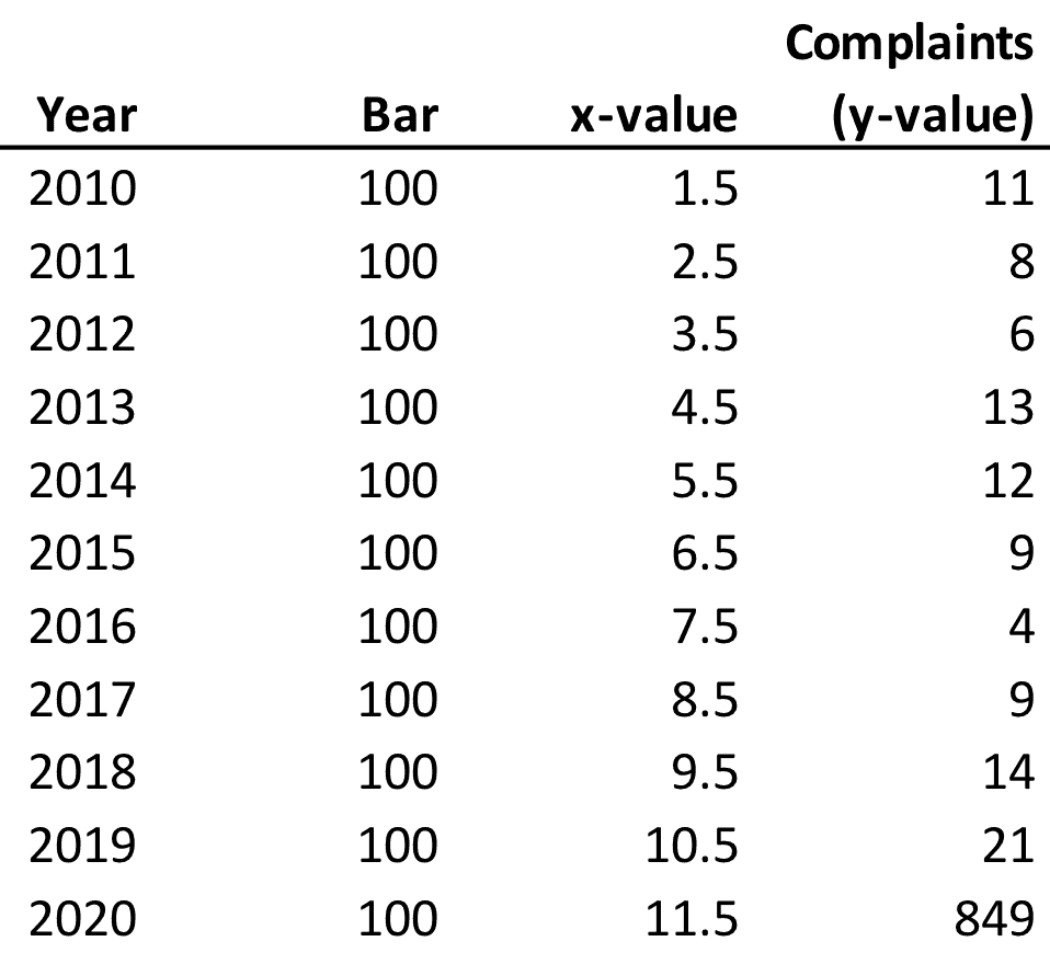
This is a simple combination chart that uses a bar chart and a scatterplot. I use a bar chart to create the x-axis labels (and set the color fill to No Color at the end). The scatterplot dimensions are set so that the x-values are right in the middle of the bars and the y-values are the data values (Complaints).
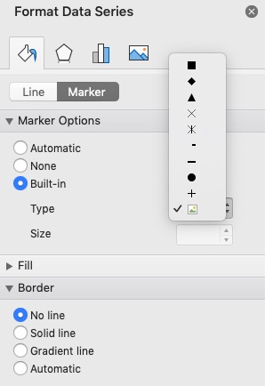
I then changed the marker in the scatterplot to a Picture. I started first by using an icon directly in the Insert menu, but when I shrank the image down and inserted it into the chart, it looked really blurry. Instead, I grabbed an icon from The Noun Project, downloaded it in SVG file format, and resized and colored it in Adobe Illustrator. (I initially downloaded it as a PNG, but I needed to resize and color it, so I used the SVG format.)
Do I foresee using this in the future? Probably not, but more generally, hopefully you can see how you could add icons to your Excel charts (so-called “chartjunk” notwithstanding). Anyways, it was fun to create, especially for July 4th.
UPDATE: In case you didn’t see the comment below, Jon Peltier suggests just doing this as a line chart (with markers), add Drop Lines, and then copy-and-paste the icon over the markers. On this last step, I have found that the resolution of the icon is much worse using this method (see below). I’m not sure why–maybe inserting into the Excel file and then copy-and-pasting does something to the file? In any case, a line chart is definitely easier than the bar/scatterplot combo chart.


You made it more difficult than necessary. Skip the middle two columns (Bar, x-value), and make a line chart with Year and Complaints. Remove the lines from the line chart, use a dropline for the line from the X axis to the explosion, and use the same icons as the markers for the line chart data points.
Also, to add the icons as data points, all you need to do is copy the icon, select the series, and Ctrl+V to paste.
Damnit, Jon! You’re always right! Thanks.
On the icons, I think the trouble may still be the resolution of the icons, so Noun Project may still be necessary.
I haven’t worked with icons much for this us. It could be that the regular copy-paste enforces the screen resolution, limiting the image quality of the icons.