
Take a look at this line chart that shows changes in COVID-related infections in Pike County, Kentucky since late March. Looks like things are moving in the right direction, doesn’t it?
On second glance, the vertical axis is getting larger as we move down the visual, so instead of COVID infections declining, as it first appears, they are in fact rising. (I haven’t played around with this inverted axis approach in Infogram, but I hope it’s not an easy default switch.)
Wanna see something fucked up out of Pike County, KY? Take a look at that there Y-axis. pic.twitter.com/qWffnLUpYV
— Stop Killing Black People. Really. Like, Right Now (@warmaiden) June 12, 2020
I’m not sure how many people would notice this on first glance, but the fact is, when we flip this graph around, confirmed COVID cases continue to rise (and one might even argue accelerating). (The number of COVID-related deaths–shown in the green line–has not increased since April 17, consistent with counts from the New York Times, but the line should be extended to the right. As it stands, it appears as if there is missing data since that date.)
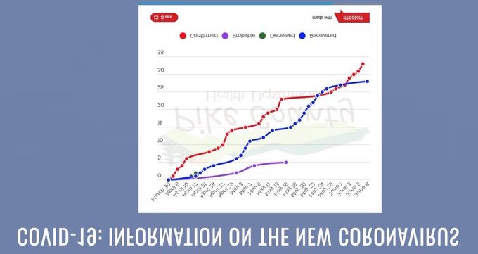
One quick aside on this, if you don’t mind. You may have also noticed that the number of people who Recovered from COVID (the blue series) has also increased. It only appears to flatten out in the most recent few weeks because it lags the Confirmed cases line, which flattened in mid- to late-May, so it will again increase in a few weeks. Disease recoveries are good, of course, but I want to pass along a word of caution. A friend who works in a rehabilitation hospital tells me that her patients who are recovering from COVID–ranging in age from early 30s and up–are remarkably debilitated. Some have had strokes while on ventilators, and some have had limbs amputated because of blood clots formed while in the hospital. Even those without serious complications are still incredibly weak, unable to care for themselves. Please please please take care of yourselves and your families, maintain social distancing, wash your hands, and wear a face mask while out in public. Okay, back to the dataviz….
Does this approach of flipping the vertical axis ever work? I can remember only one such case (from 2014): Simon Scarr’s Iraq’s Bloody Toll graphic published in the South China Morning Post.
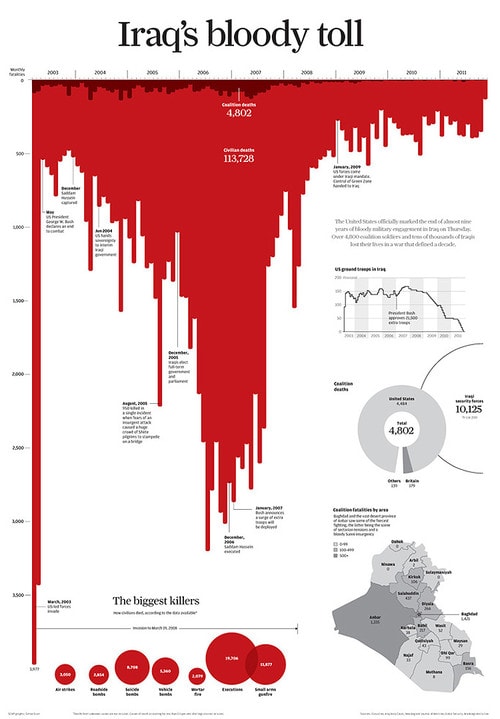
Here, deaths in Iraq (the darker red shows coalition/military deaths and the lighter red shows civilian deaths) are visualized from 2003 to 2011. The vertical axis starts at zero and more deaths track down the page instead of up the page as would be the case in a traditional vertical axis.
There are a few reasons why this graphic works: No matter which way you look at it, you can see the number of deaths declined starting in late 2007. The downward orientation of the bars is a good metaphor for dripping blood, and the bars have rounded edges furthering the metaphor. Andy Cotgreave did a great video explainer on this visual when it came out in 2014. (I still show the video in my classes and it’s worth a couple of minutes of your time.) In it, he demonstrates that you can flip and rotate the graph, change the color and rewrite title to tell a more positive story–deaths are on the decline–but clearly the author’s intention here was to focus on the tremendous number of deaths.
Now let’s take a look at this Gun Deaths in Florida graph that uses the same inverted vertical axis technique and red color.
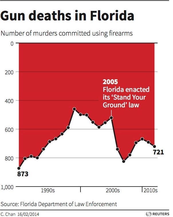
Why does this graph give us a distorted view of the data? Small design judgements change our perspective–the bars have been replaced with an area chart and instead of rounded bars it is outlined by a thick, dark black line. The horizontal axis is placed at the bottom of the space, which makes us more likely to view this graph as a line chart (with white space below) showing a sharp decline in gun deaths starting in 2005 and then a slight increase.
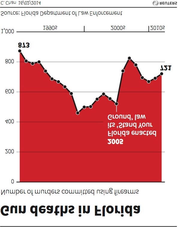
Instead, the actual trend is an overall increase in deaths since 2005, which you can more clearly see when the graph is rotated and flipped. Here, we are more likely to view this as a standard area chart with a black border along the top of the red fill.
Both the Iraq and Gun Deaths graphs are from 2014 and the data visualization community has already discussed and debated them. I don’t mean to bring them up to rehash old arguments, but instead to show how this small data visualization decision of inverting the vertical axis can have large and important impacts on our understanding. And how the technique is still being used to distort information.
The question we need to ask ourselves is whether using an inverted vertical axis is worth the risk of confusing and misleading our readers. Line charts, bar charts, and area charts are some of the more common chart types and thus I suspect many readers take the basic visual at face value rather than taking a closer look at the axes, labels, and annotation. We need to be careful when we create and when we read visualizations to ensure we are interpreting the data correctly.


