Last week, the US Bureau of Labor Statistics published its monthly Employment Situation Summary. A few major issues came to light with this month’s report that I thought worth discussing. First, the attacks on a nonpartisan federal government agency. Second, and more relevant to data visualization, several misleading graphics using the new numbers. Third, variation in all employment numbers.
Attacks on the BLS
Having spent nearly a decade at the Congressional Budget Office, I am sensitive to attacks on the federal civil service. This month’s employment report comes at a difficult time for agencies like BLS where data collection is extremely difficult and traditional economic models may not be sufficient to capture the abrupt change in economic activity.
Even so, attacks on civil service workers—though surely not unprecedented, especially by politicians and other partisans—threatens the objective, science-based framework citizens must rely on. I find it even more distressing when economists—who should know better—unfairly attack the agency because the results don’t fit their expectations.
Are things perhaps strange in this month’s report? Surely. I haven’t found any reports from prominent economists or banks who predicted that the loss of 20.7 million jobs in April would be followed by an increase of 2.5 million jobs in May.
In their consistent efforts to be fully transparent, the BLS has admitted that an error in how furloughed workers were treated in their data sample may have resulted in a higher unemployment rate than reported. This does not mean they “botched” the jobs report or were influenced by politics. It reflects the difficulty of measuring people’s employment status when the traditional categories may no longer apply. BLS employees, like those in many other agencies, strive to do the best they can to serve the country and provide an objective, unbiased view of the economy, the climate, health care, and other important aspects of our day-to-day lives.
Visualizing Employment
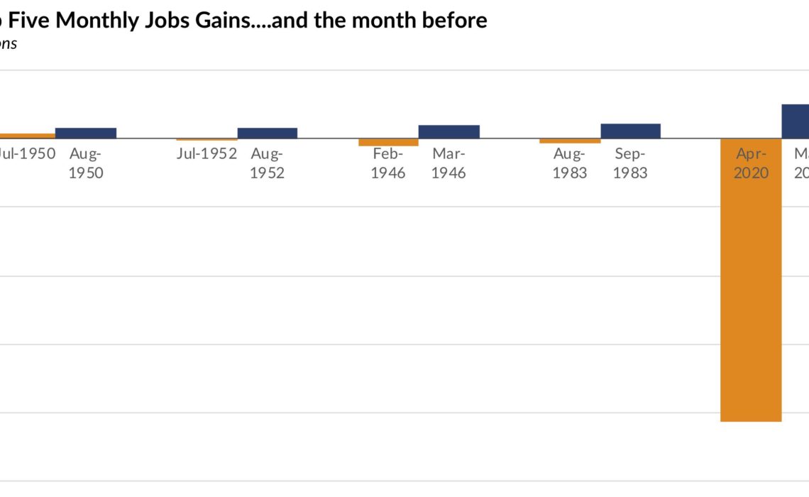
Two graphs caught my attention on Friday regarding the employment report. First, was this tweet from President Trump.
Greatest Top Five Monthly Jobs Gains in HISTORY. We are #1! pic.twitter.com/Cs8NEFbHG0
— Donald J. Trump (@realDonaldTrump) June 5, 2020
Of course, Trump is not one for telling the truth and this graph tells leaves out important information in an effort to tell a story that fits the narrative he desires. Context is everything here: The gain of 2.5 million jobs in May does indeed rank as the biggest single month-to-month job gain since the BLS started collecting data, but it also followed the single largest month-to-month job loss—by more than 10 times!
It’s like saying I gave you $20 last month and you gave me $2.50 this month, and them claiming I made a profit!
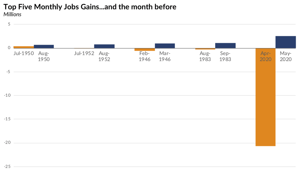
My redesign (tweet here) of this graph more clearly reflects the context.
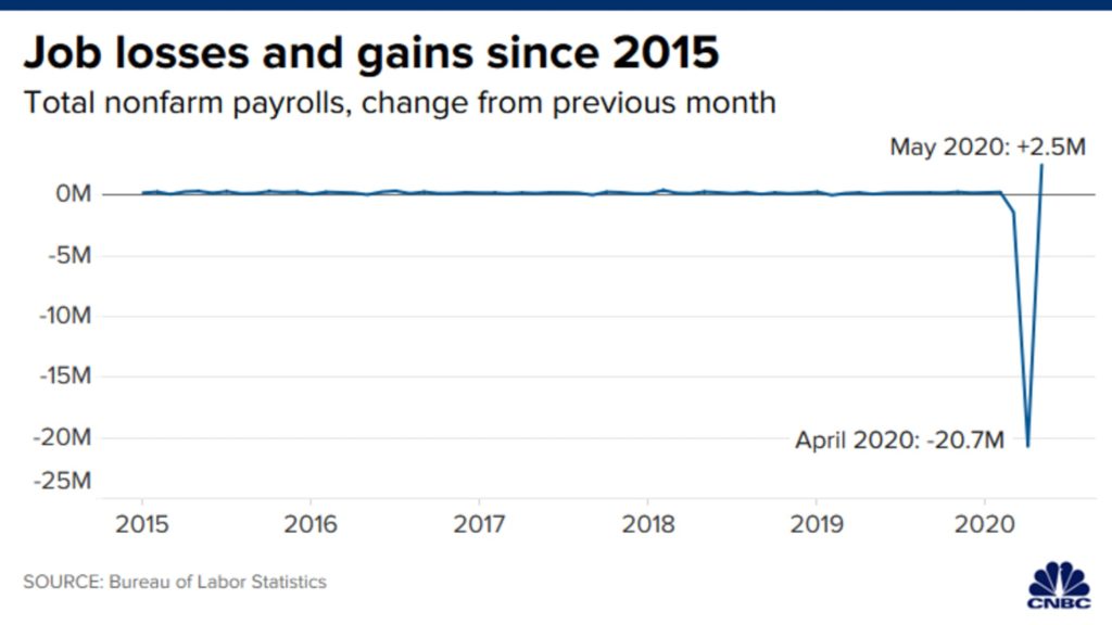
The second graph that painted a misleading story was this line chart from CNBC. Here, the authors show the month-to-month change in jobs from 2015 through May 2020. The chart isn’t as misleading as the President’s but the resulting V-shape appears because the data are encoded as a line. Instinctively, we read this V-shape as a big improvement in jobs, not the change in jobs from one month to the next.
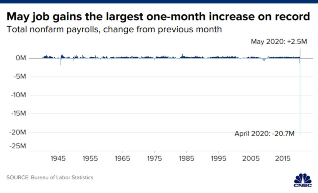
By contrast, using a bar chart—as this one did in a different CNBC article—makes it clear that the big increase in May only followed a huge decrease in April.
None of this is to say the 2.5 million jobs is something to ignore. There are 2.5 million more Americans with jobs this month than last month. But there are still nearly 20 million fewer Americans with jobs than just three months ago.
More generally, I think this highlights a common misunderstanding about percent changes. Our common definition of percentage change is asymmetric, meaning that a rise and fall of the same percentages do not cancel each other out.
Say you invest $100 and you immediately lose 20%. You are now left with $80 (or $100 x .20). If you increase your remaining $80 investment by 20% (that is, $80 x 1.20), you end up with $96, not $100. To get back to $100, you need an increase of 25% ($80 x 1.25 = $100), not 20%.
Many people are not doing this math, so our visualizations need to accurately reflect the numbers and, in this case, the percent change from one month to the next.
Variation in Employment Numbers
It’s convenient for the President, news organizations, and others to tout the 2.5 million job increase last month. But those gains are not shared equally across the country. Especially now, we need to be cognizant of how economic gains can—and are—leaving many people behind.
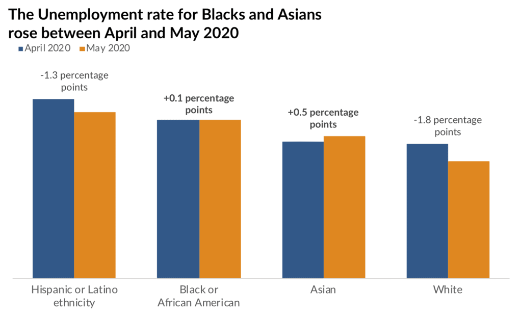
As an example from this month’s report, the overall unemployment rate fell to 13.3% in May from 14.7% in April (ignoring the possible aforementioned issues the BLS has highlighted). But that 1.4 percentage point decline was not shared equally—Hispanics or Latinos and Whites experienced declines in their unemployment rates, but Blacks and Asians saw an increase. Keep in mind that aggregate numbers can mask important sources of variation.
Alberto Cairo consistently asks us to see how charts lie. As data consumers and producers, it is incumbent upon us to spot these errors and call them out. If you see something that doesn’t smell quite right but you’re not sure, trust your gut. Question the source and seek clarity from experts and trusted sources who seek truthful representation of data.


