Last year, I was invited to speak to the Social Security Technical Panel, a group of experts who convene every four years to review the assumptions of the Social Security Trustees, a six-member board charged with overseeing the Social Security system. The Technical Panel reviews the methodologies used to project the finances of the US Social Security system and make various recommendations to the Trustees.
When I was working at the Congressional Budget Office, I attended and presented at Technical Panel meetings to understand (and similarly model) the finances of the Social Security system. This time around, my goal in presenting was to urge the Panel to recommend that the Trustees and the Social Security Administration improve how they communicate their work to the general public. Not everyone is an actuary or an economist, so improving the data visualizations and the language they use in their reports could, I argued, go a long way in helping people–both program beneficiaries and policymakers–better understand the challenges the Social Security system faces.
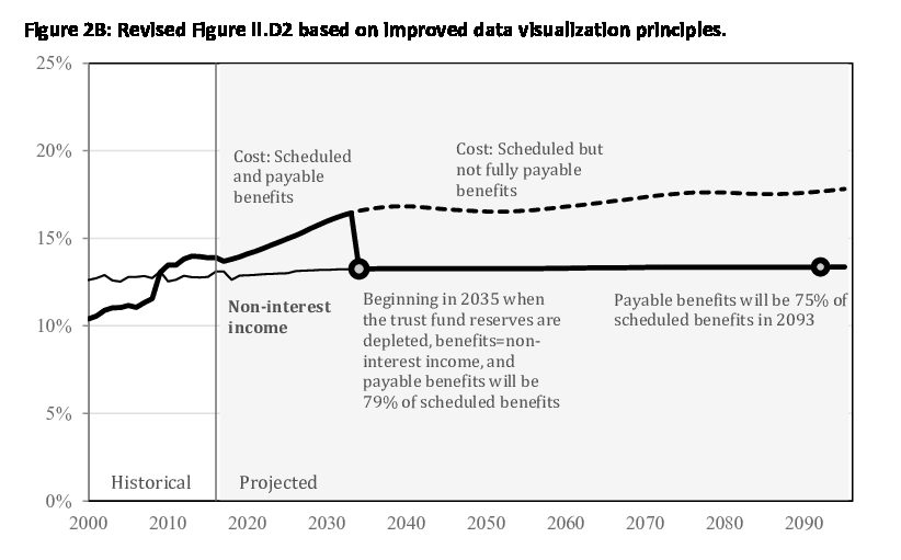
As part of my talk, I showed a step-by-step redesign of one of the primary graphs in the annual Trustees report (stitched together here as a GIF). I made a simple argument: you don’t need to completely overhaul the presentation of the primary results, but instead consider ways to make the graphs clearer and more accessible.

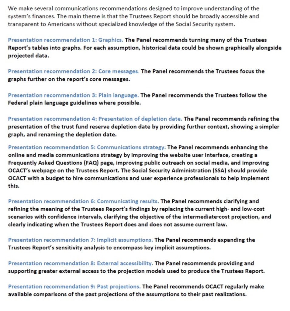
When the Technical Panel’s report was released in October 2019, I was excited to see an entire set of recommendations related to presentation and data visualization.
When the Social Security Trustees Report was released just a few weeks ago, I was even more excited to see that they incorporated the Technical Panel’s recommendations about presentation and communication. In the release, Board Chair Kim Hildred said:
“The Board chartered the 2019 Technical Panel on Assumptions and Methods, in part, to improve the presentation of key concepts in the Trustees’ report. The Board strives to increase public understanding of the Social Security system. I commend the Panel for its hard work and extensive deliberations to help the Trustees’ annual report be more meaningful to policymakers, the media and public.”
While the visualizations in the main report are largely unchanged, the Social Security policy office did create this infographic, which highlights the major parts of the report. They are taking steps in the right direction.
I’m grateful to the Technical Panel for inviting me to speak, and especially grateful they included these recommendations in their report. I am hopeful that these kinds of improvements can ultimately lead to better understanding of public policy and, in this case, the Social Security system.