
TLDR. PowerPoint doesn’t make bad slides and it doesn’t give bad presentations—people do. Here, I refute the arguments in a recent “death by PowerPoint”-type blog post. Though seemingly rooted in academic research, upon further inspection it becomes clear the author did not read the cited research papers. As a result, the author presents an incomplete and inaccurate picture of the impacts of using PowerPoint. Generally speaking, if you are going to rely on research to buttress your argument, be sure you read the entire paper because the abstract or introduction can give a limited view of the findings.
Lots of people like to hate PowerPoint. “Death by PowerPoint” is a refrain we’ve all heard time and again. I don’t think most people blame PowerPoint for bad presentations and instead—rightfully—blame the presenter.
In the canon of “I hate PowerPoint,” it was no surprise to read a recent Inc.com article by Geoffrey James entitled, “It’s Official: PowerPoint Is the Worst Productivity Tool in All Creation.” In his post, James relies on a series of academic articles to buttress his argument that using PowerPoint hampers learning. Unfortunately, it seems he failed to read any of the research papers and therefore gets it all terribly wrong.
In what follows, I address each of the false and misleading claims James makes in his post. As you’ll see, his claims are demonstrably incorrect, and the very evidence he cites instead suggests that PowerPoint is no worse, and often better, than other presentation tools. The passages he quotes appear to be picked from paper abstracts and not the body of the articles—there is more to a published research paper than what is put in the abstract.
Generally speaking, if you’re going to cite an academic paper, you should read it first or, at the very least, skim it. Don’t solely rely on the abstract to give you the entire gist of the study. There may be alternative specifications and varying levels of precision and detail that are expressed more fully in the paper itself. Relying on someone else’s summary—including a journalist—is neither sufficient nor responsible.
Below, I present eight sections of James’ post (offset with large quotation signs) that make various claims about PowerPoint and study results. I have also included links to each cited academic paper if you want to read them for yourself.
Every description of PowerPoint “best practices” suggests using PowerPoint to make your presentation more vivid, alive and entertaining. A common way to do this is to animate your graphs, so that the bars grow into their final position, right before your audience’s eyes. Cool, eh?
Where does this come from? It is completely incorrect. I make no such claim in my book, and many of my favorite books in this area—by Nancy Duarte, Garr Reynolds, and Carmine Gallo, to name just a few—make no mention of making your presentation “more vivid, alive and entertaining” simply, as implied, for the sake of it. All of these authors, and many others that I follow and respect, focus on creating content that is clear and concise, and that helps the audience more easily obtain information. Perhaps a minor point, but one I felt important to make.
Well, it turns out that animated graphs lead to bad decision-making. Robert Cialdini, professor emeritus of psychology and marketing at Arizona State University, and author of the classic business bestseller Influence: the Psychology of Persuasion, showed three groups of people performance statistics for a fictional high-school football player named Andrew. He then asked each group to rate Andrew, as a player, from 1 to 7.
The first group received a hard-copy table of statistics, the second group got a hard-copy of bar graph, and the third group were shown a PowerPoint presentation with animated graphs. The first two groups rated Andrew a 4.5 and 5 respectively. The group that saw the animated graphs rated the Andrew a 6.
Cialdini repeated the experiment using sports fans who were more experienced at understanding such statistics. The first two groups came up with the same number. The group shown the animated graphs rated Andrew as high as the novices had done, as a 6.
Let me be clear: James did not read the Cialdini study. Instead, he lifted the findings from this New Yorker article that he linked to in the next paragraph. Again, if you’re going to use academic research to support your argument, you should read the paper!
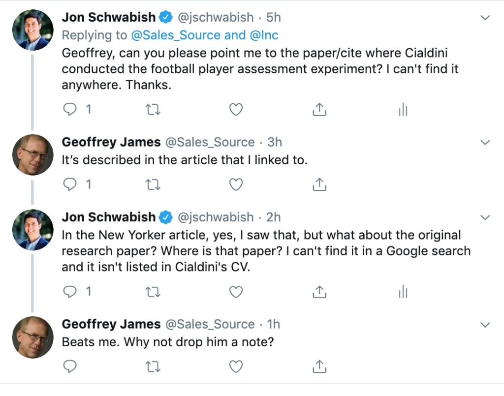
I, however, did hunt down the Cialdini study. It took me a while—the findings are not in Cialdini’s books or listed in his CV, and the New Yorker journalist did not respond to my request. I was able to contact Professor Cialdini directly who graciously shared the link to the 2013 paper published in the Psychology of Popular Media Culture.
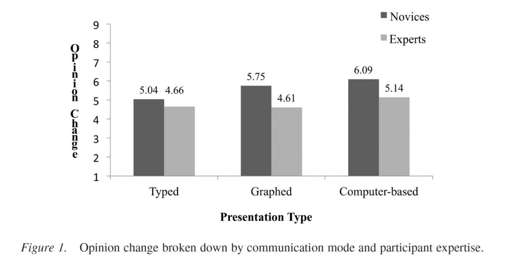
In this case, the New Yorker (and subsequently James’) summary are both incorrect. The basic description is correct—the authors split their study participants into six groups: football expertise level (novices and experts) and the presentation type each person viewed (typed summary of statistics, printed PowerPoint charts, and animated PowerPoint charts).
Here’s where things go awry: Among the experts, there are no statistically significant differences between the three groups. Opinions among the experts who watched the animated PowerPoint charts were slightly higher than the other two groups, but not in a statistically meaningful way. Among the novices, opinions among the group that watched the animated PowerPoint slides were, on average, higher than among the static PowerPoint charts, which were in turn higher than in the typed results.
Of course, all of this seems intuitive, doesn’t it? If I don’t know much about a topic, more engaging (i.e., animated) visual content may be more likely to convince me of something than static content. Similarly, if I am an expert in some area, the ‘bells and whistles’ may not impact my conclusions as much because it is going to take more work to convince me. I should also note that the study authors don’t specify how animation was used—it could be something gratuitous like the Blinds or Checkerboard animation, or could be something more simple (and possibly more helpful) like having each series or category appear one at a time.
In sum, the presentation of these research results in James’ post are incorrect and misleading. In fact, the results may actually suggest that using PowerPoint can help make a convincing case to an audience that consists of people who are not experts in the topic or field—as the authors put it, “the technological sophistication inflated positive opinions, particularly for novices.”
There is one interesting aside that I think is worth mentioning. Among the 116 survey participants (24 female and 92 male), none of the women ended up in the expert group! This gender data bias is the subject of the fascinating new book by Caroline Criado Perez, Invisible Women and is striking here. The authors are aware of this potential bias, though it’s unclear to me how they can claim that, “the absence of women in the sample did not affect our results…”
A similar study of PowerPoint usage at the University of Houston and published in Computers & Education found that “students performed worse on quizzes when PowerPoint presentations included non-text items such as pictures and sound effects.
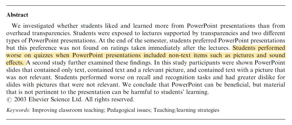
Once again, this is an incomplete representation of the research findings. The results are more nuanced and suggest that relevant PowerPoint content supports learning.
Let’s review the actual study. The researchers had survey participants watch three different types of presentations:
- “Transparency,” where the presenter used plastic transparencies (some of you might remember using these!);
- “Basic PowerPoint,” where the presenter used PowerPoint with only text information; and
- “Expanded PowerPoint,” where the presenter used PowerPoint slides that included not only text but also pictures and sounds. Importantly, the authors state that “Although the pictures did relate to the lecture, the sound effects and how the text appeared generally did not.” This group, therefore, saw information that was not all related to the content of the lecture.
James’ citation from the abstract (highlighted in the picture) only applies to the comparison between the “Transparency” group and the “Expanded PowerPoint” group. I think that finding makes sense—including irrelevant information would, I suspect, negatively affect learning. (The authors also report findings from a second experiment that corroborate these findings and that “unrelated graphics in a presentation have a negative effect on the enjoyment and learning of the material.”)
Importantly, and more relevant to the central issue about the effectiveness of PowerPoint, the authors find that there is no statistically meaningful difference in quiz scores between the “Transparency” group and the “Basic PowerPoint” group. If we don’t care about statistical significance, then it’s also worth noting that relative to the “Transparency” group the “Basic PowerPoint” group liked the presentation better (a mean score of 7.43 vs. 7.24), reported learning more (7.59 vs. 7.38), and had higher quiz scores (8.41 vs. 8.36). It also took the presenter less time to create the PowerPoint slides (1.5 hours vs. 1.83 hours) and were able to cover more information in class (28.5 points made vs. 26.5 points made).
By just reading the abstract, James misses the more important and more relevant finding that it is PowerPoint presentations with irrelevant information that inhibit learning, not PowerPoint presentations in general.
Another study at Perdue University, also published in in Computers & Education found that “students retained 15% less information delivered verbally by the lecturer during PowerPoint presentations.”
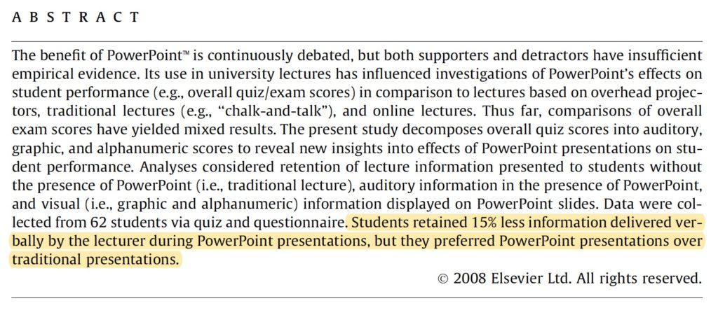
Again, James relies on the abstract (highlighted text above) to extrapolate to the entire paper and, once again, gets it wrong. As with the previous paper, the researchers tested two types of presentations: a standard lecture with no slides or exhibits (“Traditional”) and a presentation using PowerPoint.
The authors did find that students’ quiz scores were 15% higher on average for the first group than the group that watched a PowerPoint presentation, but that was only for verbal (e.g., audio) information. For other types of information—graphics, alphanumeric, and overall, the PowerPoint audience scored higher than the Traditional audience. Students also preferred the PowerPoint presentation in three of the four outcome measures—graphics, alphanumeric, and overall, all of which were statistically significant. The Traditional lecture won out on Discussion scores, though that difference was not statistically meaningful.
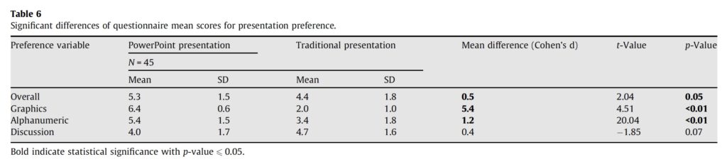
Importantly—and I think correctly—the authors note that, “No one delivery style is optimal for all content and contexts. Therefore, the blind use of a particular presentation type for all course material is not advised… Availability, familiarity, or sheer preference should not dictate the use of educational technologies. Course material (i.e., type of information) and objectives should influence the use of educational technology to develop a learning environment that fosters increased student performance and attitude.” If only James had read the paper.
As yet another aside, both of these first two studies (the first from 2003 and the second from 2009) compare PowerPoint presentations to those using transparencies. I wonder whether a new generation is more familiar sitting through presentations and watching (and using) PowerPoint and how that might affect these results. The world was undergoing a transition from transparencies to PowerPoint around the time of both papers, but does anyone use transparencies anymore? Can you even find a transparency projector? In other words, while these findings are interesting, I wonder if they are as relevant as they once were. If you don’t read the paper, however, you might not ask this question at all.
Yet another study, this one from Harvard, showed that having words on a screen while you’re talking has no effect, positive or negative, on comprehension or retention, making the creation of the presentation just so much wasted effort.
James decided not to link to this study, but I found it in a previous blog post he also wrote for Inc. with the clickbaity (and also incorrect) title, “Harvard Just Discovered that PowerPoint is Worse Than Useless.”
So, let’s look at this more recent study (from 2017). The authors compared the effectiveness of a presentation delivered in PowerPoint to one delivered in Prezi. It is especially worth nothing that this study was funded by Prezi. I don’t doubt the authors’ sincerity when they write that “we took special care not to allow bias or demand characteristics to influence this research,” but the optics of conducting research that finds Prezi is better than PowerPoint is just bad.
To the findings, once again James grabs the abstract summary and pawns it off as the entirety of the research. The basics of the finding are true: survey participants claimed, on average, to have found the presentation to be more organized, engaging, persuasive, and effective in Prezi than in PowerPoint.
But it’s also important to look at the entire framing of the study: Each presentation was less than 5 minutes and presented via Skype on viewer’s computers that were 13 inches or larger. The study is therefore really about the effectiveness of Prezi and PowerPoint in a webinar format. I would argue that watching a (short) webinar is very different than watching a live presentation in a room with a projector, speaker, and audience. It’s probably harder to maintain your audience’s attention in the webinar format, and thus Prezi’s panning, zooming, and spinning effects may be a way to grab people’s attention that simple clicking from one slide to the next doesn’t do (as earlier, we don’t know exactly what kind of animation was used here).
This study suggests that Prezi may be better in a webinar-style presentation, but that doesn’t necessarily make it a better choice overall. In fact, with many of the changes Microsoft has made to PowerPoint over the last year—the Morph transition, Designer, Zoom, and others—it is moving closer to Prezi in different ways.
The authors of this paper also do a nice job summarizing the existing research, which is funny because it refutes James’ entire argument:
“In terms of student performance…findings were notably mixed: Of the 28 studies we identified, 17 found no effect of PowerPoint lectures relative to traditional lectures, 9 found a performance benefit of PowerPoint over traditional instruction, and 2 found a performance benefit of traditional over PowerPoint instruction.
There is near consensus in the literature, however, when it comes student perception: Of the 26 studies we identified, 21 found that students preferred PowerPoint over traditional instruction, 2 found that students preferred traditional over PowerPoint instruction, and 3 other studies found no preference for one or the other formats.”
Also importantly—and also to refute James—the authors specifically note that, “Like others, we caution against technological determinism: Presentation medium is but one of many factors that determine presentation success, and presentations that rely on any given medium can succeed or fail.”
The root problem with PowerPoint is the way it encourages you to think, according to Edward Tufte, arguably the world’s foremost expert on information design.
I don’t know why Tufte is considered an expert on presentation design (for better advice, check out any of the books in this list). He has provided little, if any, practical advice on how to give an effective presentation and has instead concentrated his efforts on criticizing PowerPoint. If you’ve ever attended one of his Presenting Data and Information workshops, you’ll know that he spends the entire day presenting material on slides (see this critique). Ironically, he argues instead of using PowerPoint, you should instead print your material on an 11”x17” piece of paper, let people read it, and then let them ask you questions. He doesn’t use that strategy in his workshop, but he recommends it to the rest of us.
Does Tufte use PowerPoint? Of course not—he uses Keynote! But is Keynote really that much different than PowerPoint? According to Tufte, yes. But both programs have some of the same bad animations, 3D charts, and other ineffective options.

In his Cognitive Style of PowerPoint screed (2003), Tufte laments the lack of information and data-dense graphs in a set of case studies (in my view, it’s a limited set of case studies). You can examine the document on your own if you like, but for my purposes here, it is worth going to the end where a postscript responds to this key question:
“The problem is with presenters who misuse PowerPoint. PowerPoint is just a tool; why blame the software for bad presentations? When a carpenter makes a crooked cut, do we blame the saw? Just because some people do silly things in PP doesn’t mean that PP has a problem; people do silly things in written reports also.”
Tufte responds:
“This makes one good point: responsibility for poor presentations rests with the presenter. But it is more complicated than that. PP has a distinctive, definite, well-enforced, and widely-practiced cognitive style that is contrary to serious thinking. PP actively facilitates the making of lightweight presentations.
This essay reports evidence based on several thousand slides, 5 case studies, and extensive quantitative comparisons between PowerPoint and other methods of communicating information. The results are clear: some methods of presentation are better than others. And PowerPoint is rarely a good method.
…
Nearly all the evidence of the essay suggests that there is inherent defect in PowerPoint, unless one advances the entertaining alternative hypothesis that nearly all PP users are lightweights and nearly all users of other methods are not. This is not the case; PP has inherent defect.”
Two portions are worthy of some response:
- “This essay reports evidence based on several thousand slides, 5 case studies, and extensive quantitative comparisons between PowerPoint and other methods of communicating information.” Tufte’s evidence is weak, uncited, and unsubstantiated. His “several thousand slides” likely refers to the various PowerPoint how-to books he supposedly examined, but there is no list of books or citations provided. It’s unclear what “extensive quantitative comparisons” he is referring to, but he does not perform an evaluation like those in any of the papers cited above.
- “Nearly all of the evidence of the essay suggests that there is inherent defect in PowerPoint…” In fact, his evidence suggests that the slides he found are poorly designed. Leaping from his small sample size to the world writ large is an obvious extrapolation fallacy. Nothing he shows or claims demonstrates that the PowerPoint software tool itself includes some kind of fatal flaw, nor does he show that PowerPoint has some innate malicious toolset that is not also a part of other software programs.
Tufte has built part of his reputation on bashing PowerPoint and suggesting that no, it’s not just a tool that people can use well or poorly, but that PowerPoint itself is responsible for bad slides. But I believe PowerPoint is just a tool, and like any tool it can be used well or poorly. I am, of course, not alone in this opinion and even the authors of the Harvard study feel the need to note that by using the word “PowerPoint” they are referring to the Microsoft product, not some other similar tool like Keynote: “When we say PowerPoint presentations, we mean presentations that were made using Microsoft PowerPoint, not other software such as Apple’s Keynote.”
Of course, PowerPoint isn’t without its flaws and poor defaults (though I think the defaults are getting better). Whether PowerPoint is better than the Keynote tool that Tufte uses—or any other tool for that matter—is largely a subjective matter for users. But Tufte provides little real evidence that PowerPoint presentations are in fact worse than other presentation approaches, and the body of academic research also suggests that this is not the case.
In other words, PowerPoint makes your organization dumber. That’s why, incidentally, that PowerPoint is so excellent as a Sales tool (as opposed to a productivity tool.) PowerPoint dumbs the customer down, making them more likely to make a buying decision based on bells and whistles rather than actual information.
I wonder how people in Sales jobs feel about being called dumb? The research James cites, but has clearly not read, suggests that PowerPoint is no worse—and perhaps even better—than other presentation strategies. I am not defending the use of many of the PowerPoint transitions and animations—who is using the Checkerboard animation?!—but (as opposed to Tufte) I believe that it is the user, not the tool, that creates bad slides and delivers bad presentations.
Finally, let’s look at James’ two suggestions for making your organization “smarter rather than dumber”:
- Ban PowerPoint from your workplace. That’s for all internal meetings but especially when people from outside your organization are trying to sell you something.
I’m not sure why you would do this. Aside from the evidence shown above, PowerPoint has lots of other uses including designing memos and infographics. I suspect PowerPoint also suffices for some of the basic graphic design needs for many organizations such as creating shapes, logos, and basic templates, all of which could also be developed in the harder-to-use and more expensive Adobe Creative Suite. I also suspect that many (most?) of these kinds of organizations rely on other parts of the Microsoft Office suite already, so why would they purposefully delete PowerPoint? This argument makes little sense, either strategically or practically.
- Start every meeting with a group reading. Prepare a short document summarizing the issues, providing some analysis, and defining the decision that’s to be made.
I actually like this recommendation, though I would tweak it to have people read meeting materials before the meeting. That way, meetings can focus on discussion and decision-making instead of debating details and minutiae likely more easily understood and absorbed beforehand when reading the materials. And why can’t PowerPoint be a viable tool to prepare these short documents? Personally, I find it much easier to lay out text, graphs, and other images in the blank canvas that is a PowerPoint slide than in the margin- and tab-restricted world that is Microsoft Word.
It’s true that I’m a PowerPoint user. I think it’s a great tool and I use it for my slide presentations as well as memos, handouts, infographics, and more. It’s not perfect—I could go without the swirly transitions and animations, and I wish they would drop the 3D exploding pie charts—but it works really well for my purposes. Personally, I don’t love Keynote or Prezi, but that doesn’t mean they are bad tools (I do basically like Google slides, likely because it mimics the PowerPoint environment).
If you’re a PowerPoint user, it’s completely fair to criticize the tool. It’s fair to make the case that it promotes bad practices and has too many options and bells and whistles. It’s also fair to claim that it hampers learning. But, if you choose to use scientific research to support your claims, please read the research and do not rely on summary-level bullet points or news articles. This is not an easy task and requires more time and examination, but as experts, authors, and thought-leaders, we have a responsibility to present clear, responsible arguments.
Thanks to Bruce Farrell, Stephanie Lewis, Marshall Makstein, Tony Ramos, and Julie Terberg for their comments and suggestions on this post.
Featured Image by Teemu Paananen on Unsplash
References
Bartsch, Robert A., and Kristi M. Cobern. “Effectiveness of PowerPoint presentations in lectures.” Computers & education 41.1 (2003): 77-86.
Guadagno, Rosanna E., et al. “The opinion-changing power of computer-based multimedia presentations.” Psychology of Popular Media Culture 2.2 (2013): 110.
Letrud, Kåre, and Sigbjørn Hernes. “Affirmative citation bias in scientific myth debunking: A three-in-one case study.” PloS one 14.9 (2019): e0222213.
Moulton, Samuel T., Selen Türkay, and Stephen M. Kosslyn. “Does a presentation’s medium affect its message? PowerPoint, Prezi, and oral presentations.” PloS one 12.7 (2017): e0178774.
Parker, Ian. “Absolute PowerPoint: Can a software package edit our thoughts?” New Yorker magazine, May 28, 2001, 76-87.
Savoy, April, Robert W. Proctor, and Gavriel Salvendy. “Information retention from PowerPoint™ and traditional lectures.” Computers & Education 52.4 (2009): 858-867.
Tufte, Edward R. 2003. The Cognitive
Style of PowerPoint. Graphics Press. Connecticut.


Very interesting, thoughtful, and helpful information! More context is always welcome and I learned a lot from your analysis.
The second suggestion James makes is very similar to Tufte’s suggestion, which I might add he *does* do at conferences, to a point… he usually has paper handouts. However, I don’t think its so easy to ask people to do advance preparation for most meetings. Tufte in fact talks about this and how he tried asking people to read in advance but it didn’t work, most people just show up not having read it. So, I wouldn’t modify that second suggestion, I think just using the time from the meeting is the most efficient and respectful of people’s time.
This was wonderful. I am gathering information on the effectiveness of PPT and I found this to be extremely helpful. I appreciate greatly the time and energy you put into debunking the myths being put out there by others. Too many people are guilty of skimming the high points and passing it off as fact. This was a reinforcement for me and I hope it is for others as well to dig deeper into the research.