
Spoiler alert! This post is going to ruin the end of the movie Avengers: Infinity War. The movie was released in April of this year and grossed more than $2 billion worldwide, so if you haven’t seen it, you probably don’t care about having the ending ruined. But, in case you’re the one person who reads this blog, likes superhero movies, hasn’t seen the movie, and doesn’t want the ending ruined, here’s a gif of the bad guy, Thanos. You can go ahead and close your browser now.
Okay, now that it’s just the rest of us, let me tell you about the ending of Infinity War. The Avengers fight Thanos, the intergalactic bad guy whose goal is to collect all six Infinity Stones and put them in this cool-looking metal glove. With the power from the Stones, Thanos plans on saving the universe by eradicating half of all life.
What would eradicating half of all life in the universe look like? I don’t know how many people live in the entire universe, but I can get estimates of the number of people who live on Earth. So, just for kicks, I simulated what the world’s population would like if you randomly killed half of the roughly 7 billion people on the planet.
The simulation was relatively easy. I downloaded population estimates for each country in 2017 from the World Development Indicators database at the World Bank. I assigned a uniformly-distributed random number (bounded between 0 and 1) to each country and multiplied it by each country’s 2017 population. I then calculated the gap between this new global population and the actual 2017 population. I then uniformly redistribute the gap between to hit my target of half the 2017 population. In other words, if I initially kill 100 million people too many, I uniformly put them back in countries across the world, making sure that the population in no country goes negative or above its 2017 population. Once the framework is set up, I ran 200 simulations in the same way.
Notice that I’m not stratifying by country type, region, or demographics. I don’t know Thanos’ training in statistics, but I, like others, have wondered what his sampling framework looks like. Stratifying by location or demographics could ensure that no category (in my case, country) completely disappears. But, I digress. Anyways…
Visualizing the Results
The challenge then comes in visualizing the results. My instinct is to show a choropleth map and then animate through the 200 simulations. Populous countries like China and India become problematic because even in simulations where they lose lots of people, they are still very large countries. There are nearly 1.4 billion people living in China—even if half disappear, it is still the second-most populous country in the world (behind only India), still more than double the number of people in the United States. So most maps would likely show China and India with dark colors and little color variation across the rest of the world.
The other way to deal with these large countries is to take the natural log of everything. I generally shy away from using logs mainly because I’m not sure many people will understand them. But in this case, it might be fine (also because this is just a fun exercise, not a real viz).
The other thing I can do is to combine the map with another visualization type—I thought histograms work nicely. The histogram gives you a good view of the distribution of countries at different population levels and how they change between the different simulations. (I also considered a morphing cartogram, but I didn’t feel like learning how to do it in D3 or some other programming language.)
All that being said, I created dashboard in Tableau with a histogram paired with a choropleth map. I clicked play and recorded the results in the videos below. The first uses population measured in levels with the histogram above and map below. The second measures everything in logs and I include a third graph in the top-right of the number of countries with no population. You can see more variation in the map with logs. In both cases, I highlight China and India.
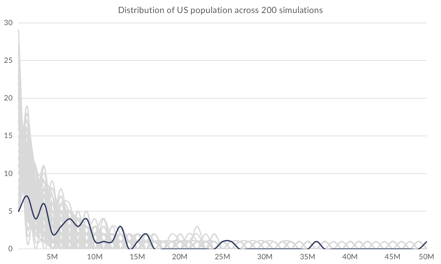
Because I live in the US and have US population data sitting on my computer, I did the same thing for the US. While California, Texas, Florida, and New York are all large states, they are not magnitudes larger than other states in the country. Thus, using population levels seems to work.
You can see all of the US simulations in this smoothed histogram. The dark blue line represents the actual 2017 population, and you can see how the population gets pushed to the left side.
I’m not sure what the upcoming Captain Marvel movie will bring, but it promises to give us some hope that the Avengers will be able to save all of us in the Avengers 4 movie coming next year. Maybe there will be another visualization to make.


Hi can i get the real data set of how many people died in avengers infinity war actually more probably in endgame i mean when in infinty war the snap happened some people were in airplanes some in boat some riding cars and i think the people who have died of natural causes like the plane crash when pilot is dusted or the car crash………boat captain dusted and people in the boat died from hunger etc etc and these people can’t be bring back from the second snap when hulk did it………..I hope u r getting what i mean…………Is their ant data set related to this plz e-mail me if u can!!!!