The histogram is one of the most basic ways to visualize the distribution of your data. It’s a specific kind of bar chart that presents the tabulated frequency of data over distinct intervals (called bins) that sum to the total distribution. The entire distribution is divided into these bins and each bar shows the number of observations within each interval.
Histograms are useful to help show where values are concentrated within a distribution, where extreme values are, and whether there are any gaps or other unusual values. Histograms do not necessarily need to be bar charts—line charts and area charts, for example, are also viable substitutes. With any of these, however, careful decisions about color, font, and lines can help your reader better understand the data. In this post, I walk through a variety of design decisions when it comes to using histograms.
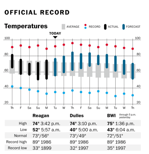
Let me first start with a quick discussion about visualizing distributions. Graphs that depict the distribution of a data set or statistical uncertainty may be difficult for some readers, not because the graphs themselves are overly detailed or complicated, but because many people don’t have the statistical or numeracy knowledge to fully understand and appreciate them. Charts like the fan chart and the box-and-whisker plot show statistical measures like confidence intervals and percentiles, metrics that are not familiar to many readers. This doesn’t mean that these charts are inherently bad at visualizing data—proper labeling and design can make even the most esoteric box-and-whisker plot interesting—but the lack of statistical understanding may make such graphs difficult for many readers. This graph, for example, is shown on the weather page of the Washington Post every day—it’s essentially a box-and-whisker plot but shows temperature instead of percentiles.
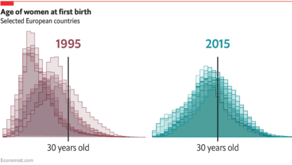
There are lots of great examples of histograms shown well. As an example, I like this set of layered histograms, for example, from the Economist graphics team. Even though the distributions for the different countries are not all labeled, you can clearly see a shift in the age distribution as it moves closer to the indicated line for 30 years old. I wanted to try my hand at making something like this in Excel and while there was a somewhat interesting technical challenge for one approach, it got me thinking a bit more about the best way to plot distributions.
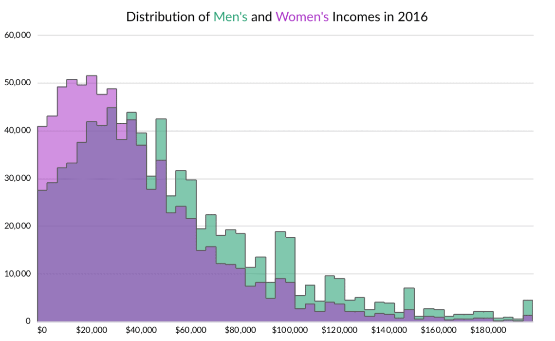
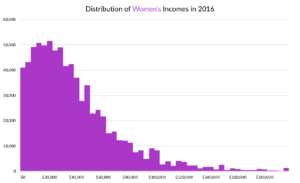
For this exercise, I use wage and salary income data from the 2016 American Community Survey for men and women. I only look at positive incomes that are less than $200,000 for people between the ages of 16 and 65. I don’t control for work status (full- or part-time), industry, or anything else; my focus is on the graphs here, not the details of the data tabulations.
1. Paired Histograms. These are clean and easy to read on their own, but it’s more difficult to compare the distributions to one another. You can get a quick sense that there are more women with lower incomes than men, but you can’t really see where they cross, and the magnitude of the shift is not quite clear.
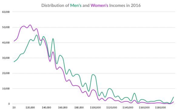
2. Overlaid Line Charts. Putting the two series on the same chart solves the c
omparison issue that comes up with the small multiples version. I’m not sold on the line chart version—its lacking some visual weight and the crossing point becomes more of a focus rather than the area under the curve, which, for purposes of comparing the two distributions, is of greater interest. In other words, is it important that the two lines cross around $32k or that the distribution for men is shifted towards the right relative to the distribution for women?
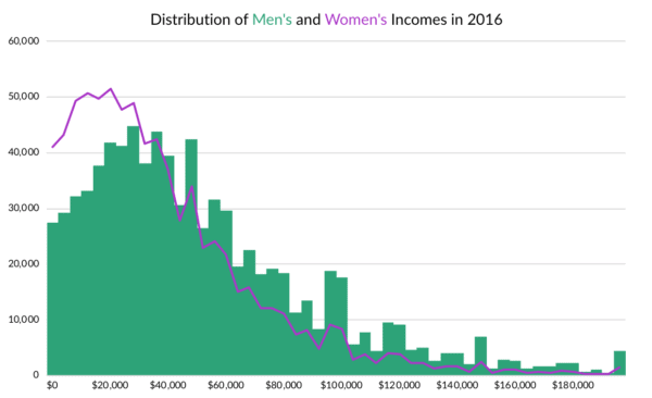
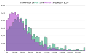
 3. Combination Line and Bar Chart. This again solves the comparison problem, but there’s an imbalance in the encoding (bars and line) that is not quite satisfactory. If my goal was to focus on the distribution of men’s income and was making a less-detailed point about the women’s distribution, this approach might work (though in such a case, I would make likely different color decisions).
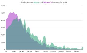
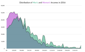
4. Overlaid Area Charts. I think this solves the visual weight and the focal point issues. You can clearly see the differences in the two distributions. I also prefer the version with the lines at the top because it visually helps bound the edges of the areas. The downside of the area chart version is that it suggests the data are continuous when instead the bins are discrete and divided into $4k buckets (the underlying income data is, of course, continuous).
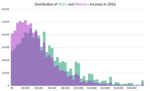
5. Overlaid Bar Charts. Probably the standard way to present distributions. It solves the visual weight and focal point issues. It also suggests that the data are discrete. In Excel, adding the outlines to make the definition of the bins clearer gives the graph bit more of a stacked bar chart look, which I don’t want (and is not accurate). Eliminating the outlines could work, but again, I liked the outlines in the area chart, so I want to repeat that here.

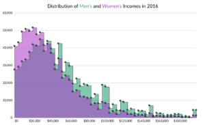
Another option, which gets us back to the original Economist graph, is to include the outline only at the top of each bar. To do so in Excel, I need a little trickery. As you can see from the line-bar combination chart, I can’t use a line chart for the outline (which is how I did it in the area chart) because the line intersects the middle of each bin. I could generate new data to create a line chart with multiple values for each bin, but I think I have a better way: I added scatterplots to the left corner of each bar and then added vertical and horizontal error lines. For each error line, there is a negative vertical error line that is the difference between the two series (so that it doesn’t drop all the way to the horizontal axis), and a positive horizontal error line that equals one. In this way, both distributions are better defined and it doesn’t require creating that much new data or series.
The histogram is just one way—maybe the most basic way—to visualize the distribution of your data. Other graph types to show distributions, like the box-and-whisker chart or beeswarm plot, either show specific points or all the points. Because some of these charts are less familiar, they may be harder to read and understand. By comparison, because the typical histogram is a bar chart, I suspect people can easily read it. Some of the design decisions we make regarding color (and transparency), lines, and overlaps can be important features to help our readers understand our data.
What do you think? Do you have a histogram preference? Let me know in the comment section below or on Twitter.


I love that temperature chart from the Washington Post. I think Tufte would be proud.