Think of all the things you learned in elementary school: How to read. How to write. How to count. How to do add, subtract, multiply, and divide. These are all learned skills, things that we are not innately born knowing how to do.
Just like these, reading graphs is a skill. We might be taught how to read line, bar, and pie charts in elementary school because they have been around longer than others and are used the most. But there is a wide array of graph types outside of these standard types that we can use to visualize data. In the right context—with the right content—some of these graphs are inherently better than standard graphs while other times they enable us see patterns and relationships that might not be as apparent in standard forms. I’m a big believer in helping people better understand how to read all kinds of graphs—the concept of a ‘graphic literacy’ that is a learned skill like any other.
My hope is that we can help people can expand their graphic literacy so that the next time they open their newspaper or open their favorite tool to create a graph, they don’t feel bound by the graph types in the default menus.
Last week, I was offered the opportunity to work with my youngest workshop attendees when I visited my son’s 4th-grade classroom. I’ve made guest appearances to my son’s and daughter’s classes in the past, mostly talking about economics or what the day-to-day job of an economist looks like. This year, I focused on data visualization and tried to educate and entertain them at the same time.
I approached the class with three goals in mind: First, I wanted to show them different graphs. Second, I wanted them to do something. And third, I wanted them to have fun. Here’s how I approached the day, followed by some reflections.
Expand their graphic literacy
I’m not foolish enough to think I could teach 30 kids an array of new graphs in one afternoon, but I could at least help them understand that there’s more to the world than line, bar, and pie charts. I primarily focused on maps because they are familiar, even to nine-year olds. I also wanted to keep it light, so I showed them a simple map of the United States, asking them to identify certain states. I showed them a map of the world, asking them to find the United States and Australia.
I then introduced the term “choropleth” and showed them this map of graveyards in the US and this map of McDonald’s (a couple of kids actually tied the two together!). I also showed them a clip of Aron Koblins’ Flight Patterns project (my son loves this one)—the simple and intuitive animation, and black and white color scheme make it easy to follow. I also showed them a video of Martin Wattenberg and Fernanda Viegas’ Wind Map, again, something I think they could all relate to.

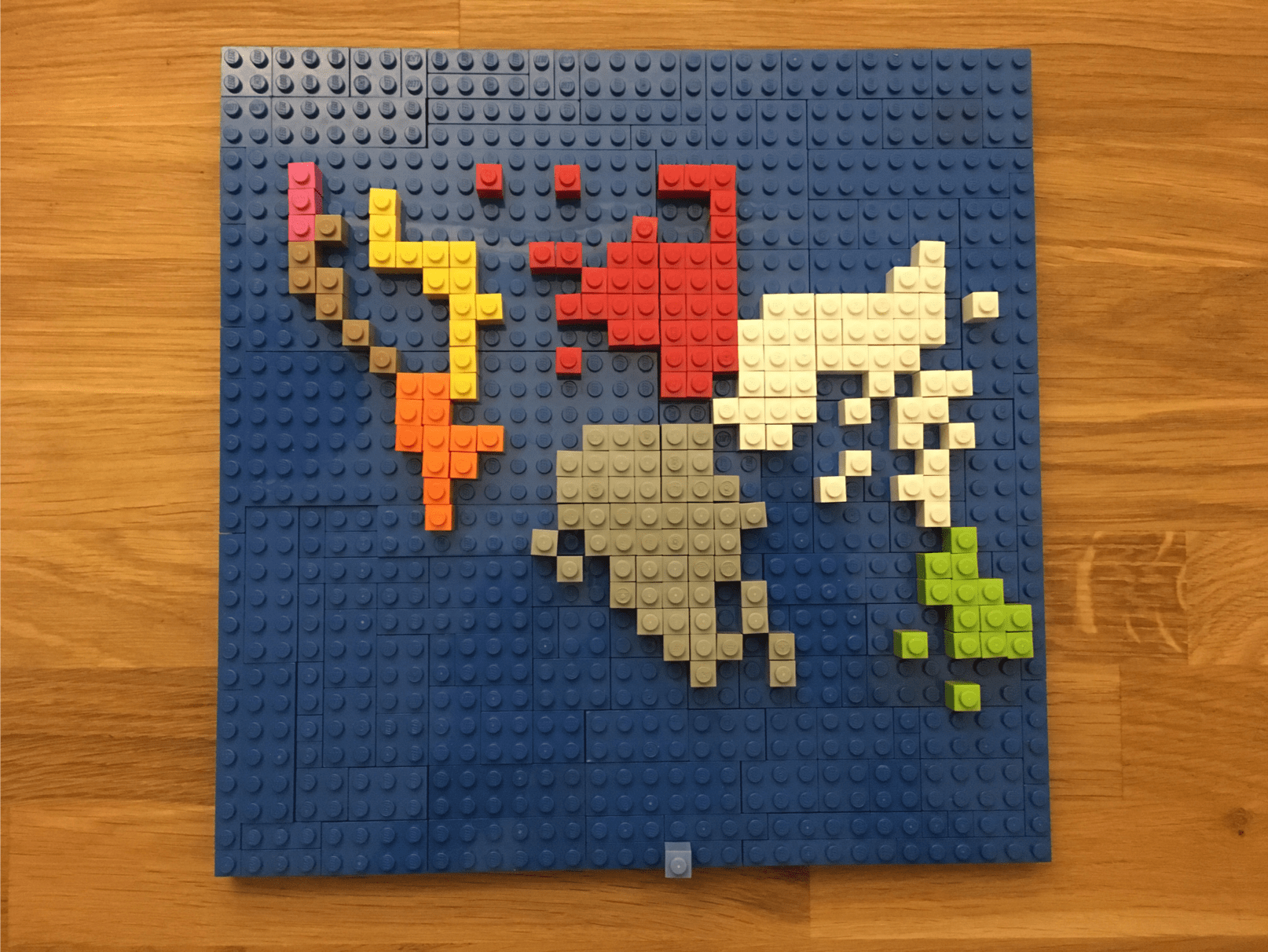
I also showed them some alternatives to the standard choropleth map, like my world tile grid map and the Lego version my kids and I created. I think they loved this emoji map from National Geographic the most (“Why aren’t people in Virginia as happy as people in Arizona?”). I also showed them some other graphs, like this clever Sankey diagram I found on Reddit and a histogram of finishing times in the New York Marathon.
Draw something
Next, I wanted them to be able to do something. In classes and workshops, my go-to exercise is to give people two numbers and have them draw as many graphs as they can on Post-It notes. It’s an exercise about quantity, not quality, and it gives people an opportunity to get away from their computers, flex their creative muscles, and not worry about whether they can create their ideas on the computer.
This wasn’t going to work for fourth graders, so I tried something new. At the Information+ Conference a few weeks ago, Valentina D’Efilippo talked about an exercise she conducts in her workshops and with clients: She asks people to draw a map of the world. It’s so simple and, as you might expect, people center their maps in different places depending on their background. Once they have their map, they get a piece of tracing paper, lay it on top, and start adding data: where they’ve been, their impressions of different countries, whatever they want to add with whatever shapes or encodings they like.
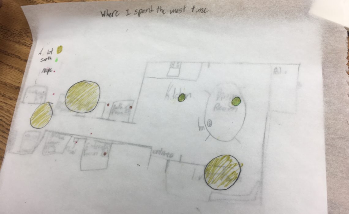
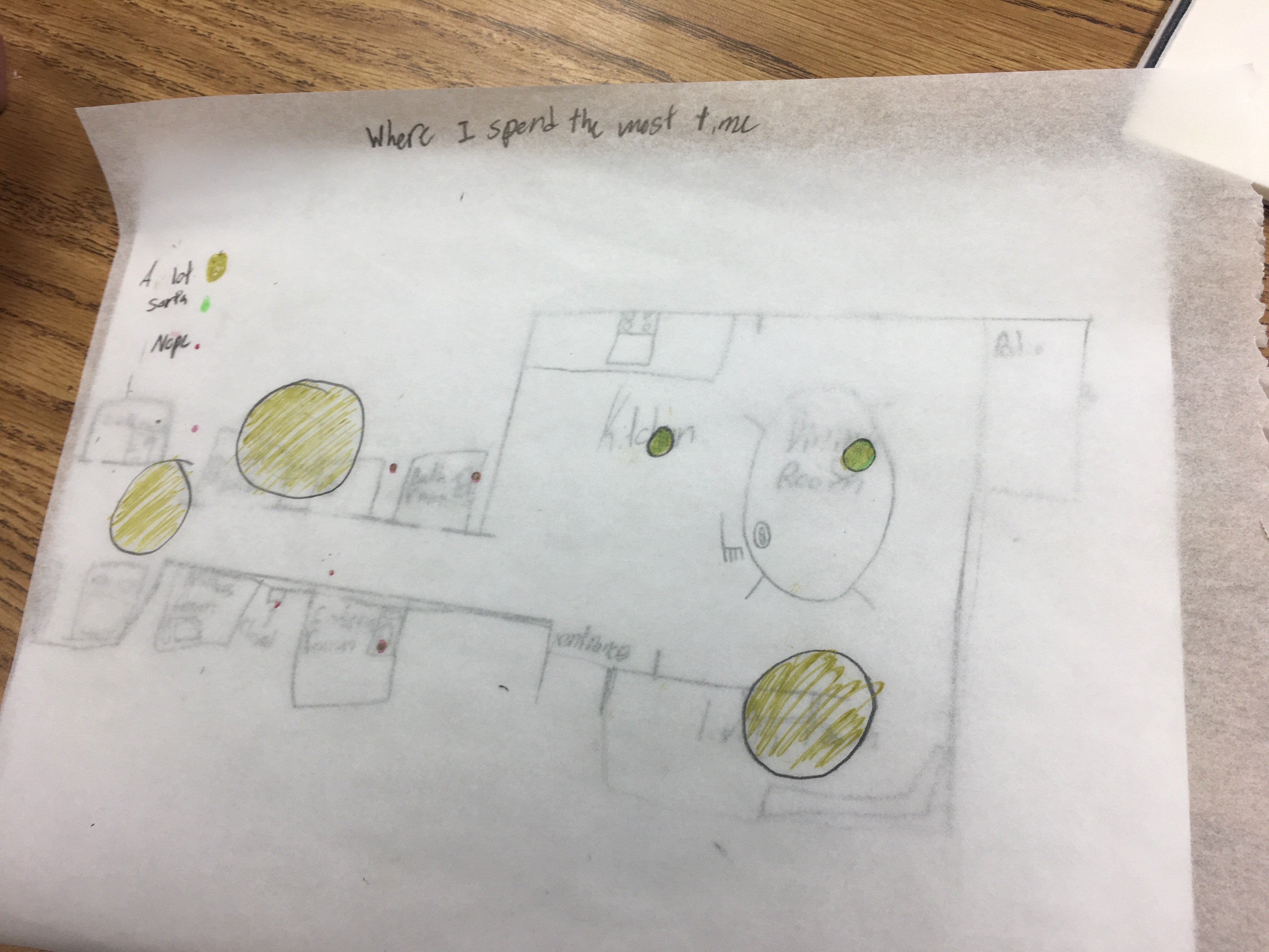
I asked Val about doing this exercise with kids and she suggested having them draw maps of their homes instead of a map of the world (genius!). I showed the kids a simple example, gave them a piece of paper, and they went to it. Some included the street outside their house; some drew just a single room; some drew their bedrooms; others their playrooms—but they could all draw this simple map.
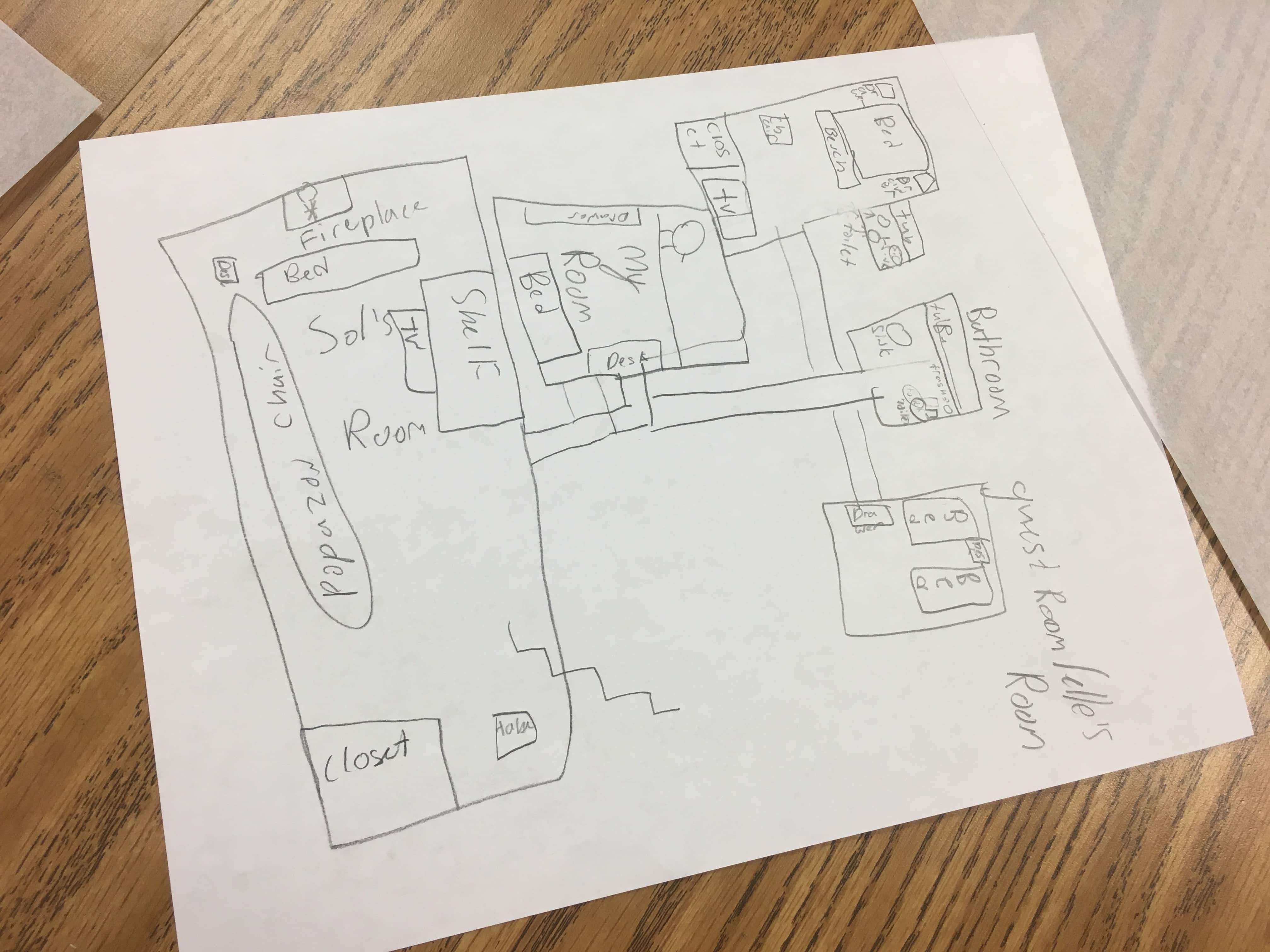
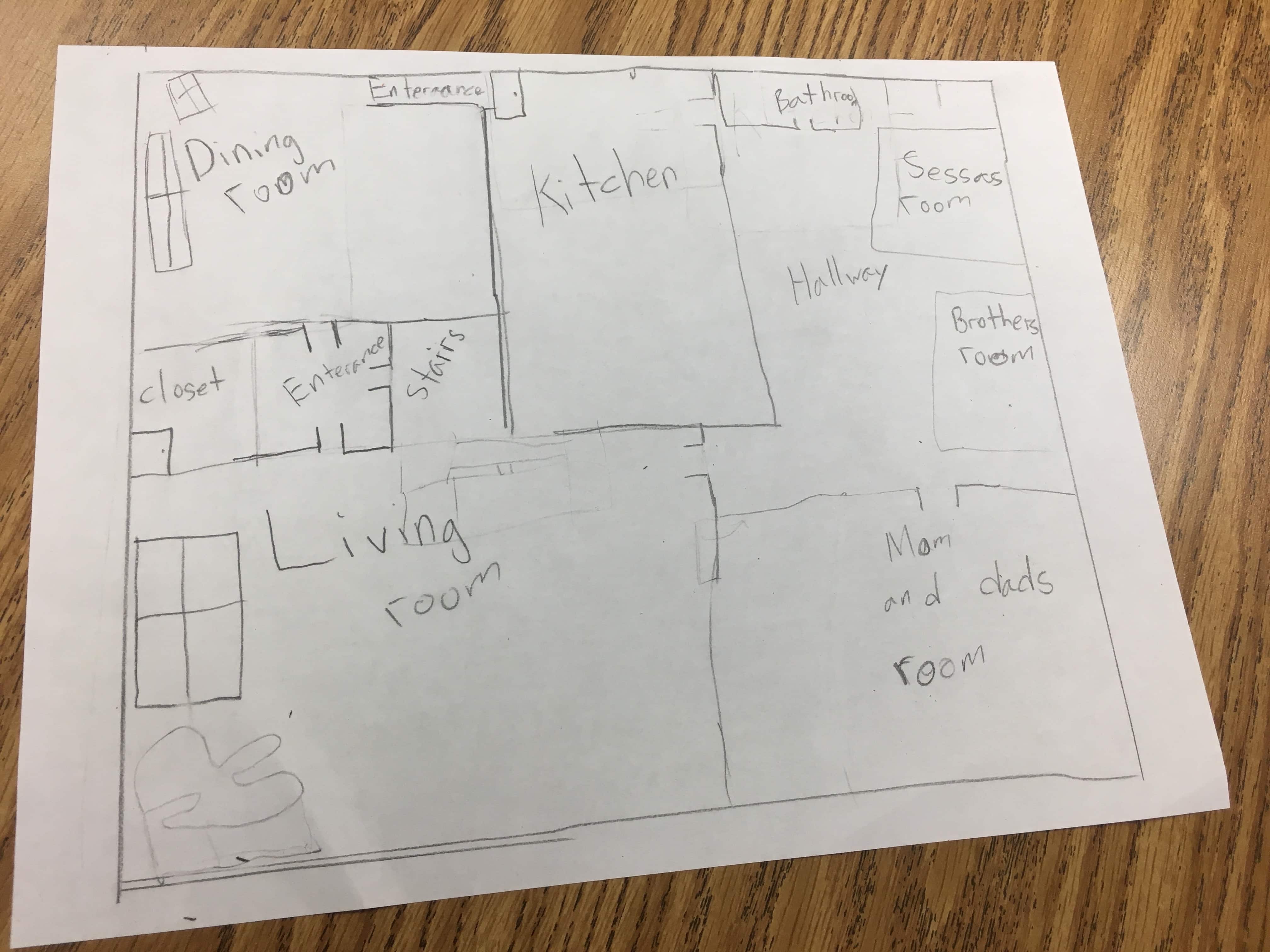
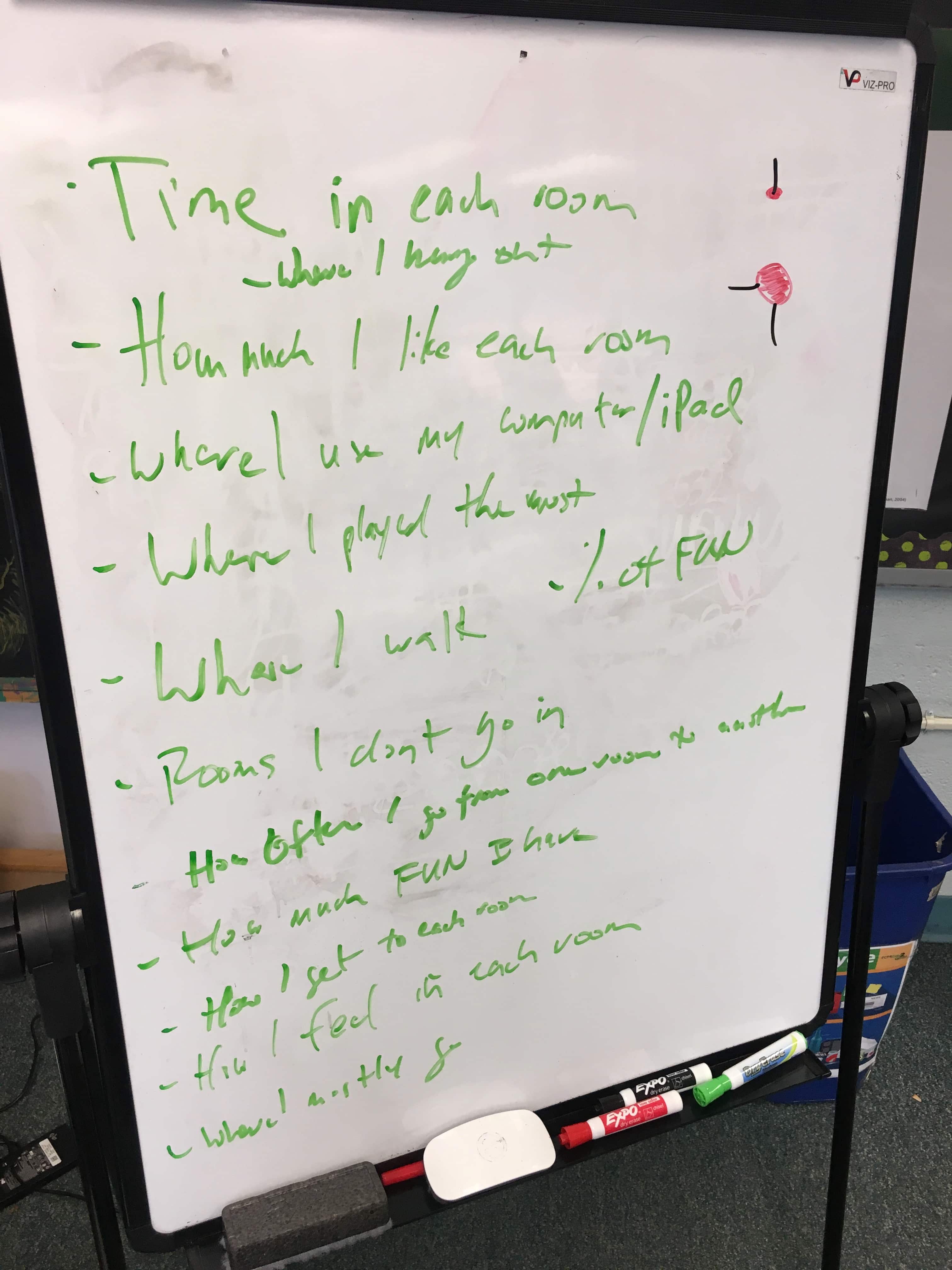
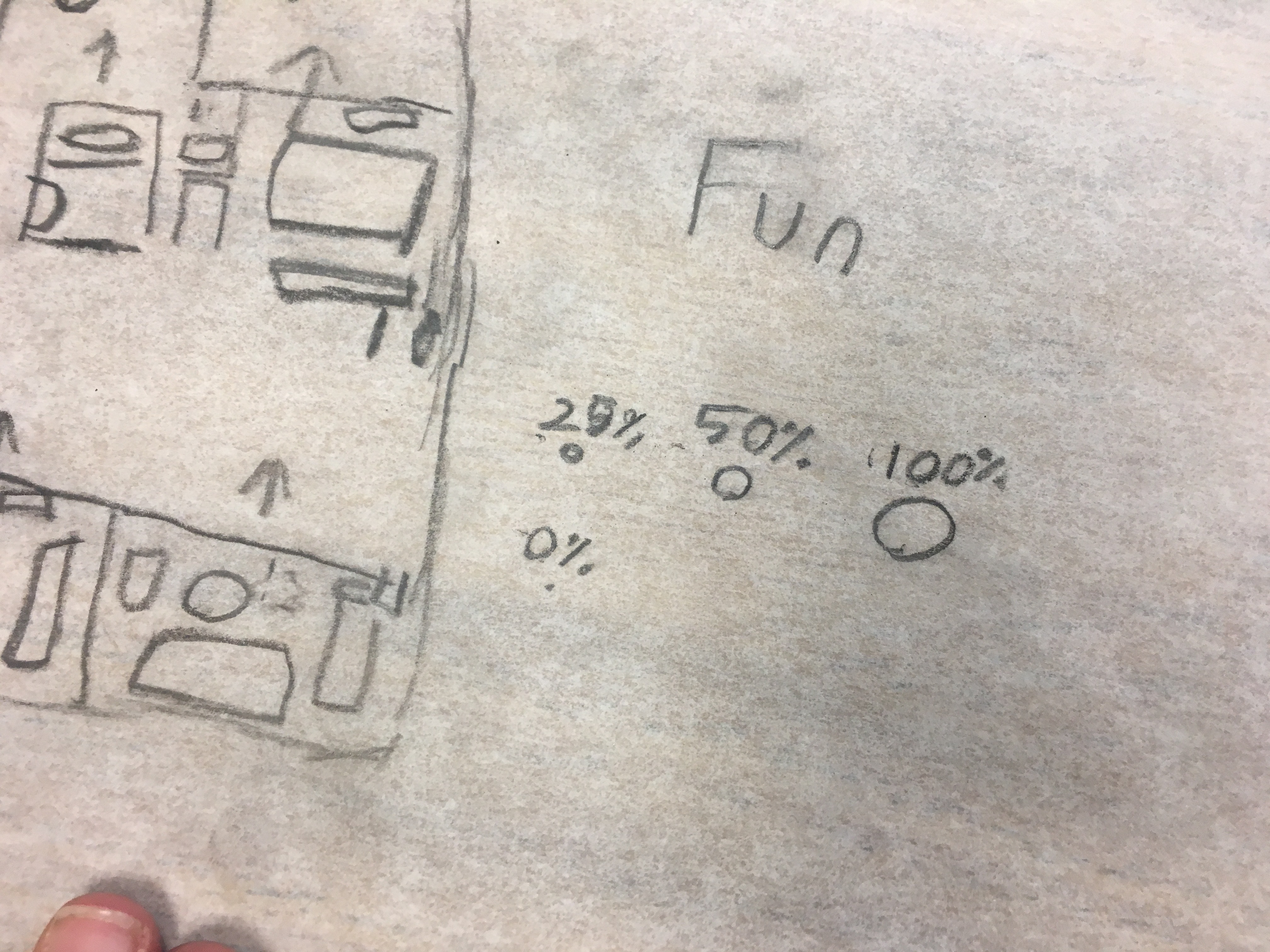
I then passed out tracing paper and, bringing up the graphs I showed them earlier in which color, dots, lines, and bubbles were placed on top of the map, I asked them to plot any data they liked. Here, I had to prompt them a bit (and, again, thanks to Val for help here): Could they add differently-sized bubbles to their favorite rooms? Could they draw lines showing their paths through the house? What about smiley faces for the most fun room? They came came up with a pretty good list (yes, that’s my terrible handwriting) and some pretty good maps.

Have fun
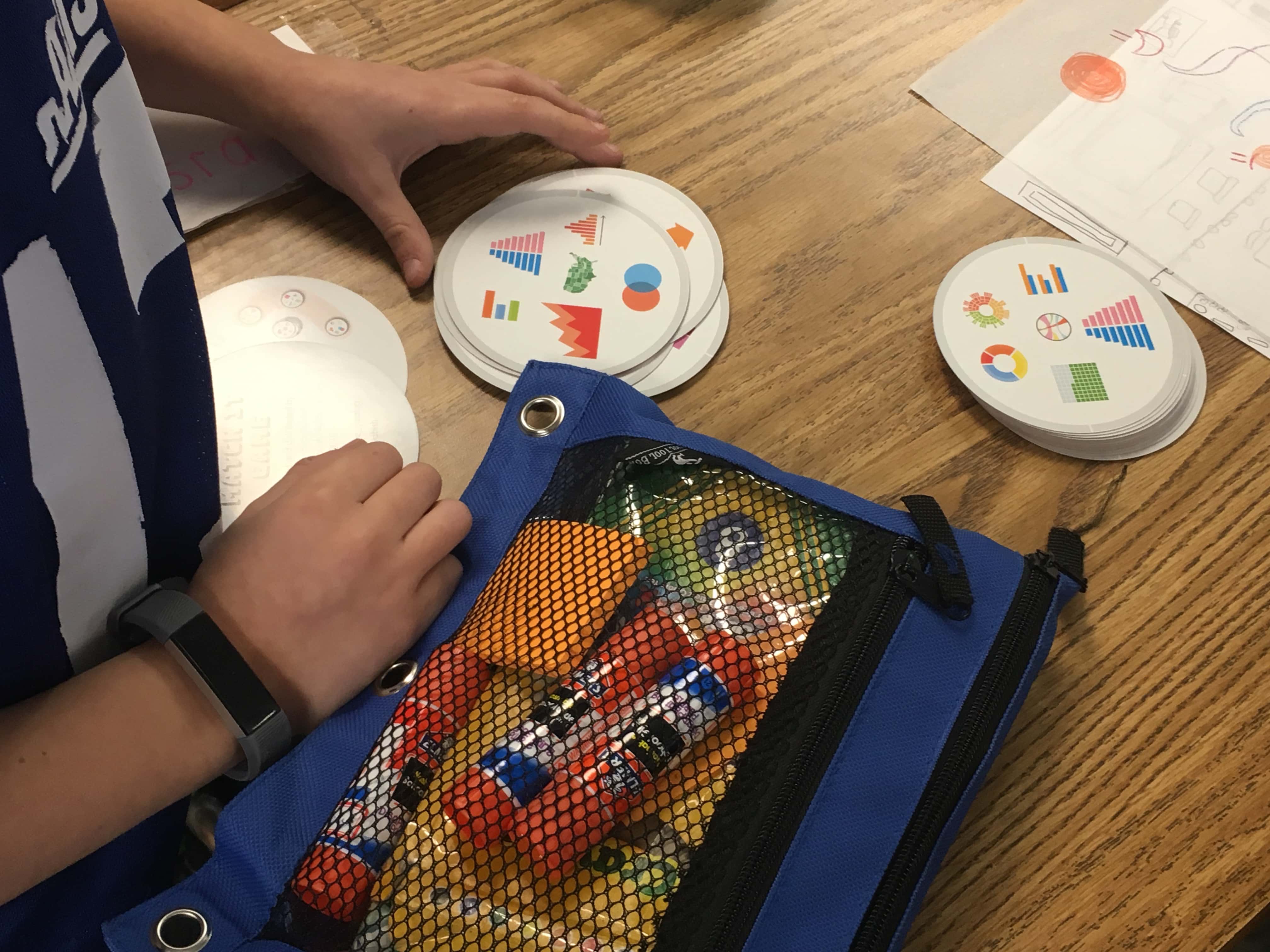
Honestly, the class was already pretty fun. Most of them were really into drawing the maps and the tracing paper was a big hit (who knew!). But I wanted to try one more thing. As you likely know, about a year ago, Severino Ribecca and I published our data visualization Match It Game. The game consists of 31 cards, each with eight graphs of various sizes. Each pair of cards has exactly one match between them.
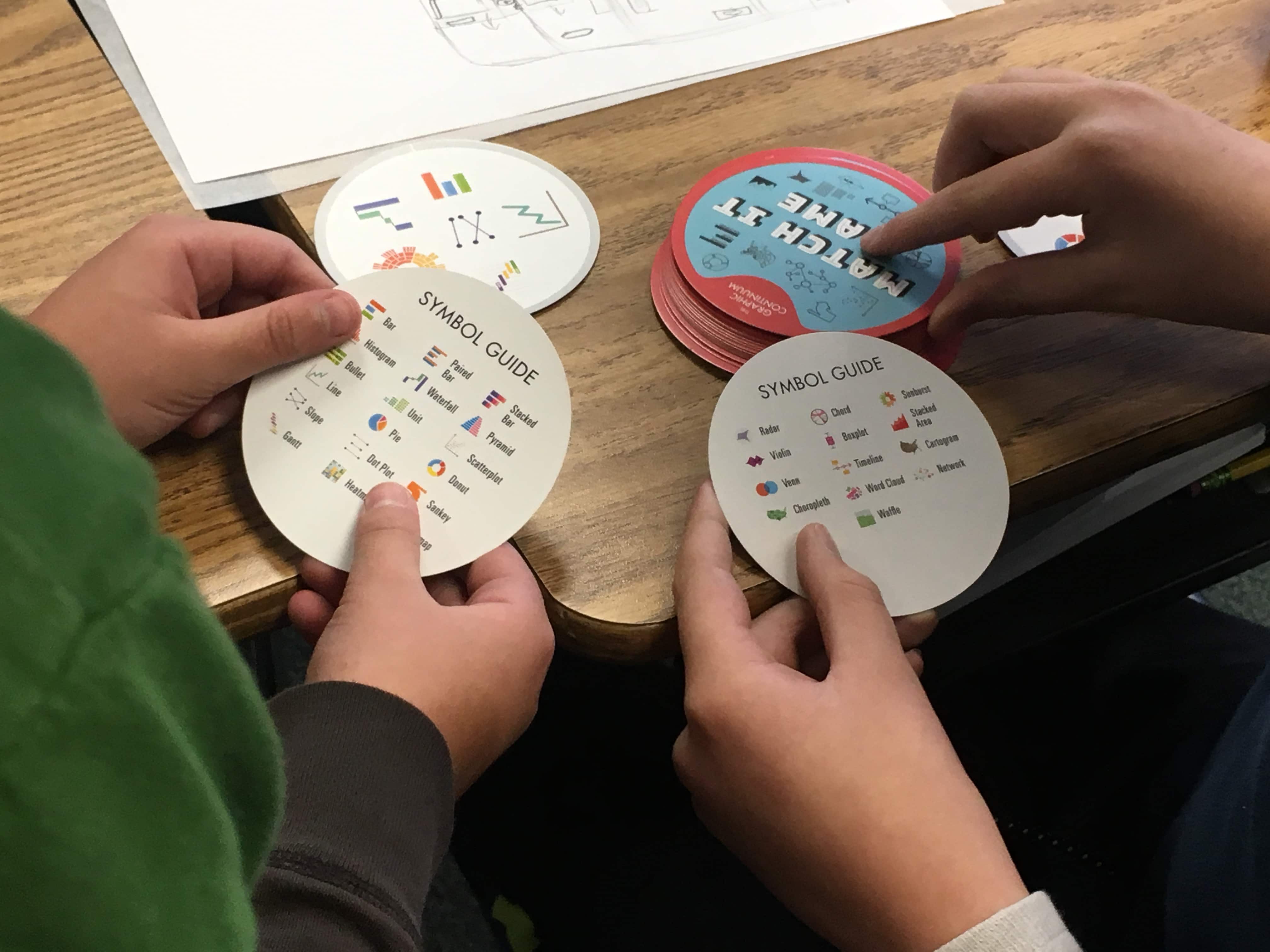
The basic game is pretty simple: Each player gets a card and places it on the table face up. The rest of the deck is placed in the center face up, with the top card face down. That top card is then flipped over and the first player to identify the matching card calls out the graph and takes the card, revealing another card below. The game continues until there are no cards left and the person with the most cards wins.
I gave each student a deck and set up a “Tournament of Champions”. They were given five minutes to study the Symbol Guide card, which is the glossary for the game. When the first round started, I was amazed to see 30 kids sitting on the floor and at desks calling out “Histogram!”, “Waffle Chart”, and “Sankey!”. I wasn’t sure if they would actually try to play the game, or just mess around, but they really got into it. We had several rounds, making our way to the championship round in which my son came out champion (I mean, not unexpectantly—he has played the game countless times as home).

Reflections
A few final reflections:
- I’m grateful that my son’s teacher was interested in having me come in and teach data visualization. Math is (and must be) a core part of the curriculum, and teaching kids how to read graphs will undoubtedly help them better understand the world around them.
- I need to find graphs that better connect with the students. The map of McDonald’s locations and the Flight Paths video were hits, but there are surely other graphs I could use.
- I can imagine trying to replicate the Camouflage Sankey diagram by asking them to spell a similarly long word. If I set it up beforehand, I might be able to show them how to collect the data and create the graphic.
- The Match It game was a big hit—also especially because they got to take a deck home with them. Turns out that many of them are playing the game at home with their parents. Also surprisingly, parents have found it fun as well.
- I’d love to see a way to make data visualization education a broader part of the curriculum, both on its own and linked with their math and other classes. Imagine adding different shapes to maps in their Social Studies classes to encode data or using waterfall charts in their math classes to visually demonstrate a simple mathematical equation or developing simple network diagrams in science class. The combination of the scientific approach to data visualization and the creativity it sparks could serve as a great way to help students learn.


m&m histograms? pictograms and histograms are still some of my favorite chart types.
I hope that “art” education programs in schools will expand rheir scope to include visual literacy, design and visual thinking, including data visualization. All the arts, for that matter, would benefit from broadening their scope so that, for example, music should be thought of broadly as sound design rather than the limited, traditional band and chorus.
Hi Jonathan, I’m part of the Big Data and Analytics Association undergraduate student organization at Ohio State, and would love to teach viz to kids with this exercise. If you have follow up thoughts on the reflections at the end of this post, I’d love to connect.
Best, Elizabeth
Attached image:
I entirely thought the file attachment was for a profile photo, but it looks like it grabbed googles’s. My bad!
Hi Elizabeth,
Thanks for writing! I have a few other ideas of how to expand this. The one that I think might work best is to bring in an inflatable globe and show the kids how difficult it is to go from the actual planet to a 2D representation. Vox Media did something similar like this a couple of years ago: https://www.vox.com/world/2016/12/2/13817712/map-projection-mercator-globe.
Thanks again,
Jon
As schools are dropping arts due to funding, I found this interesting as a alternative way to work it back in. I am very intrigued to explore this further
Thanks, Rick. Please let me know what you come up with!
This Viz provides an example of student pipeline data using Tableau. View the Advanced Placement Pipeline (AP Enrollment AP Exam Taking AP Exam Passing) for school districts in New Mexico disaggregated by sub-group.
By the way! The best essay writing service – https://www.easyessay.pro/
And Happy New Year!
I would love to purchase your Matching game-where can I find it?
Hi Corin,
Great! It’s in my shop: https://policyviz.com/shop/
Thanks,
Jon
Hi! I’m at work browsing your blog from my new apple iphone!
Just wanted to say I love reading through your blog and look forward to all your posts!
Keep up the superb work!
Great