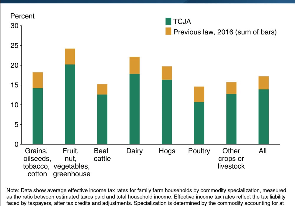
This stacked column chart from the USDA shows how effective tax rates will decline across seven farm commodity specializations resulting from last year’s Tax Cuts and Jobs Act (TCJA). I needed to take a second look at this graph before I completely understood what was going on. The entire height of the bars—the green plus yellow segments—show the effective tax rates in 2016, prior to passage of the TCJA. The green bars alone show the effective tax rates after the TCJA was passed. In other words, the yellow segments show the decline in the tax rates owing to the tax law.
I think this is one of those cases where relying on the tried-and-true graph types—you know, the ones that show up in the standard Excel drop-down menu or the Tableau Show Me tab—just doesn’t work. It’s an easy graph to make and people understand the basic graph type. But there are lots of graph options out there and lots of ways to visualize your data–perhaps no way is “right”, but maybe there are better ways. If you can learn about more and different graph types, you’ll be better equipped to present your data in the best way you can.
In this case, because the important aspect is to focus on the change in the effective tax rate before and after the tax law, I thought a dot plot would be a better approach. I tried both a horizontal and vertical version, placing each within the confines of the original layout. Personally, I think I prefer the vertical layout as it more clearly signifies a decline in the tax rate.
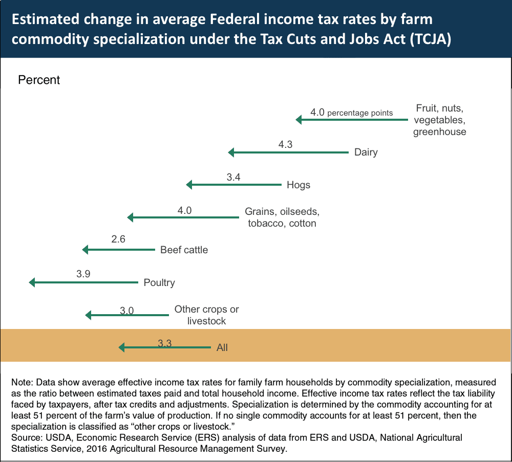
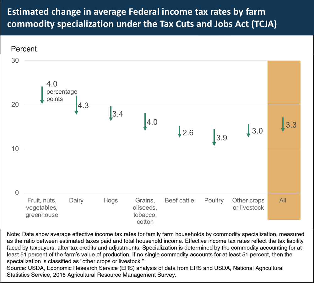
I also highlighted the All group to help differentiate it from the other specific sectors. And I changed the title to help focus on the change, which, again, is the focus of this graph.
What do you think? Any other chart types you might try? Here’s the data file if you want to play around.


How about a Slope Graph?
Attached image:
And strictly speaking, a simple clustered column chart is better than the somewhat confusing pseudo-stacked column chart. No need for the “sum of bars” notation in the legend to try to clarify the chart.
Attached image: