When you look at this column chart from the USDA, what is the first thing you see? Go ahead, take a second…
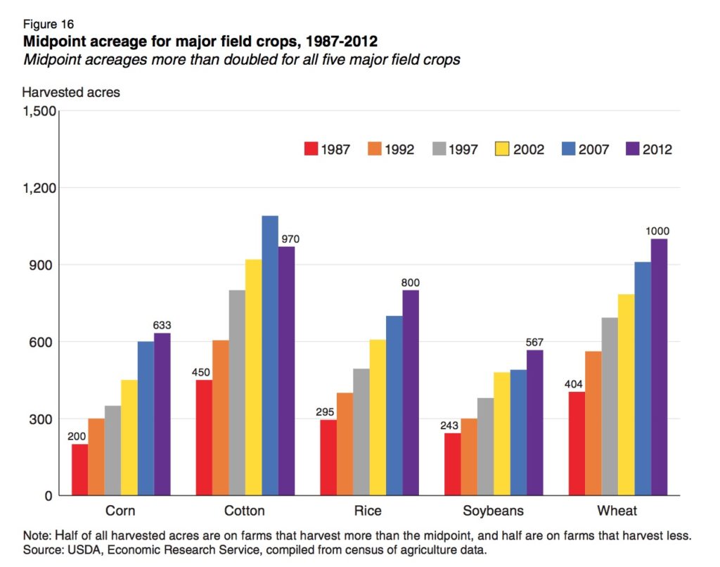
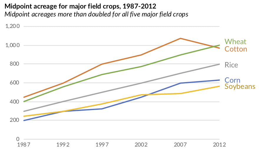
My guess is—admittedly, based on a sample size of three people I’ve already asked—that your first observation is that the acreage for all five crops increased over this period. Your second observation, that quickly follows the first, is that there was acreage for Cotton fell in the last year. Unlike the other groups of bars, that purple bar is shorter than the others, but it’s hard to clearly see that in this representation.
This is not to say column charts can’t be used to visualize changes over time. In this case, however, I think there are too many columns, which makes these observations a bit more difficult.
Let’s try two remakes.
First, the obvious, simplest approach: a line chart. Here, the drop in acreage for Cotton is very clear, as is the relative sizes of the five crops. It wasn’t immediately clear to me that Rice, for example, sits right in the middle of the five crops in the original. And while I’m using the default Excel colors here, notice that I added data labels to the end of each line and colored the text—no legend for me!
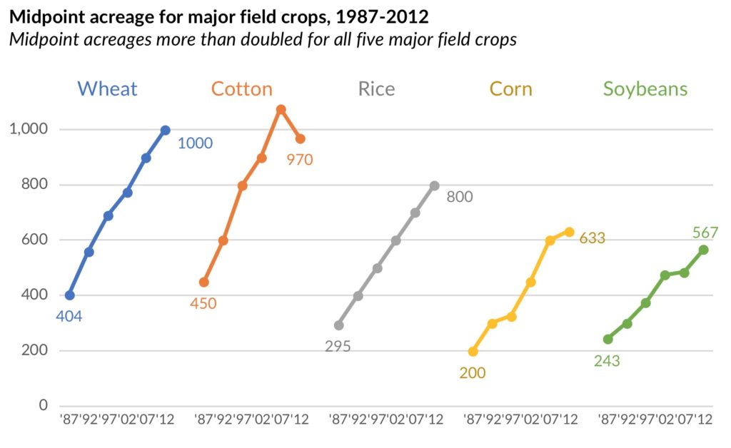
Second, how about a cycle chart? Instead of putting the lines all together, this cycle chart is essentially a small multiples line chart where each crop gets its own panel, as it were. Some pros here: there’s more space for the graph and it’s maybe a little more engaging because it’s a little different. But I’m not sure you see the relative patterns as clearly as you do in the line chart.
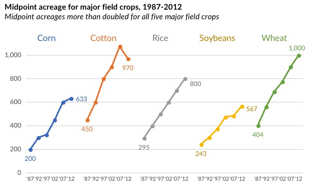
I also did a version in which I sorted the series by the last value (2012).
I guess what I’m trying to argue here is that sometimes simple charts are the best. In this case, maybe a simple line chart would have been best.
Which do you prefer? Have another alternative? Here’s my Excel file (I just guessed at the data values here, by the way).


I looked at the data, and thought of how to compare the different crops. I thought a line chart might have been better than a cycle plot, so that’s what I used. I’ve provided links to my charts below.
You sorted your second cycle plot by the last (2012) value, so I first normalized my data by the last year’s data. It looks pretty spread out. The variation may have been driven by Cotton, which had a big retrograde change in the last period.
https://i.imgur.com/DnXSqYX.png
Then I normalized by the first year’s acreage (1987). The variation in the first half of the chart is not too much, but it’s still pretty wide in the second half.
https://i.imgur.com/0SLbl3o.png
Finally, I did what I wanted to do in the first place; I normalized by the average over all of the years. The crops fall close to each other. Cotton has some variation, but it appears that Corn has the most. However, this variability is not too severe. From their respective initial acreages, all crops increased roughly proportionally.
https://i.imgur.com/a8O6Rla.png
This proportionality can be seen pretty clearly in a stacked area chart. Each crop maintains a nearly constant proportion across the entire chart.
https://i.imgur.com/CnUosMk.png
The variability in Cotton looks more severe than it probably is. I like to play around with data, so I looked at the data, and thought, what if someone switched the last two values? The drop was roughly half of the gain in the previous interval, so I thought it wasn’t out of line to tweak the numbers (in real life, of course, I would use this approach to help me think, but then I’d track down the original data and validate the numbers). Instead of the sudden reversal, the Cotton line just looks “normal”. The line of best fit isn’t changed much, and the story that all crops gained acreage proportionally has not changed.
https://i.imgur.com/WW6BiAR.png
By the way, I don’t like the column chart approach at all.