Yes, tables are a form of data visualization. Many tables don’t include bars or circles or arcs, they do show data in much the same way as a graph. If you need to show the exact amount of every value in your data, a table may be your best solution. And while table design doesn’t really make its way into too many discussions about data visualization—Chapter 8 in Stephen Few’s Show Me the Numbers is perhaps the most comprehensive treatment—I’ve begun thinking more about how improve the way we make our tables.
An Example
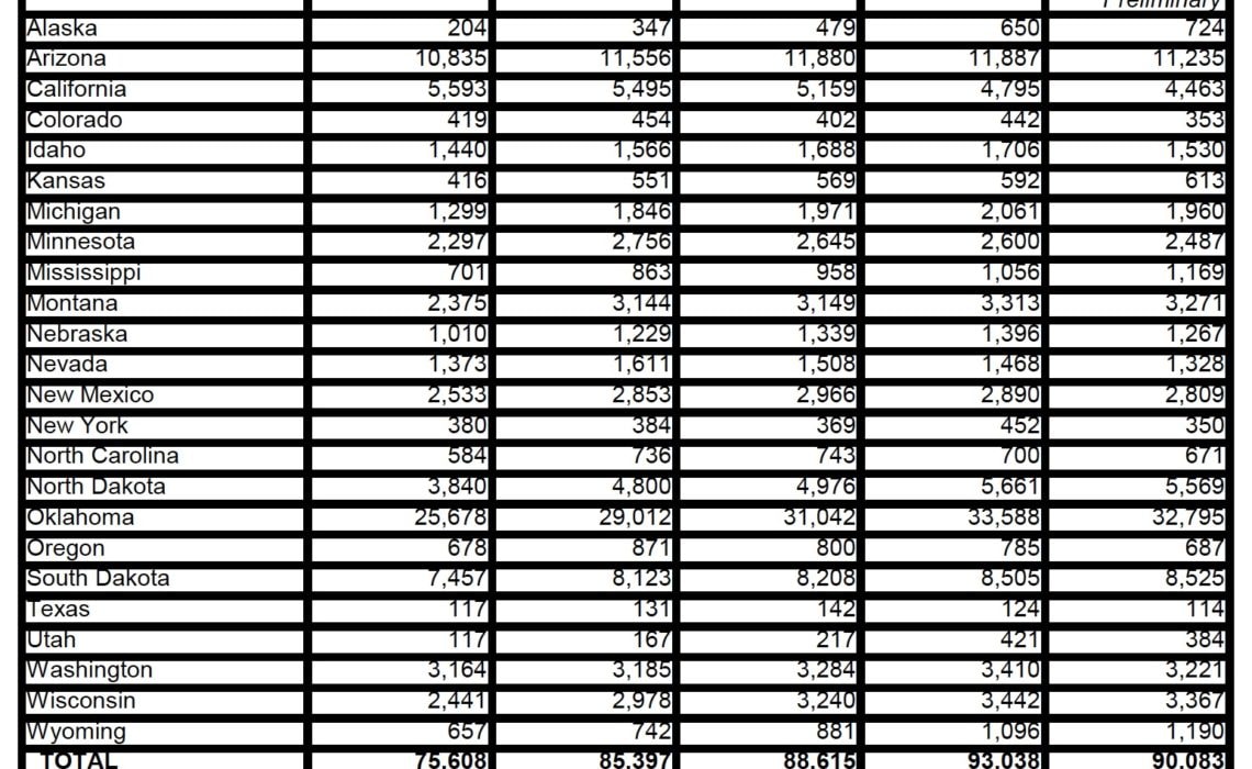
This table from the US Department of Agriculture Food and Nutrition Service provides information on the number of people participating in food distribution programs on Indian reservations around the country. For these 24 states, participation estimates are shown for fiscal years 2013 through 2016, plus preliminary numbers for fiscal year 2017. Note the very dark, thick gridlines, which makes the whole thing very heavy and don’t help direct your eye anywhere on the page. The table might also benefit from some ways to offset the column headers and some of the row headers.
Also notice this odd feature resulting from the heavy gridlines—the numbers are top-aligned in each cell and are therefore slightly cut off.
Remaking this Table
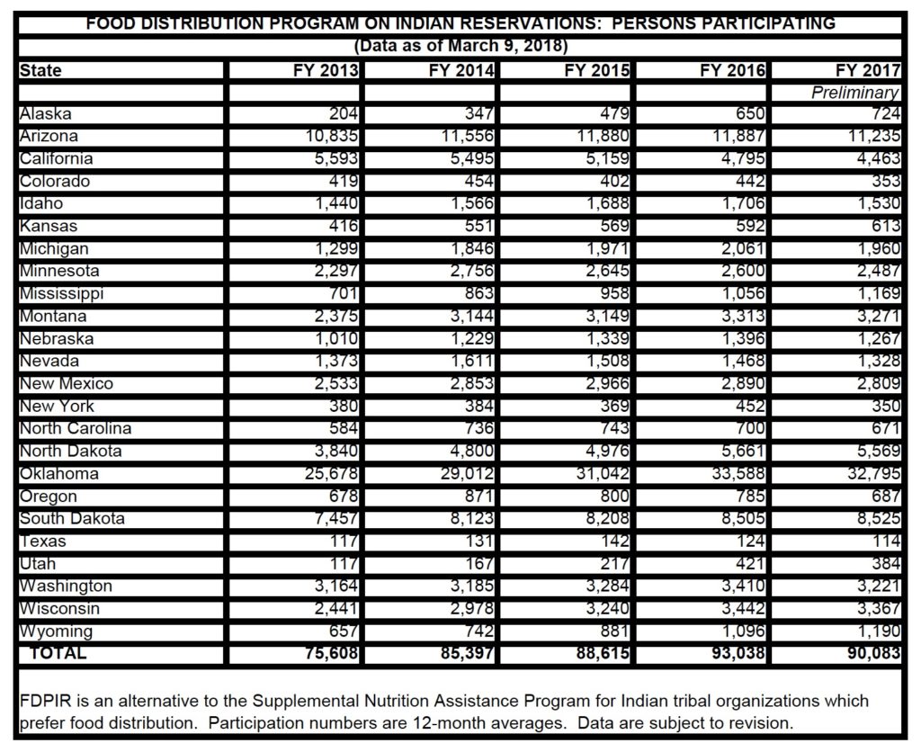
I think there’s a way to improve this table. Instead of including all of the gridlines—and making them super dark and thick—I’ve removed them and kept only the line below the column header row and below the Total row at the bottom. I also boldfaced the headers at the top and the Totals line to help offset them from the rest of the table. To keep the column headers aligned at the bottom, I moved the word “Preliminary” above “FY 2017”, a small change but one that I think helps with readability. I also made the subtitle—“(Data as of March 9, 2018)”—a little smaller than the title. I kept the title and subtitle centered, though I could also see a reason to left-align them (as I typically do with graphs).

Extensions
Taking this a step further, we might be able to add some additional graphic elements to the table. Again, the specific values are obviously important in a table, but by adding visual elements, we can help highlight or summarize values or trends.
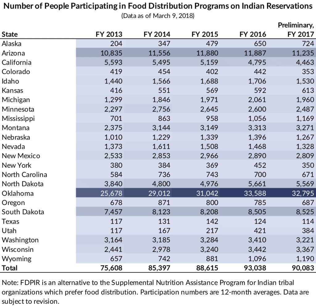
This first chart is a simple heatmap using gradients of blue. Until I made this, I didn’t realize how vastly different Oklahoma was from the rest of the states in the table. It was only after the dark blue row color materialized could I clearly see the difference.
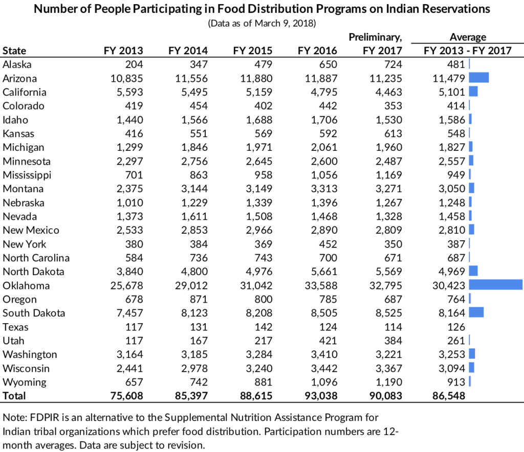
I tried a couple of additional extensions to incorporate more visual elements. In this version, I added a new data point, the average between fiscal year 2013 and 2017, and then a bar chart directly next to it. The addition of this small element gives the table a graphic anchor and helps direct the eye to the states with higher (average) participation.
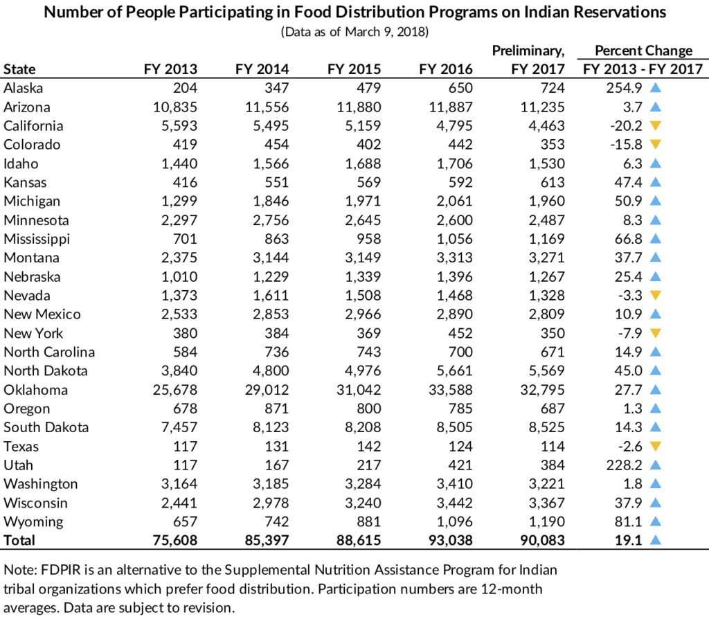
In this version, I added the percent change between 2013 and 2017, and then visualized that change by adding a small up or down colored triangle/arrow.
Concluding Remarks
This is obviously not a comprehensive treatment of the best ways to create better tables. Tables are maybe the best way to show detailed, exact data values. But they don’t have to be hard to look at or hard to use. I suspect USDA’s goal with these and other tables that they create are to be transparent and give data to researchers, program participants, and other groups, but that doesn’t mean the table has to be hard to read.


