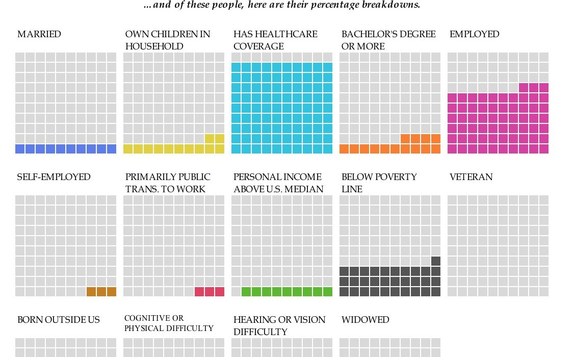
Back in January, Nathan Yau at Flowing Data published an interactive set of waffle charts that allows you to explore selected demographics of people in the U.S. The user can select across three demographic characteristics—gender (Male, Female); age group (18-24, 25-44, 54-64, 65+); and race or origin (White, Black, Asian, Native, Hispanic)—and a series of waffle charts changed to show the percentage breakdown for each.
Whether the waffle chart is the best way to visualize these data is somewhat outside the scope of this post. I did play around with remaking this as a series of bar charts and while it may be easier to compare the data in that format, it is a bit less, well, fun.
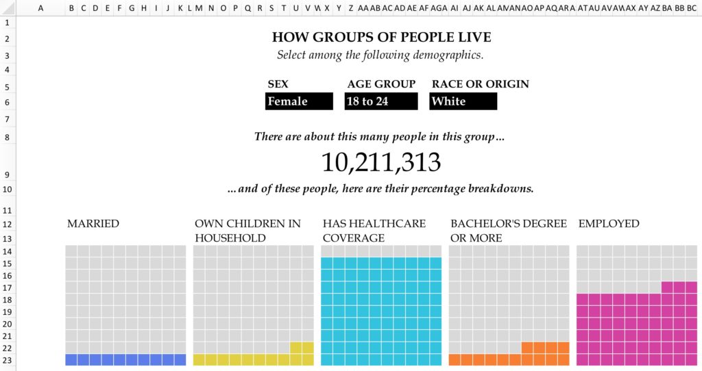
I took Nathan’s visualization and remade it in Excel (he was kind enough to provide the data, which you can fine here). Before I show you how I made it, there is the question of whether using this kind of Excel interactivity is worthwhile in the first place. I think many people struggle to make interactive visualizations because maybe they don’t know how to code in a tool like D3 or R, or because tools like Tableau and others are expensive or hard to use, or because there are data-security issues that don’t allow them to post their visualization publicly. We can create some basic interactive elements in Excel using VBA macros, Form Controls, or Data Validation. I think this kind of Excel interactivity is primarily useful if you want to send a dataviz to a colleague or manager who wants to uncover the basic arguments and also have some control over the view. You obviously can’t directly post an Excel sheet to a website, so it doesn’t have that accessibility, but if you’re more concerned with giving someone control over the data, this kind of interactivity may be useful to you.
How to Build Interactive Waffle Charts in Excel
Although this is a long blog post, the process is actually fairly easy. I’ll proceed in five steps:
- Set up the entire workbook
- Use Data Validation to create the drop-down menus
- Set up the data worksheet
- Set up the waffle charts and link them to the data
- Use Conditional Formatting to add color
1. Set up the workbook
I’m going to need two main tabs for this visualization (you could of course pack this all onto one tab or use more than two tabs, but two seems about right). The Waffles tab will contain the visualization. The waffle charts themselves are going to be 10×10 squares, so the columns and rows are going to be sized the same, in this case, 19px each. The cells of the waffle charts will have their own formulas, and that will pull in the data. There are some wider rows above the visualization for the dropdown buttons and titles. The WafflesSetUp worksheet is going to contain the raw data and all the lookup tables I’ll need to make this work. I’ll explain all the details about that worksheet in a bit.
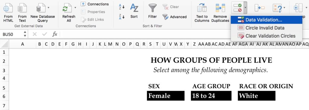
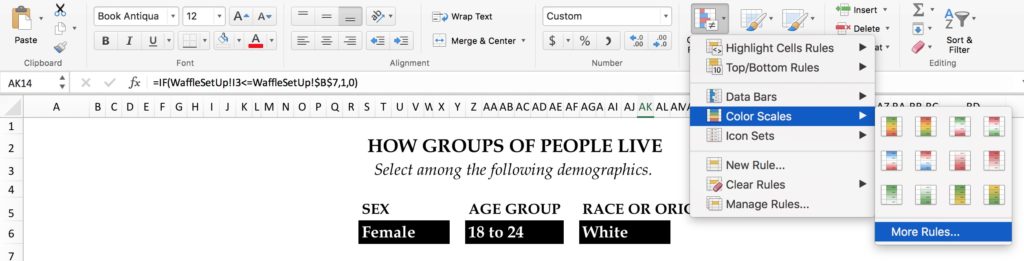
2. Data Validation in Excel
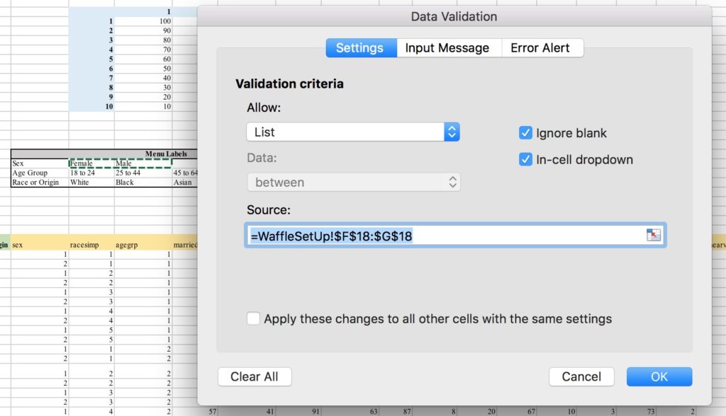
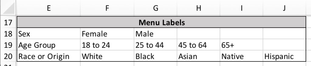
In the Data tab of Excel, you will see a Data Validation button, which enables you to create different kinds of validation structures. For purposes of this visualization, I used the “List” option in the “Allow:” dropdown. I’m then prompted with a cell reference box, to which I point to a spot in the WaffleSetUp worksheet that is designated for “Menu Labels” (see they gray-shaded area in the next section). I’ll create three dropdown menus in this same way and then merge and format the cells. This will make the button labels big enough to see and centered across the entire visualization.
3. Set up the Data Worksheet (WaffleSetUp)
There are five parts to the WaffleSetUp worksheet that are used to organize the data and labels. I’ve added color here to make it easier to describe.
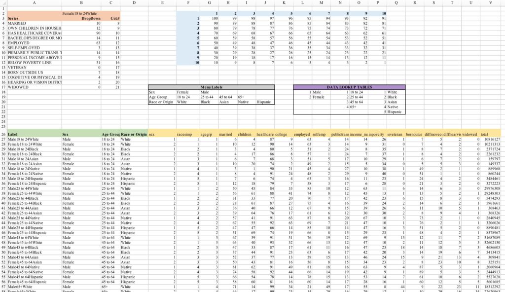
- DropDown Table (orange). Column B contains the selected data series; in the screenshot, you can see that the user has selected “Females, 18-to-24, White”, which I’ve merged into one cell by concatenating the selections (using the & sign) from the three drop-downs in the Waffles sheet. The concatenation is useful because I’m basically creating a single variable name, and I can take that name and match it to the data set (see the green section below). To do the concatenation, the formula in cell B2 is:
=Waffles!$S$6&Waffles!$Z$6&Waffles!$AG$6
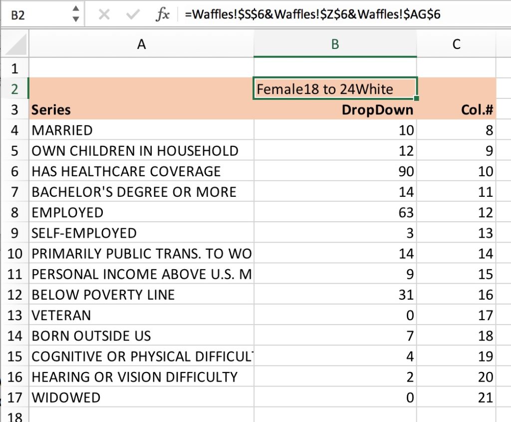
- Waffle Chart Schematic (blue). This is essentially the waffle chart, here placing the positions of each cell in the grid. This goes from 1 in the lower-right corner up to 100 in the top-left corner. You’ll see how this works in a moment.
- Menu Labels (gray). As noted above, I use these to populate the Data Validation button in the Waffles tab.
- Data Lookup Tables (purple). I’m going to need this because the category labels in the original data set were numbers, not text (strings), so I’ll use this as a lookup table to create my labels.
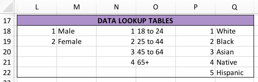
- Data Table (green and yellow). There are two parts to this. Columns E-Q (in yellow) contain the original data from Nathan. Columns B-D (green) use a VLOOKUP formula to convert the number of each category to a text label. For example, in Column C, I get the “18 to 24” label by using this formula:
=VLOOKUP(G27,WaffleSetUp!$N$18:$O$21,2,0).
The first argument (G27) takes the value from the ‘agegroup’ column; the second takes that value and compares it to the first column in the age group part of the Data Lookup Table; the third argument pulls out the name for the age group that corresponds to that number; the final argument (“0”) assures that this is an exact match (I want to match on the 1 and nothing else). Column A pulls these text labels together so they will match the label in the DropDown Table so that A27=B27&C27&D27.
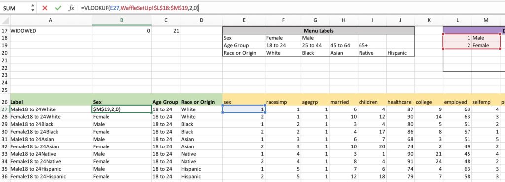
Okay, let’s go back up to the DropDown Table (orange) at the top. Column B is where we find the data that matches the series the user wants to find and will ultimately be plotted in the Waffle charts. In cell B4, for example, I enter this VLOOKUP formula:
=VLOOKUP($B$2,$A$27:$V$66,C4,0)
Here, again, the first argument looks to the value the user wants to visualize shown in cell B2 (in this case, “Female18 to 24White”). In the second argument, I specify the full Data Table ($A$27:$V$66) to look within. The third argument looks for the relevant data column. I’ve set this up so the data labels in column A are in the same order as the data in columns E-U; the “Col.#” series in column C is there so I can use a cell reference (C4) instead of hard-coding each one. The last argument in this VLOOKUP again specifies an exact match so it find the exact column I specified. By using the absolute reference symbol (“$”), I can just copy and paste this formula all the way down the column.
4. Set up the waffle charts and link them to the data
Back in the Waffles tab, we’re now going to set up the Waffle charts. There is a bit of manual work here, but once it’s set up, this entire workbook is completely flexible for new data or categories. The philosophy here is that each Waffle chart is going to look back to the Waffle Chart Schematic and compare the position value in the schematic to the data value.
Let’s look in the first Waffle chart for the Married variable. For this group, 10% of people are married, so only the bottom 10 boxes should be colored in and the rest left gray. Here’s the formula in the top-left square:
=IF(WaffleSetUp!G3<=WaffleSetUp!$B$4,1,0)
This is a simple IF statement: If the position value of this cell (100) is less than or equal to the data value (10), then put a 1 in the cell; otherwise put a 0. So this cell gets a “0”.
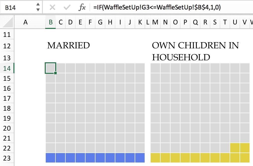
Let’s go to the bottom-left cell. The IF statement in this cell—a simple copy-and-paste from the top—is:
=IF(WaffleSetUp!G12<=WaffleSetUp!$B$4,1,0)
Here, the position value of the cell is 10, which is equal to the data value 10, so this cell is assigned a value of 1.

To get the other Waffle charts set up, you need to copy-and-paste the IF statement, but you also need to do some manual work and change the $B$4 reference to the next row in the DropDown Table of the WaffleSetUp worksheet (I’m guessing someone can come up with a faster way to do this).
I also linked the Waffle chart names—for example, the “MARRIED” label above the Waffle chart is linked to cell WaffleSetUp!$A4 so if I wanted to redo this visualization with new data, I would just need to drop in new data and labels in the WaffleSetUp sheet and not have to retype or copy-and-paste for each chart.
Finally, I also used a VLOOKUP statement to get the overall count at the top of the visual. The formula here is:
=VLOOKUP(WaffleSetUp!$B$2,WaffleSetUp!$A$27:$V$66,22,0)
It works just the same as the other VLOOKUP statements, but looks to the last column of the full data set that has the sample counts. 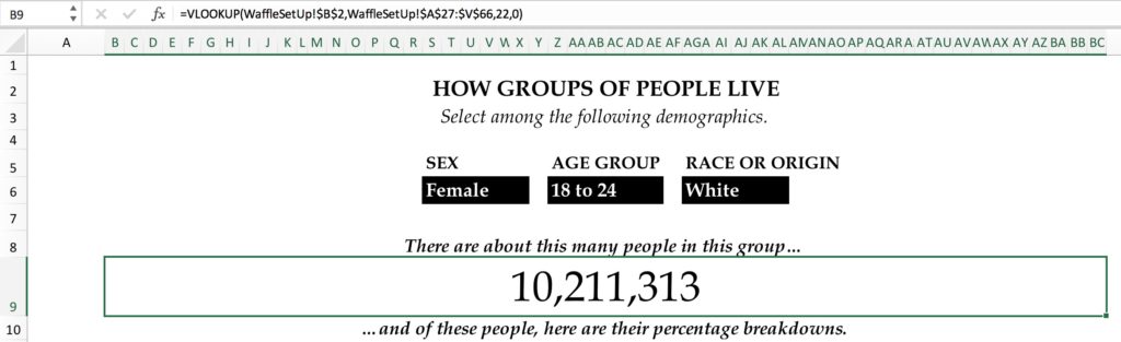
5. Conditional Formatting
The final step is to add the colors to each Waffle chart. This is a simple—though somewhat tedious, repetitive task—of applying separate Conditional Formatting rules to each chart. For each chart, go to the Conditional Formatting menu in the Home tab. Use the Equal To… option in the Highlight Cells Rules menu. Fill the value equal to “1” and format the cell with the color you choose. And yes, in the way I’ve set this up, you need to do this separately for each chart.
Note: An alternative way to do this would be to change the IF statement for each chart so that the numbers are different in each one (e.g., the formula in the Own Children in Household chart might be =IF(WaffleSetUp!G12<=WaffleSetUp!$B$4,2,0)). Then, you could apply one Conditional Formatting rule to the entire chart and differ the number and formatting each time. Additionally, while I applied a gray color to the entire spreadsheet, I could have done it within the Conditional Formatting menu also. This would also be simpler if the colors were the same across the waffle charts; different colors for each made this a bit longer.
There you go. A fully functional, interactive, flexible set of waffle charts in Excel. The user can select the category from the drop-down and everything will update. From here, it would be relatively easy to change the underlying data and to update the whole thing.
If you want the easy way out, here is my Excel file, in which you can just drop in new data and not worry about having to follow these steps. I’m providing this for free here, but it’d be great if you would do me a favor and help support PolicyViz by picking something up from my Shop, including the new Match It Game dataviz card game or any of my other Graphic Continuum projects. This will enable me to continue to provide these Excel tutorial files for free.
Interested in learning more Excel tips and tricks? Check out my Advanced Data Visualization in Excel ebooks, available in the PolicyViz Shop.


