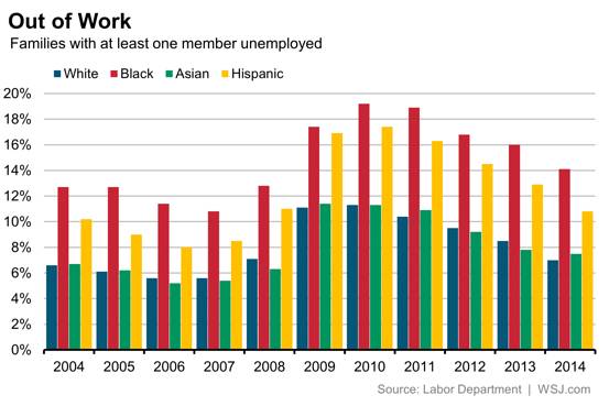
I was cleaning out some old files folders on my computer and came across this column chart from the Wall Street Journal. As I’ve written previously, I find certain column charts with lots of columns difficult to read, and this one seems to fit the bill.
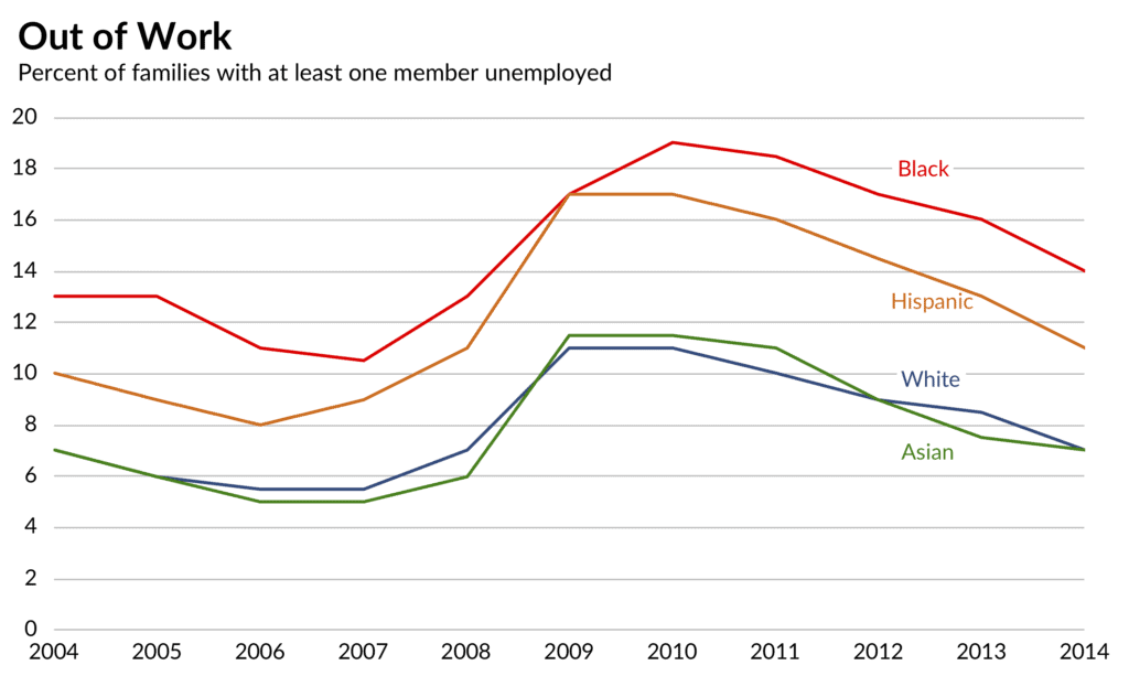
In this case, we are being asked to compare unemployment rates within and between four different racial/ethnic groups between 2004 and 2014. It’s hard to do either of these tasks because there are just so many columns. I guess the simplest remake is to simply convert it to a line chart. Here, you can easily see the four different trends.
There’s nothing wrong with this approach, but I wanted to try another approach. Instead, what if we broke the lines onto four separate charts and placed them next to each other? (Side note: I made this graph in Excel and added a separate line equal to 21 to add the four labels at the top. The graph is now ready to be easily adopted with different data and labels.)
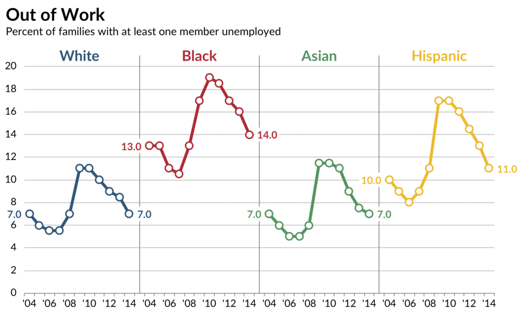
I added the vertical separator lines because without them, it was a little hard to differentiate the lines. I also added the data value for the first and last point because it helps make clear that by the end of the business cycle, the unemployment rates for Whites and Asians did not change.
As an example of this approach in practice, I think this graphic from the Pew Research Center does a good job of showing some simple patterns over time in this ‘small multiples’ approach. One could, of course, add all of the lines on each graph, emphasizing each one separately, but I’m not sure it’s necessary.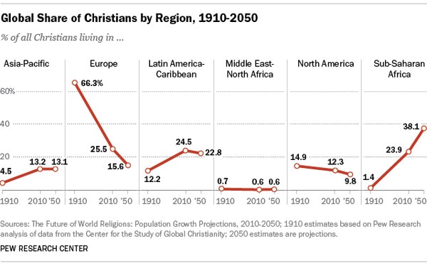
Any thoughts? What about the x-axis labels? Too many? What else might you do? Here is my Excel file if you want to play around.


The small multiples makes it hard to do fine comparisons, e.g. it’s hard to notice that Asian and White criss-cross. Also, I’ll bet that with a few more x-values you could easily miss if one curve was time-lagged by one x-value.
Overall I like this makeover. Two suggestions:
1. Change the axis to be either 0-10-20 or 0-5-10-15-20. Too many gridlines now.
2. Sort them by the most recent value in descending order. This makes the comparisons slightly easier.
Simple line graph KISS. Easiest for comparisons.