Following the recent Senate special election in Alabama, (the fantastic) Sarah Slobin over at Quartz wrote this really interesting article where she looked at the relationship between counties that voted for Democrat candidate Doug Jones and the distribution of slavery in Alabama. “[W]hile correlation is not causation,” she writes, “there is a startling visual parallel when you zoom in to Alabama…and compare it to how Alabama just voted this week.”
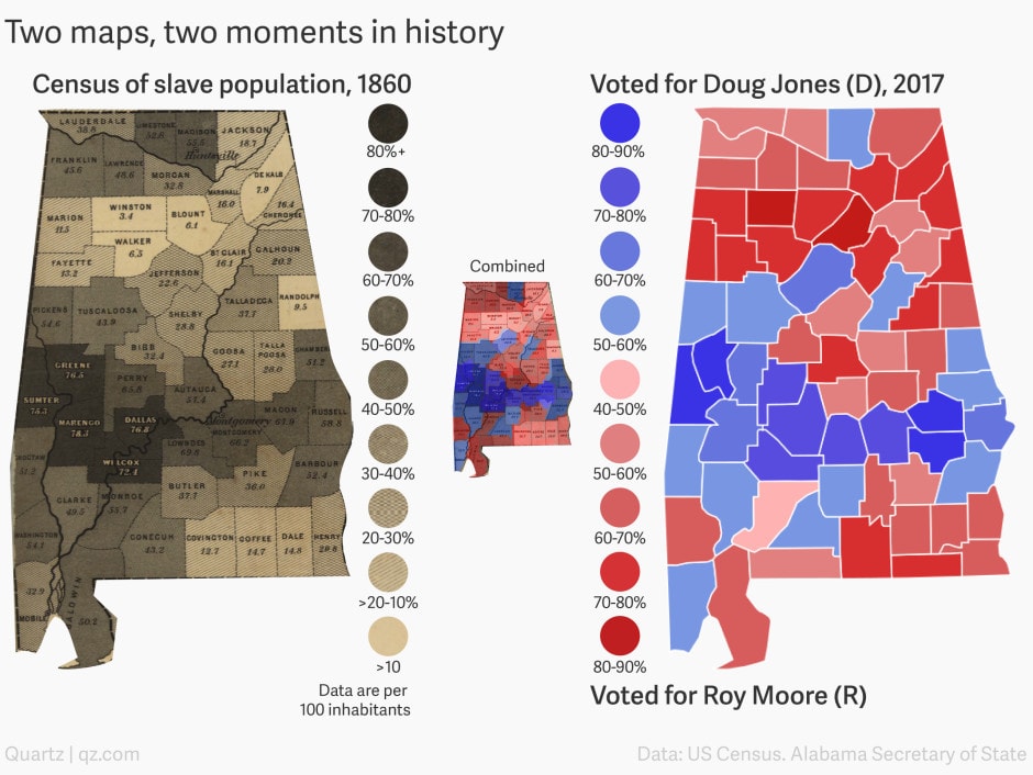
There is a very clear east-west band of dark blue (more votes going to the Democrat) on the map on the right and darker colors (higher proportion of slaves) on the map on the left. Slobin writes: “If you focus on the ‘black belt’ moving horizontally across both maps, you can see that in areas with a history of slavery, the vote went to Jones.”
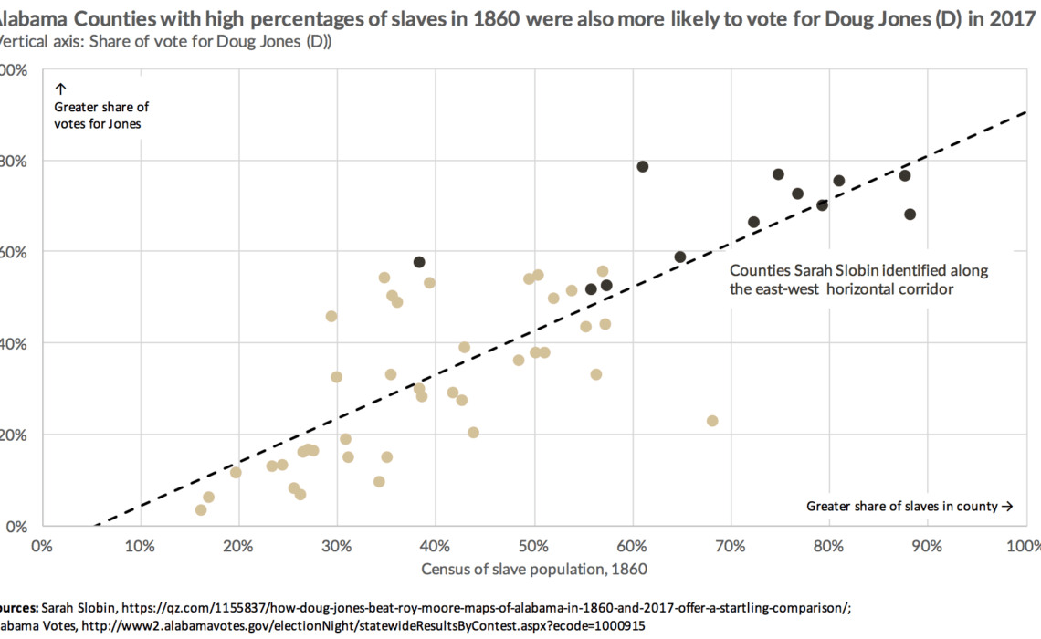
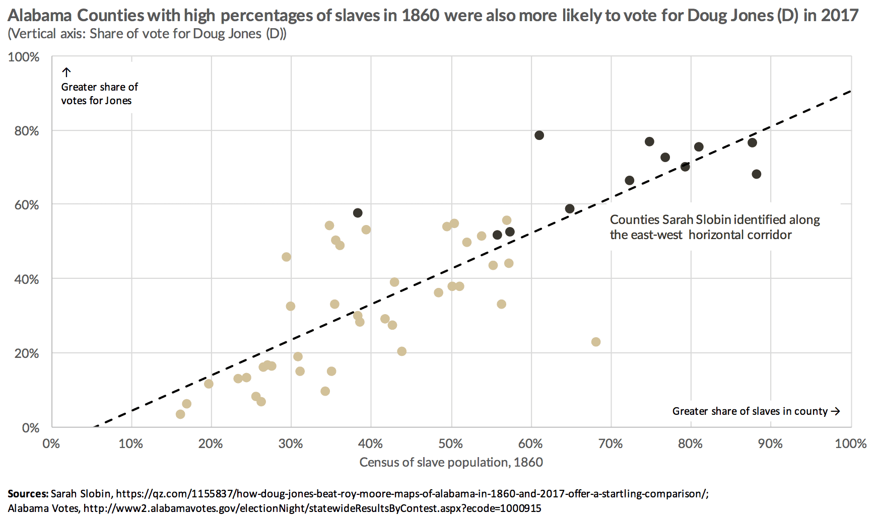
Although the correlation is clear when you visually inspect the two maps, I thought it would be interesting to directly visualize that correlation. Sarah sent me the website with the vote totals, and I visually pulled the numbers out of the slave map.
I calculated the share of the vote going to the Democrat in the 67 counties with vote totals in the recent election, which range from 16.1% to 88.1%. I then identified 51 counties in the slave map on the left with percentages of slaves, and which range from 3.1% to 78.3%. (Excuse some of the missing data here; I haven’t gone through Alabama history to figure out how counties changed, merged, or broke up in the last 150 years.) Plotting these two variables in a scatterplot quickly shows the positive relationship between the two with the (darker) circles in the top-right part of the graph marking those 12 counties along the east-west corridor.
I wouldn’t really call this a “remake” because Slobin’s map pairing is really quite striking. It’s probably even more meaningful for people who live in Alabama. If you want to play around with the data, here’s my Excel file.


