
I saw this calendar heatmap of bike rides at Via Velox a few weeks ago. It’s not a really new approach to visualizing daily data–Nathan Yau at Flowing Data created something similar a few years ago using vehicle fatalities.
Source: Via Velox Heatmap
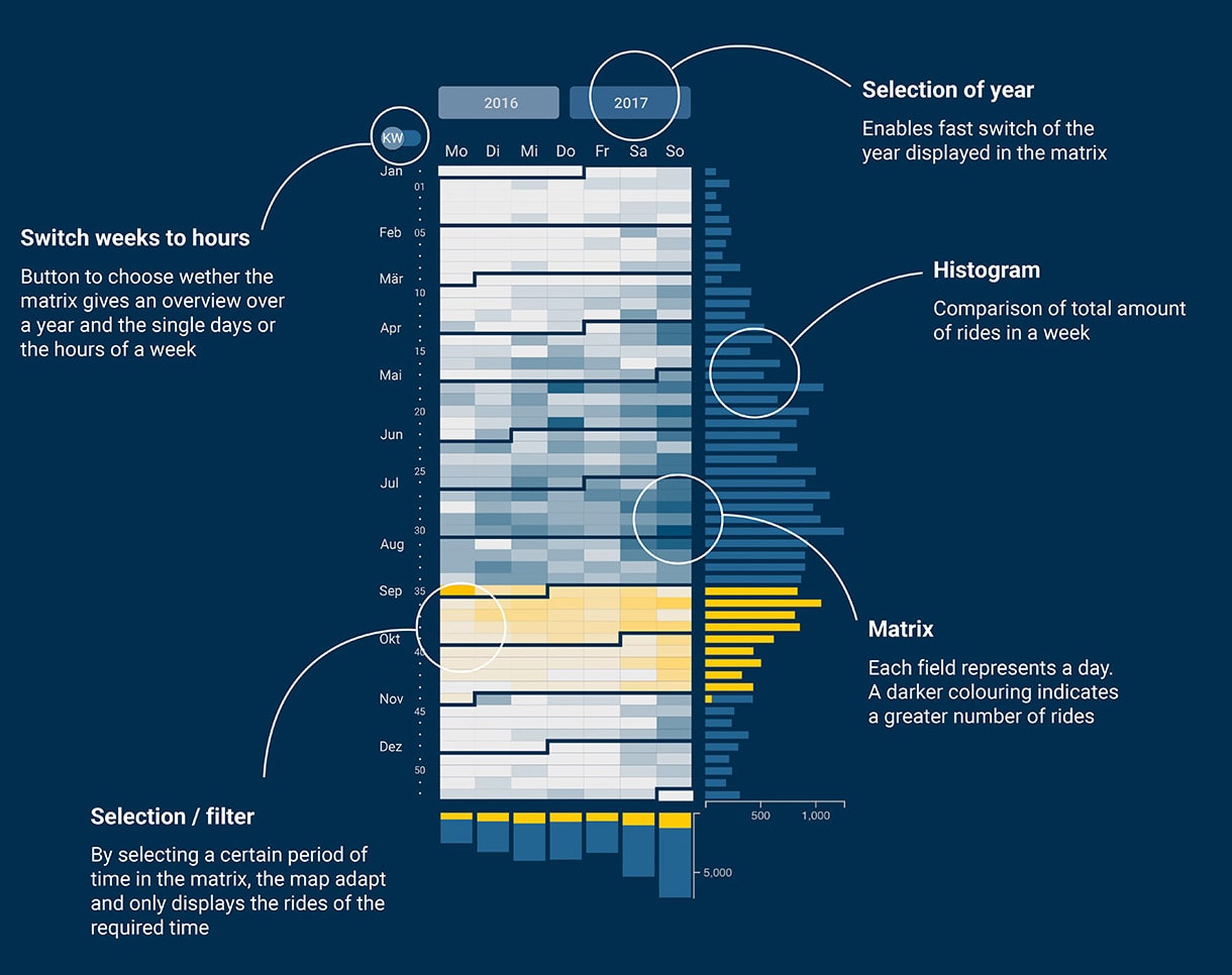
What I liked about the Via Velox version is the bar chart along the right side and the column chart at the bottom. I also like the little design feature of numbering every 5 weeks with the intervening dots.
There are 4 parts to creating this calendar heatmap in Excel:
- The heatmap itself, which requires conditional formatting a little number formatting trick;
- The bar chart, which requires more conditional formatting and the same number formatting trick;
- A column chart below, in which I use sparklines and a merge cell trick; and
- A formula to the left to get the numbers and dots set up.
Overall, this approach is fairly straightforward and easily replicable to other years. You can create this visualization in any “modern” version of Excel (2010, 2013, 2016 on PC; and 2011, 2016 on Mac).
Instead of writing out the steps one by one, I created (my first) step-by-step video tutorial, which you can watch below or on YouTube directly.
Also, instead of giving you the template for this visualization, I’m selling it in the PolicyViz Shop for (a meager) $5. I’m trying this approach as a way to build financial support for the podcast, which will allow me to bring the same great content and not have to seek out on-air sponsorship. The Excel file includes the 2015 version for which I have the data, but also templates for 2016-2020.


Hi!
I stumbled upon your fantastic calendar heatmap work in Excel and was instantly impressed. I’ve been searching for a way to track my university learning habits more efficiently. Your calendar heatmap design seems perfect for my needs.
I’m currently juggling various habits, some with checkmarks (like gym visits) and others with numerical values (minutes for “flashcards,” hours for “reading notes” and “question banks”). While I’ve explored other habit-tracking apps, I prefer a free solution within Excel.
I’d greatly appreciate any guidance or resources you can offer to help me set up a calendar heatmap in Excel. Thanks for sharing your expertise!
Hi Tom, the embedded YouTube video on this page will show you exactly how to build the heatmap. I just built calendars for 2021, 2022, and 2023 with example data that you can grab here: https://policyviz.com/wp-content/uploads/2023/11/2021-2023Calendar.xlsx.
Good luck,
Jon