In May, I published an ebook A Guide to Advanced Data Visualization in Excel 2010 that walks you through how to create more than 15 advanced chart types in Excel step by step. Today, I’m happy to release the Excel 2016/Office365 version.
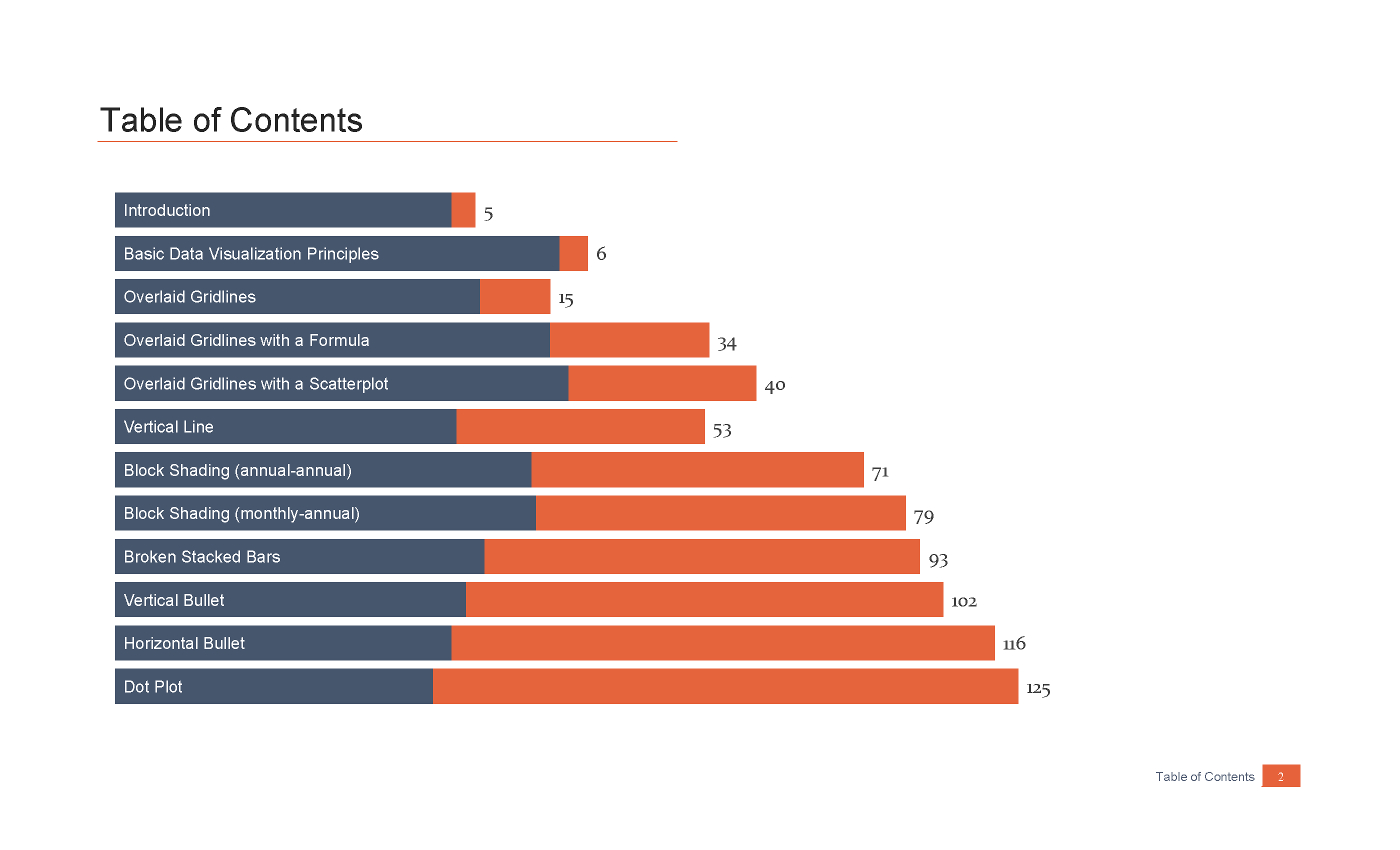
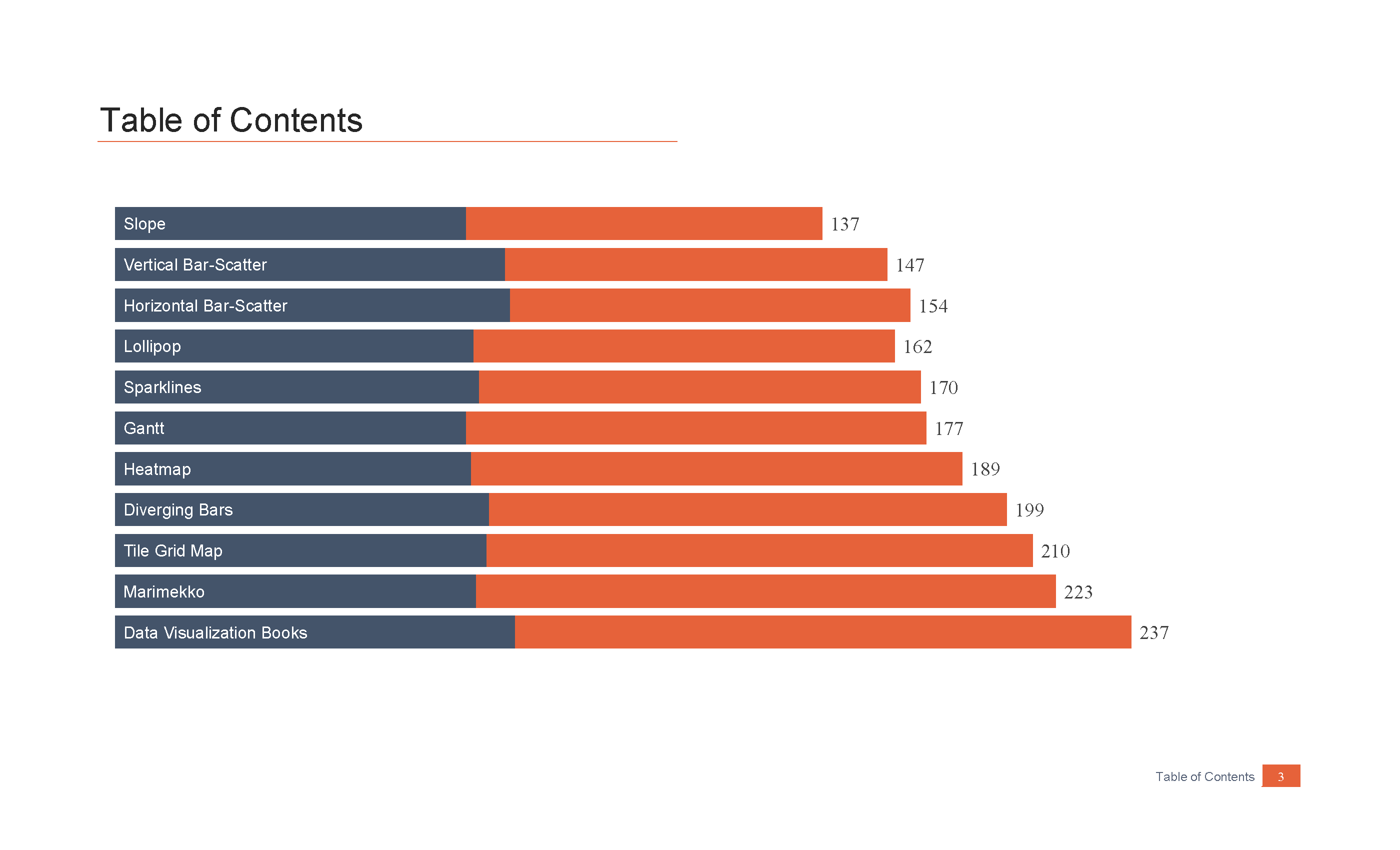
There is a lot of overlap between the two ebooks; there are only a couple of chart types for which the creation process really differs between the two versions of Excel. Of course, the menus have completely changed, so the new ebook contains new screenshots and instructions. In this version, I walk you through how to create more than 15 different charts: Overlaid gridlines (3 alternatives); Vertical Line; Block shading (annual-annual; monthly-annual); Broken Stacked Bars; Vertical and Horizontal Bullet Charts; Dot Plot; Slope Chart; Vertical and Horizontal Bar-Scatter Combination Plot; Lollipop Chart; Waterfall Chart; Sparklines; Heatmap; Diverging Bars; Tile Grid Map; and a Marimekko Chart. I’ve also added a variation of the Gantt chart that Glenna Shaw developed on a project we were working on earlier this year.
Here’s the Table of Contents:
The guide comes with an Excel file that you can use to follow the steps and create your own graphs and as a template for your own use.
I’m indebted to many students, workshop participants, and other Excel enthusiasts for helping me develop these lessons over the past couple of years. I’m especially indebted to Glenna Shaw for helping me with the layout and design of the final product.
You can purchase your copy of the version for Excel 2016/O365, Excel 2010/2011, or a discounted Combo Pack of both ebooks in the PolicyViz Shop.
Buy the entire 238-page step-by-step Guide to Advanced Data Visualization in Excel


