Last month, I finished teaching an”Intensive Learning Environment” (or ILE) course on data visualization at Georgetown University’s McDonough School for Business. The class takes place over six evenings (three hours each) and two full-day Saturdays. I try to fit in the basics of data visualization theory and best practices, some statistics, some tools (namely Tableau, PowerBI, and advanced Excel), and a day on presentation skills. I also bring in some guest speakers, this year Nick Heitzman from FI Consulting to talk about data and data visualization in business and consulting; Hannah Fairfield from the New York Times to talk about storytelling and interactive design; Brittany Fong to talk Tableau; and Catherine Madden to talk about data sketching.
Due to the compressed nature of the class and because the students are all working full-time, there is not a lot of opportunities for outside reading and homeworks. Further, because no one wants to listen to someone lecture for three straight hours, we do a lot of in-class exercises, critiques, and tutorials.
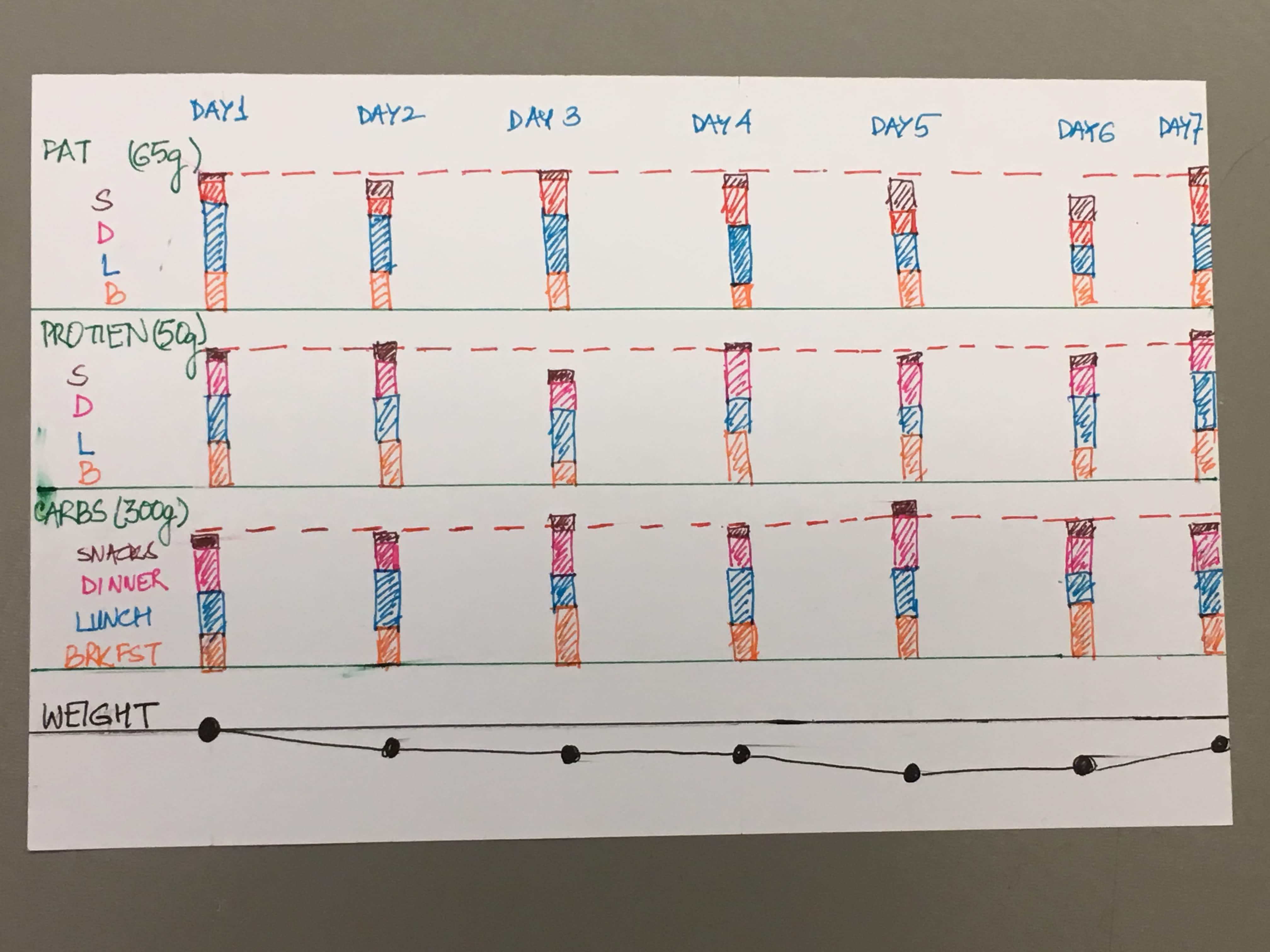
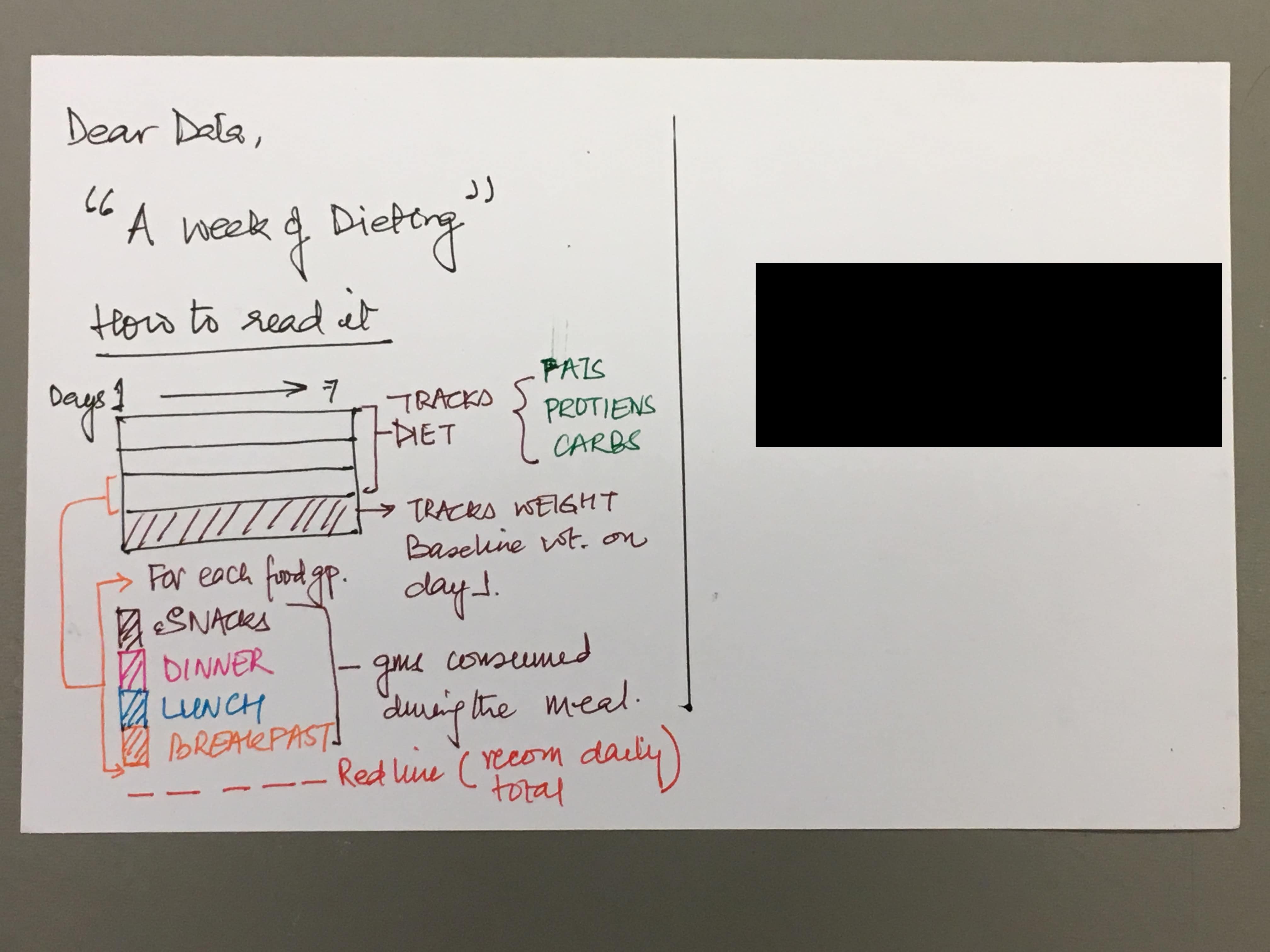
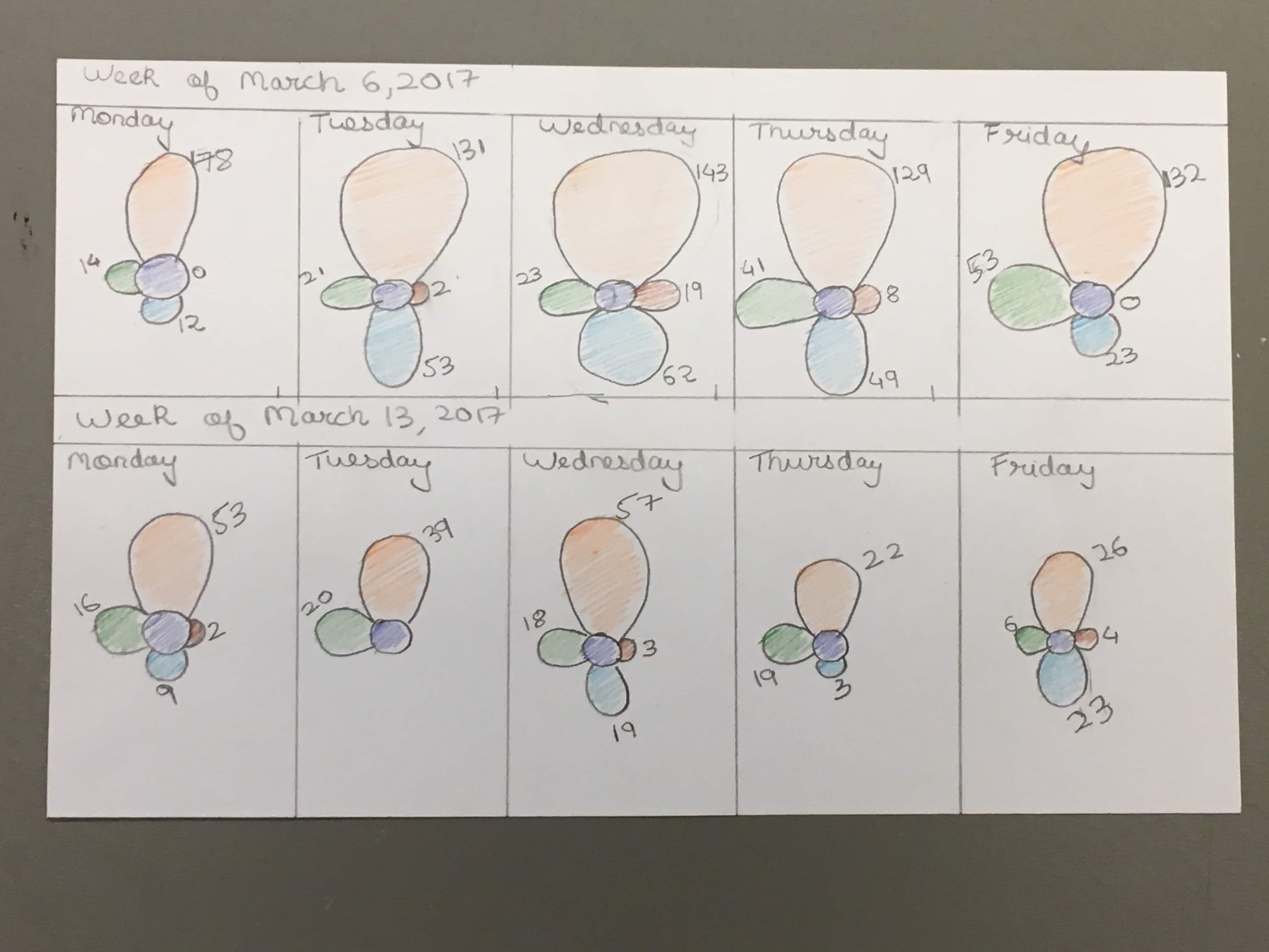
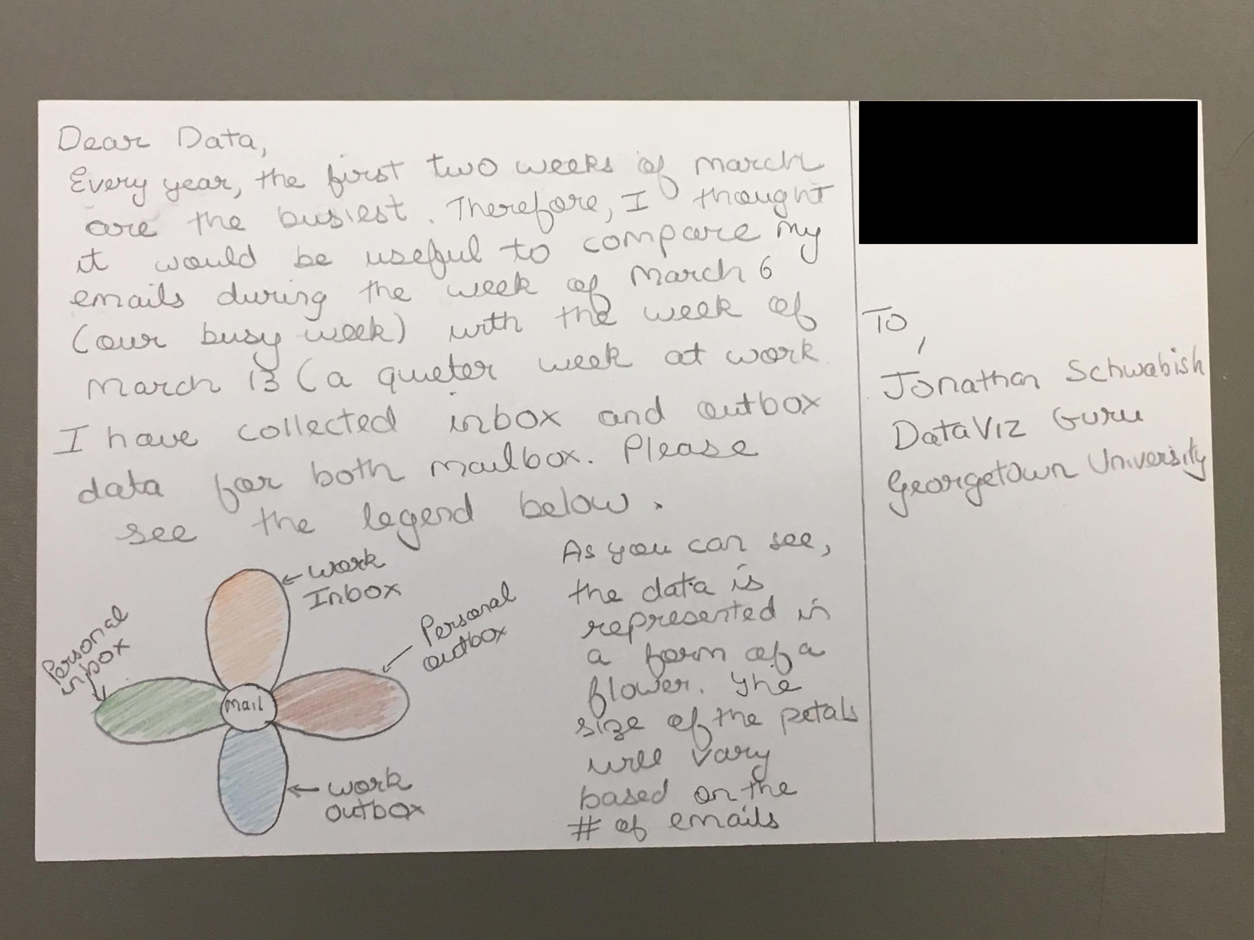
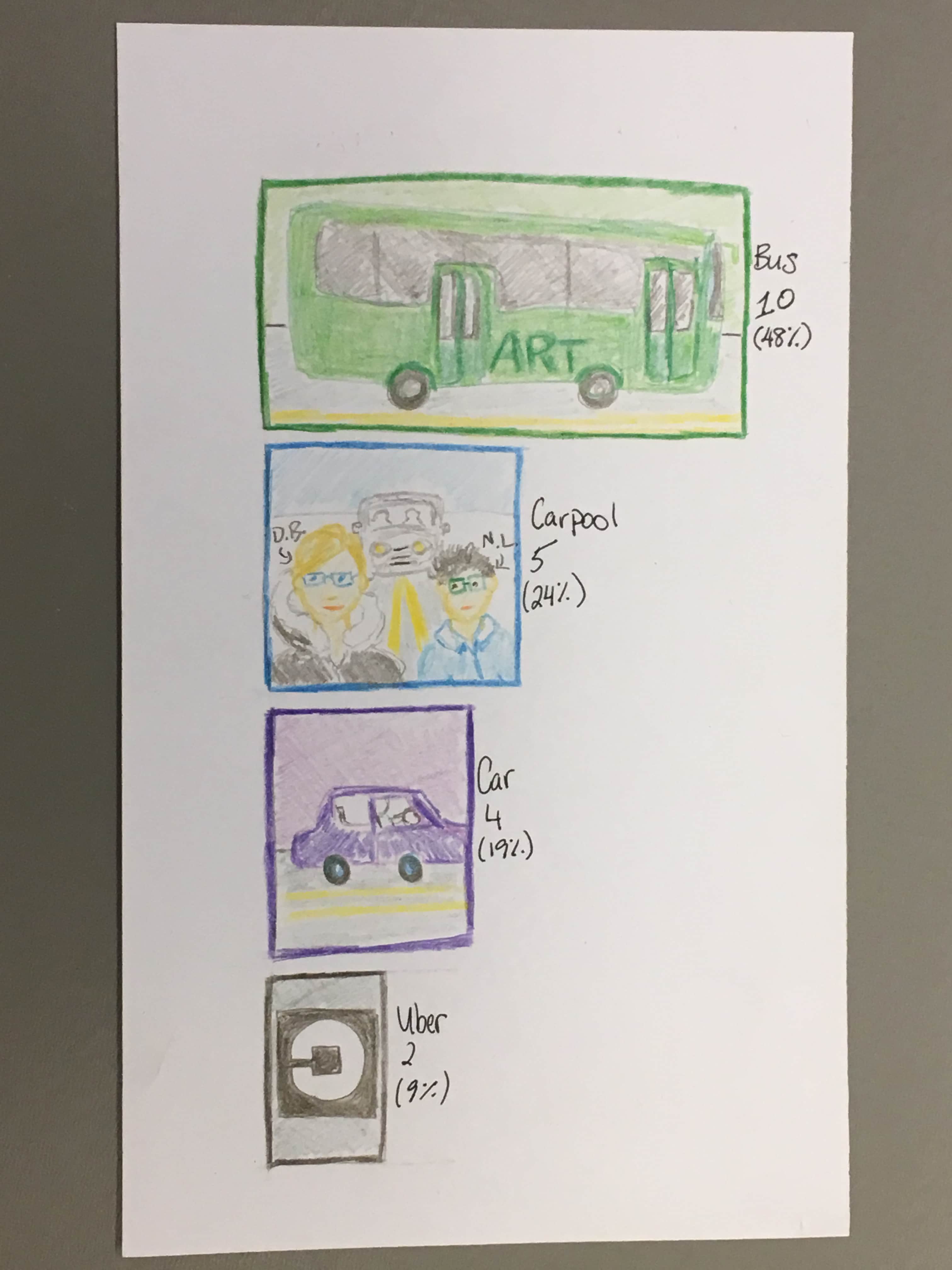
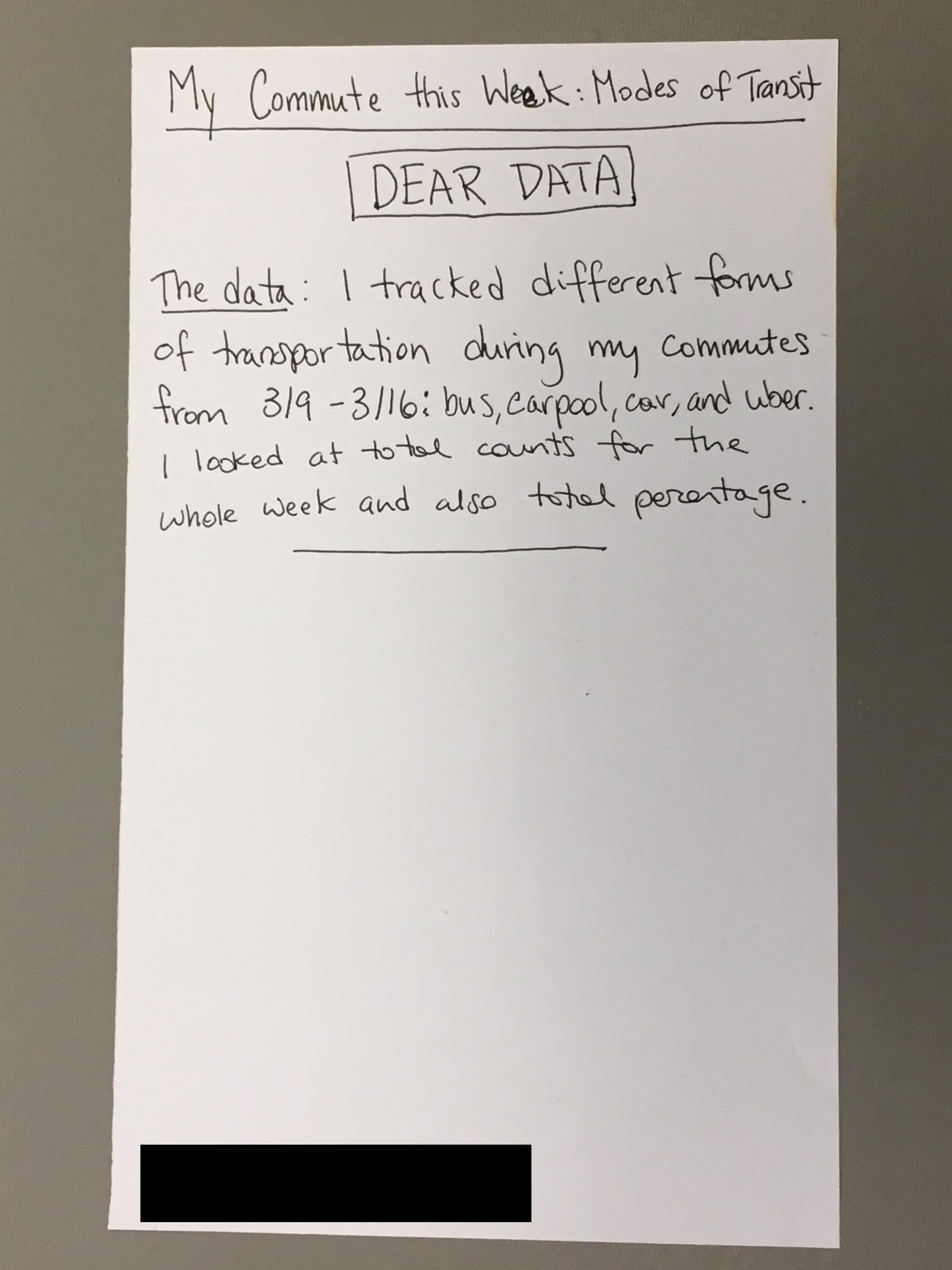
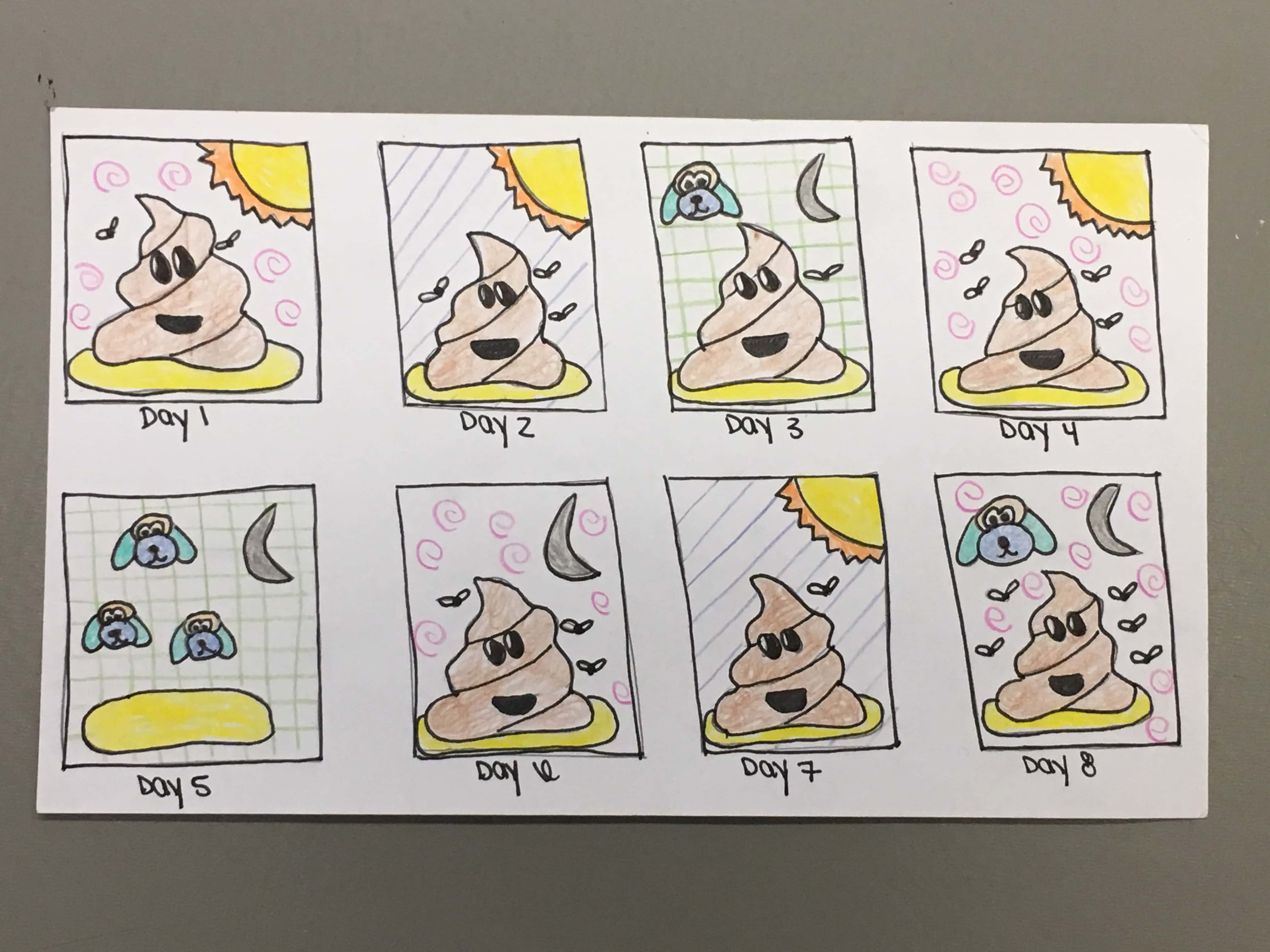
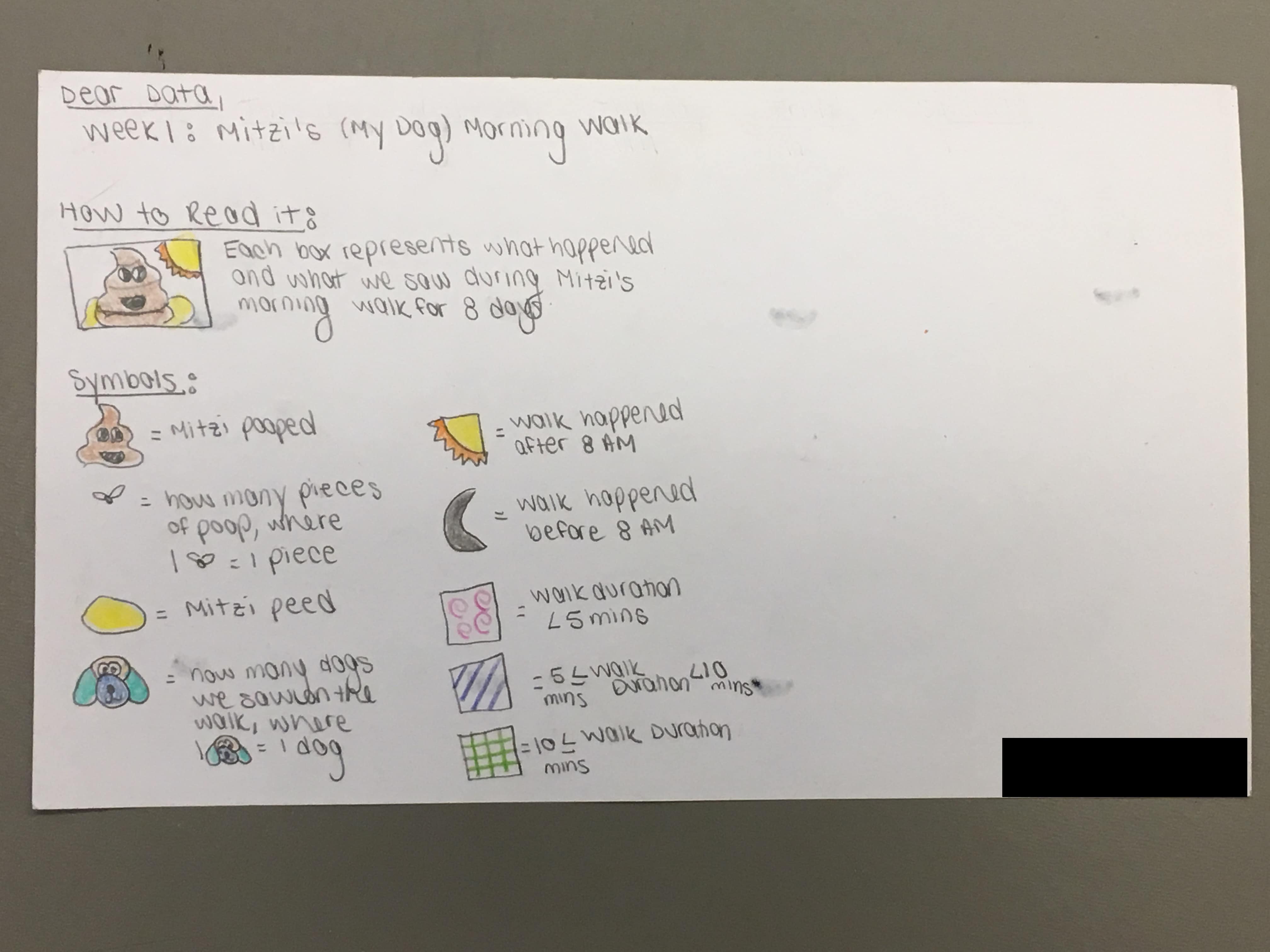
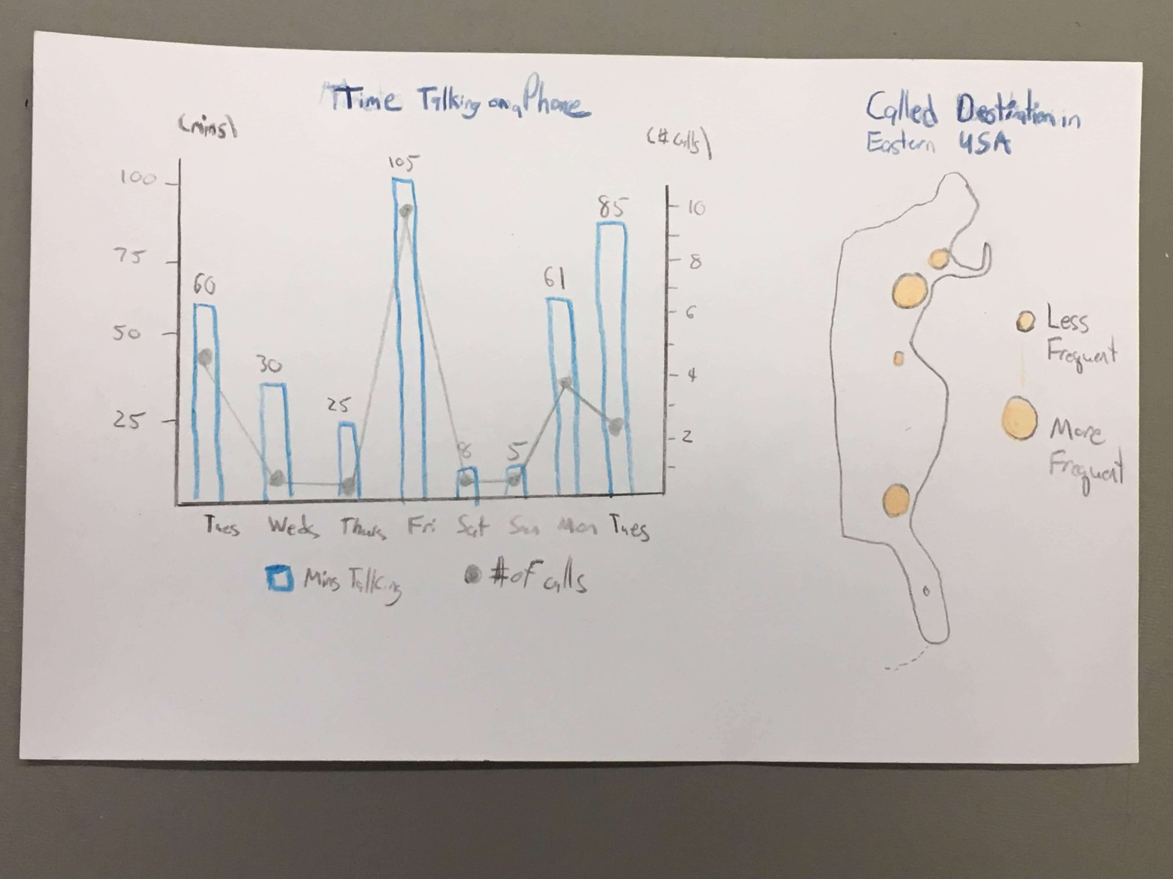
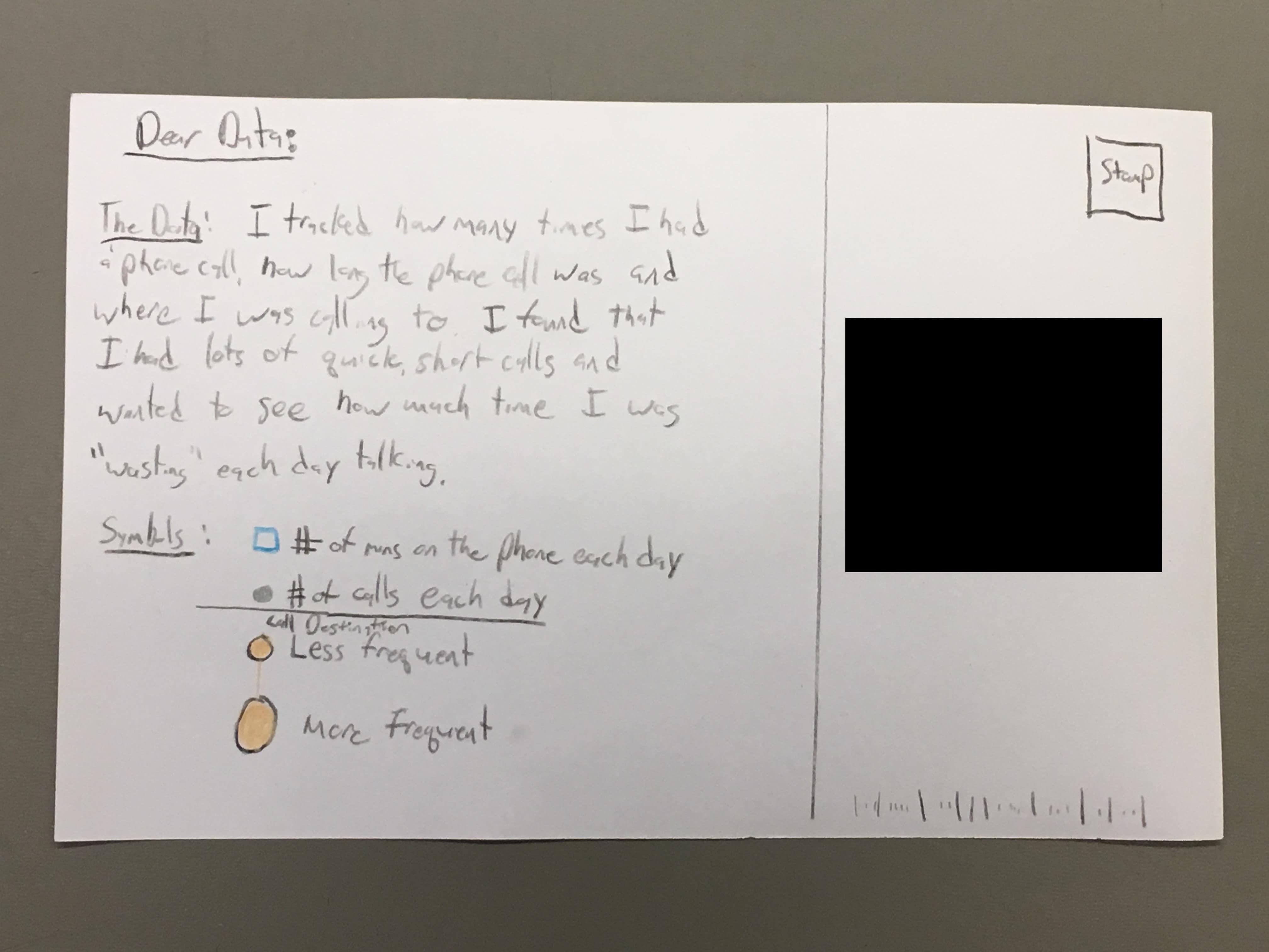
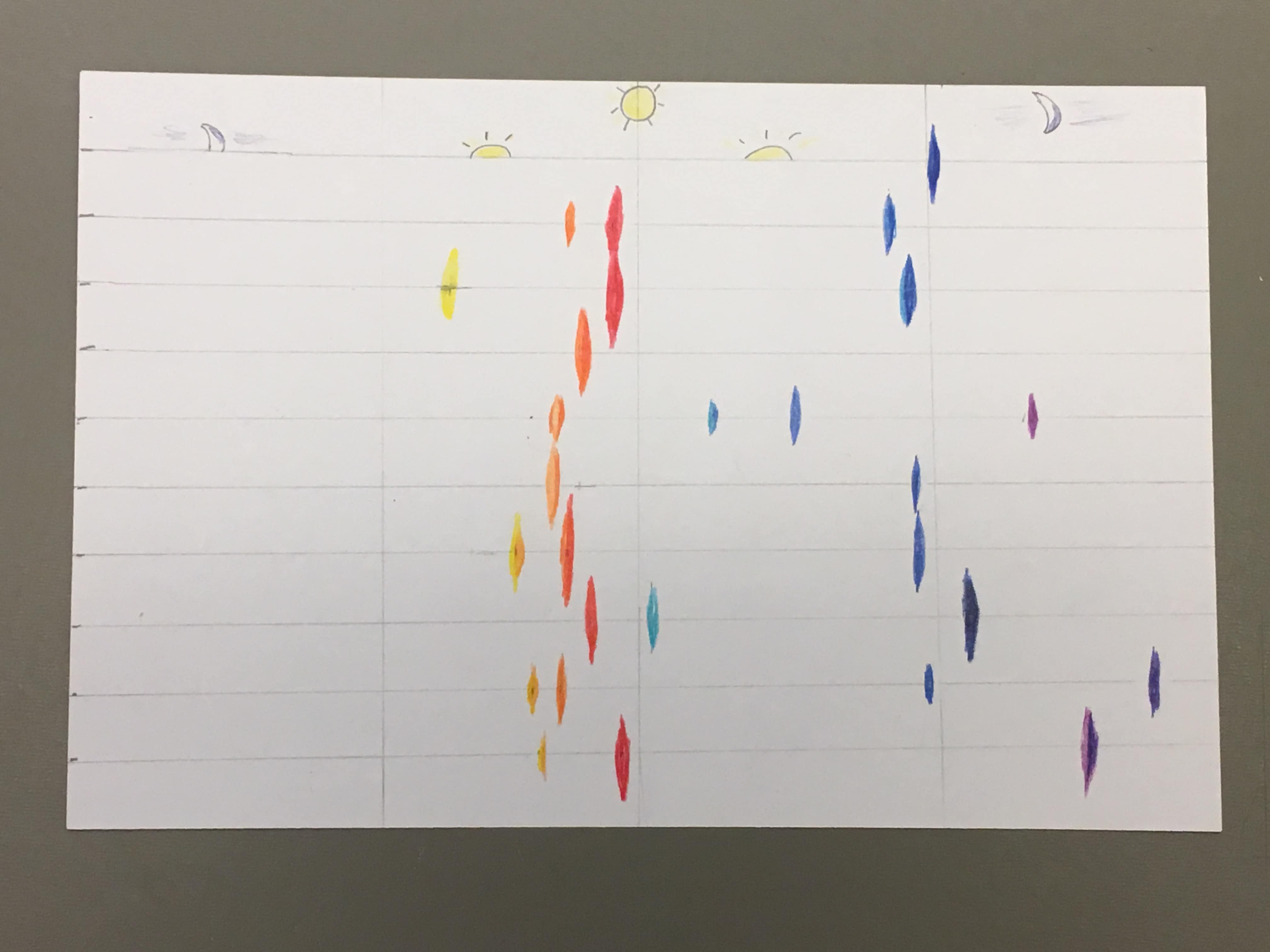
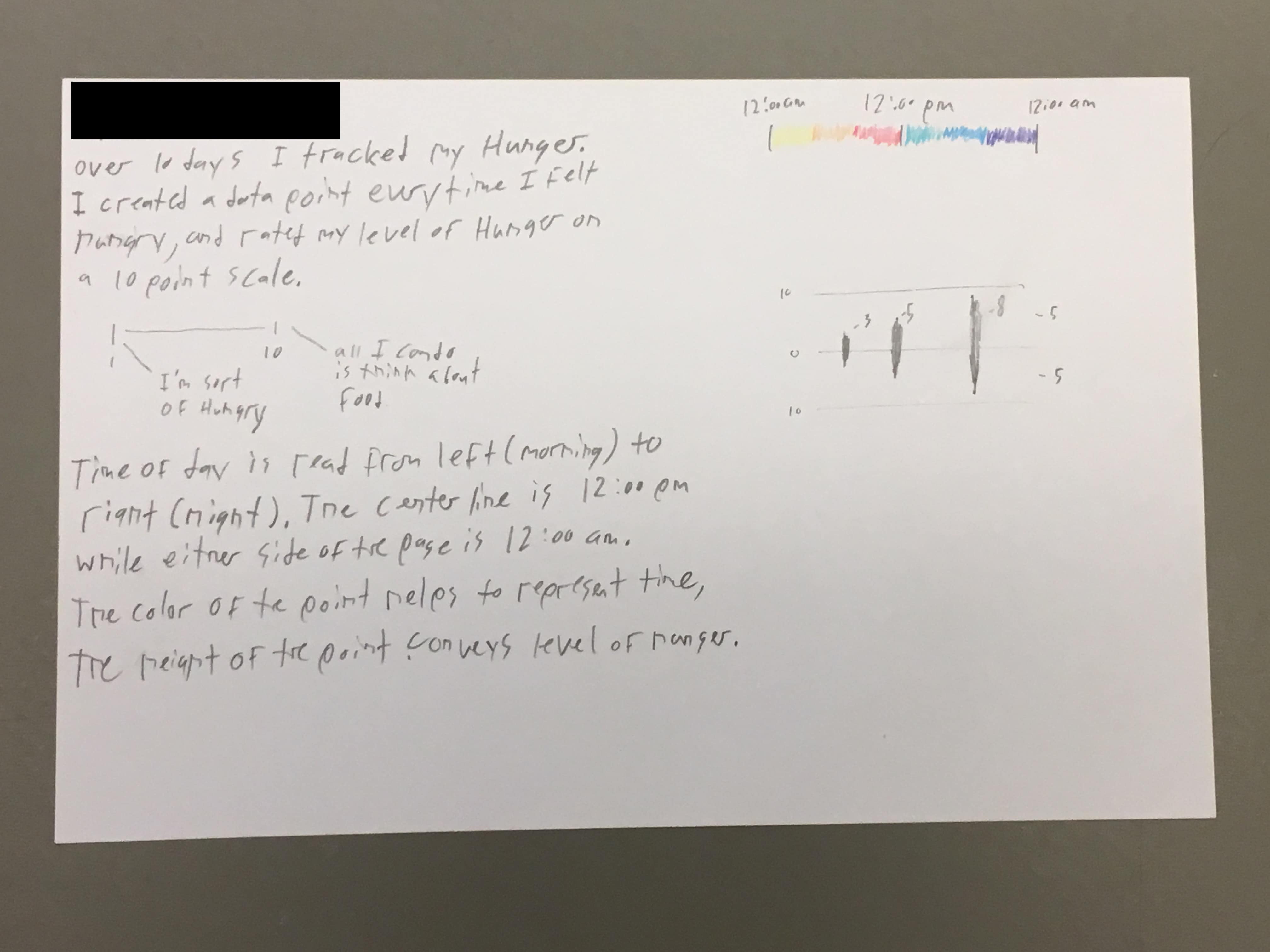
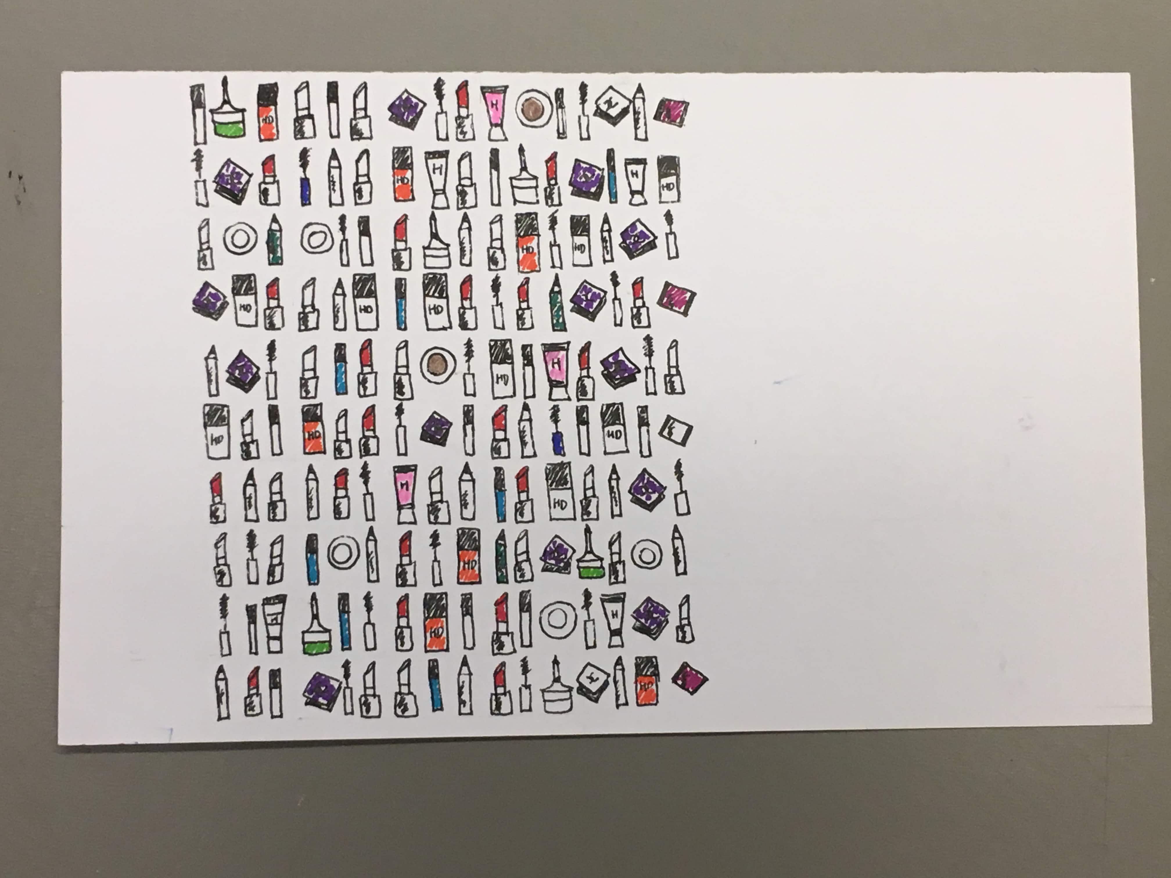
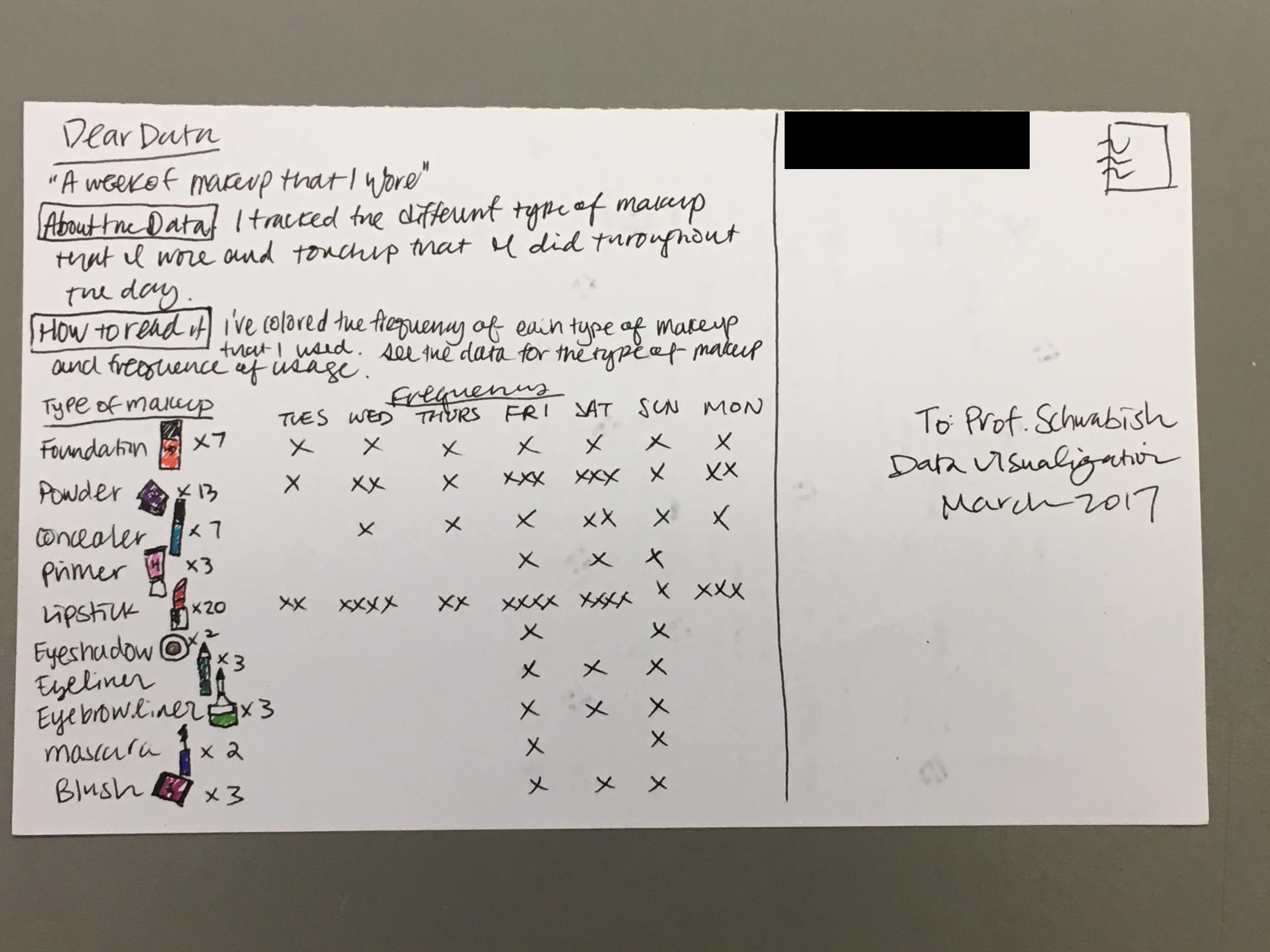
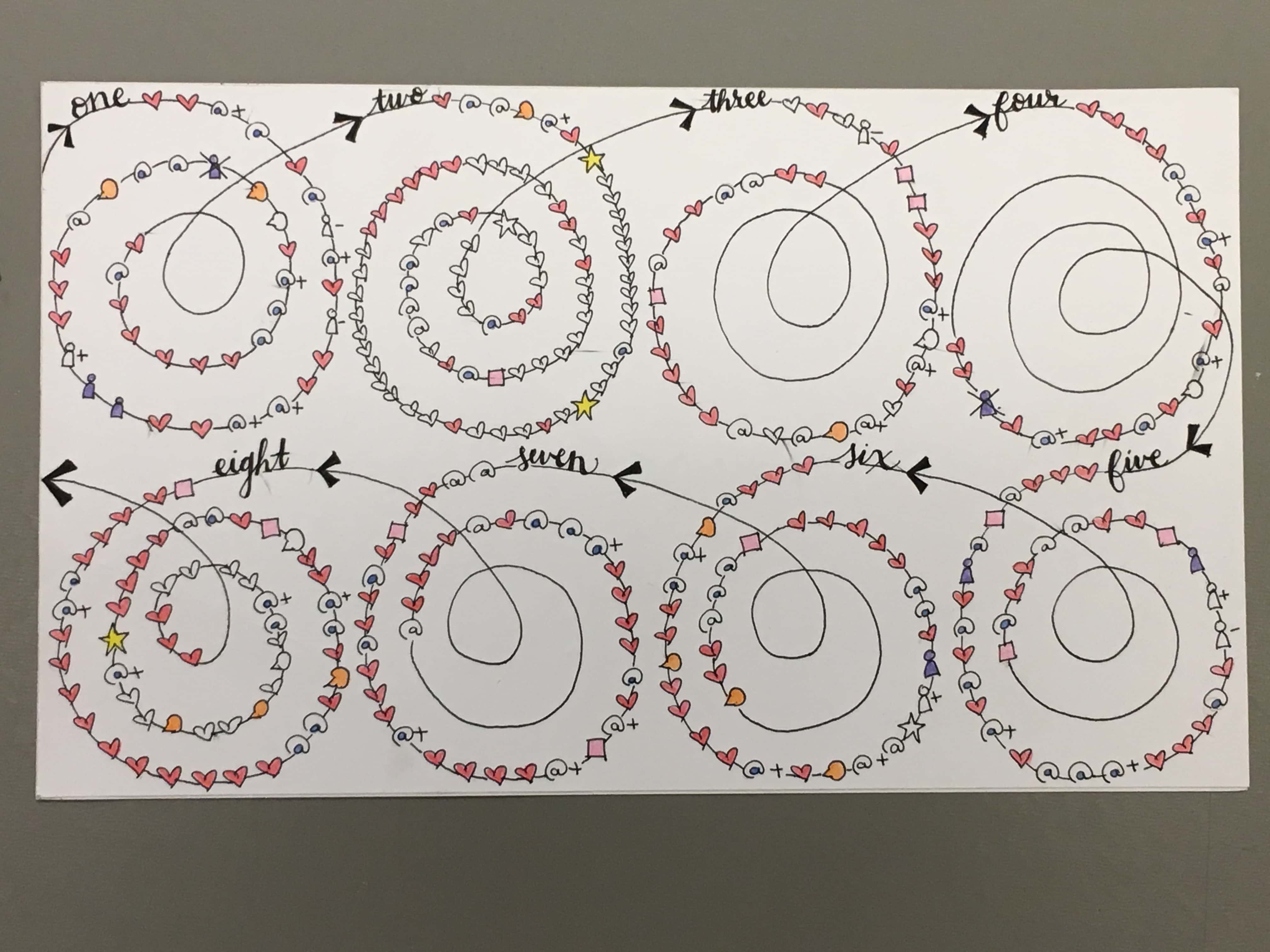
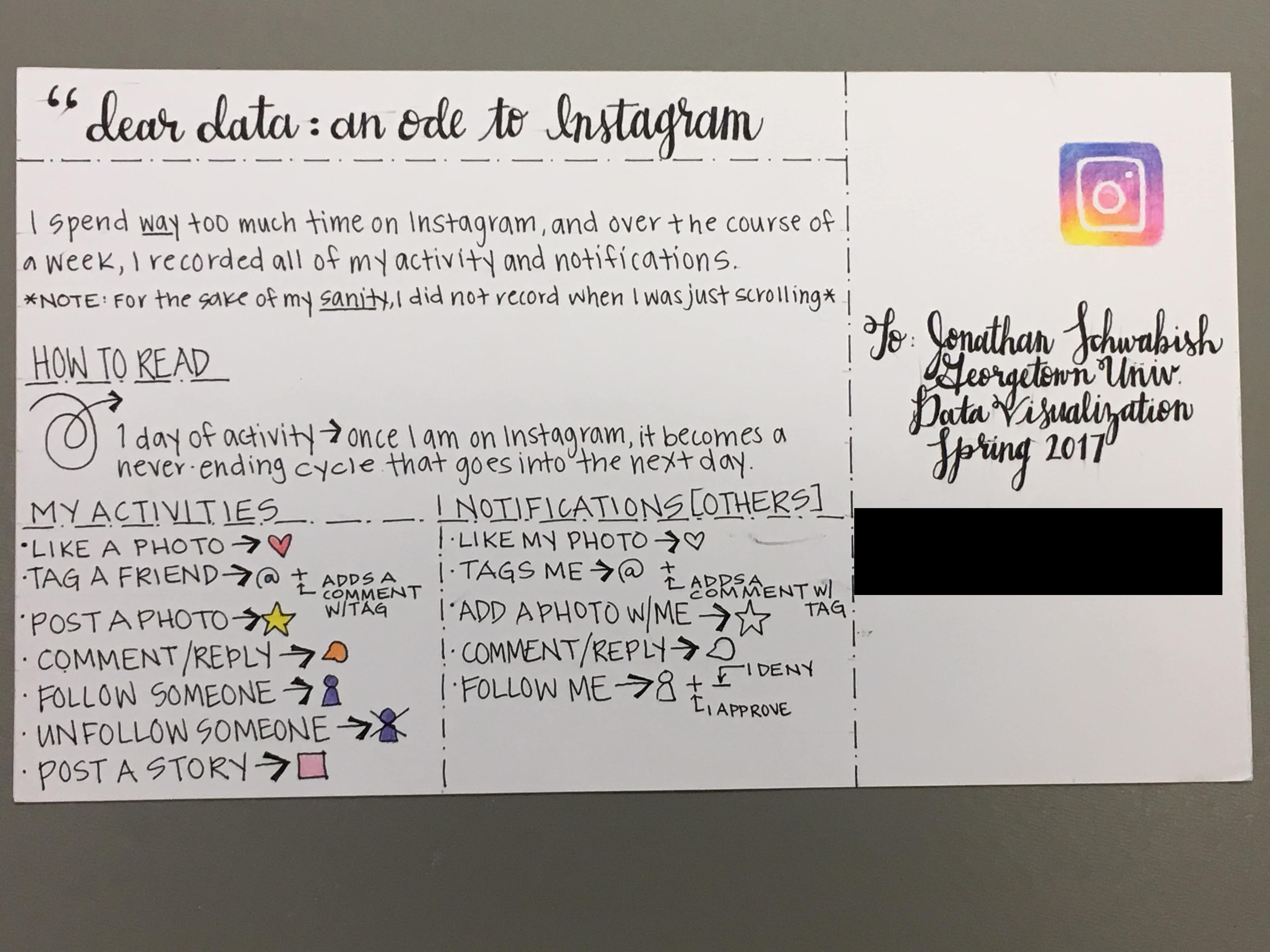
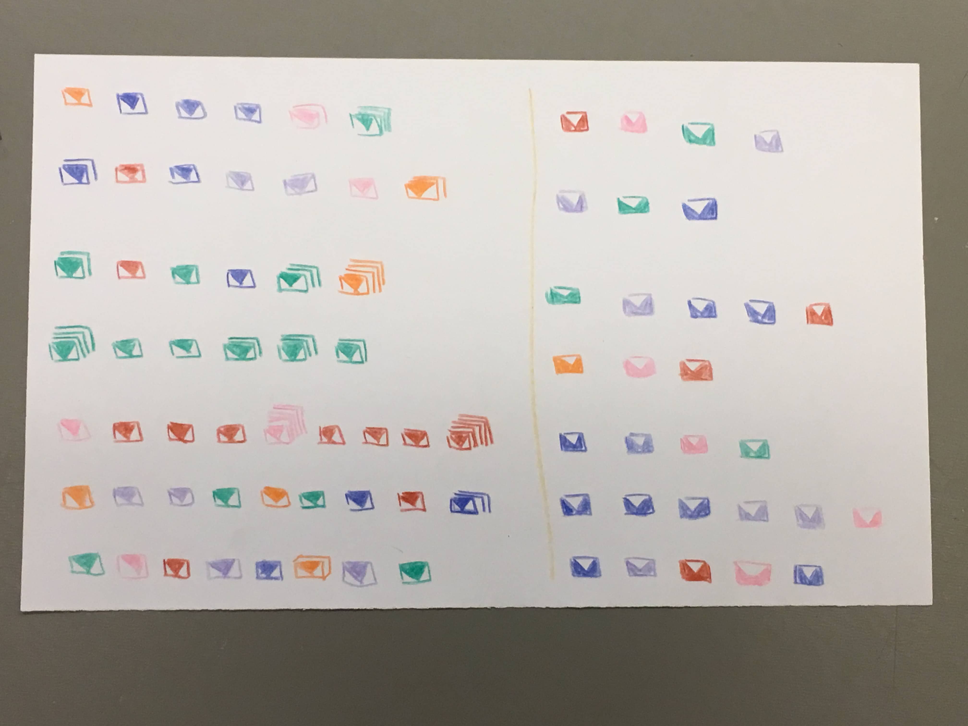
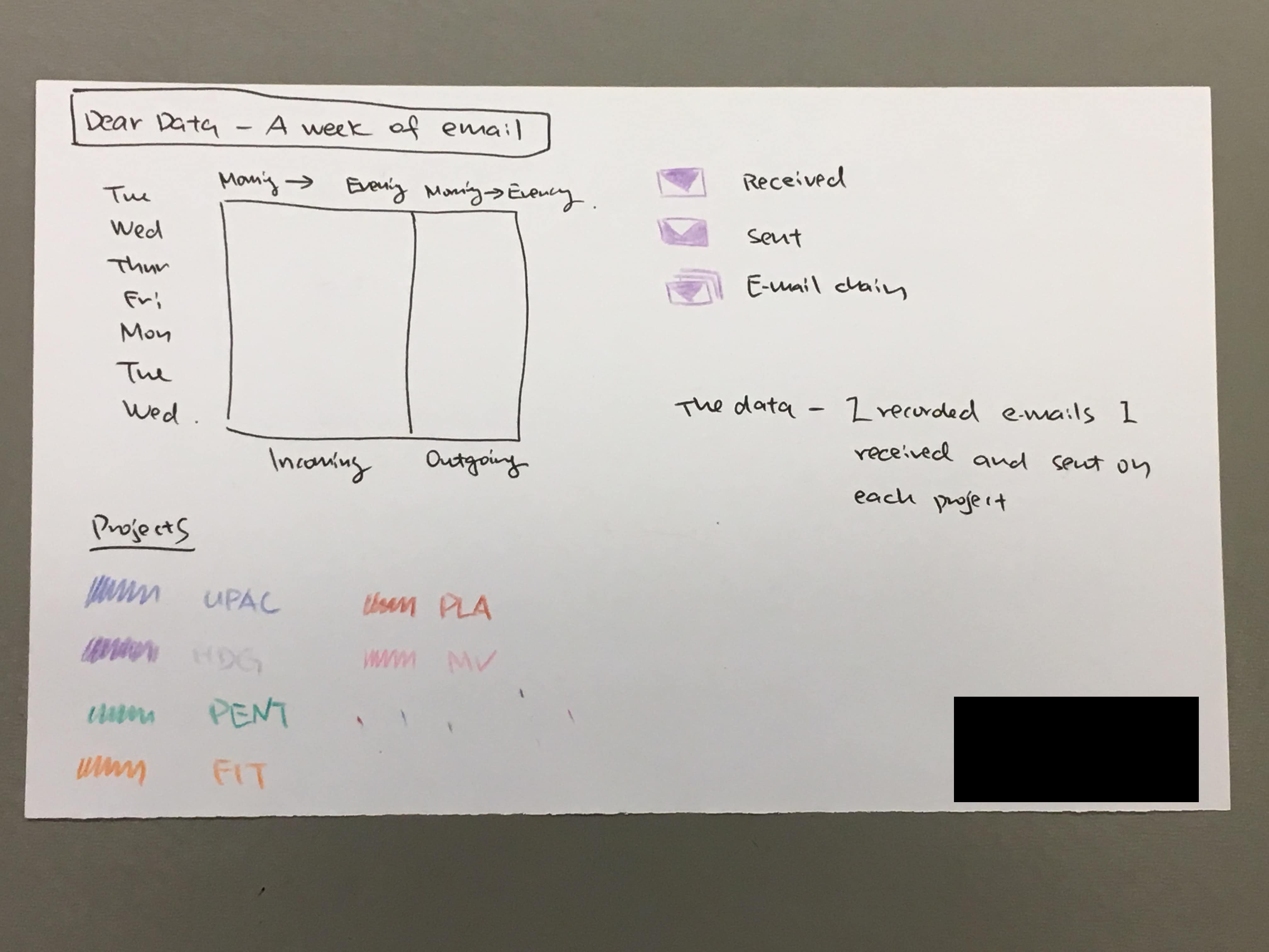
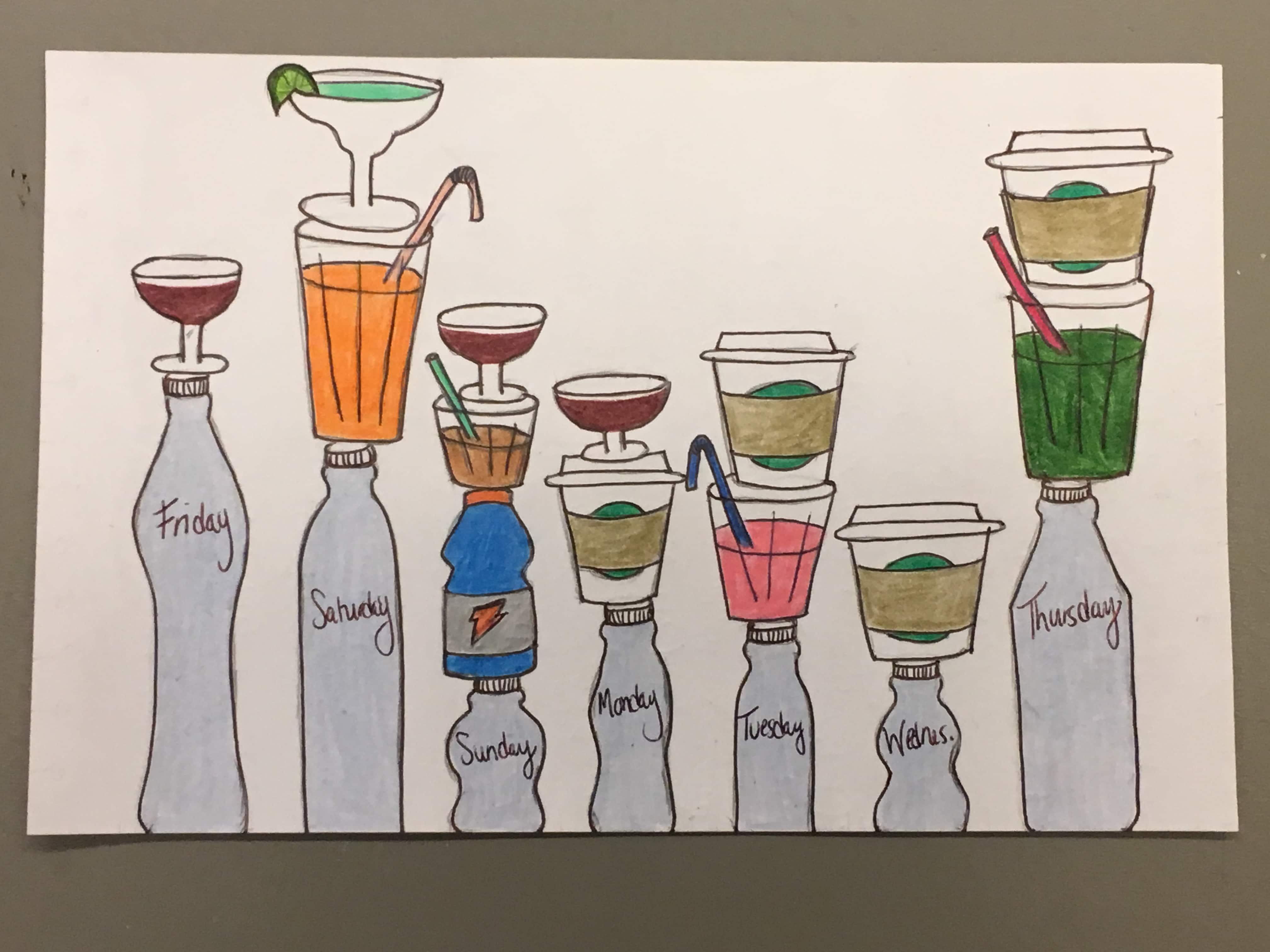
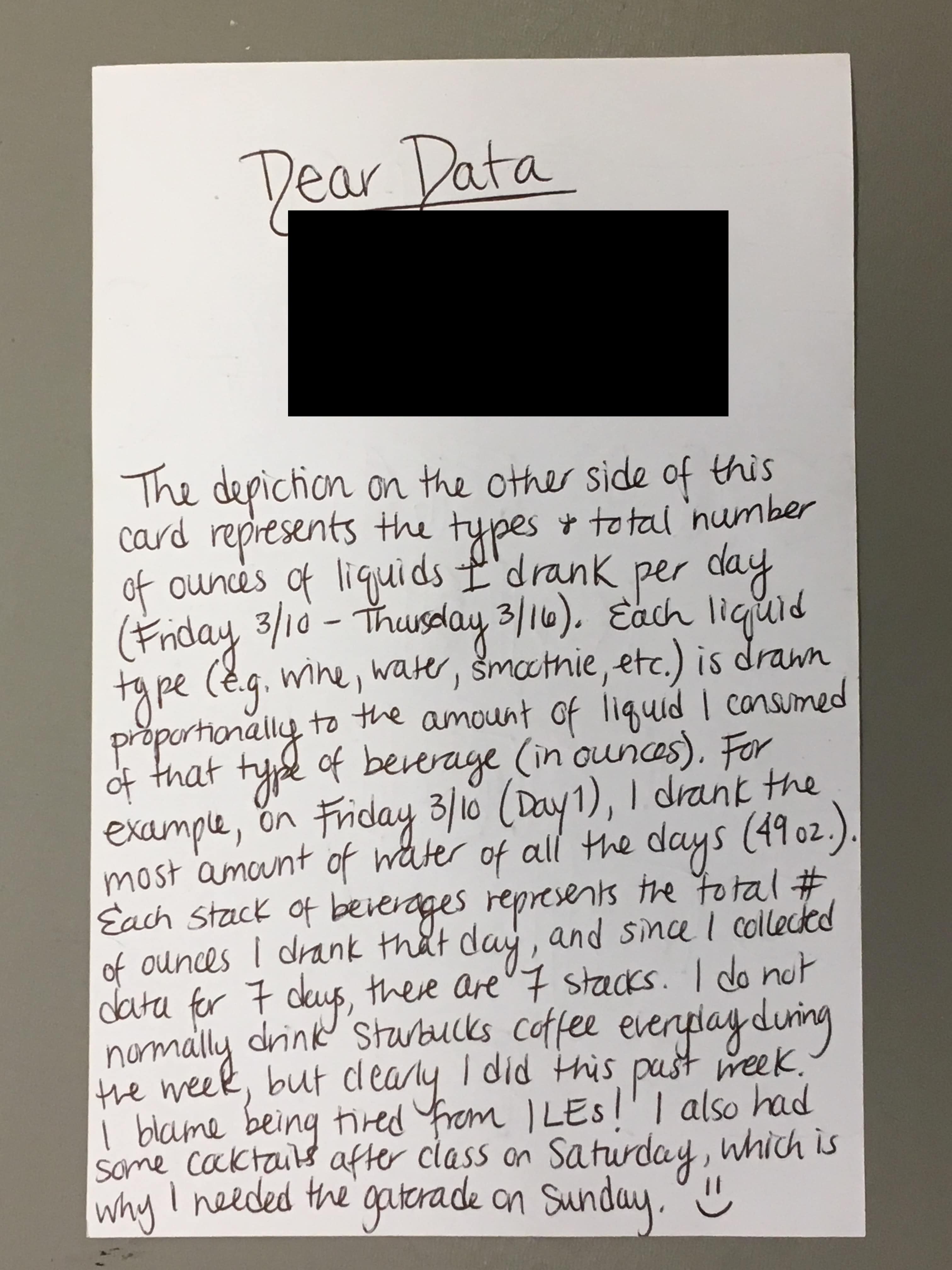
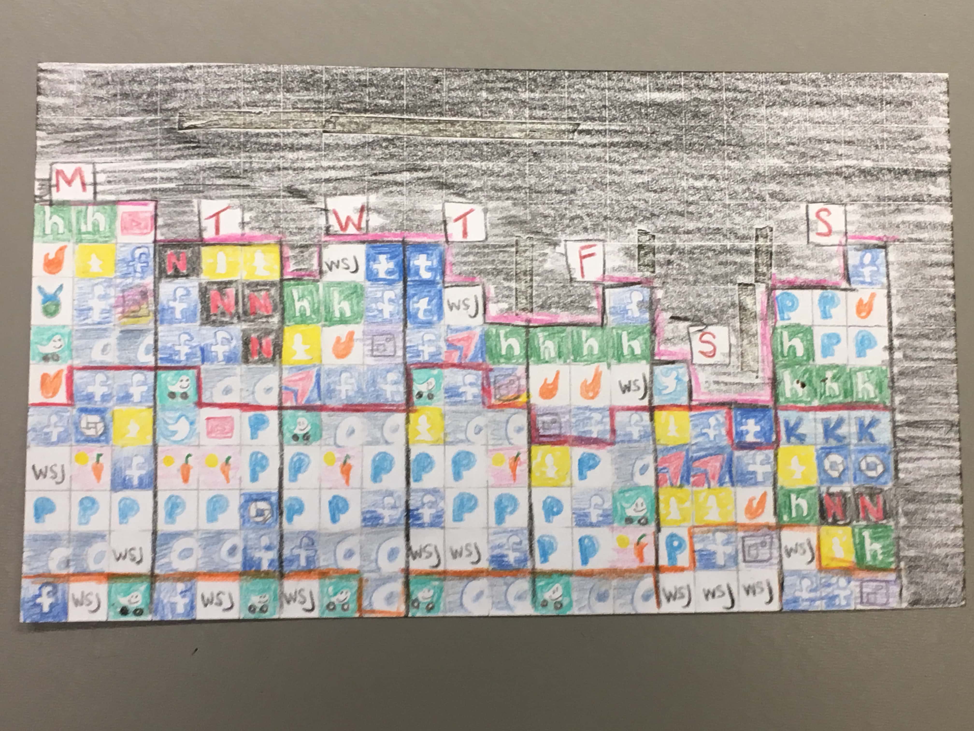
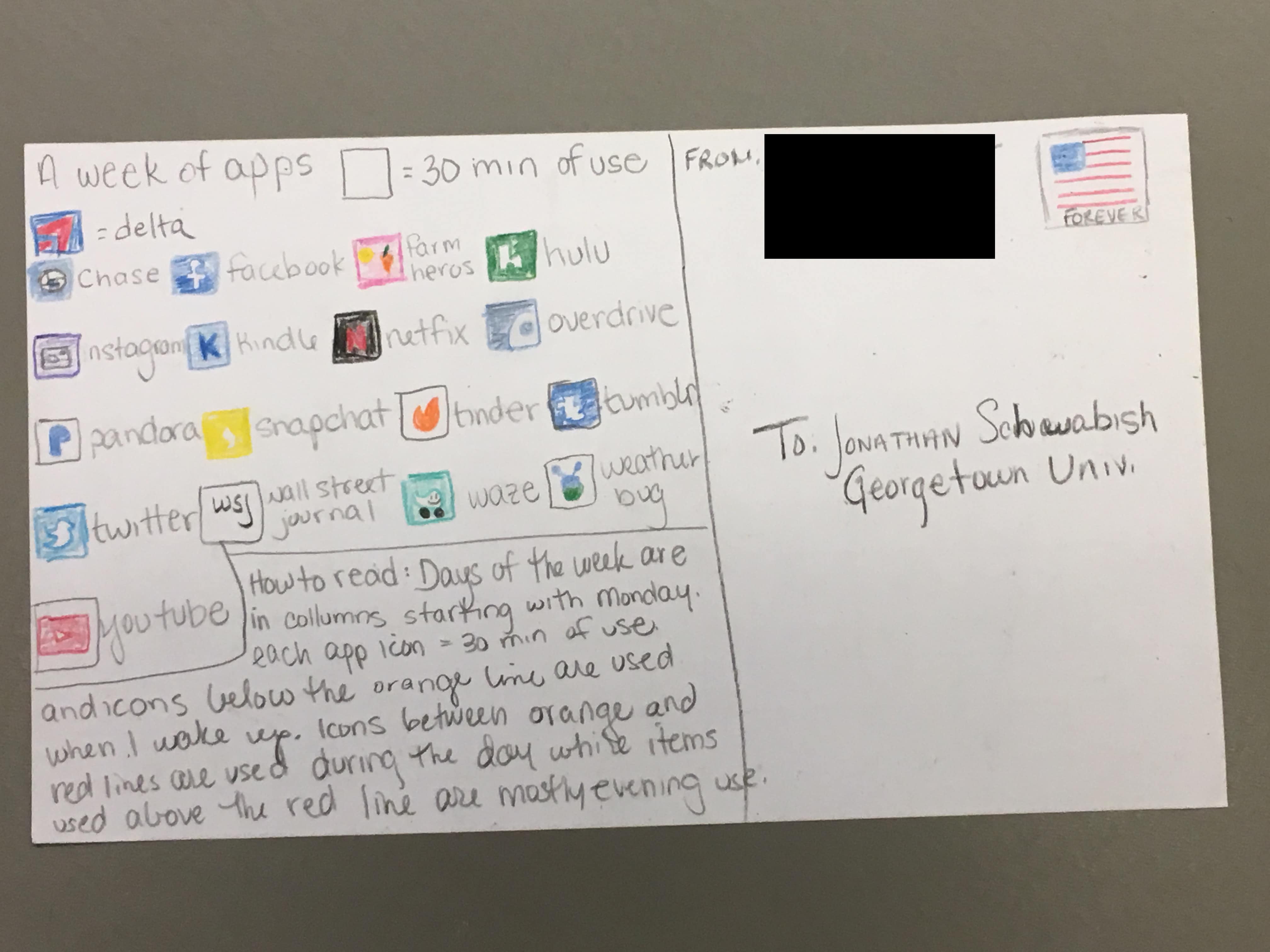
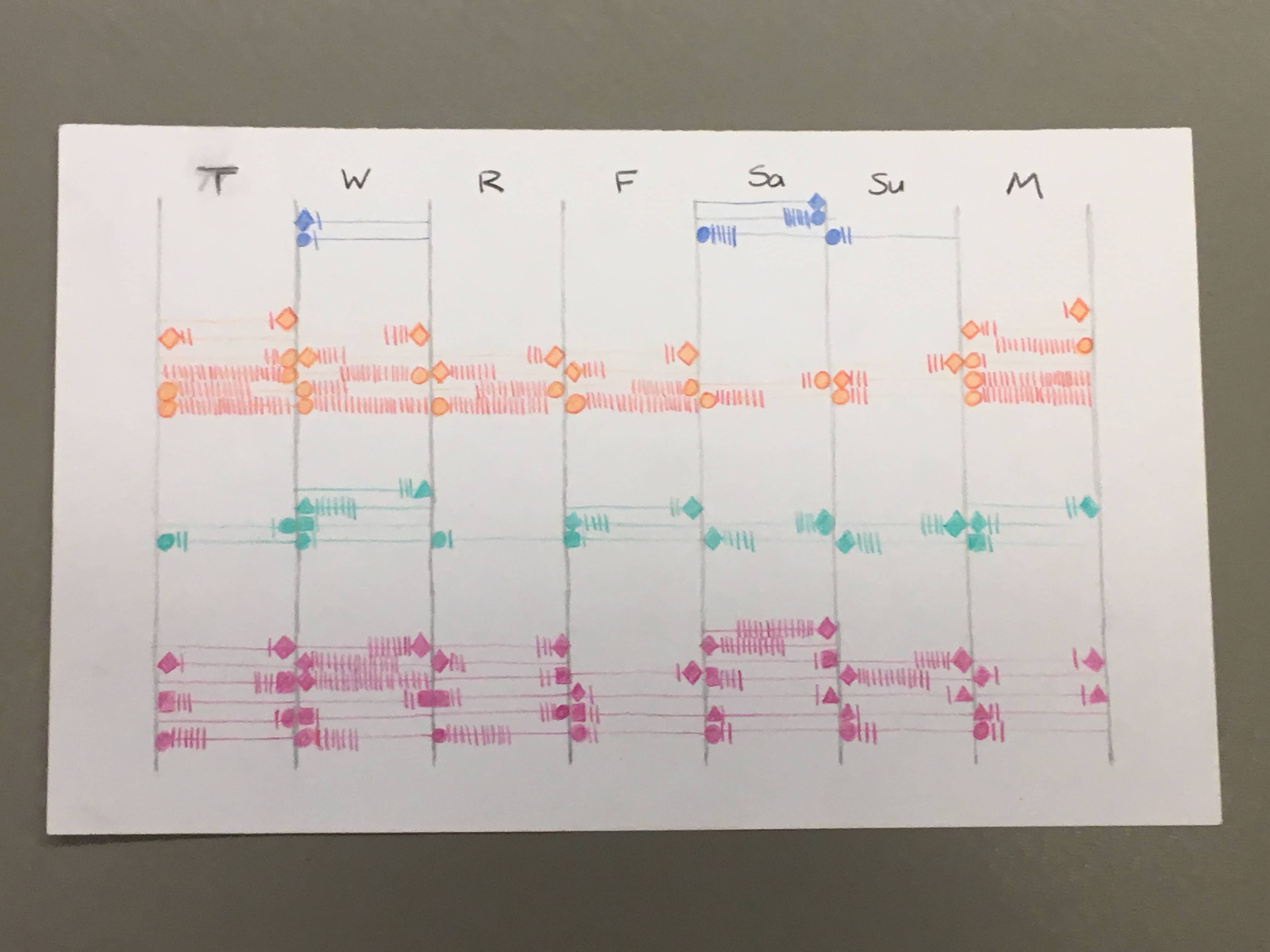
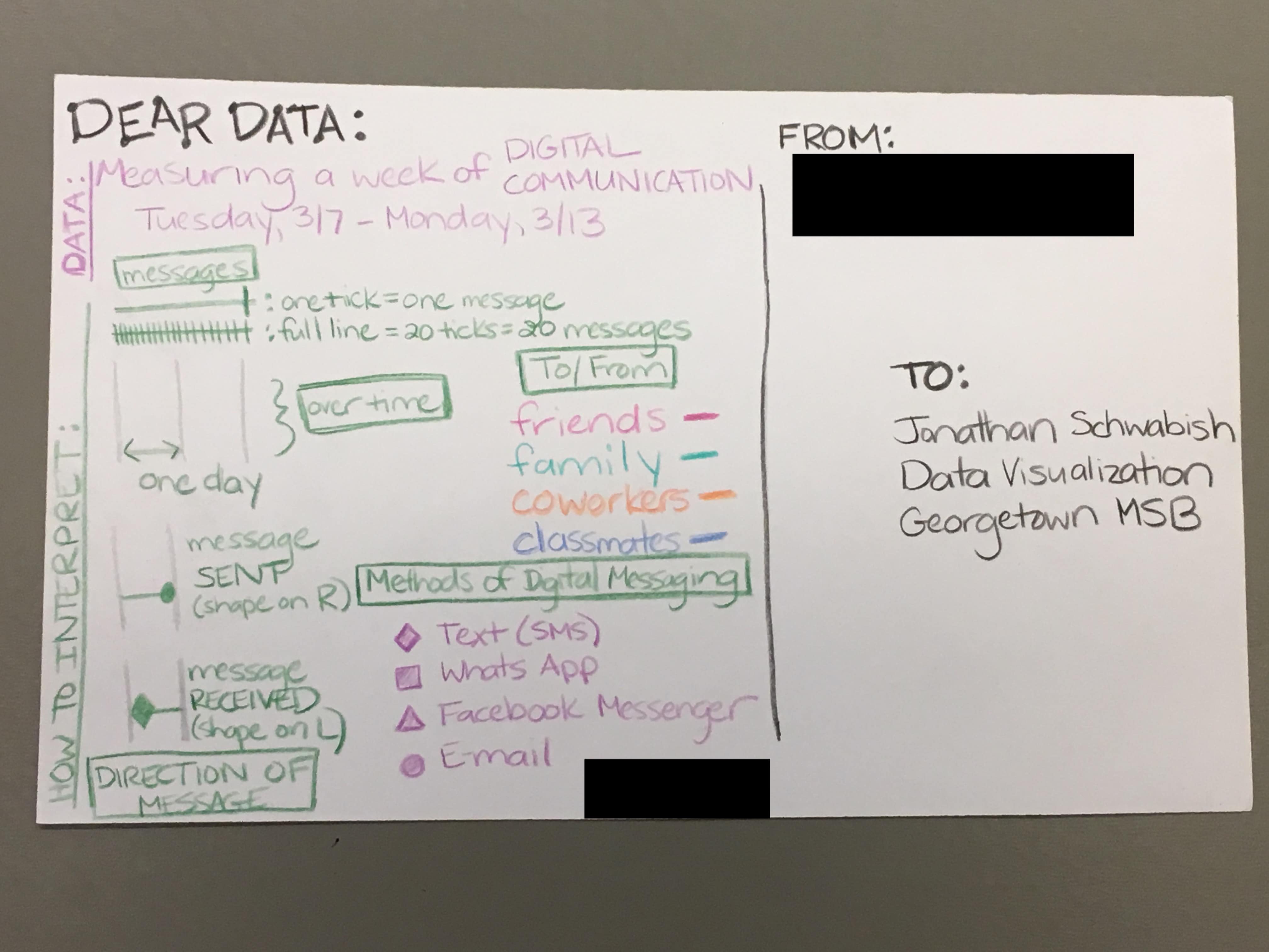
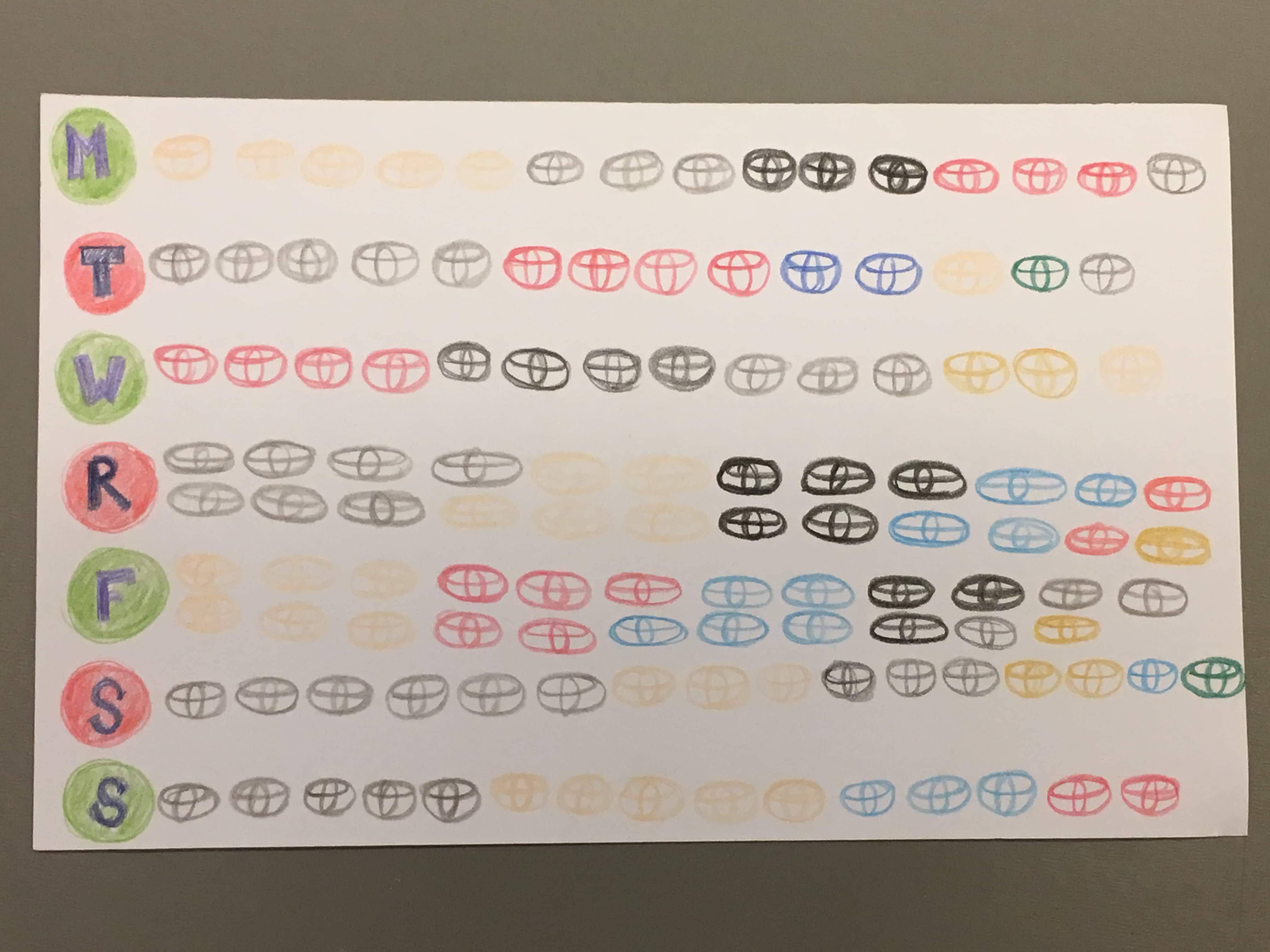
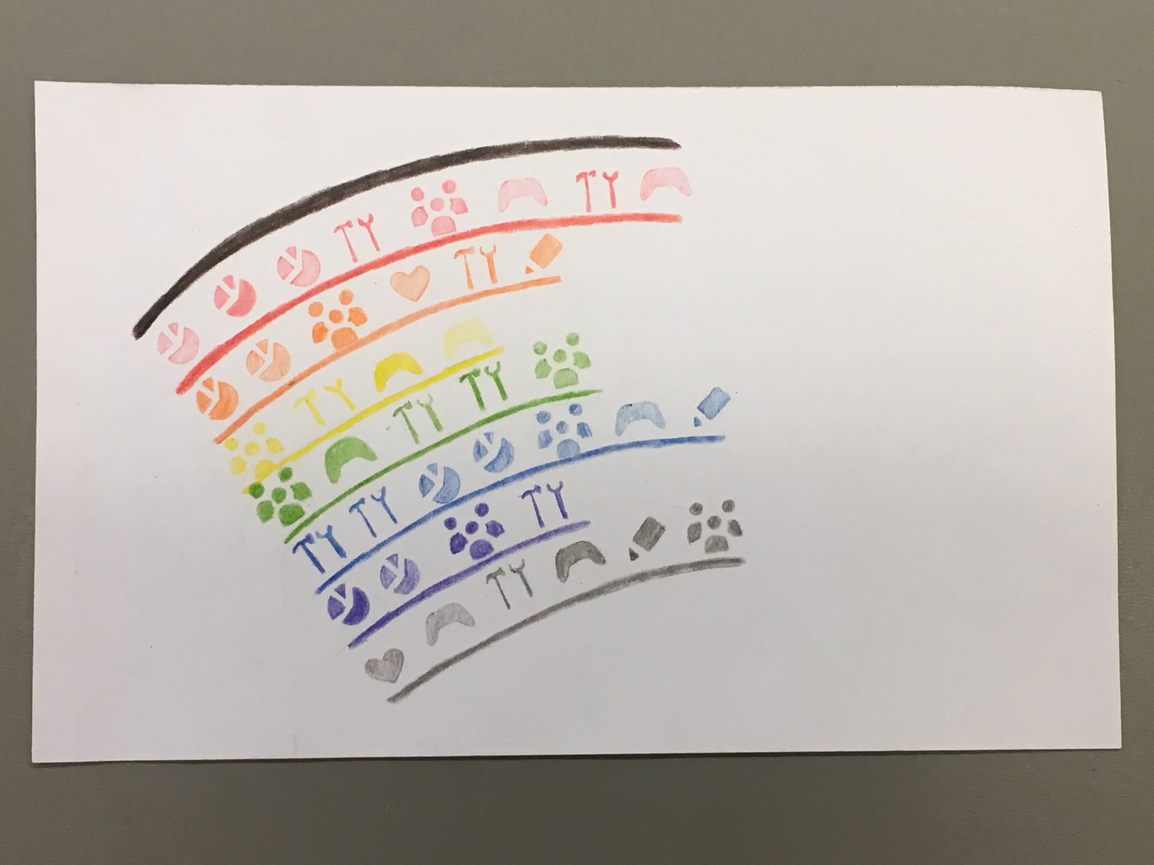
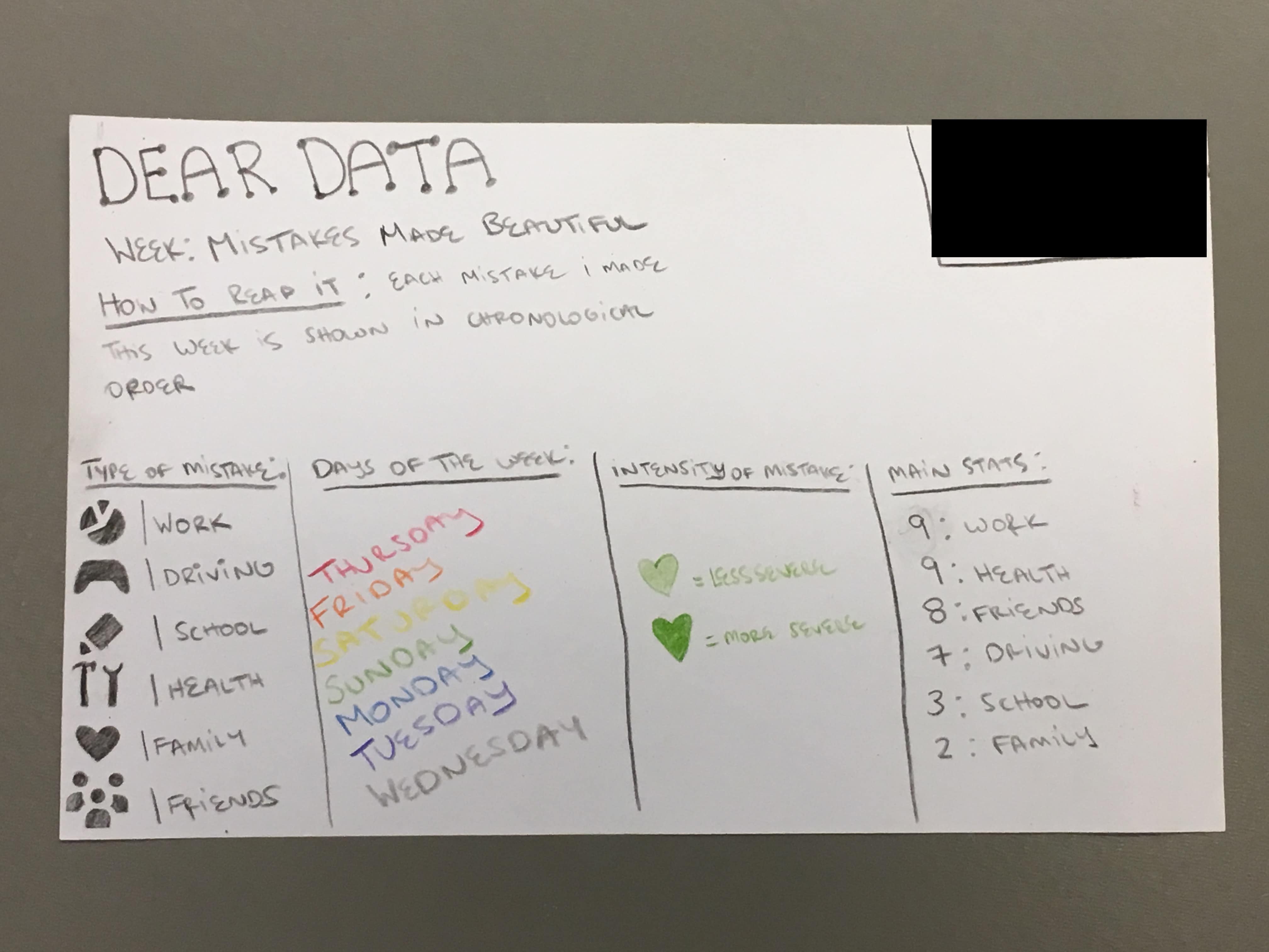
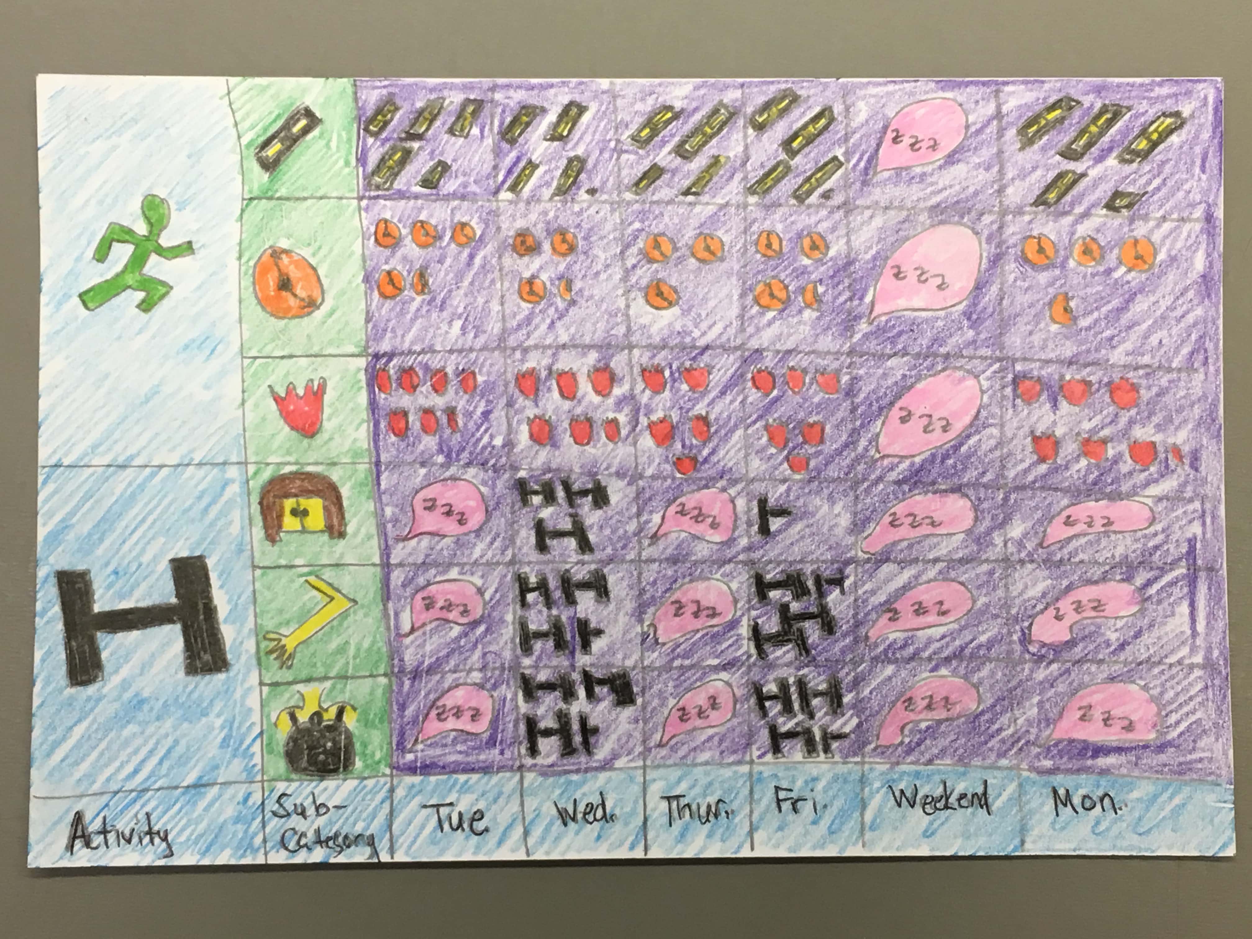
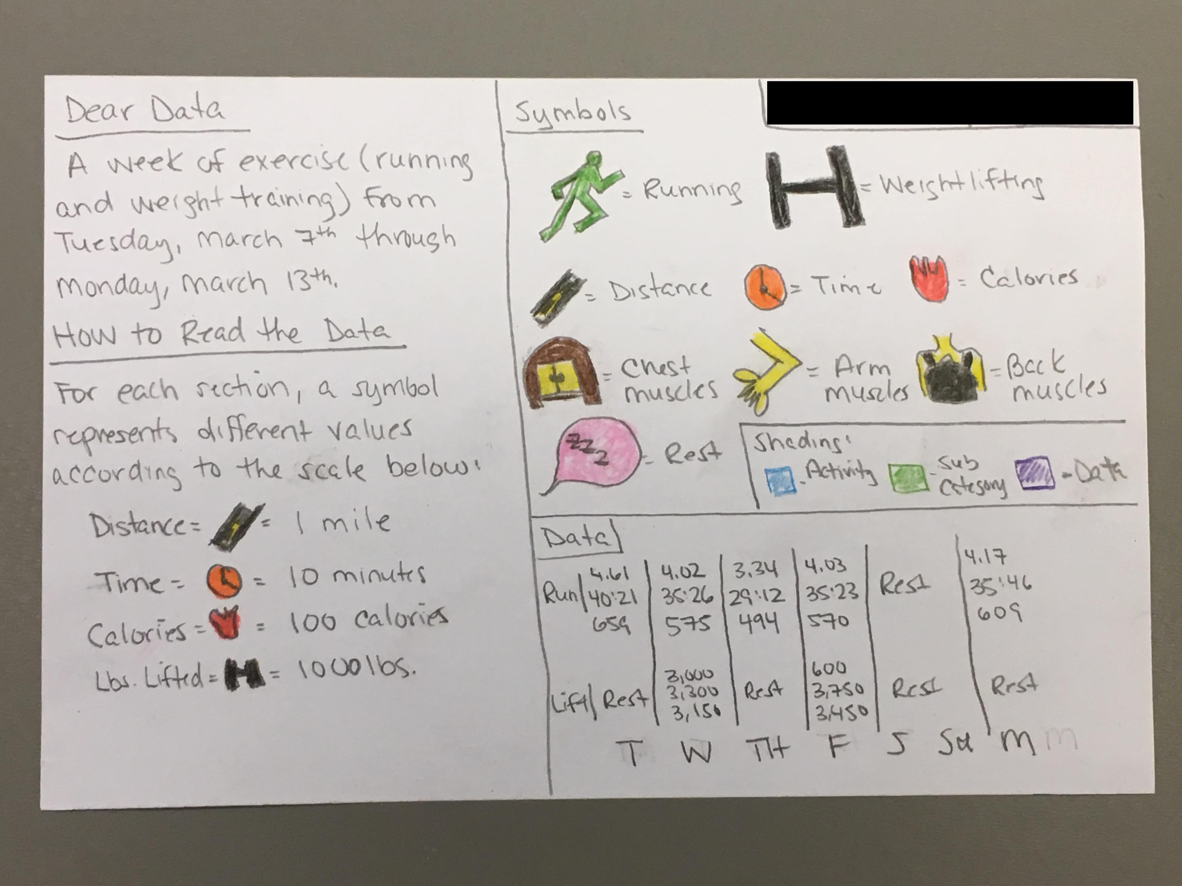
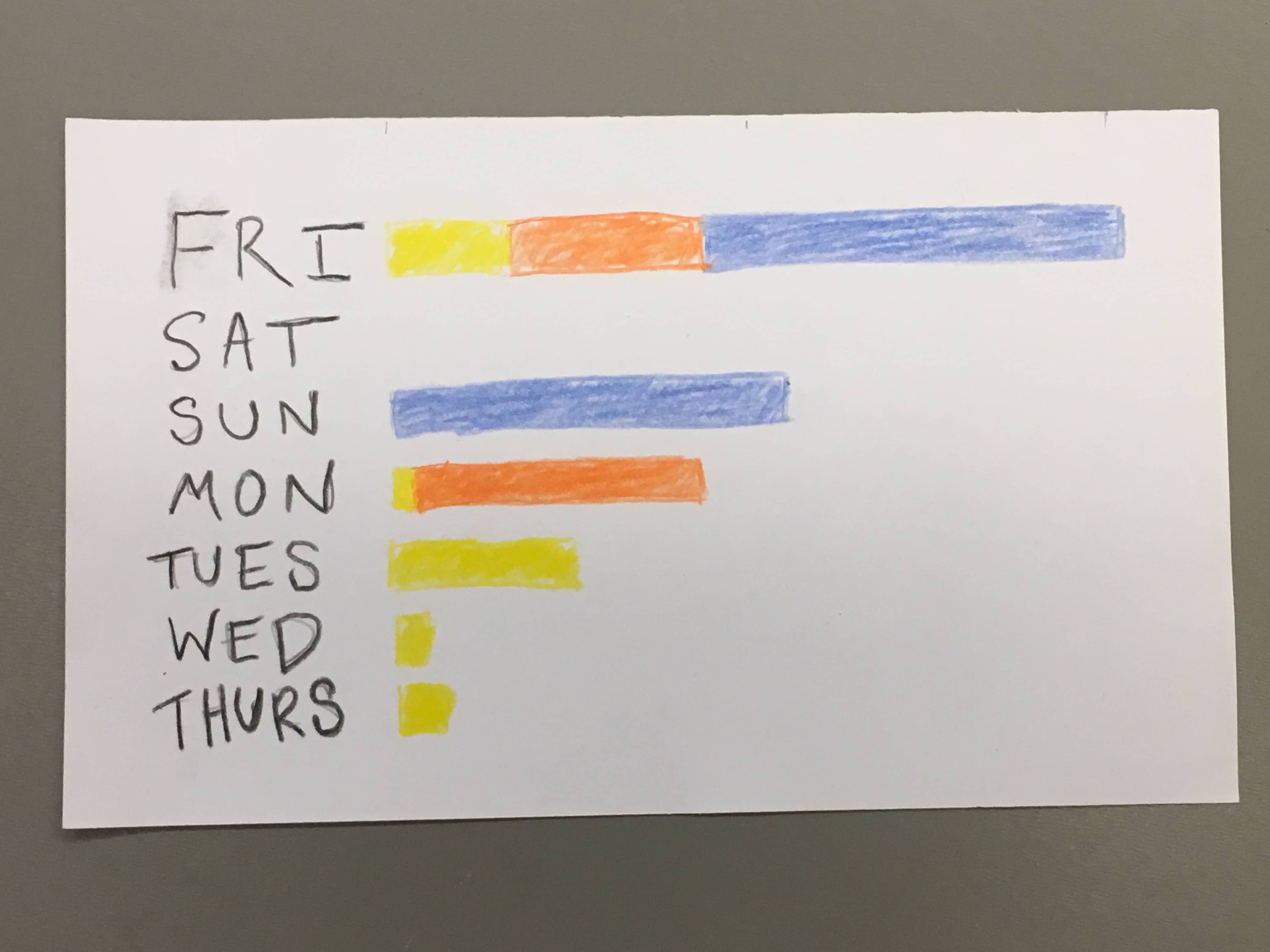
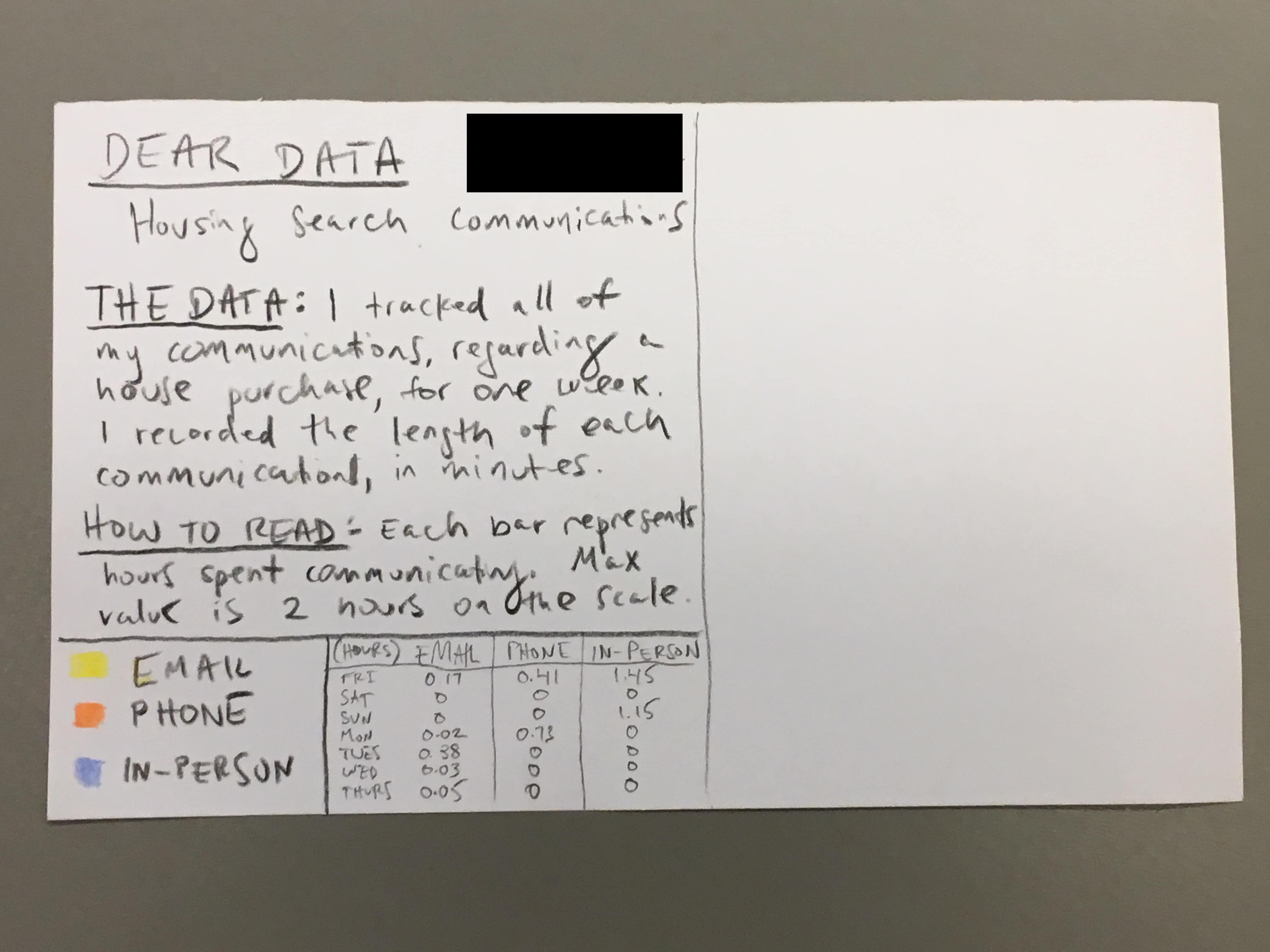
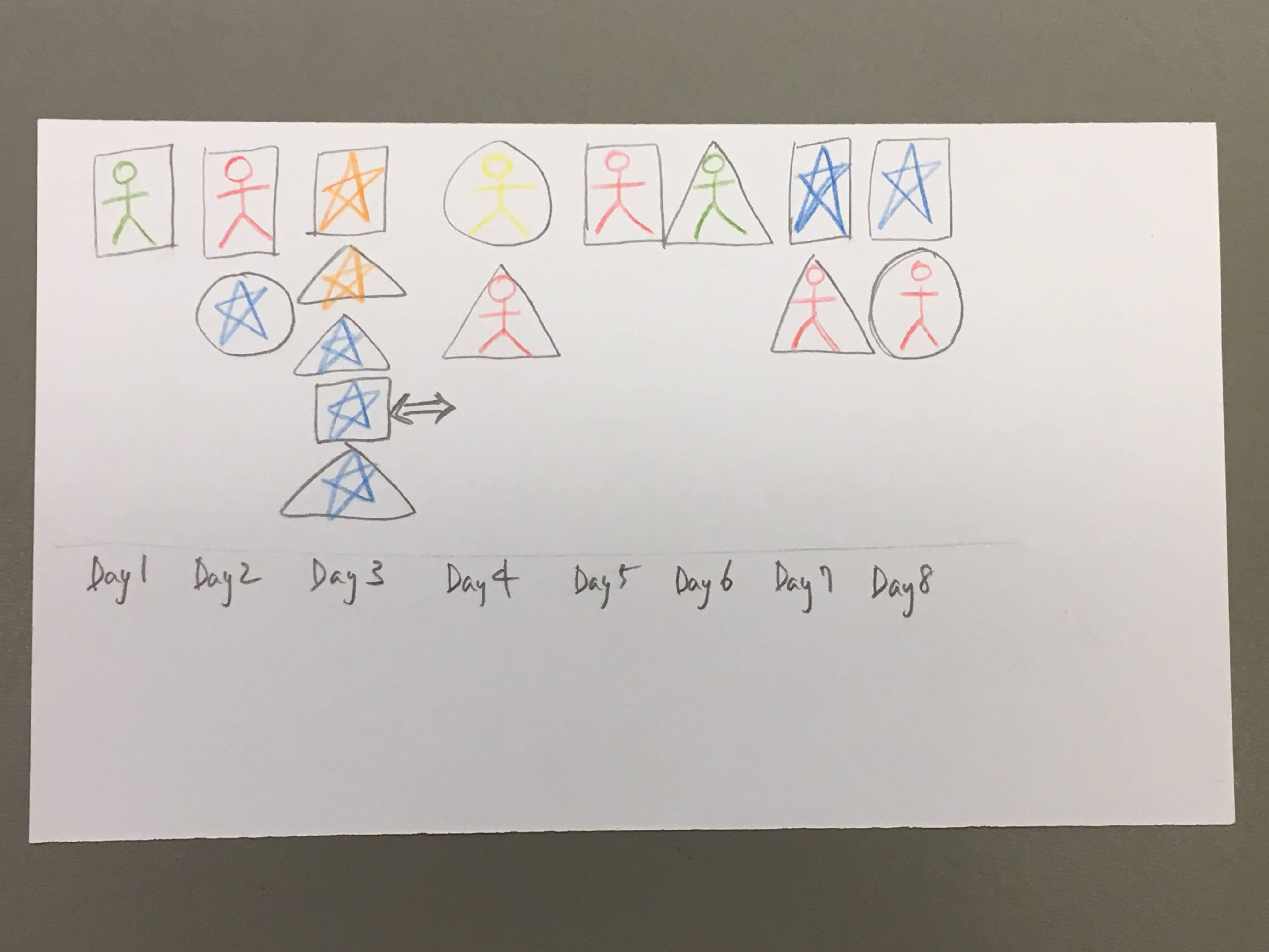
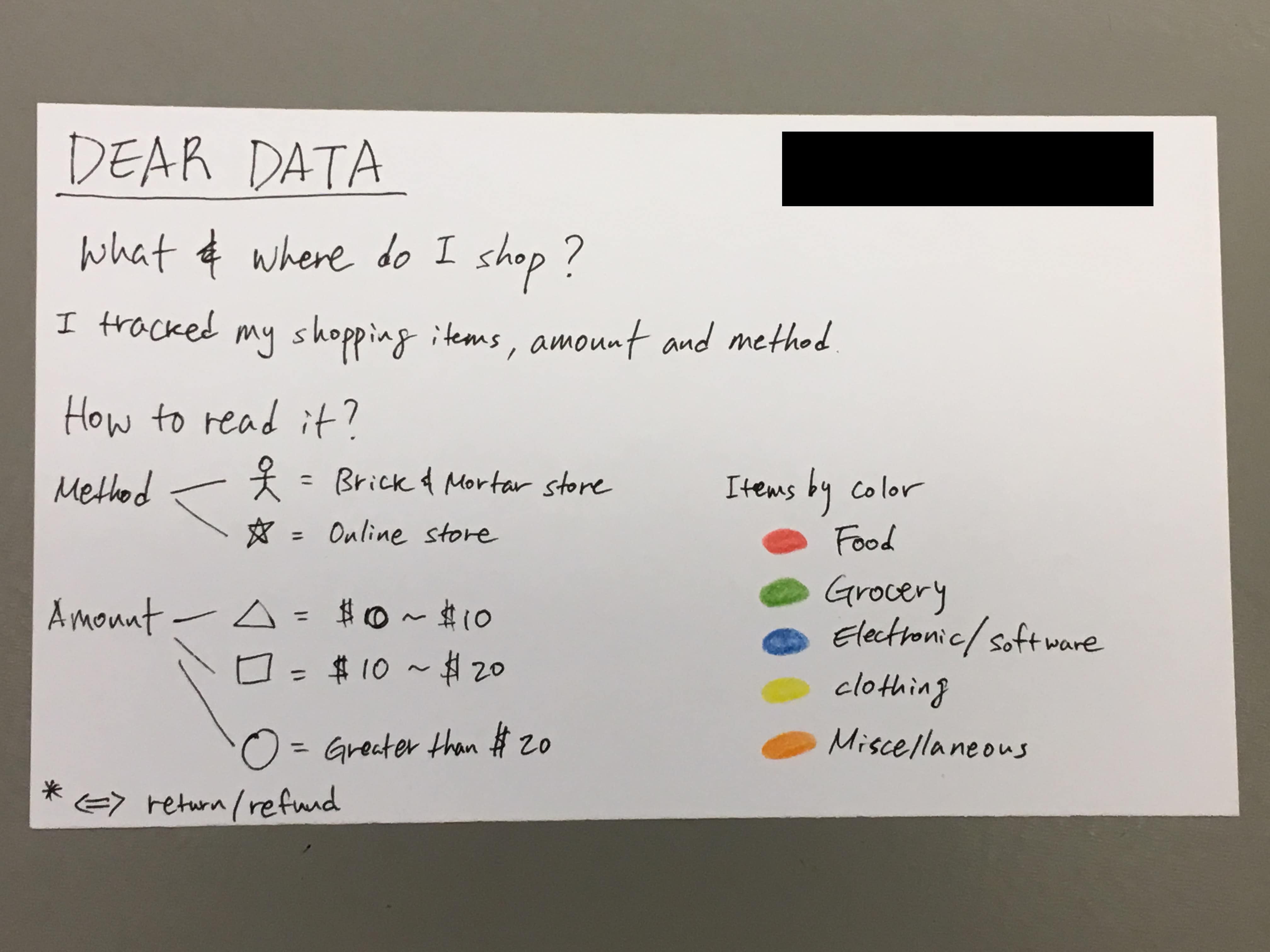
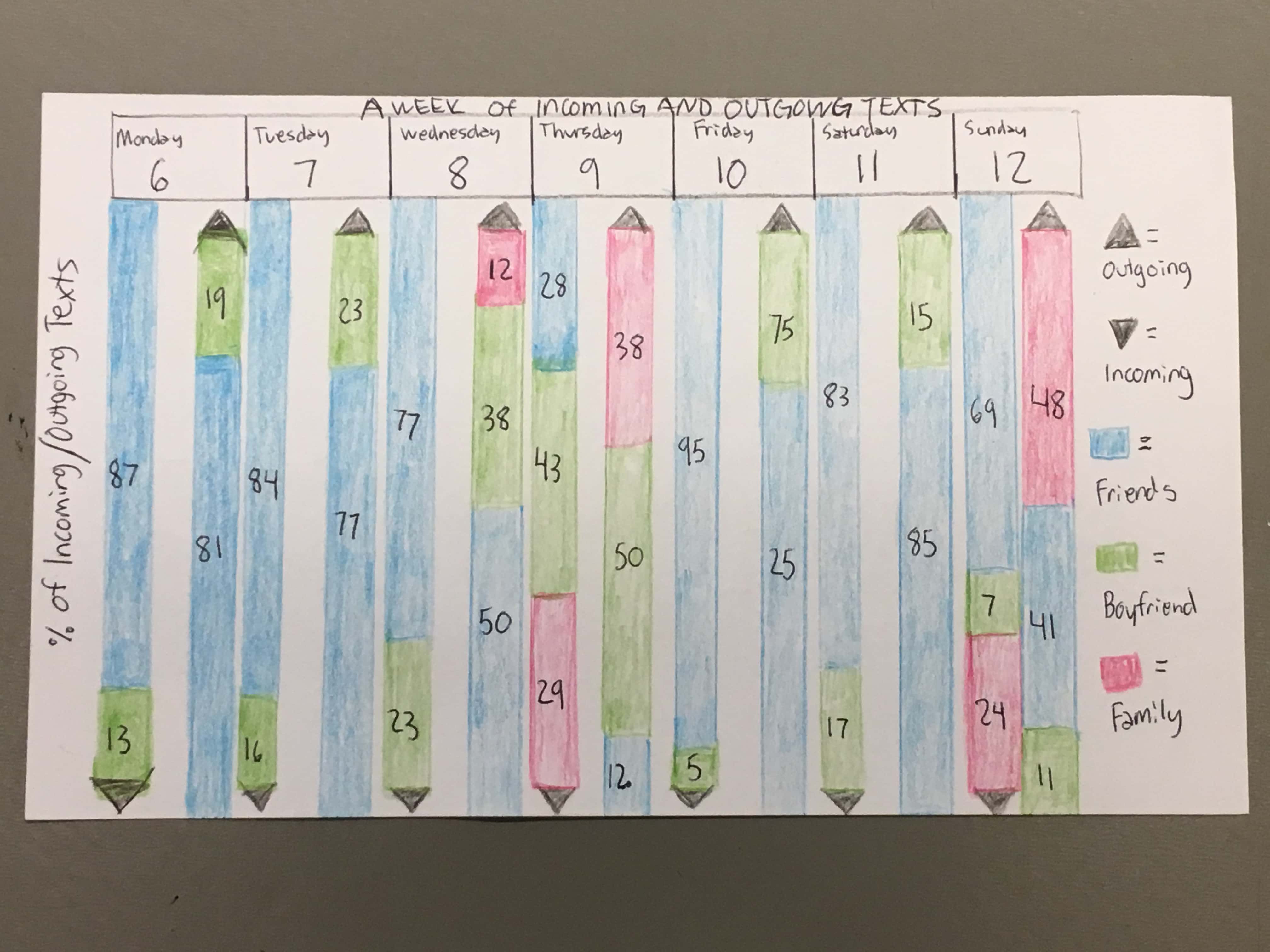
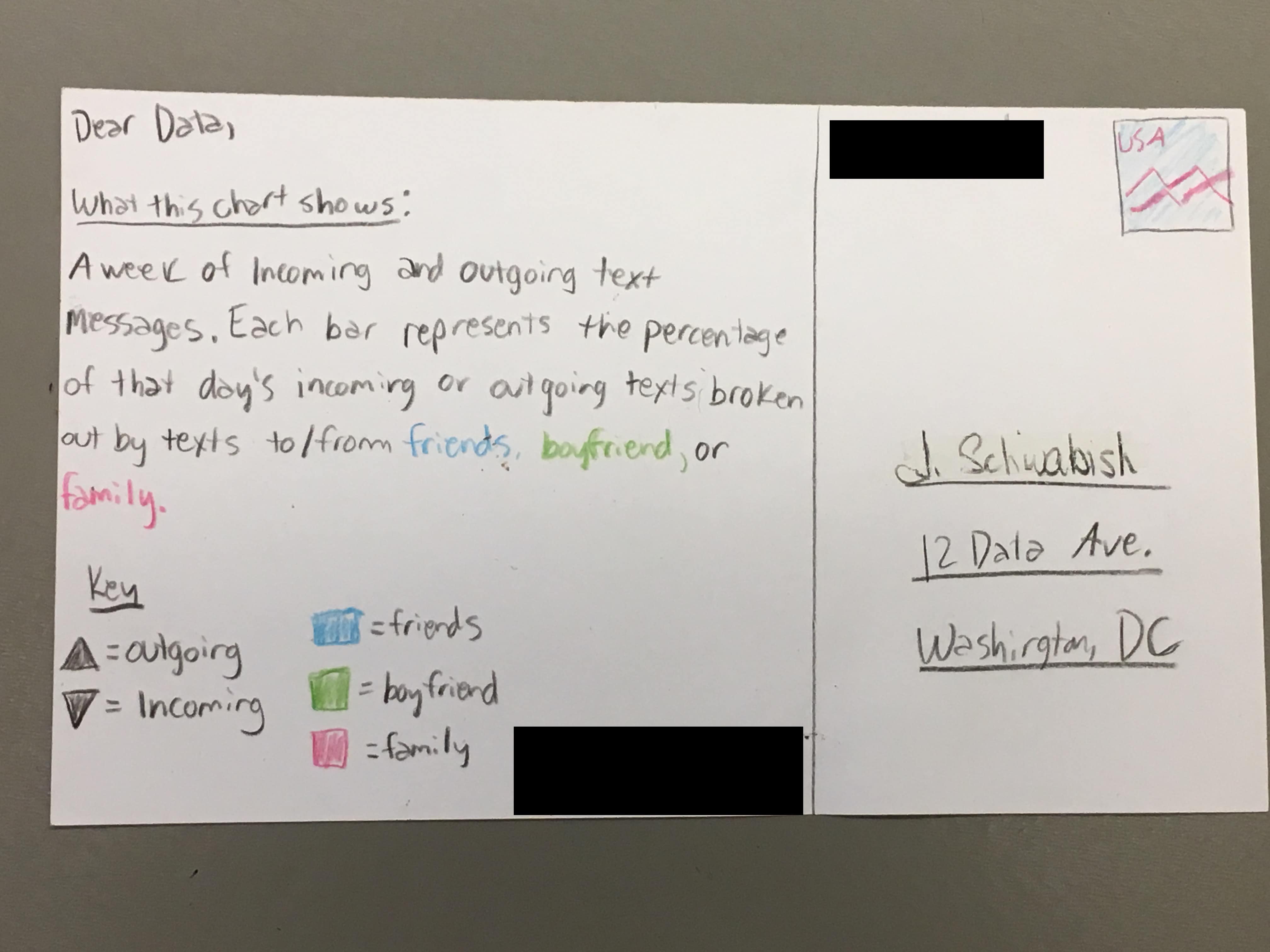
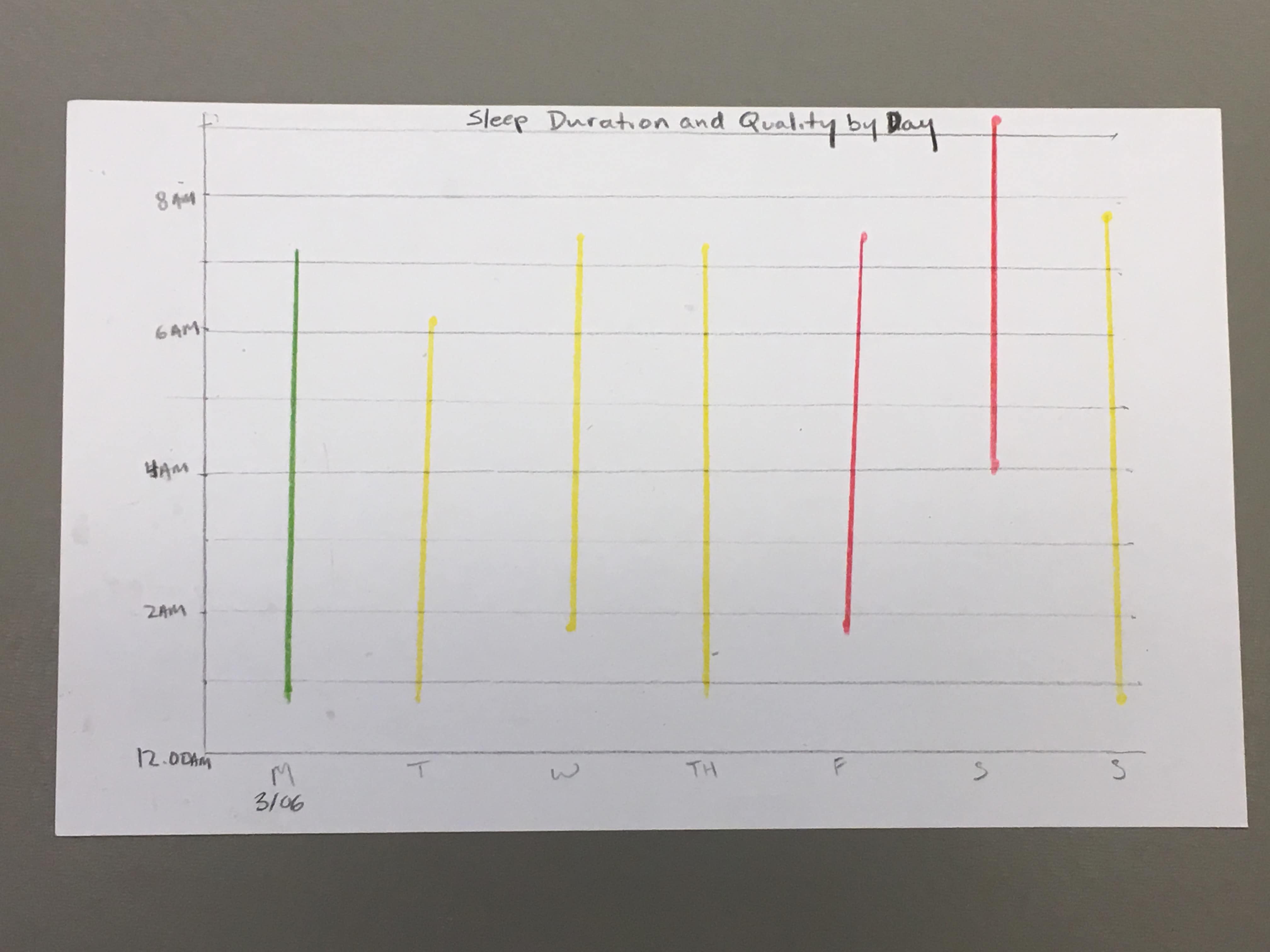
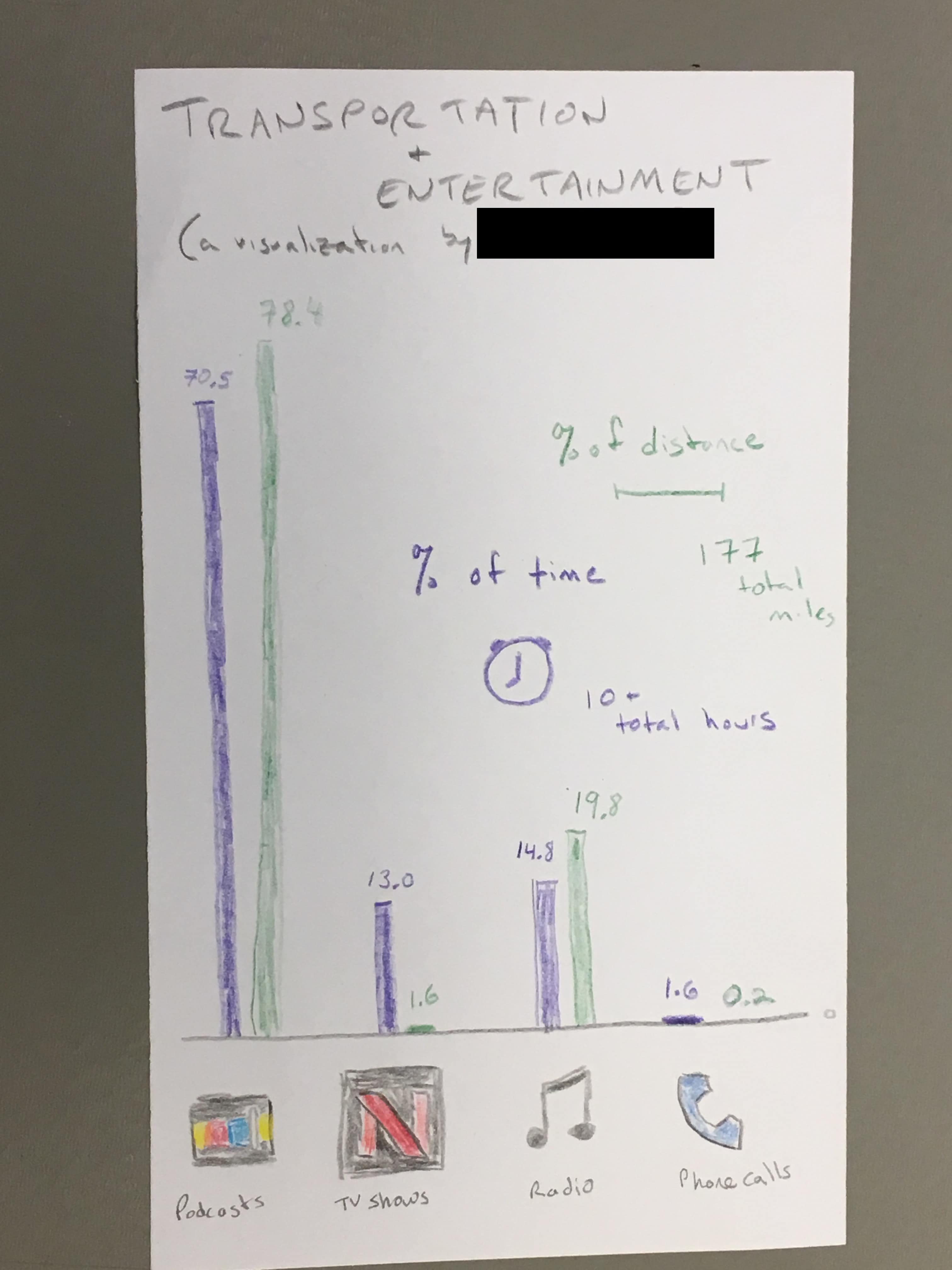
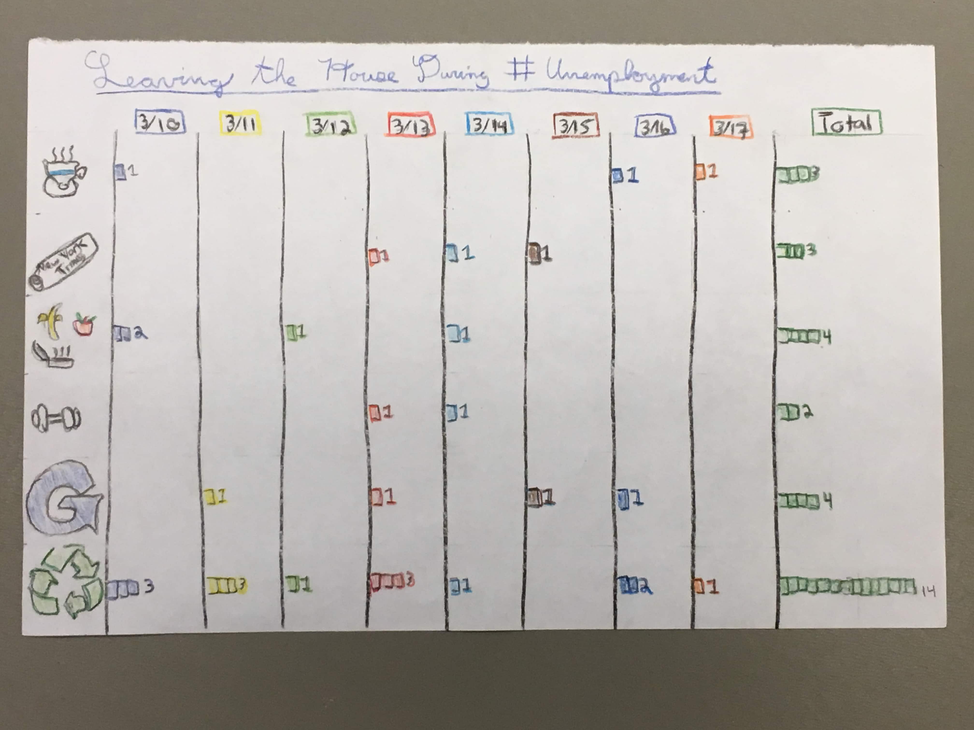
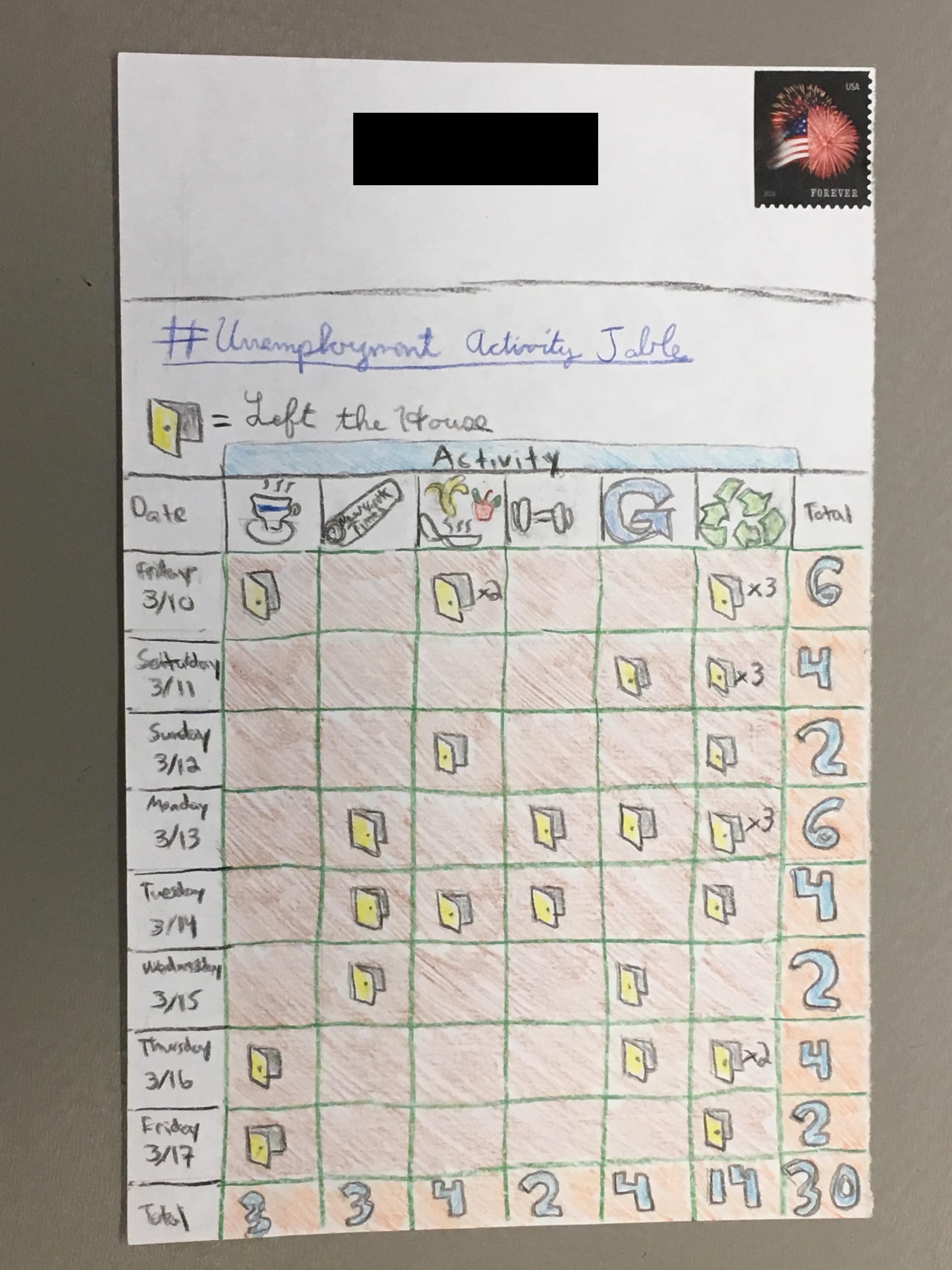
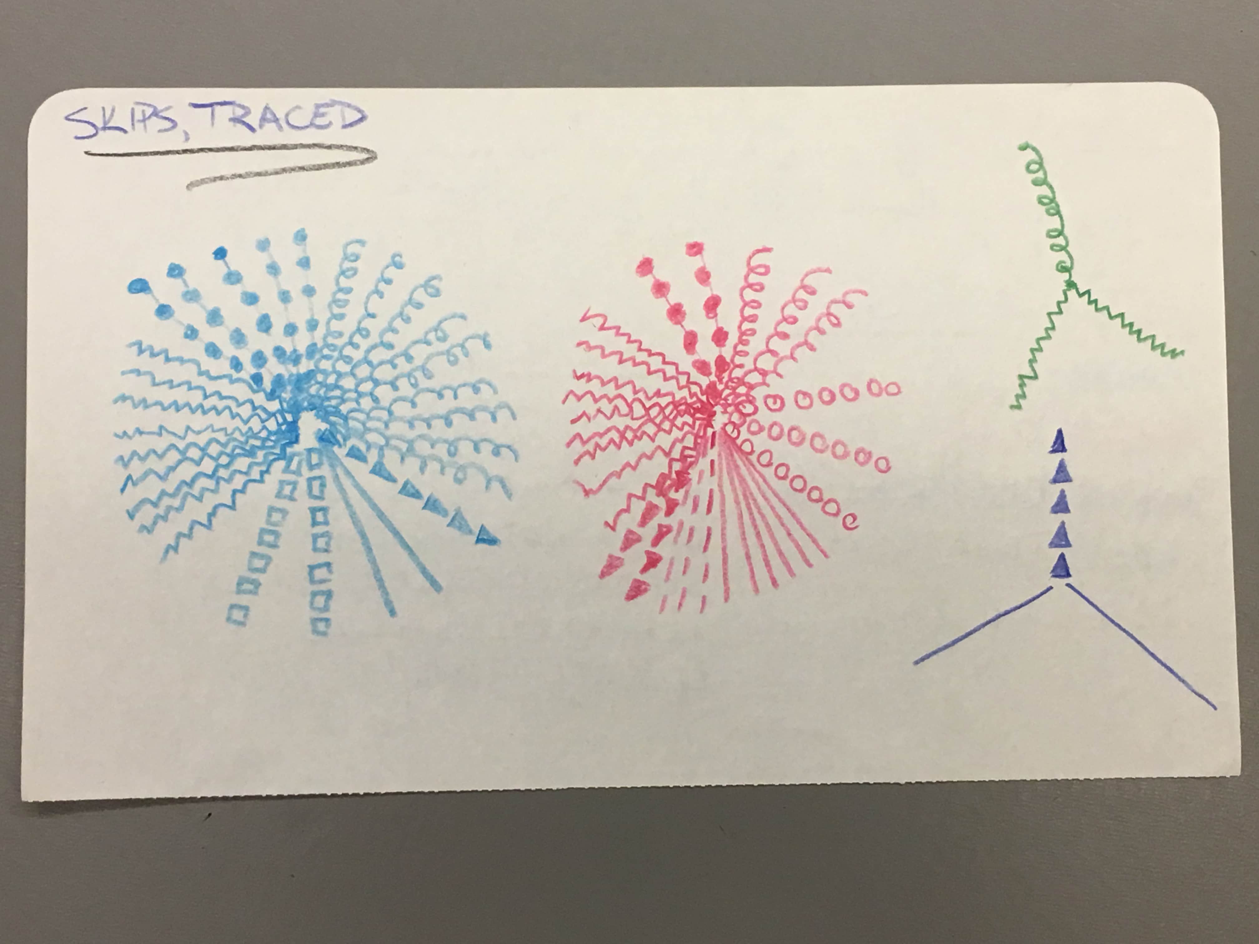
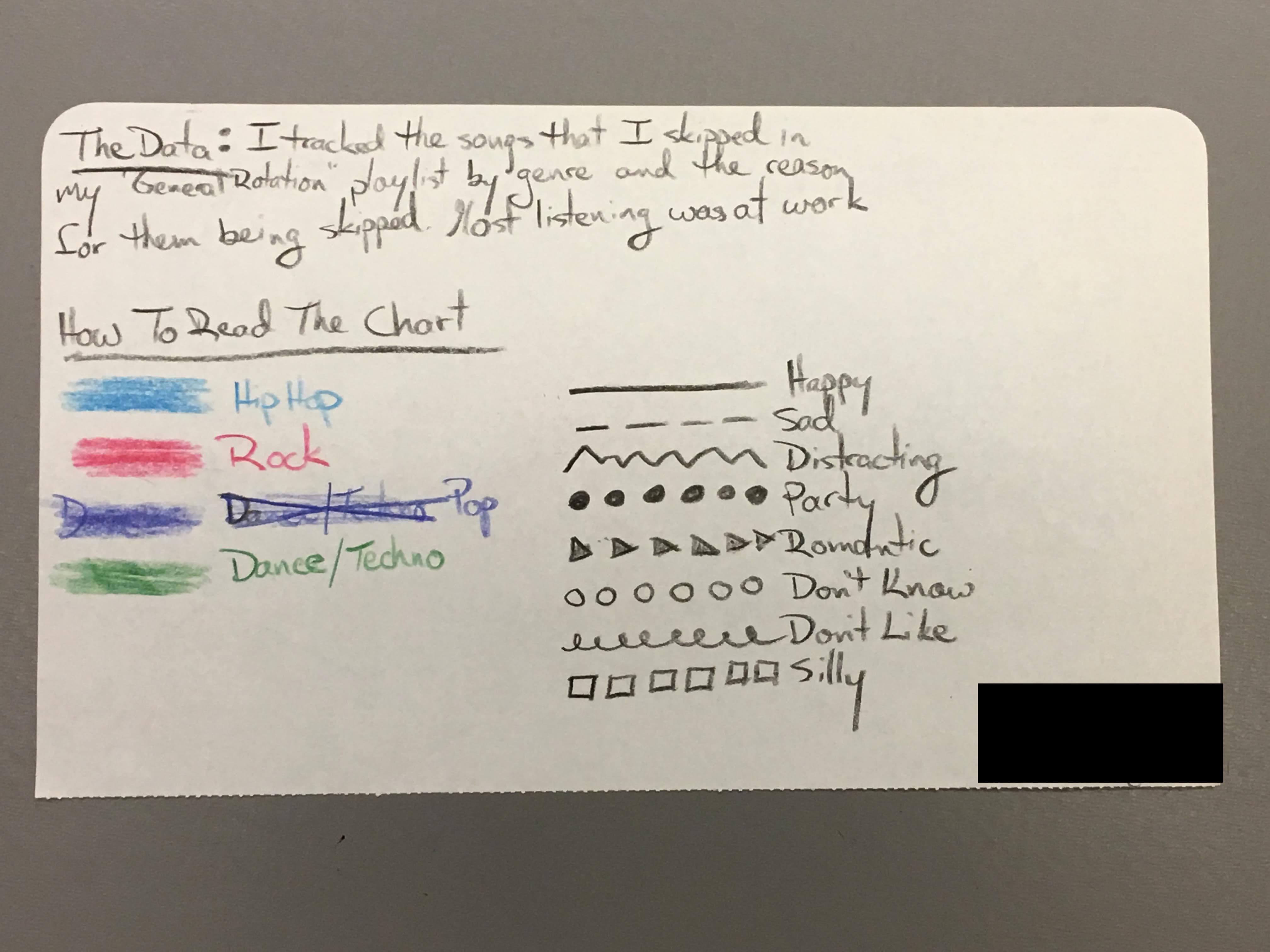
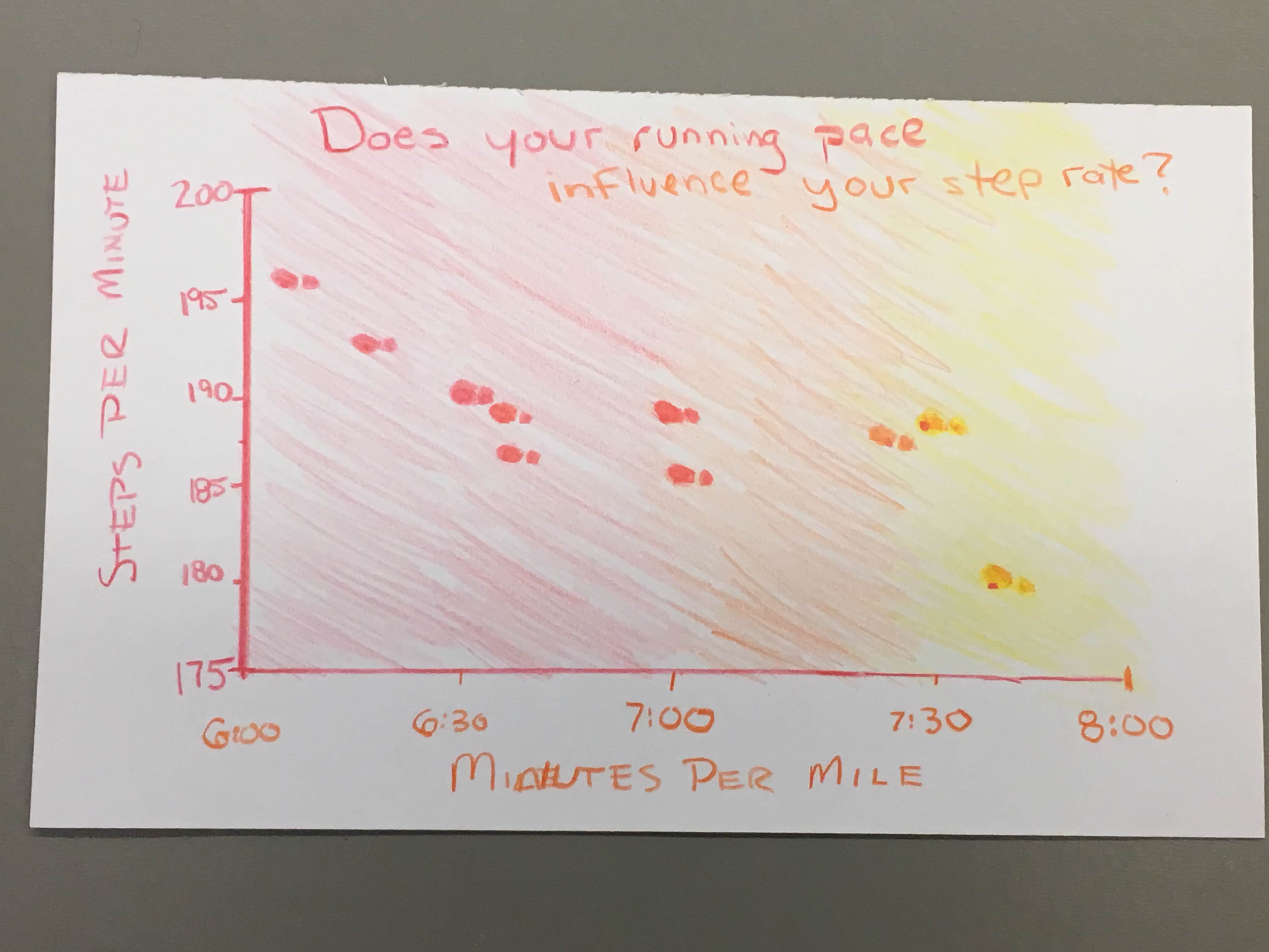
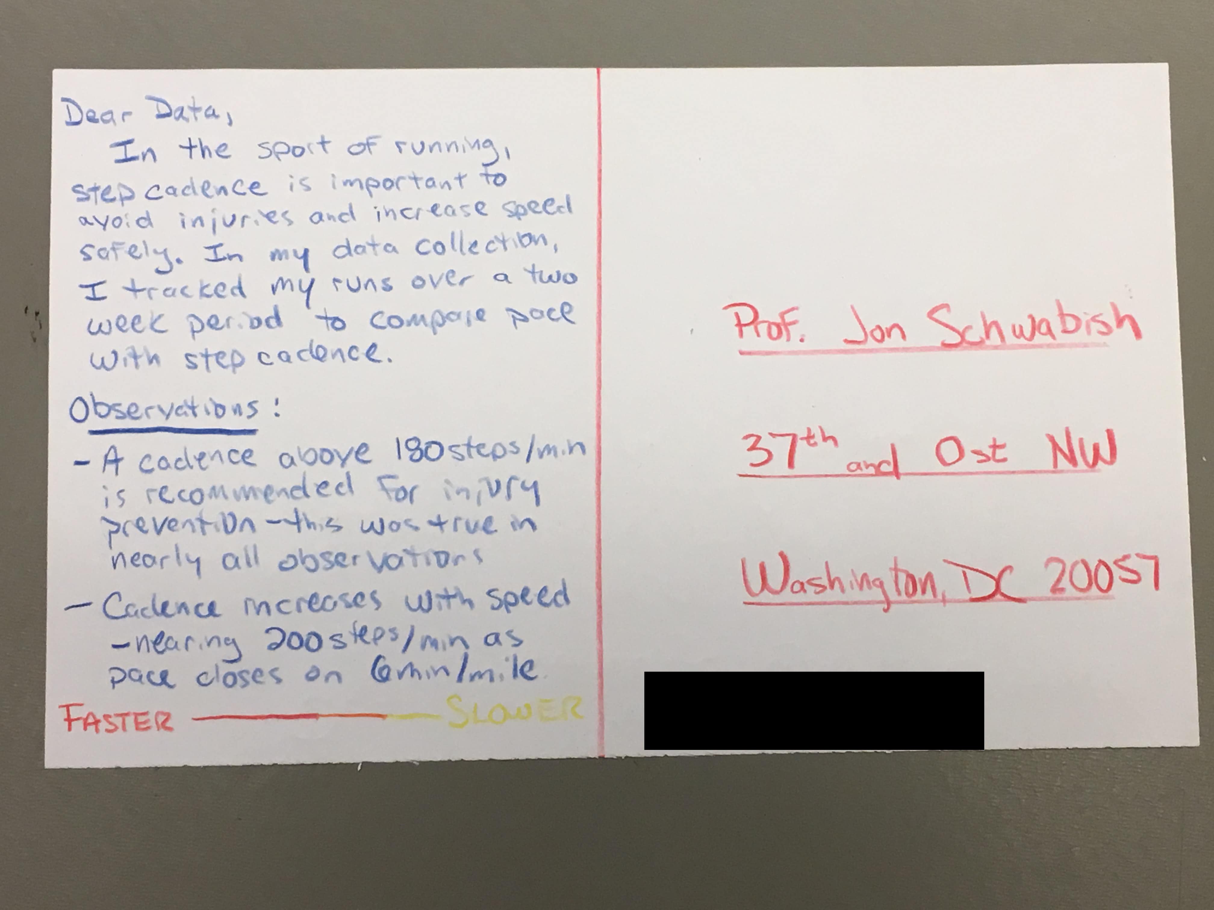
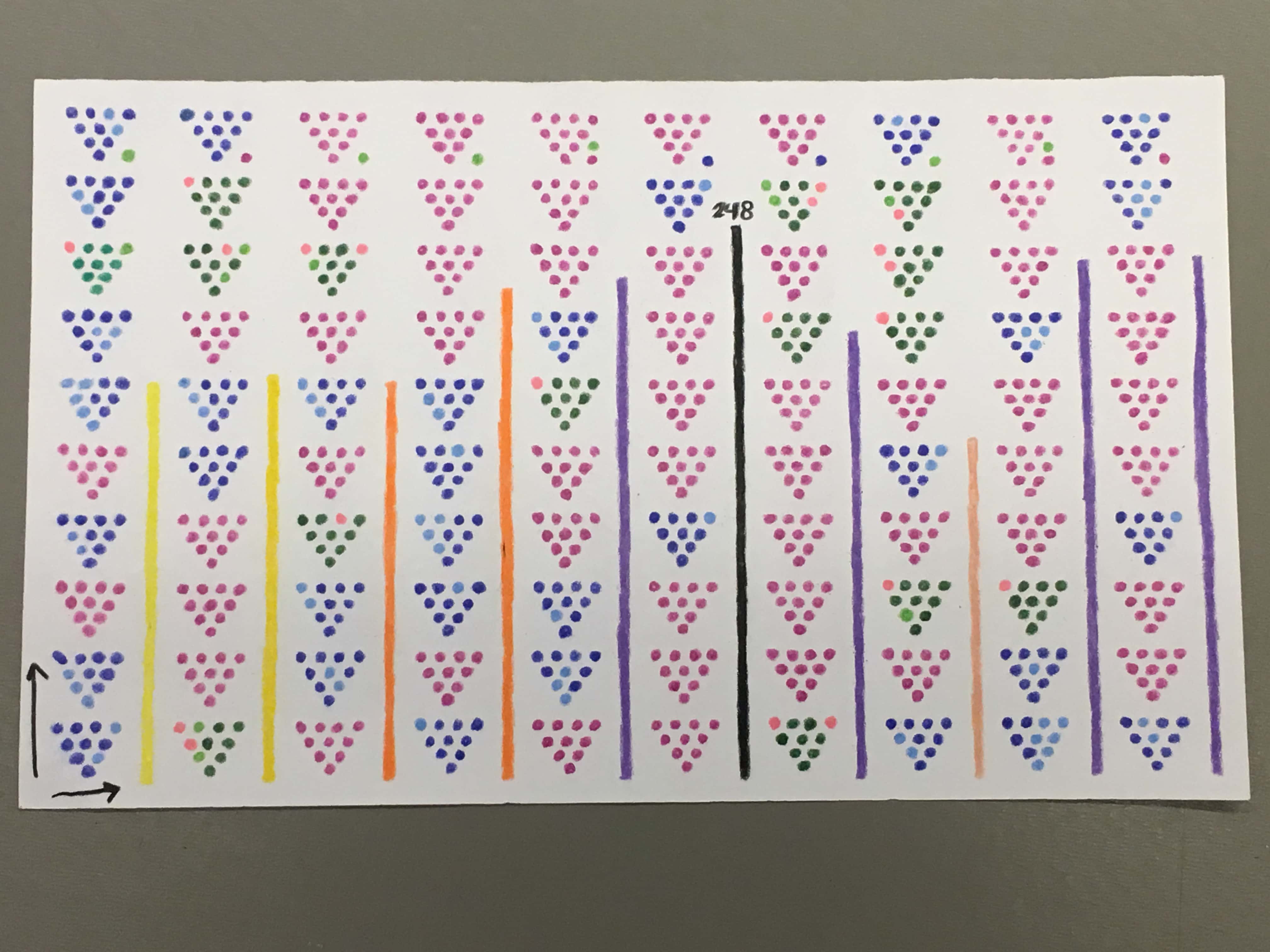
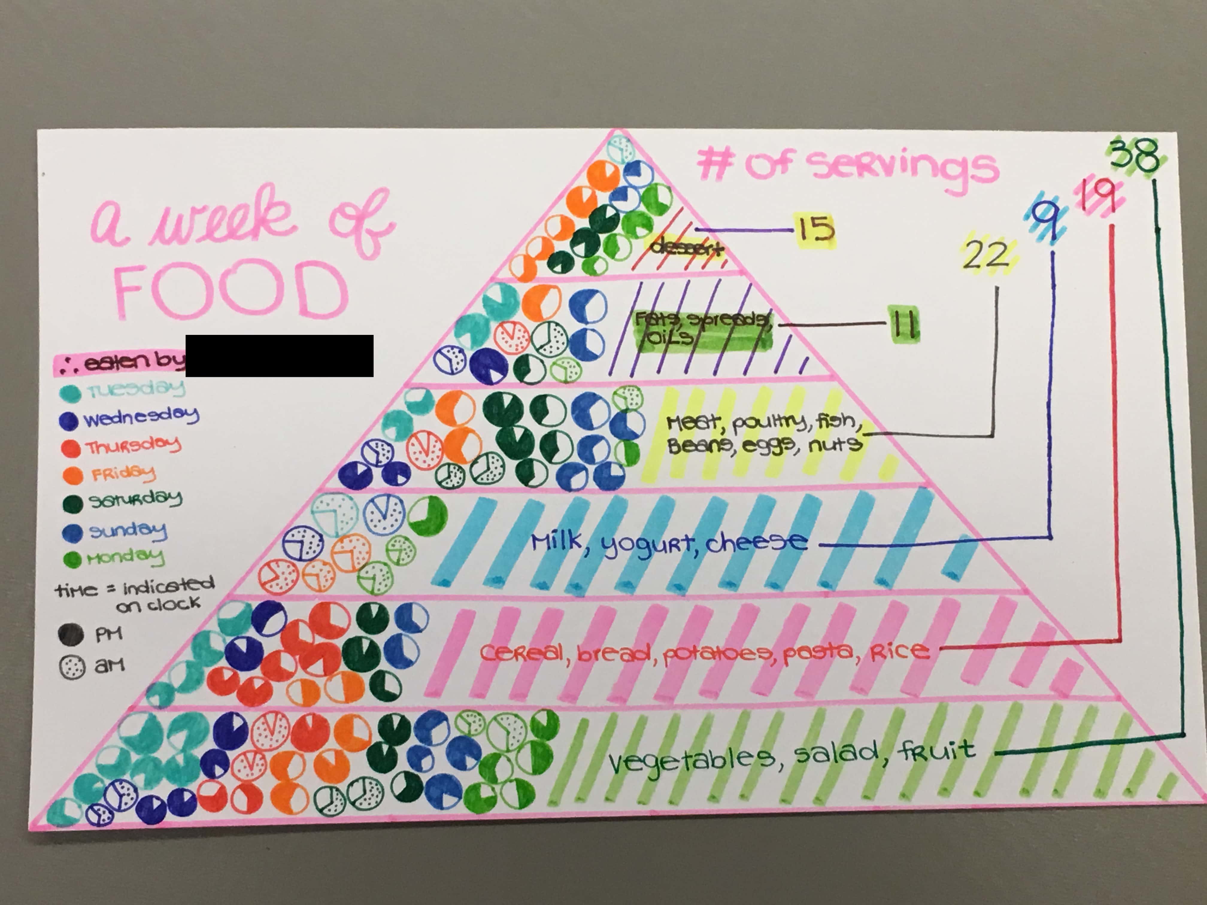
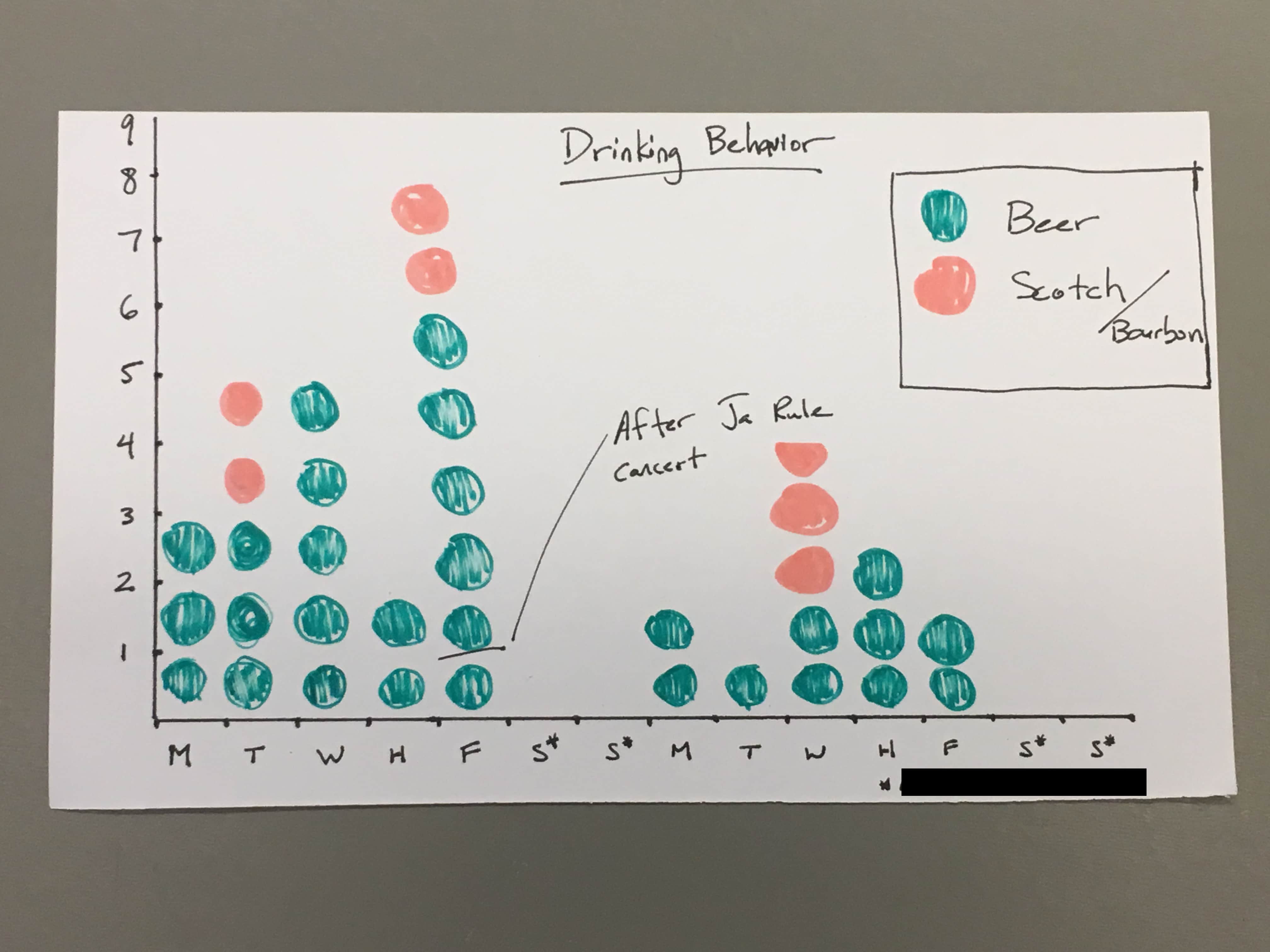
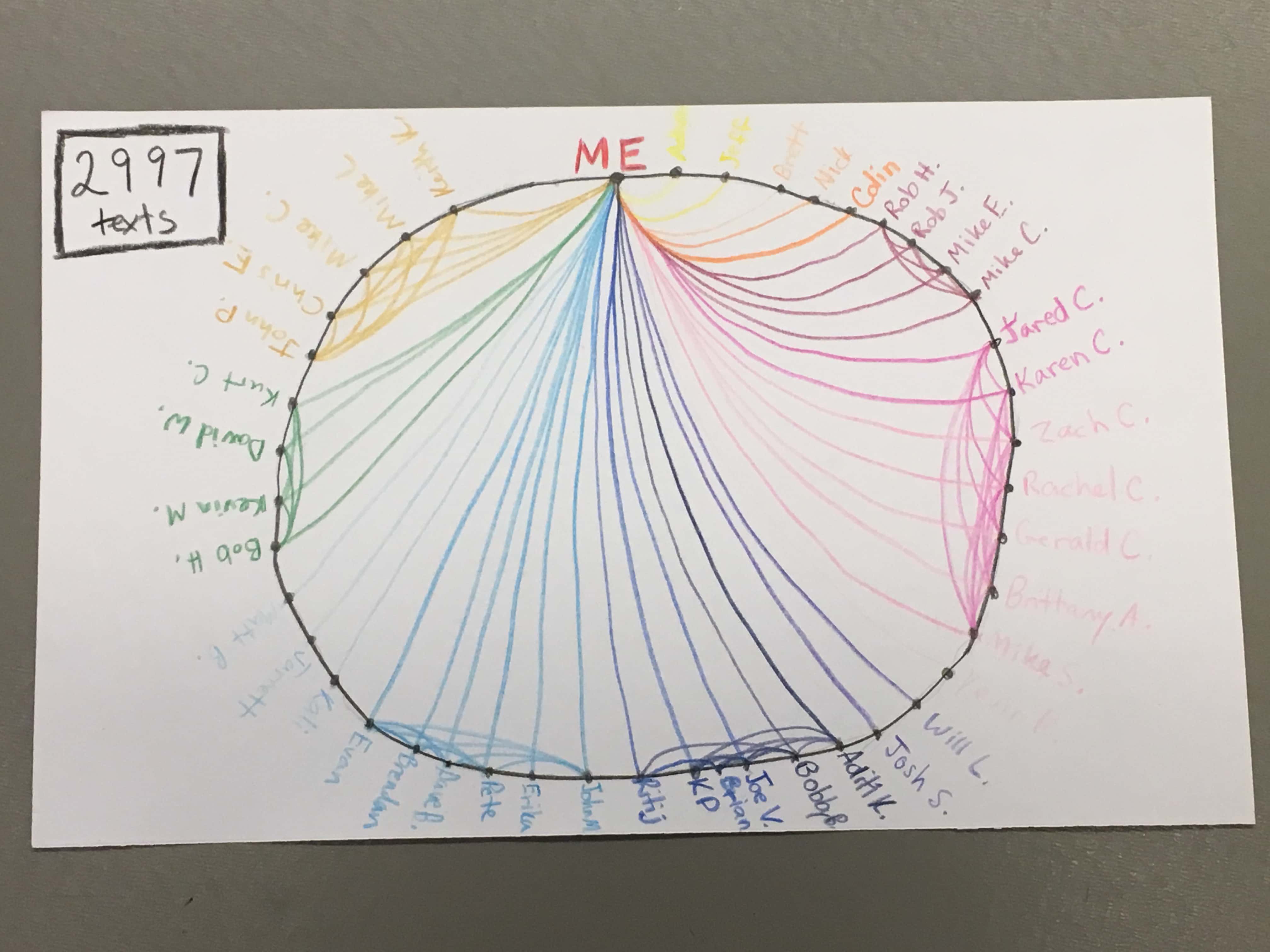
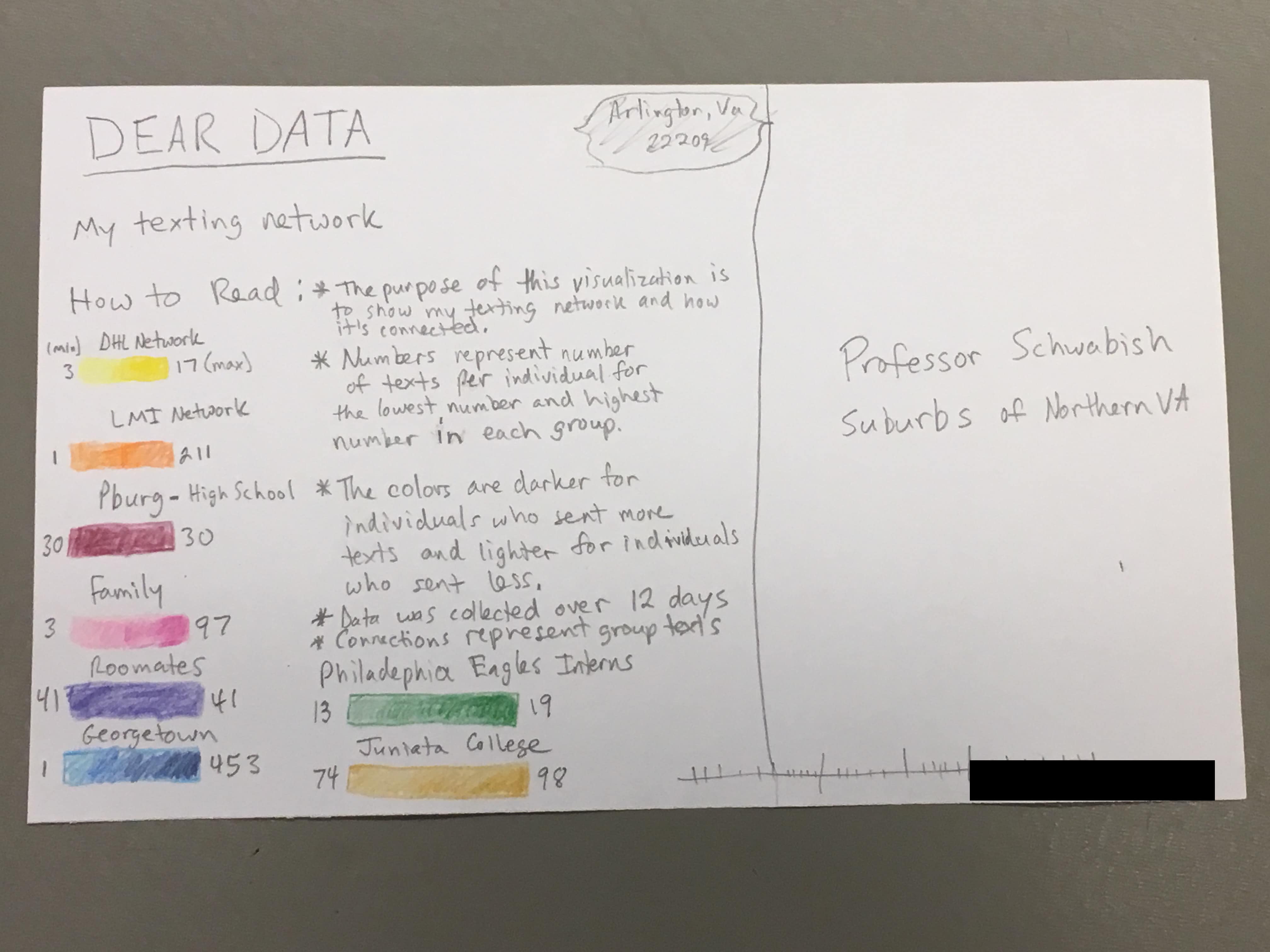
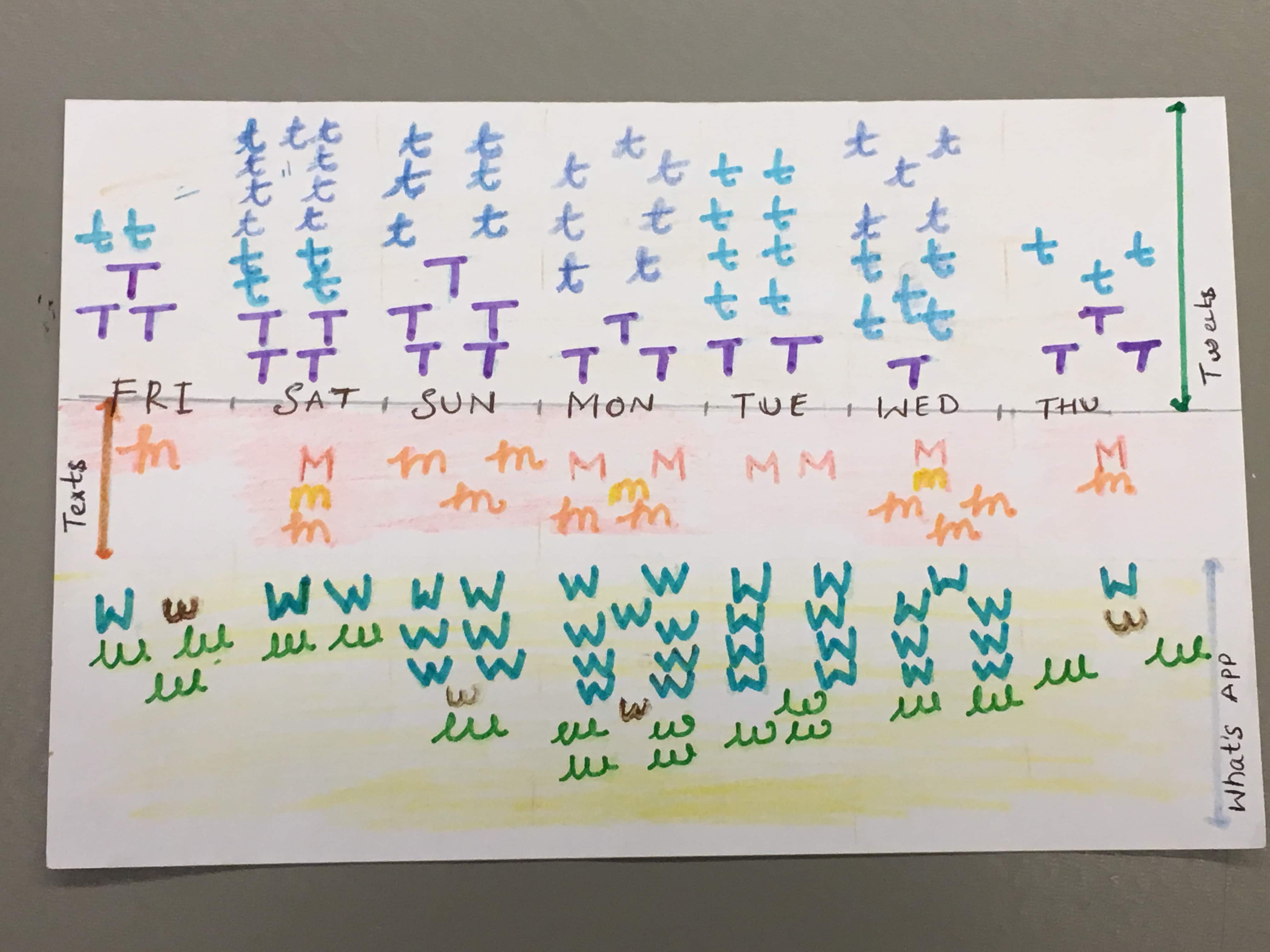
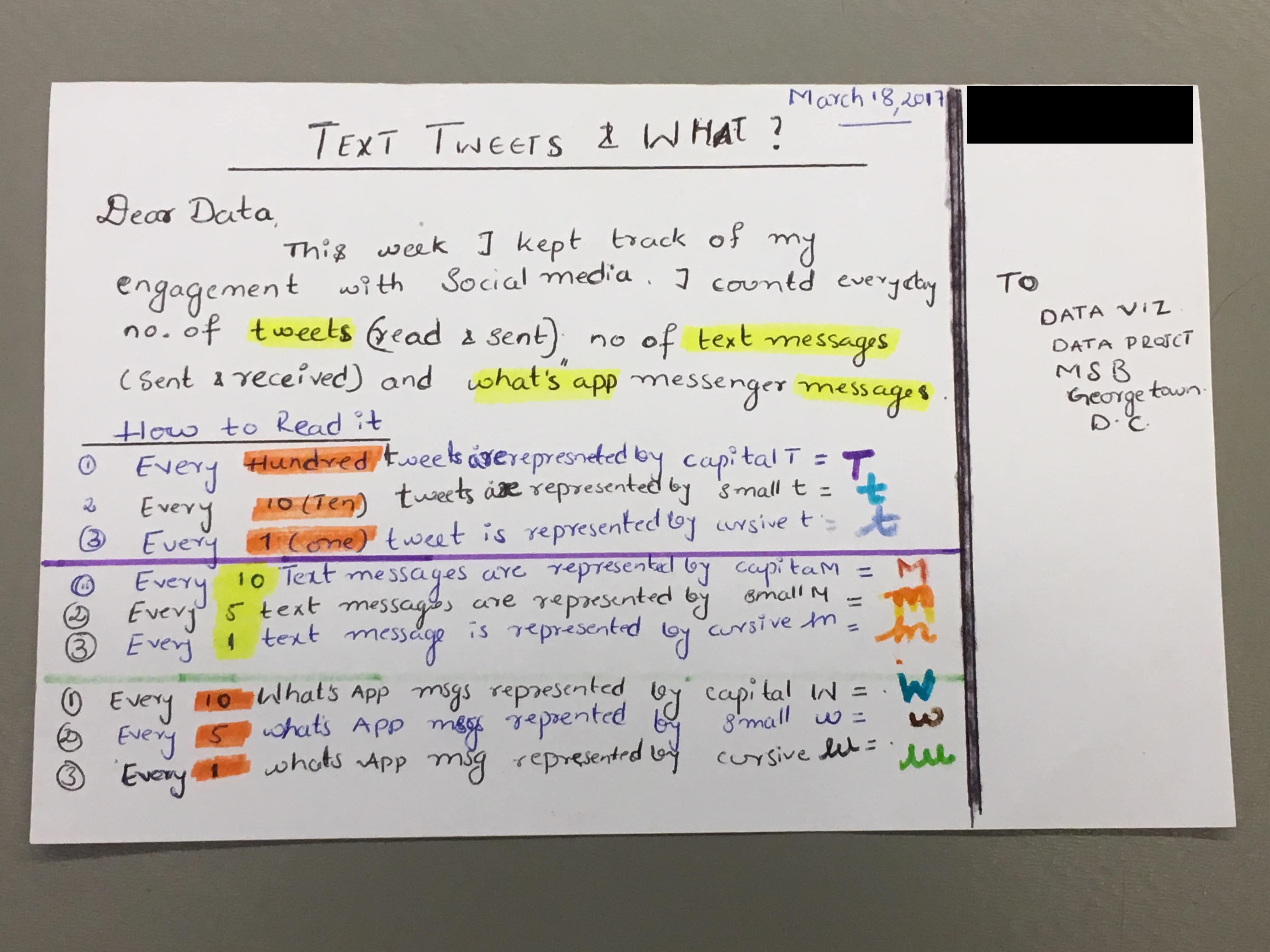
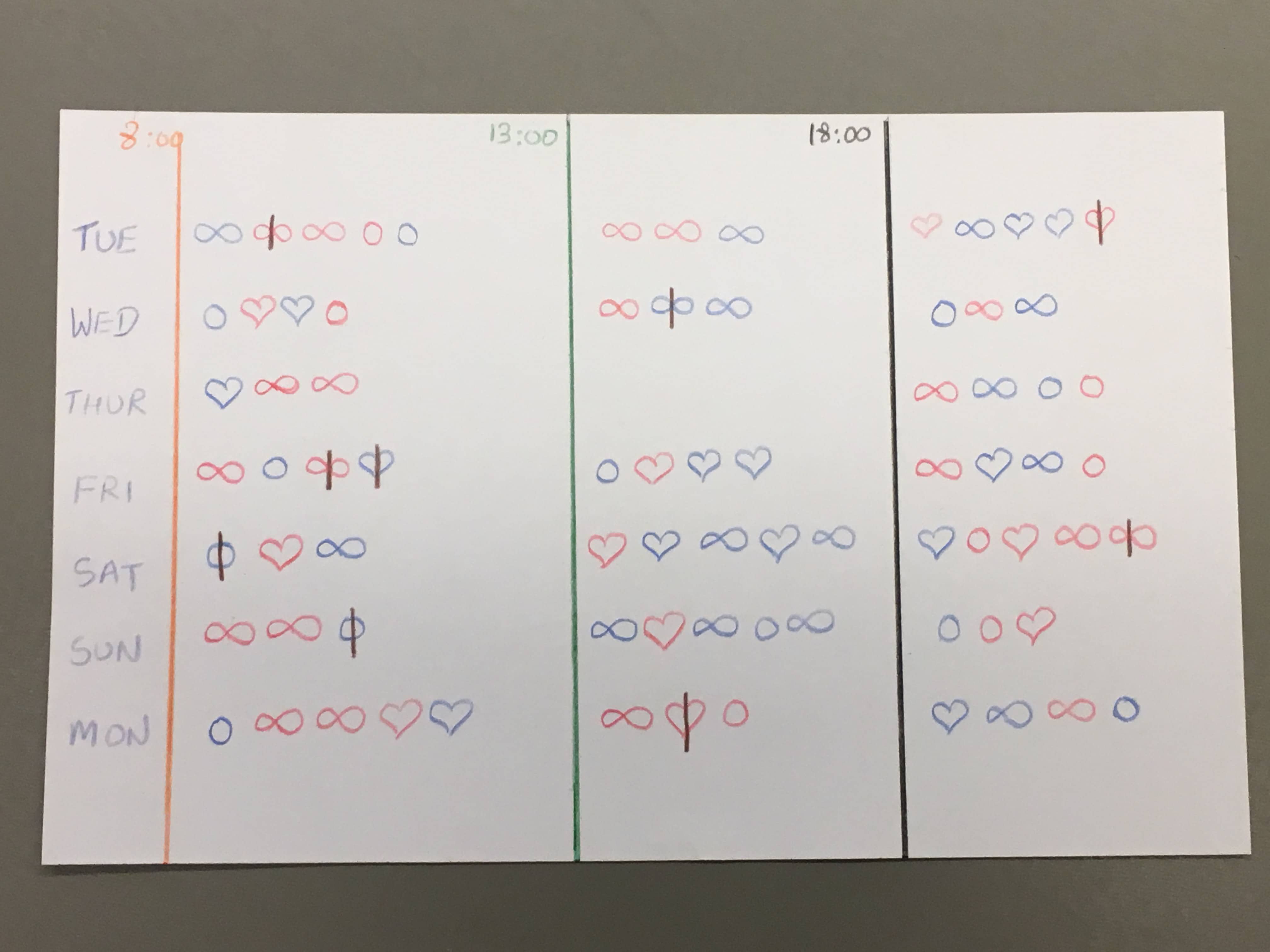
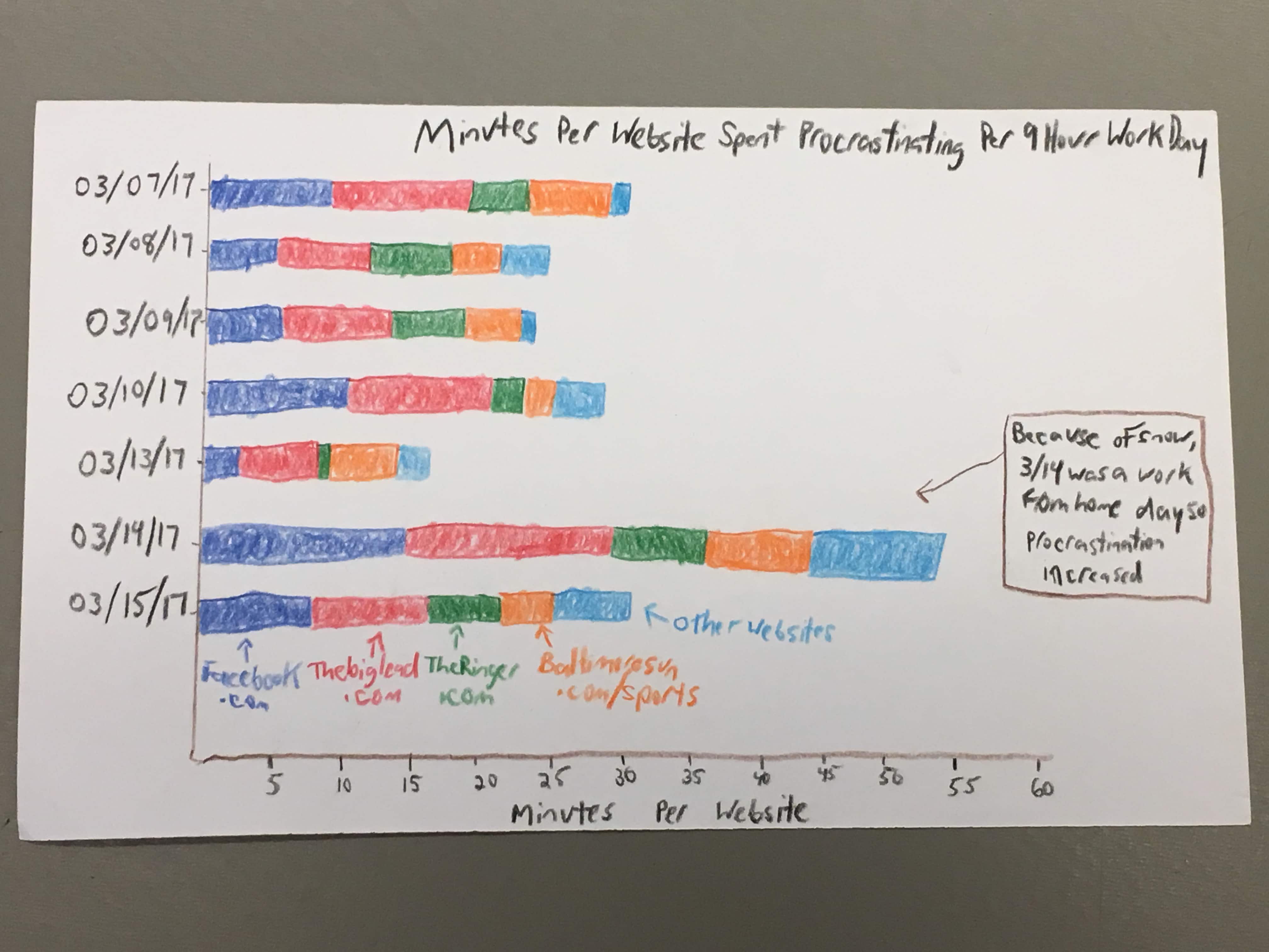
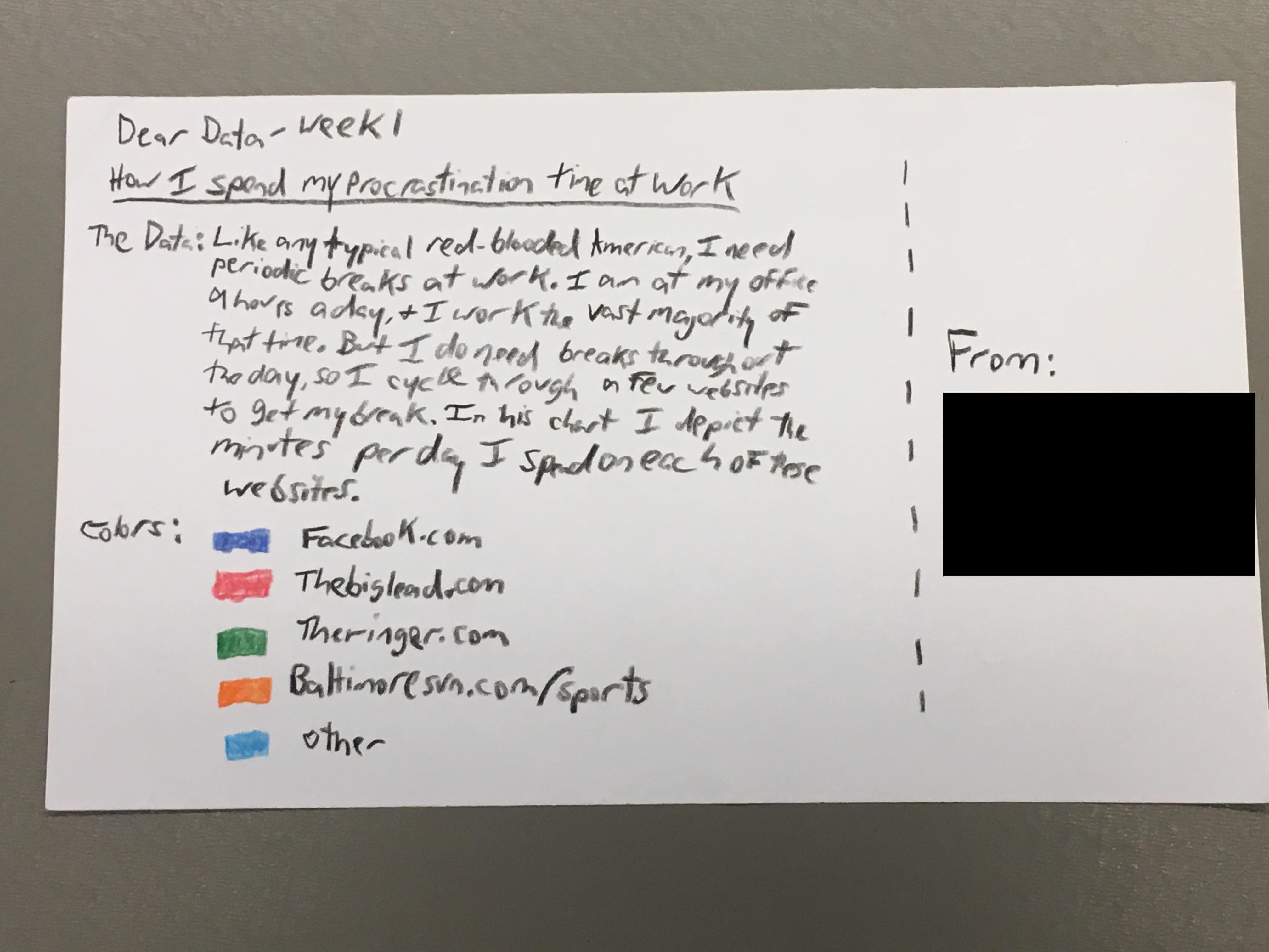
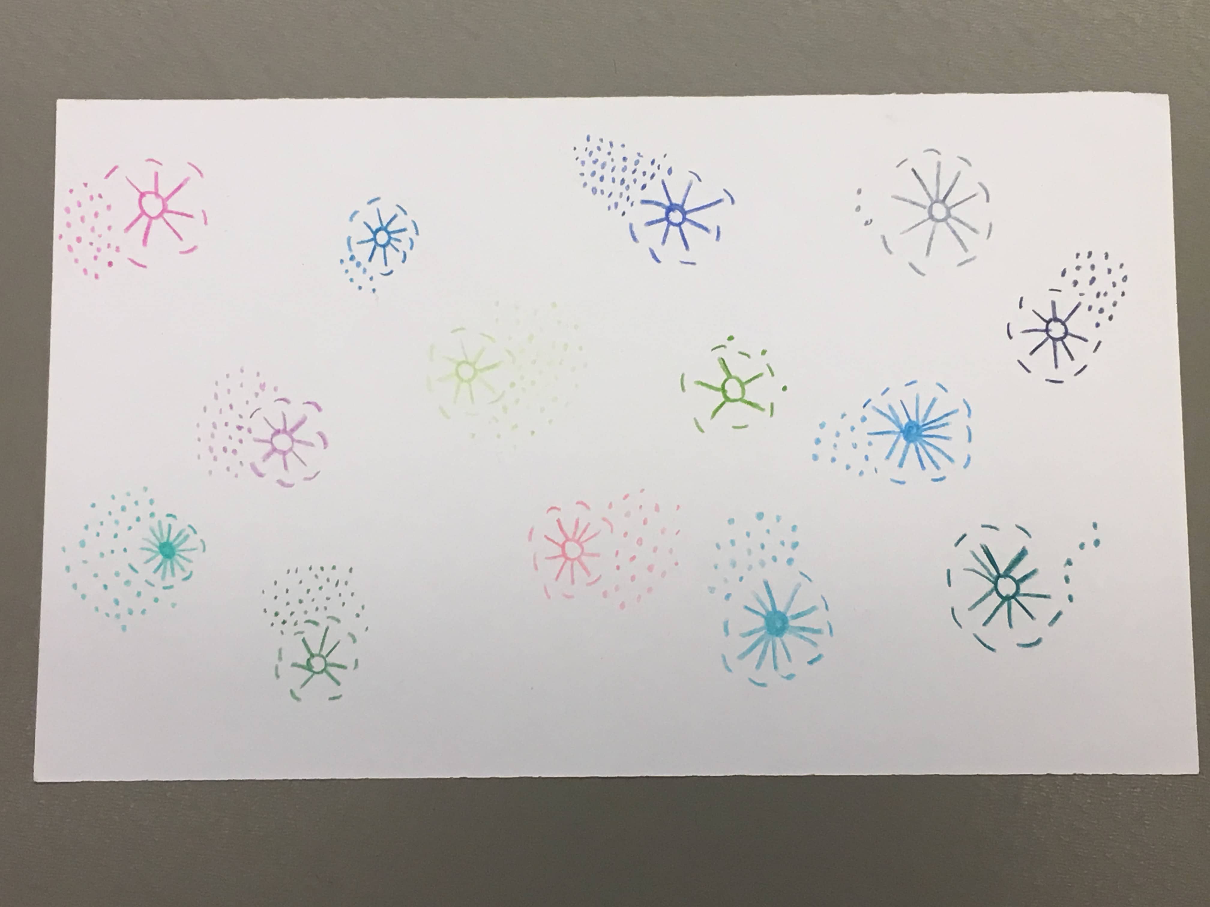
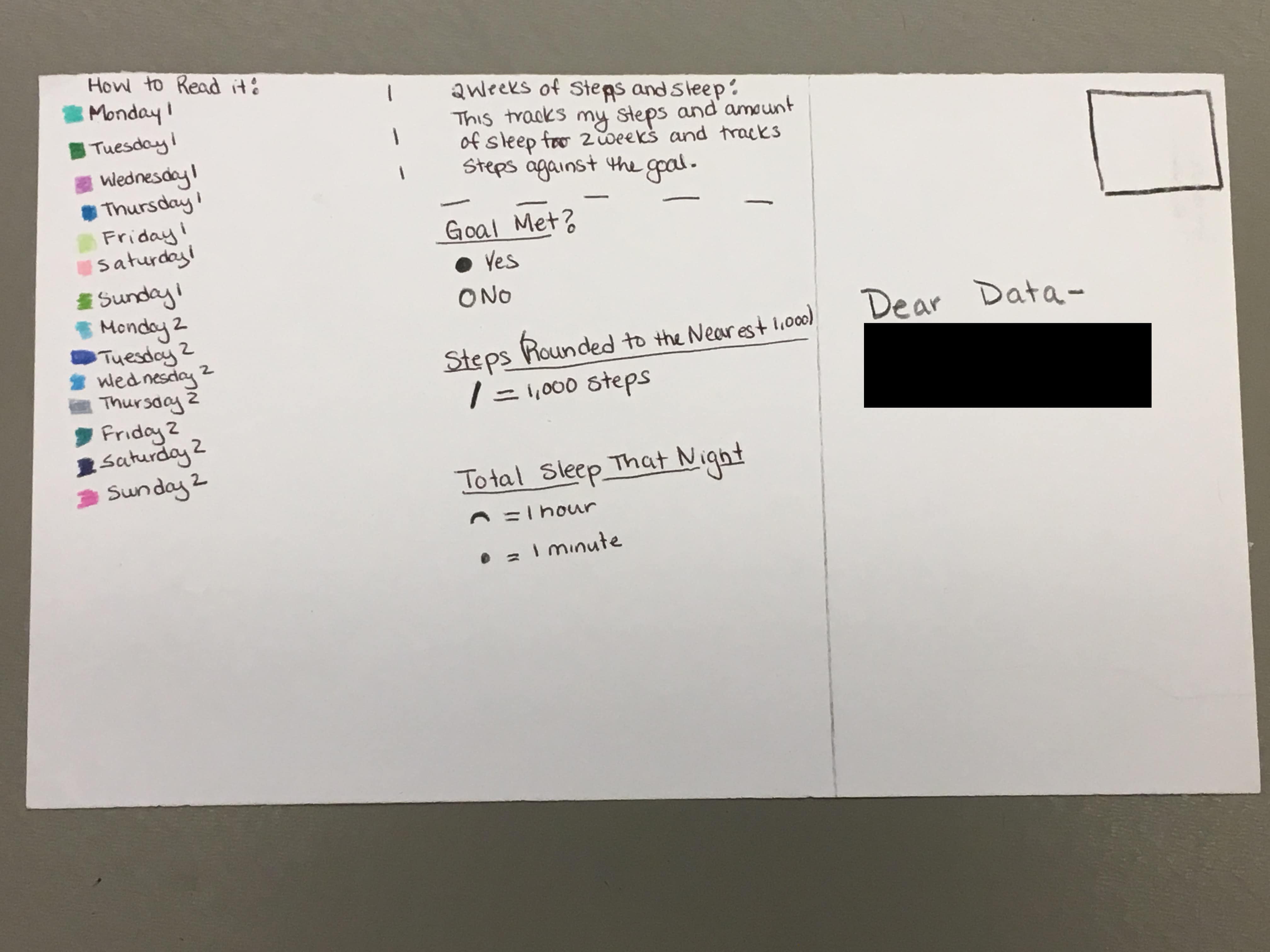
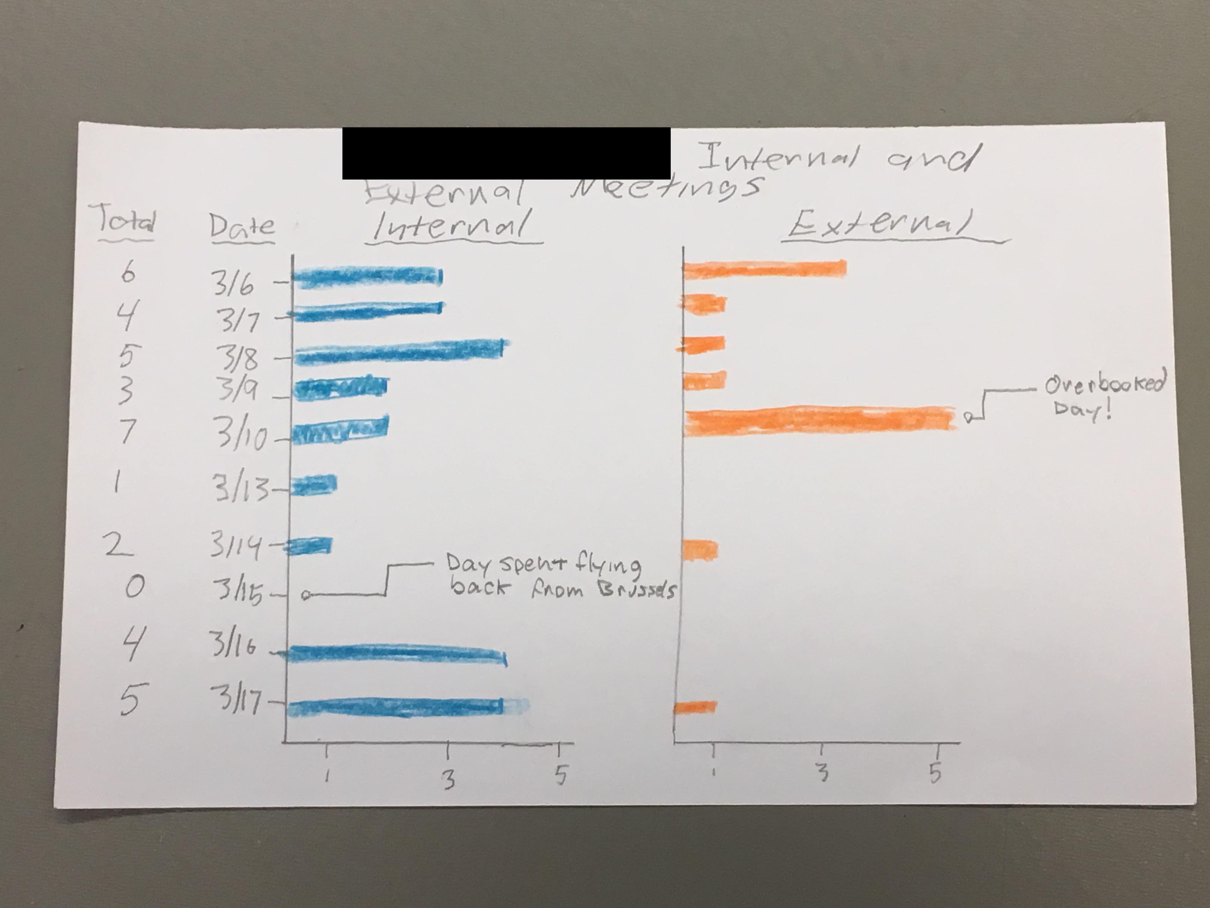
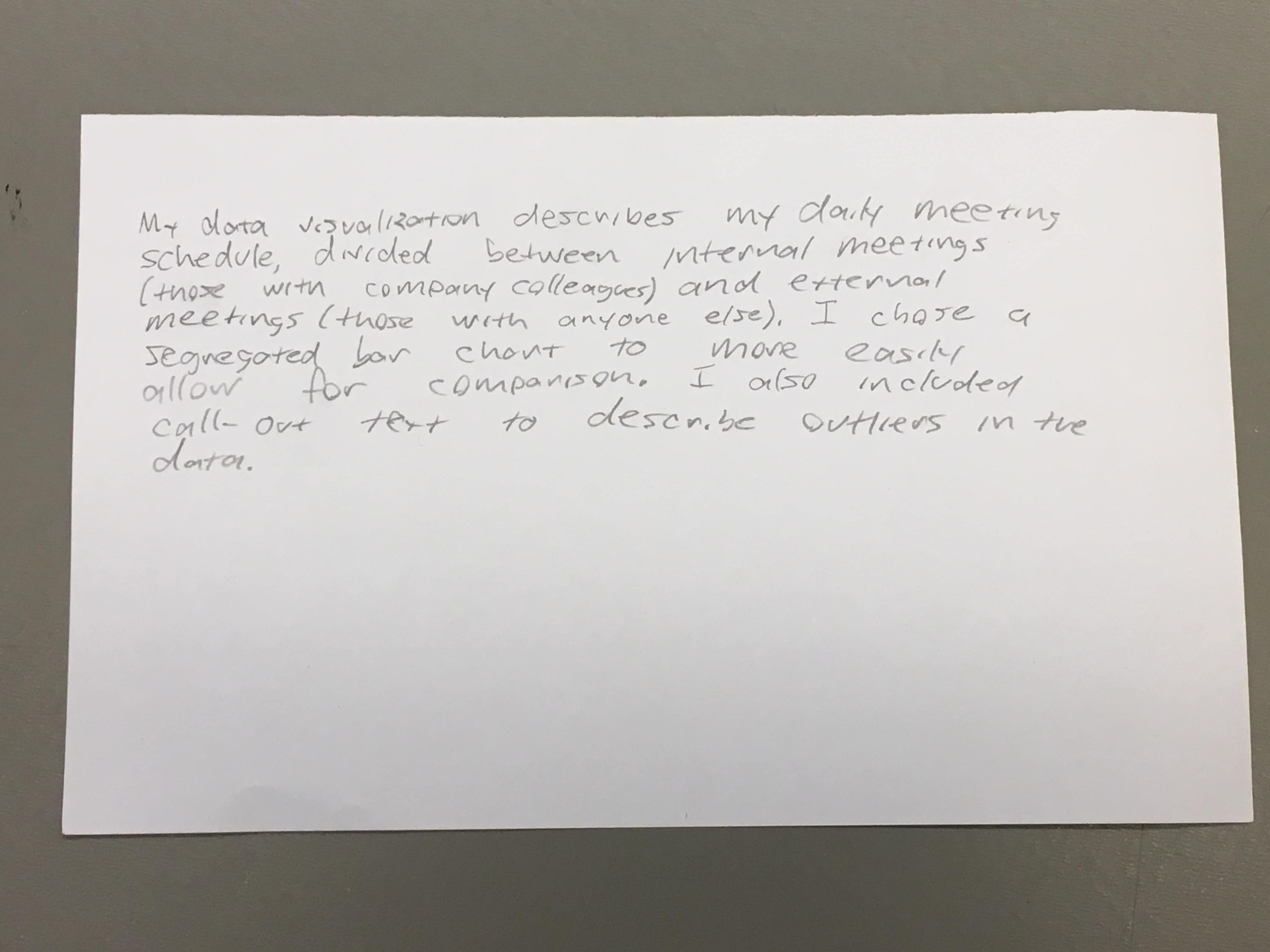
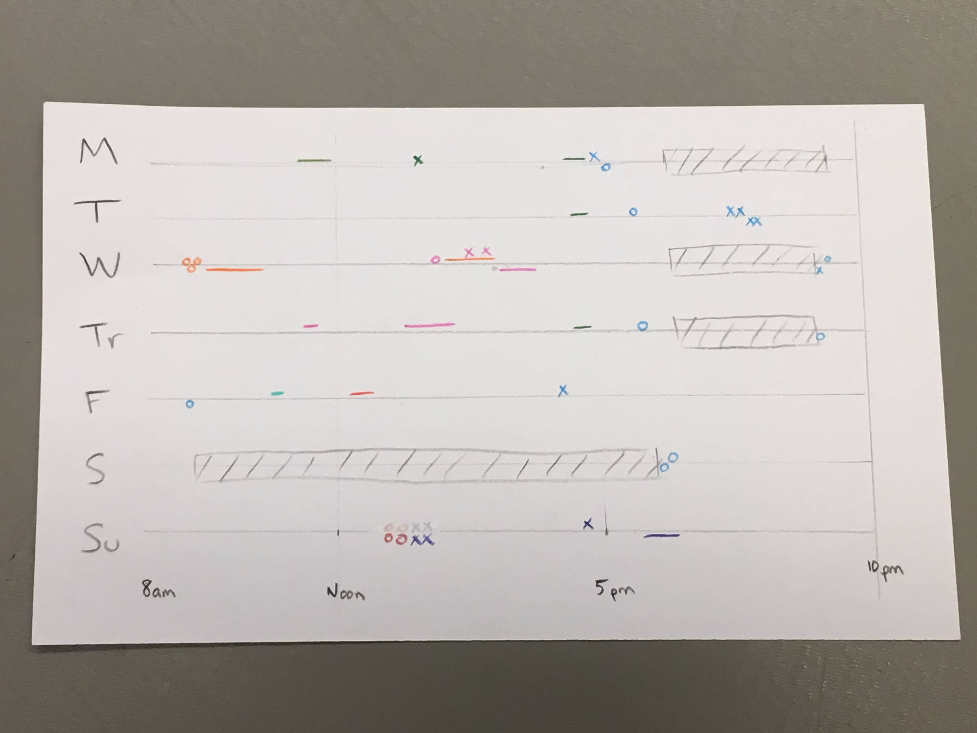
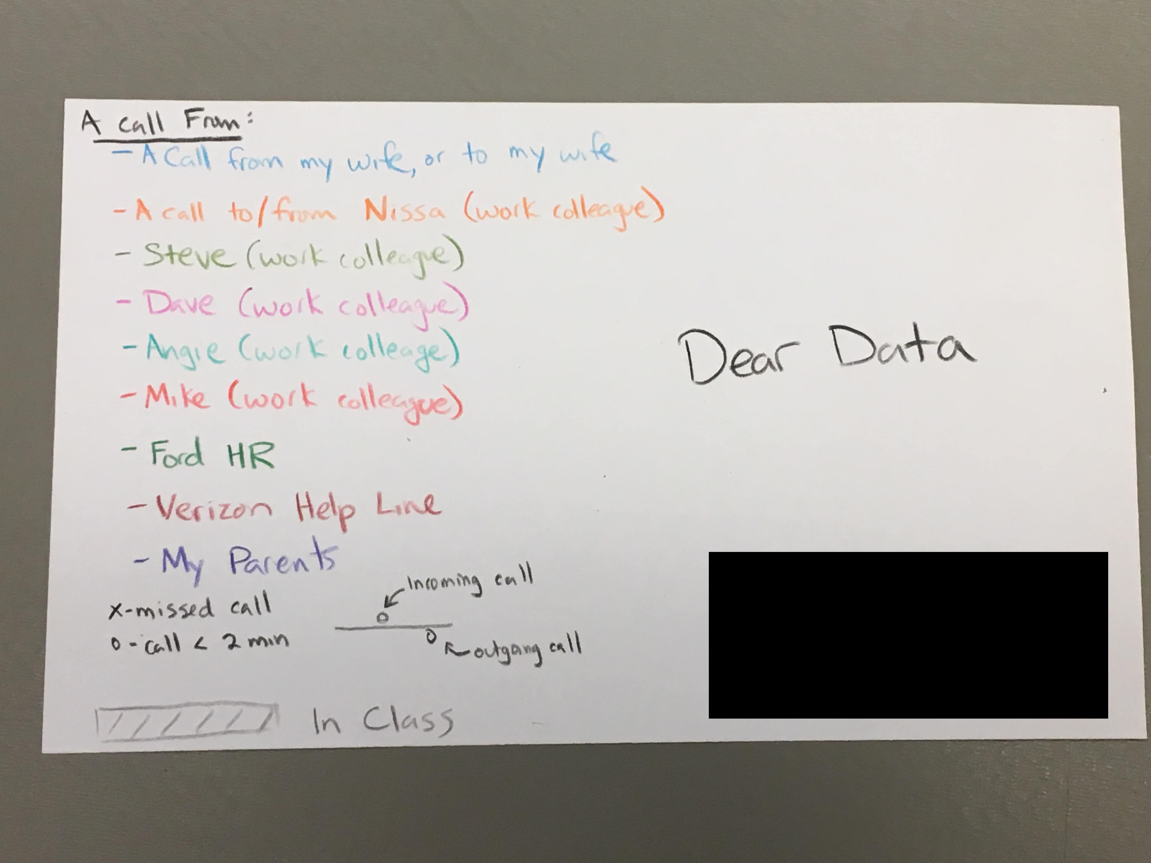
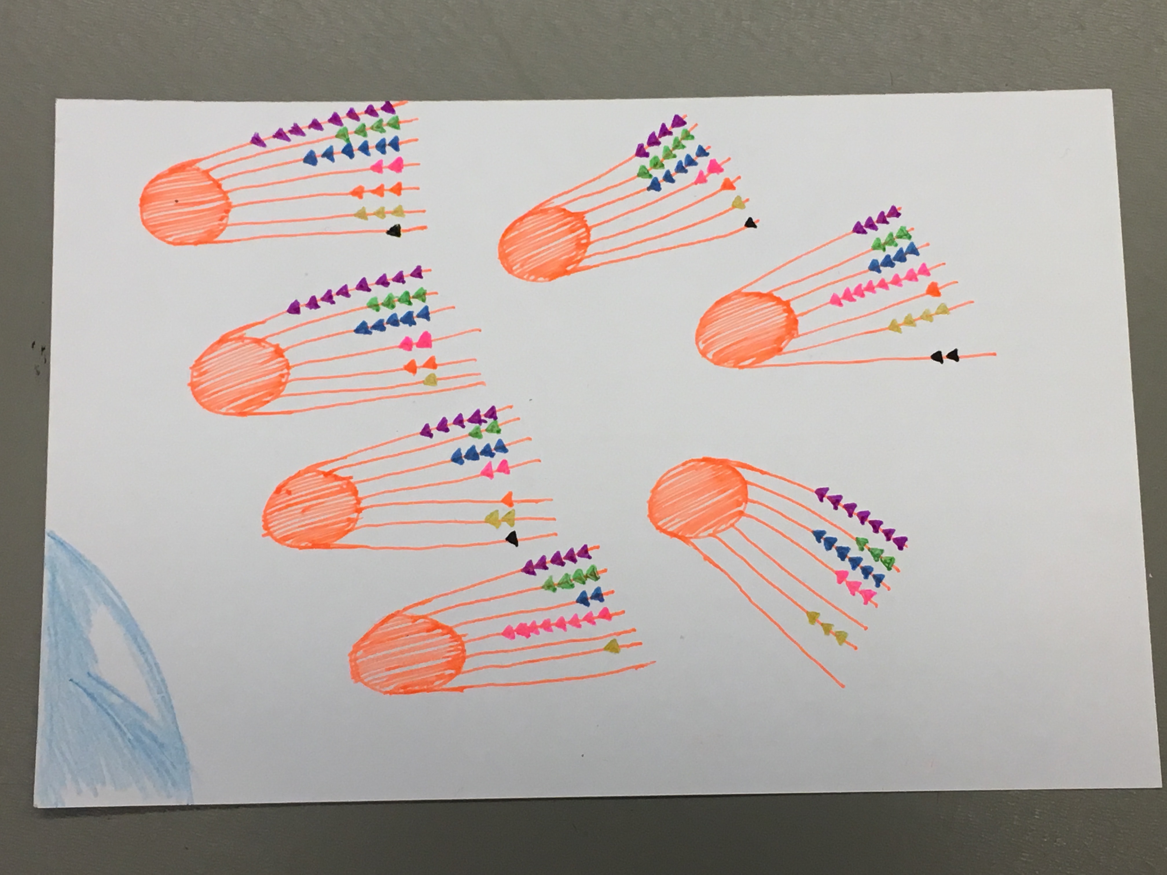
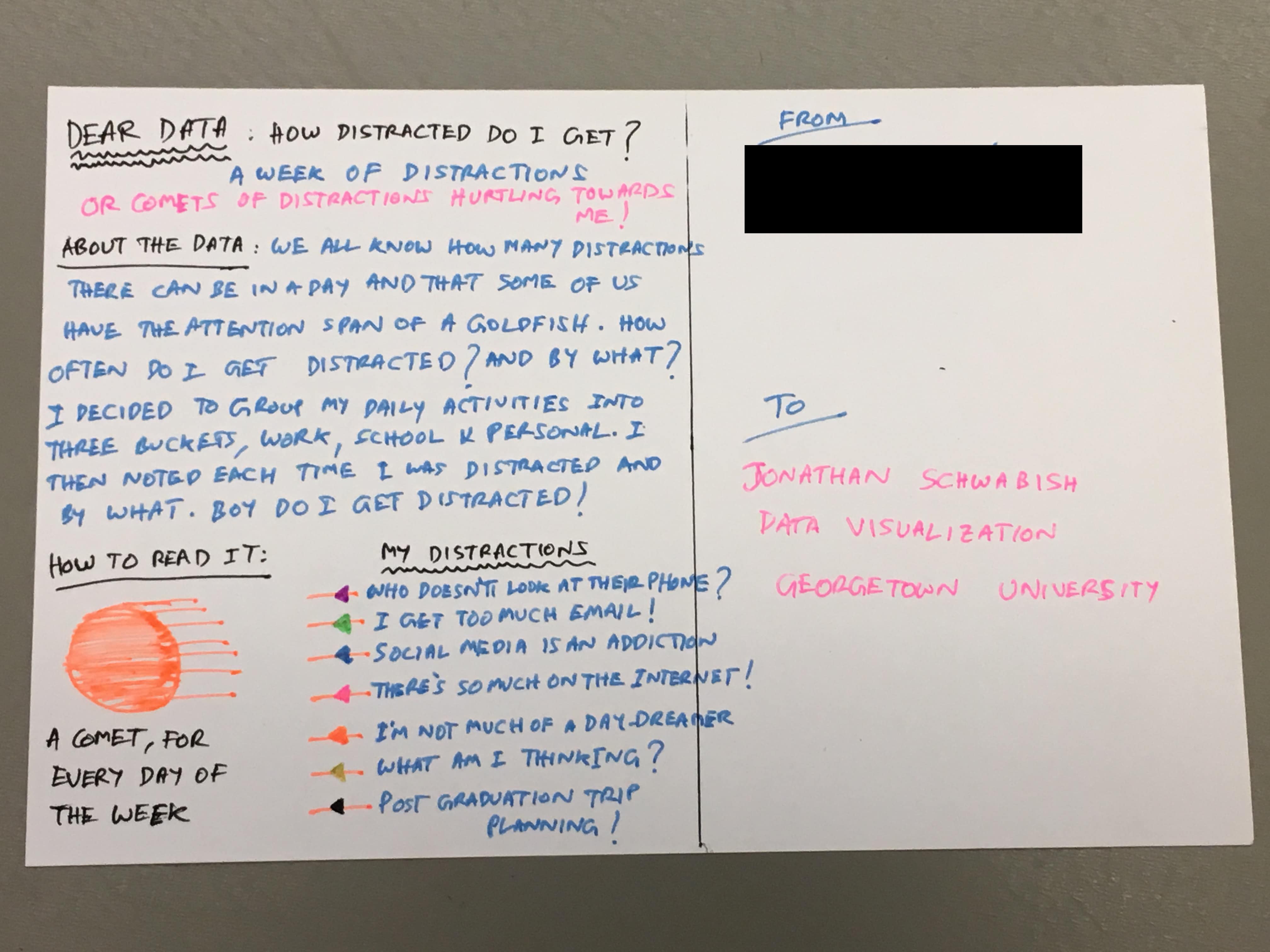
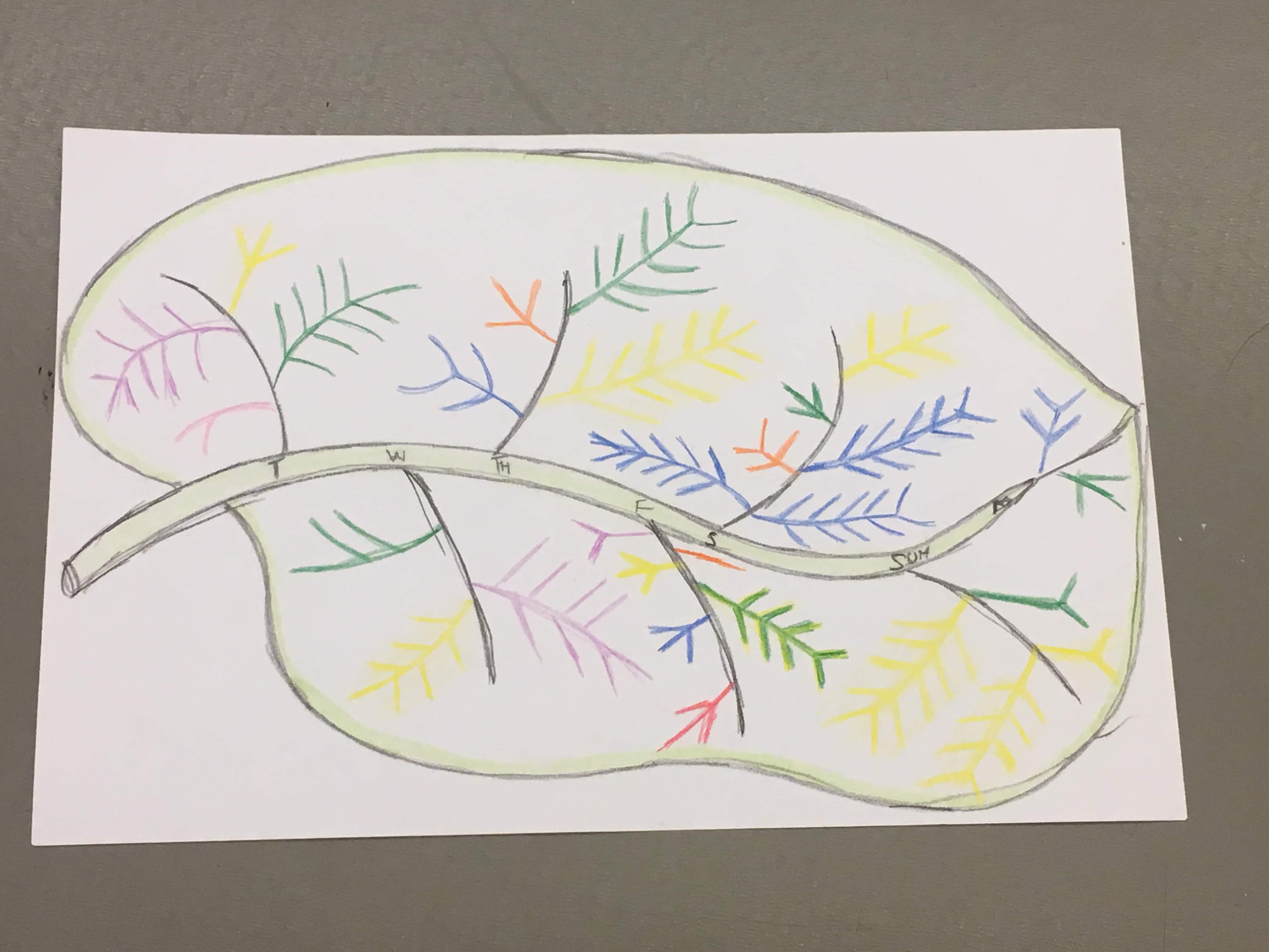
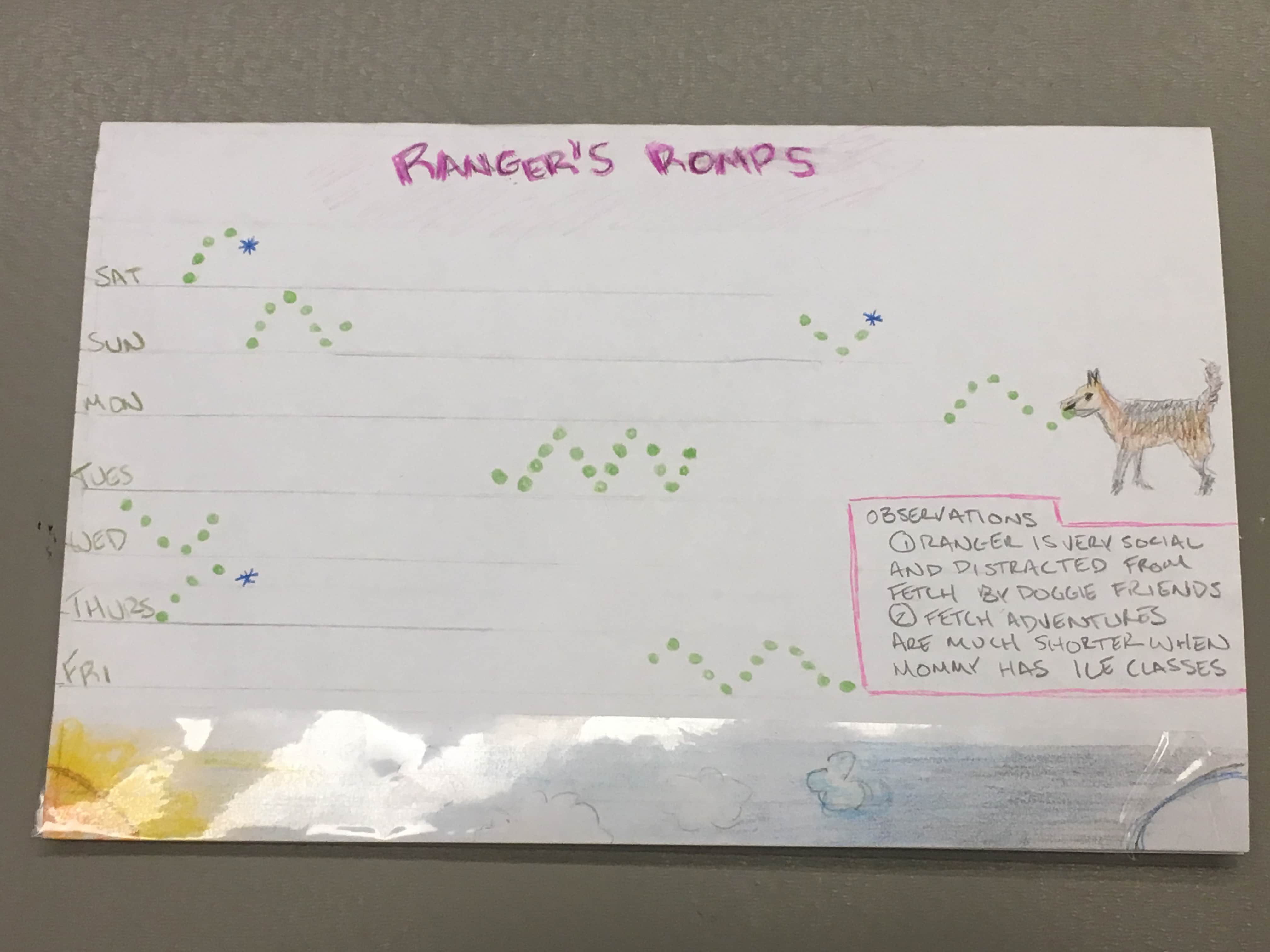
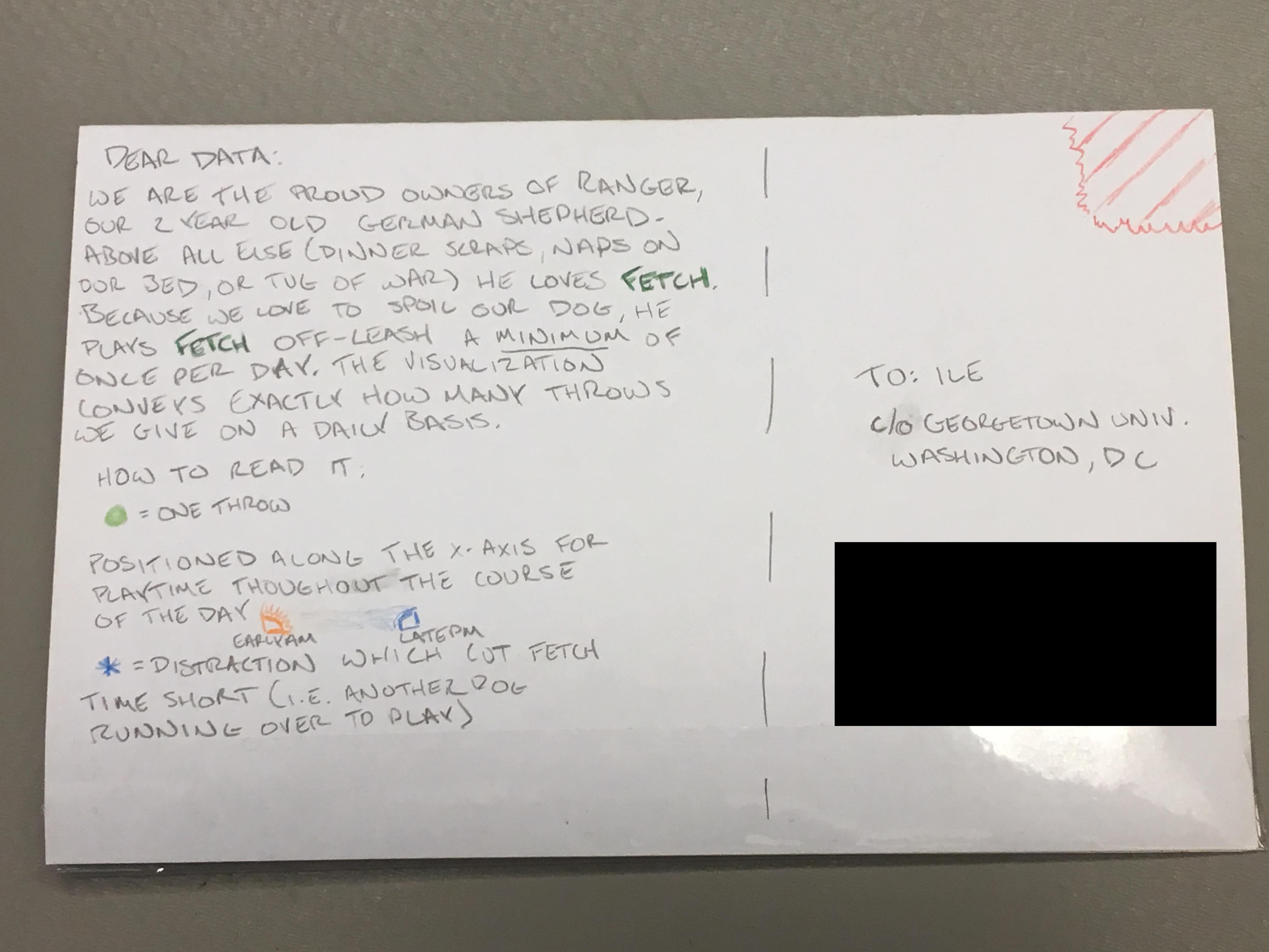
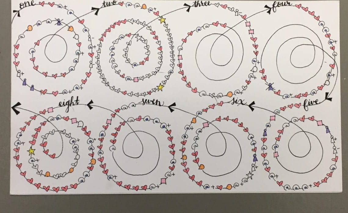
Like last year, the capstone project for the two weeks (in addition to an in-class group project they were assigned on the last day) is a Dear Data project. Students were asked to collect some personal data for at least seven days and to then create a visualization of those data on a 4.25″x5.5″ card. One side of the card includes a description of the data, legend, and conclusions they found, and the other side shows the visualization.
With the student’s permission (and blurring out names and email addresses), I’ve posted the cards below. You’ll see data on emails, music, exercise, food, beverages, and much, much more. Great creativity here, as I hope you’ll agree.