In the previous iteration of this site, I reserved a special page dedicated to collecting Data Visualization Style Guides. I’m republishing that collection here as a blog post with the rekindled hope that readers will add their own or their organization’s guides to the collection.
The original idea was developed at the Responsible Data Forum in New York City on January 11, 2016. It’s simply a list of data visualization style guides provided in no particular order. The idea is to build a collection of guides that layout style, formatting, and perhaps some other basic recommendations. These should not necessarily be documents that describe “best practices” or “dos and don’ts”.
My hope is that this post will serve as a repository for guides from around the world that others can use to develop their own guides and best practices. The list was originally published in January 2016, started small, and has grown to more than 15 documents. But I’m sure there is more, so please send me your suggestions and links using the comment box below, via the Contact form, or on Twitter.
Style Guide Collection
Humanitarian Data Exchange (HDX)
The Sunlight Foundation’s Data Visualization Style Guidelines
The Dallas Morning News Graphics Stylebook
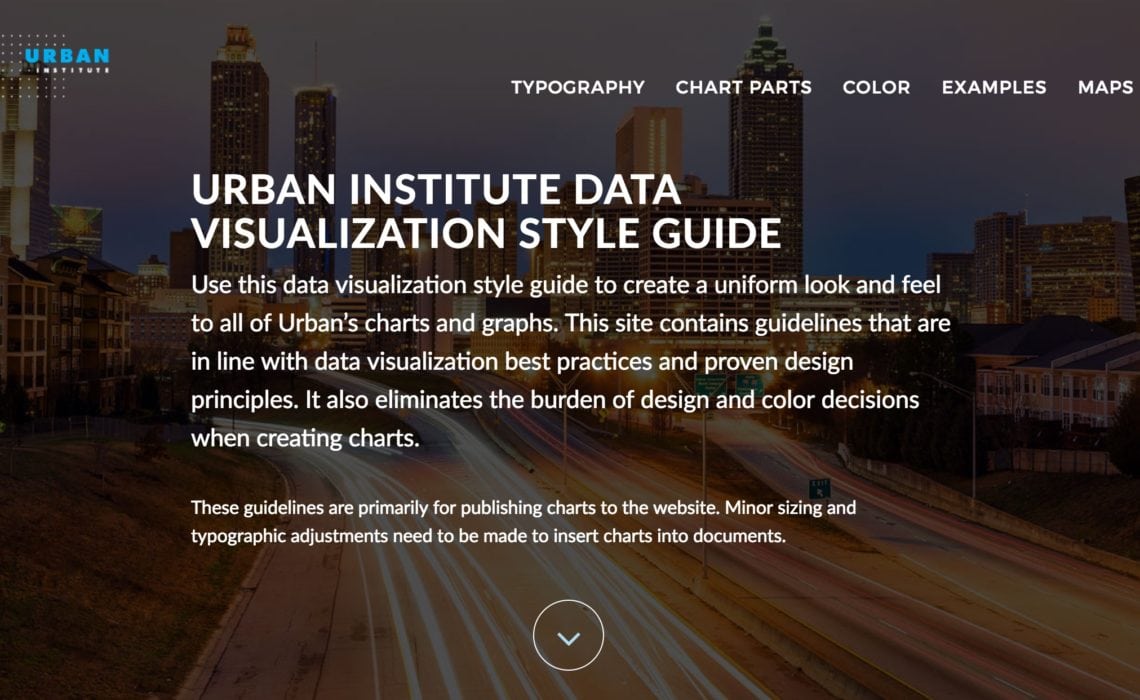
Urban Institute Data Visualization Style Guide
Annie E. Casey Foundation (editorial guide)
MinnPost Styles (thanks to Lynn Cherny)
Government (UK) Service Design Manual (thanks to Lynn Cherny)
Style.ONS (thanks to Lynn Cherny)
Texas Tribune (thanks to Lynn Cherny)
International Business Communication Standards (IBCS) (thanks to Andrej Lapajne)
United States Geological Survey (thanks to Jerzy Wieczorek)
An article on constructing a style guide
BBC Tableau Style Guide | Medium post, How we made the BBC Audiences Tableau Style Guide | R Graphics
Defense Intelligence Agency (DIA) Design and Dissemination Division (D3)
US Department of Agriculture | Visual Standards Guide
BBC Global Experience Language (thanks to Mik Nov)
BBC Visual and Data Journalism cookbook for R graphics
US Geological Survey (thanks to Ben Welsh)
Material Design (Google) | Write-up of the Material Design guide on Medium
National Cancer Institute | Branding and Logo Use Guide | Digital Style Guide (both obtained via FOIA request)
Graphics Standards for IES Publications and Collateral Materials
2012 Revision of NCES Statistical Standards: Final
American Statistical Association
Another collection: Google sheet | Google form to add others
Adele: The repository of publicly available design systems and pattern libraries
Primarily Web Design
Blog post: Airbnb, Uber and Mailchimp: Inside the web design style guides of 10 brands we love
Tables
(Big thanks to Thomas Mock for sharing!)
Office of National Statistics (UK)
Datawrapper: What to consider when creating tables
Paper: Presenting data in tables and charts
Blog post: Web Typography: Designing Tables to be Read, Not Looked At
Blog post: Design Better Data Tables
Related blog posts
Sara Delong: Why You Need to Create a Data Visualization Style Guide to Tell Great Stories (Part 1)
Sara Delong: How to Create a Data Visualization Style Guide to Tell Great Stories (Part 2)
PolicyViz: Why Your Organization Needs a Data Visualization Style Guide
Amy Cesal: What Are Data Visualization Style Guidelines?
Amy Cesal: Why does Data Vis need a style guide? OpenVisConf 2017 (video)
The Datalabs Agency: Data Visualization Style Guides
Updated June 18, 2021


Love this page so much! Thanks for keeping it going!
From Eurostat: https://ec.europa.eu/eurostat/web/products-eurostat-news/-/STYLE-GUIDE_2016
After I initially commented I clicked the -Notify me when new feedback are added- checkbox and now each time a comment is added I get 4 emails with the same comment. Is there any approach you can take away me from that service? Thanks!
Can you please email us directly (https://policyviz.com/about/contact/) with the email address you used to register for comments? We’ll take a look.
Thanks.