
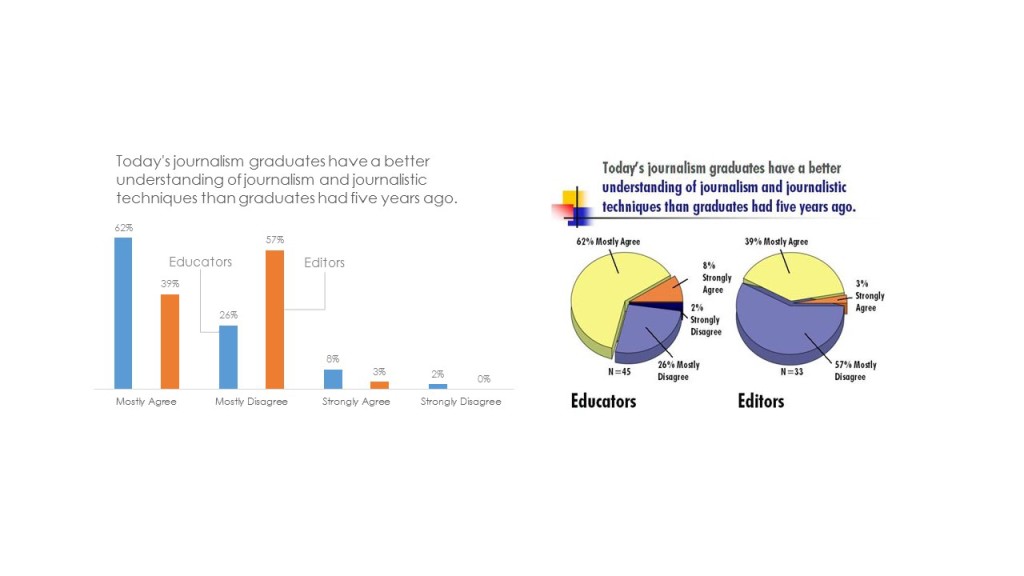
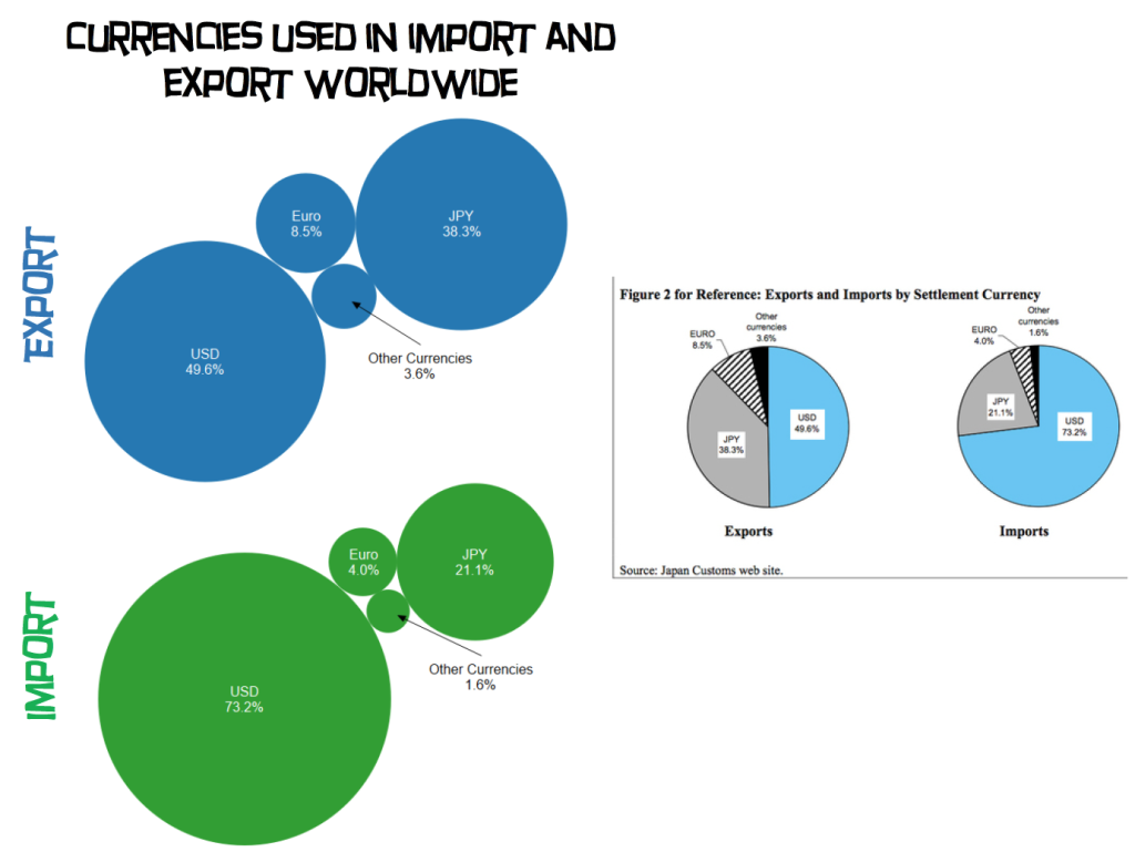
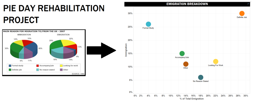
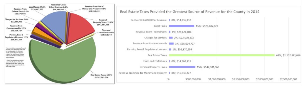
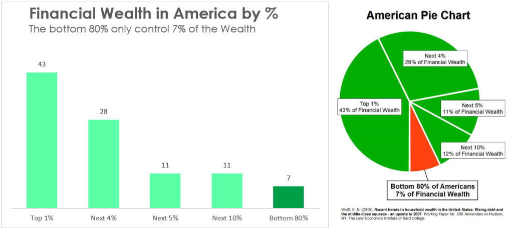
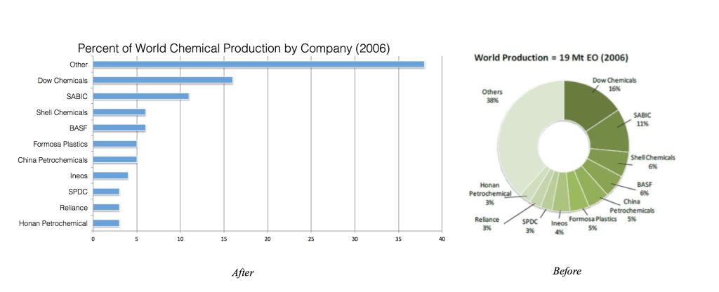
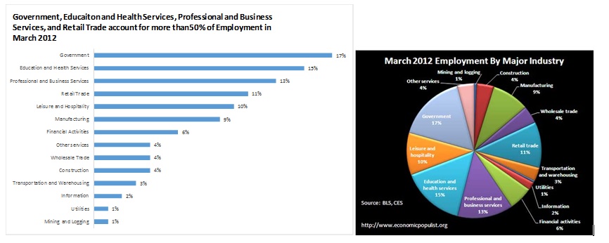
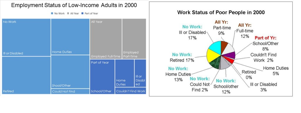
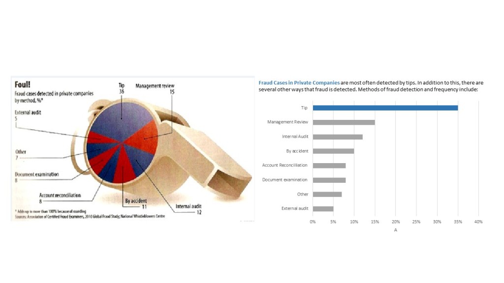
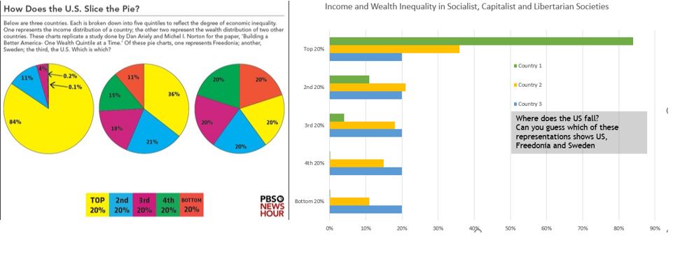
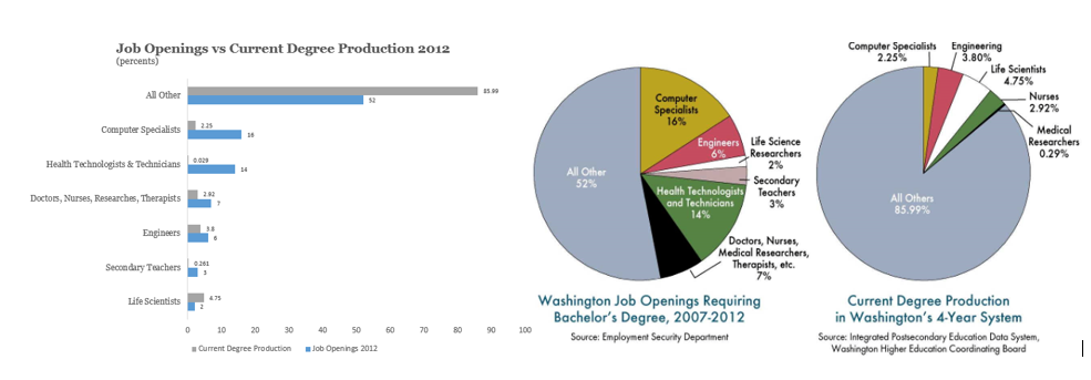
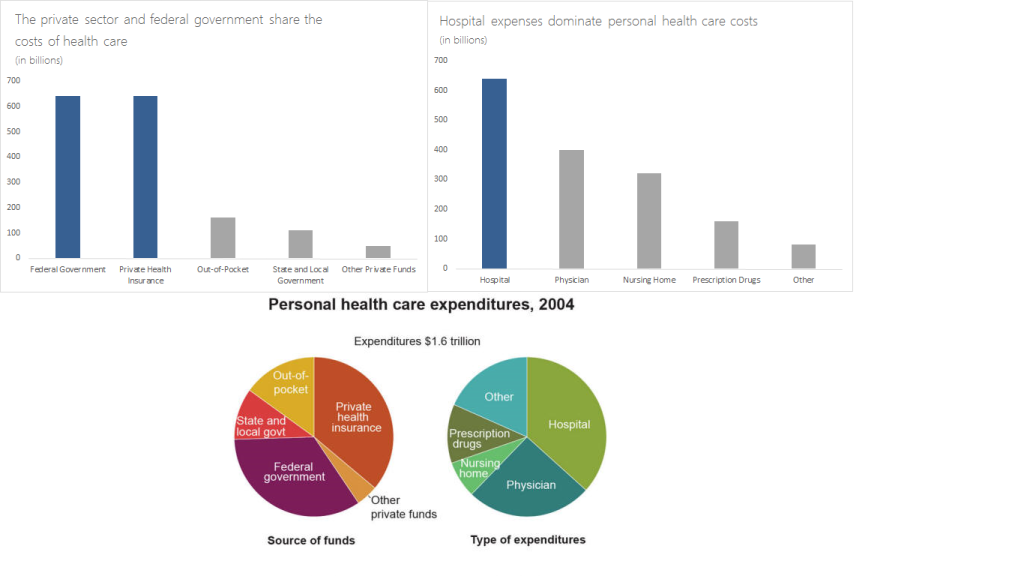
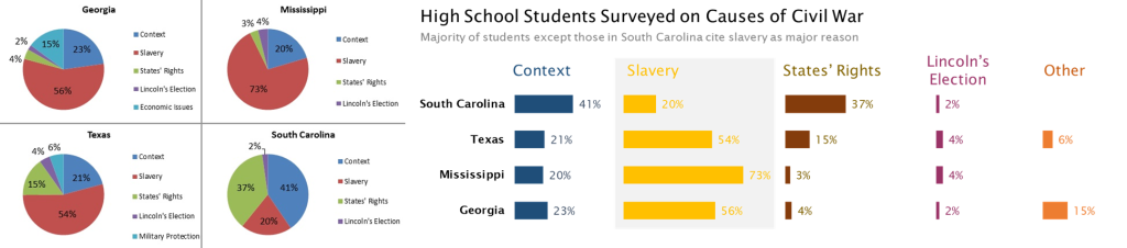
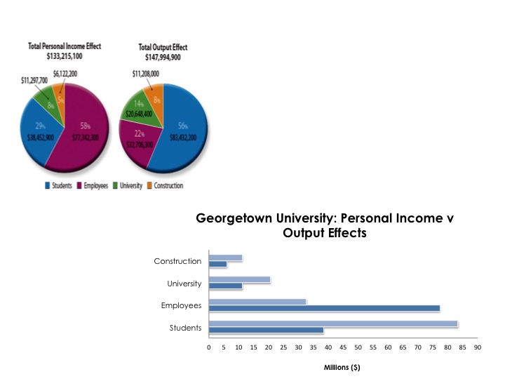
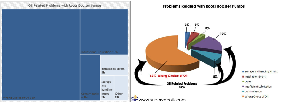
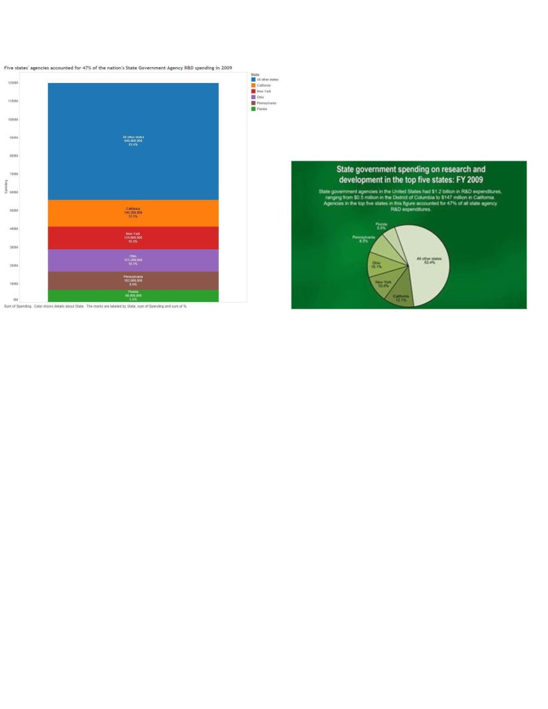
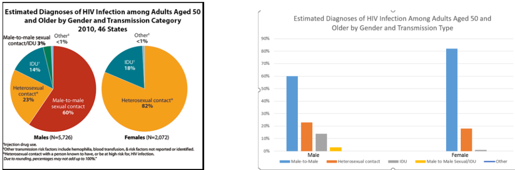
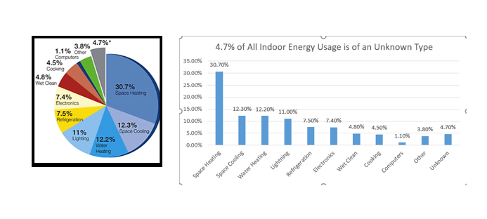
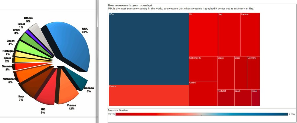
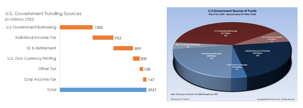
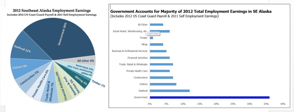
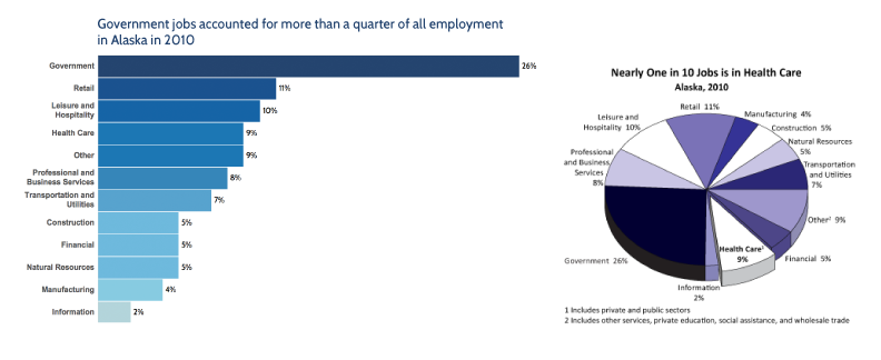
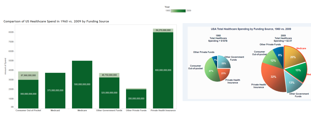
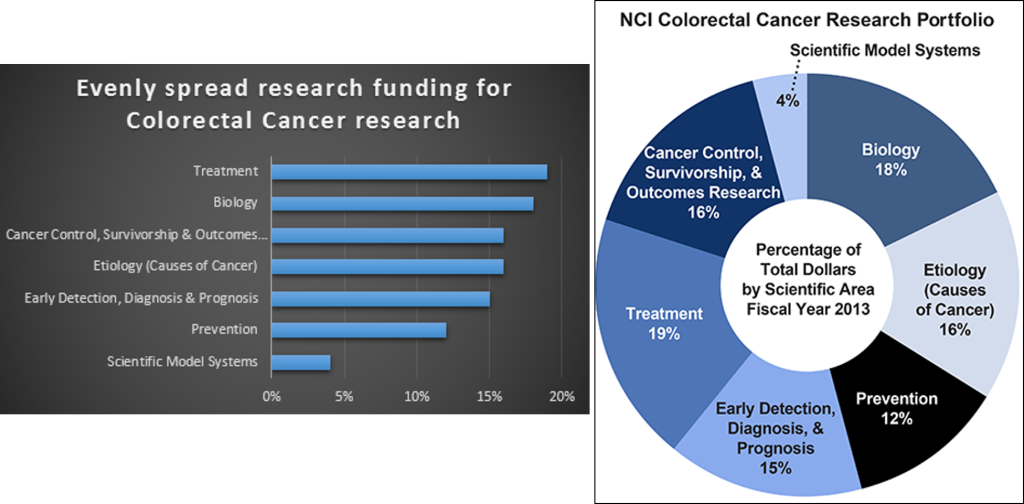
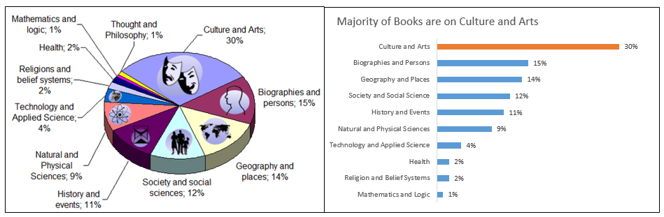
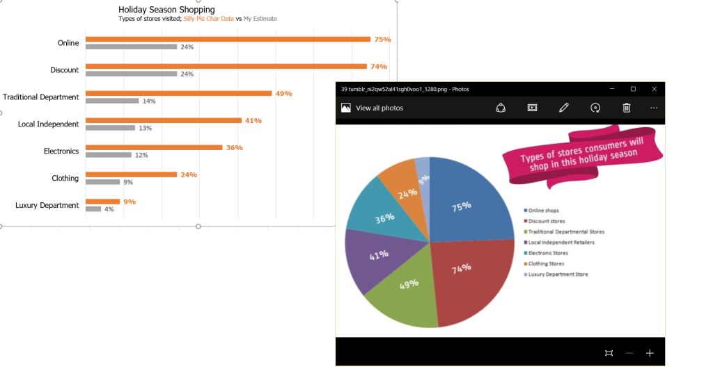
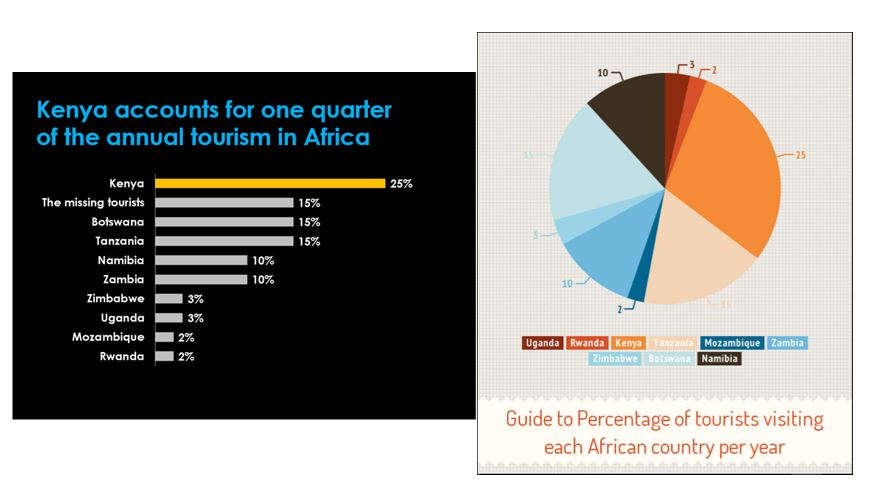
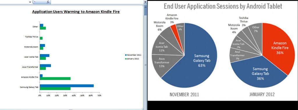
I’m currently teaching a Data Visualization class in the McDonough School of Business at Georgetown University. To celebrate Pi Day yesterday, each student was given a pie chart I found online and asked to remake it. The rules were simple:
- They had 30 minutes to create a new, static visualization from the pie chart provided.
- They could use any tool they wanted.
- If the data are hard to read or incorrect, they could ballpark it (making sure it sums to 100%!).
- Give the visualization a descriptive title. If no title is given in the original pie chart, make one up. If a poor title is given, fix it.
So, in no particular order, here are the remakes students came up with.
Happy Pi Day!

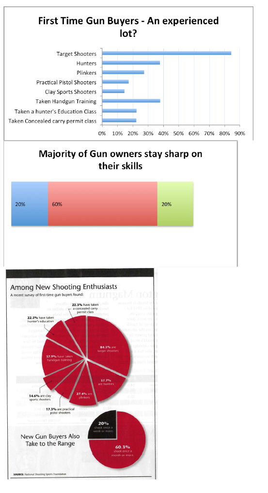
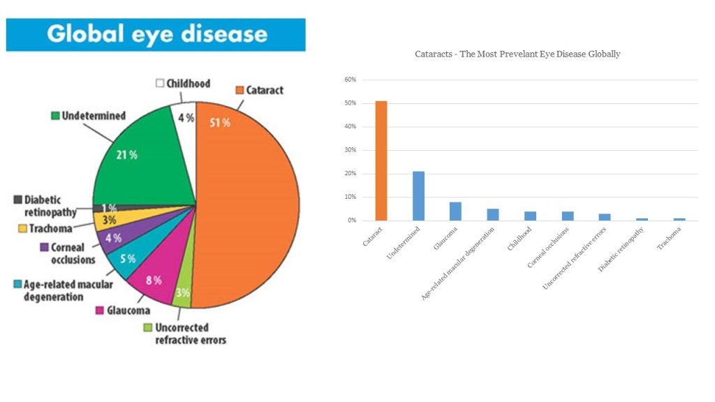


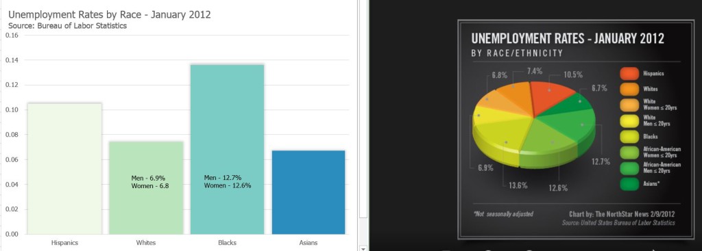

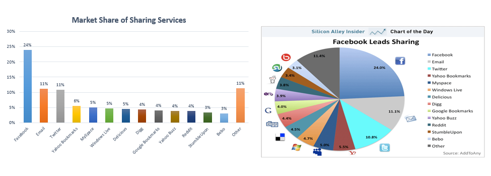


Yay! I spy some Tableau graphs in there 🙂